
When Zohran Mamdani hit the streets of New York, he didn’t just run a campaign, he demonstrated how visual design and brand strategy can shape political history. Through strategic visual and verbal communication, he built a movement that inspired over two million New Yorkers to vote. The highest turnout the city had seen since 1969. Every poster, speech and social media post worked to communicate trust, authenticity, and drive action.
Your brain can recall an image in less than 13 milliseconds. That’s faster than a blink. And Zohran Mamdani’s campaign made every millisecond count.

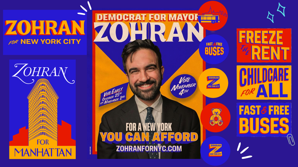
One of the most immediately recognisable visual elements was its hand-drawn typography. It felt warm, personable, and lived-in, the exact opposite of the corporate aesthetic strangling American politics. After Obama’s “HOPE” campaign, political branding had defaulted almost uniformly to sterile sans-serifs. Yet Mamdani brought back humanist serifs. The letterforms immediately communicated that he was of the people, not positioned above them.

Obama’s “HOPE” campaign
Equally strategic was the colour palette. Traditionally, Democrats default to blue. But Mamdani deployed a charged, electric royal blue paired with golden yellow and orange. The result was almost neon in impact: youthful, bold, and impossible to confuse with establishment politics. This wasn’t just Democratic alignment; it signalled a new Democratic identity.

Hand-drawn typography of Mamdani’s campaign design
Visually, it signalled authenticity and approachability. Every element evoked the working-class fabric of New York City: bodega awning signage, MTA-era condensed lettering, taxi yellow, playful storefront typography. To South Asian and immigrant New Yorkers, the visual language subtly echoed retro Bollywood film posters. The design didn’t make Mamdani look like an outsider, it made him look like someone already standing in the neighbourhood.

Zohran Mamdani
| Photo Credit:
Kara McCurdy
Cuomo’s failed switch
Mamdani’s visual language was so powerful that his main opponent, Andrew Cuomo, rebranded mid-campaign after recognising its impact. After his defeat in the June Democratic primary, Cuomo ditched his initial red, white, and blue and rolled out a new logo and colour scheme: blue and orange. Yet, it rang hollow because good campaign design must ring true to the candidate.
Visuals that “spoke” New York
At least 26 billionaires funnelled over $22 million into opposing Mamdani. And yet they lost. One of the reasons was that Mamdani’s campaign was a visual protest in a sea of sameness.
On storefront windows and telephone poles from Queens to the Bronx, to social media graphics, the yellow-and-blue signs declaring ‘Freeze the Rents’, ‘Childcare for All’, and ‘Fast and Free Buses’ stood out from the standard red, white, and blue campaign graphics. The retro, grassroots aesthetic created positive associations (where political campaigns typically evoke negativity and divisiveness), while the messaging spoke directly to the everyday pain of working-class New Yorkers.

Retro, grassroots aesthetic created positive associations
Mamdani knew exactly who he was speaking to. Through audience segmentation, he spoke to renters, working-class New Yorkers, and young progressives who long felt shut out of the political system. His storytelling was emotionally charged and visually intentional. Just as his merch design choices. They felt wearable in everyday life — on the subway, at a concert or while running errands. It didn’t say, “I support a politician.” It said, “I belong to a community.” From T-shirts and bandanas to tote bags and paper fans, it created a brand that supporters wanted to wear and share, using visual design as a secret tool that made politics feel real and community-driven.
Blueprint for authenticity
Most importantly, the campaign design never positioned Mamdani as the hero. In every ad, video, and poster, the audience was the main character. Most campaigns speak at voters. Mamdani’s design spoke with them and for them.
Over 95% of buying decisions happen in the subconscious mind. And in politics, buying decisions equal buying into candidates’ ideologies, being willing to donate, to mobilise. Visuals have the power to send subliminal cues to the subconscious, lodge into memory, and create trust. Which is why Mamdani’s visual campaign had the power to shift the entire trajectory of his movement.

The language of Mamdani’s visuals didn’t just capture a moment, it created a movement
Its language didn’t just capture a moment, it created a movement. In a political landscape drowning in sanitised mediocrity, its design became the blueprint for what happens when authenticity, cultural fluency, and brand strategy converge. The result wasn’t simply an election win. The result was a movement powered by the people themselves. And that changes everything.
The campaign was designed by Forge, a small co-op agency. Illustrator Rama Duwaji, Mamdani’s wife, also played a role in the visual direction of the brand identity.
Naba Yasir is a brand strategist and designer based in Texas, USA, and is the founder of Lumiere Creative Hub.
Published – November 15, 2025 07:07 am IST