
The designer of a typeface that was dropped by the US secretary of state, claiming its use was a diversity measure, has said the suggestion his design is inclusive is a “compliment”.
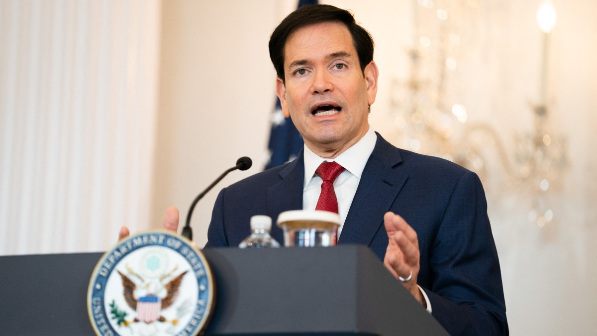
Marco Rubio ordered diplomats to return to using Times New Roman, calling his predecessor Antony Blinken’s move to adopt Calibri, a modern, rounded sans-serif typeface, in 2023 a “wasteful” diversity initiative.
The Biden administration said at the time that “fonts like Times New Roman have serifs [wings and feet] or decorative angular features that can introduce accessibility issues for individuals with disabilities” such as poor vision.
• Sign up for The Times’s weekly US newsletter
Rubio told US diplomats that the return to Times New Roman was done to “restore decorum and professionalism” to the department’s written work.
Lucas de Groot, who created Calibri, said the switch was a “bad choice” because his typeface was designed to be readable in small sizes on screens for everybody, including those with impaired vision. “It is designed to be friendly,” he told The Times. “So if Rubio thinks it’s inclusive, he’s right. It’s a compliment, of course.”
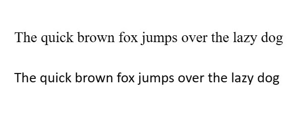
Times New Roman and, below, the more accessible Calibri
De Groot dismissed any accusation that his font was “woke” as “politics” and “just humorous to me”. He said his typefaces always had a “slightly humanistic touch” and involved lots of strokes from handwriting.
“There are thousands of parameters that I use when designing a font to make it more readable,” he said. “I’m not thinking of inclusion. In this case, it was just the assignment to make a very readable font for everybody.”
De Groot noted that Microsoft, for which the typeface was created, moved from Times New Roman to Calibri in 2007 because of the typeface’s limitations on a digital screen.
Times New Roman was designed for The Times in 1931 by Stanley Morison, who called it “English, direct, simple and free from frivolity”. De Groot said the font was “really beautiful” when used for print.
However, he said the digital version of Times New Roman was developed in the early days of computing and the typeface could create visual disturbance on typical office screens.
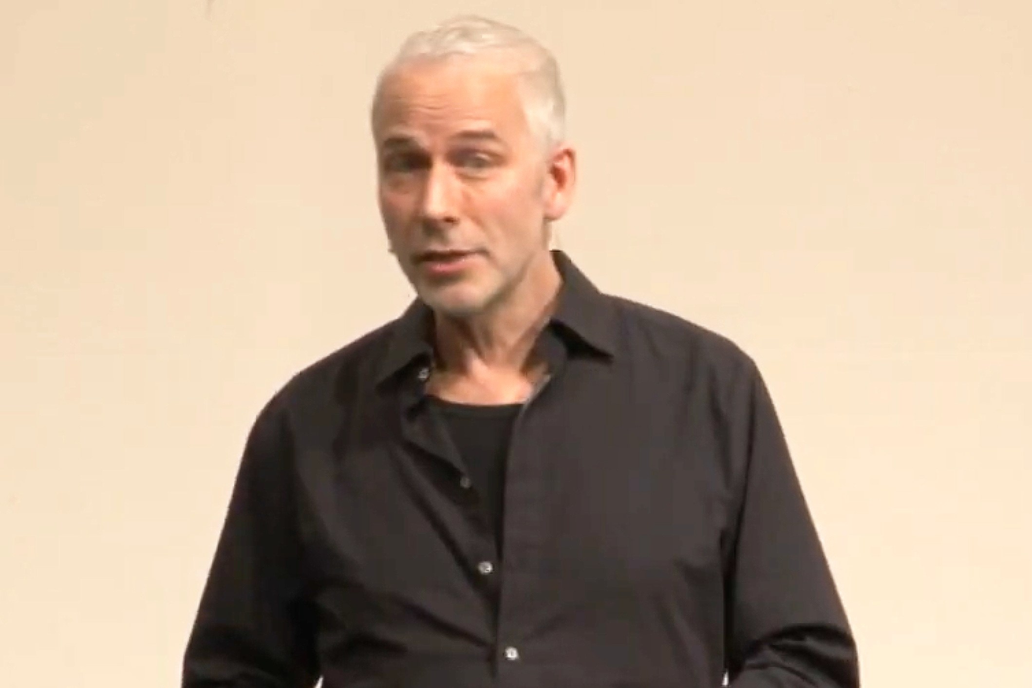
Lucas de Groot created Calibri as a more readable alternative
De Groot added: “If you write in capitals like the US administration loves to do all the time, the spacing is really irregular.
“Some letters are very tight, very close together, other letter pairs are very loose, far apart. And this gives a very unprofessional look to the serif font.
“Choosing a serif font for official stuff, no problem with that, but the digital Times New Roman as it is built into the Microsoft operating system and Office, is not a good choice. There are much better serif typefaces around.”
By contrast, Calibri incorporates “extensive” spacing and language-specific adjustments.
In 2023, Microsoft changed its default font to Aptos citing the need for “the perfect font for higher resolution screens”.
In an editorial that same year, The Times said the State Department’s switch to “the round-edged upstart” Calibri was a “monstrous misjudgment” and “dumbing down”.