
NASHVILLE – The Titans have a new look, which was unveiled on the team’s social media channels Thursday night.
The new logo, new uniforms, and some of the details included represent the franchise’s history, and its home in Nashville, as it heads into the next chapter of Titans legacy.
The fresh new look pays homage to the Luv Ya Blue Days as the Oilers, and also incorporates elements of the team’s nearly 30-year history in Tennessee.
“We wanted to come up with something that took the best parts of all of that and bring it together in a way that makes sense,” said Burke Nihill, President and Chief Executive Officer of the Titans. “I feel like we’re building on the legacy of what got us here, and we’re doing it in a way that is going to set the course of this organization for decades to come in a pretty special way.”
Let’s get straight to the Tennessee makeover, and what the new Britches Report might look like moving forward:
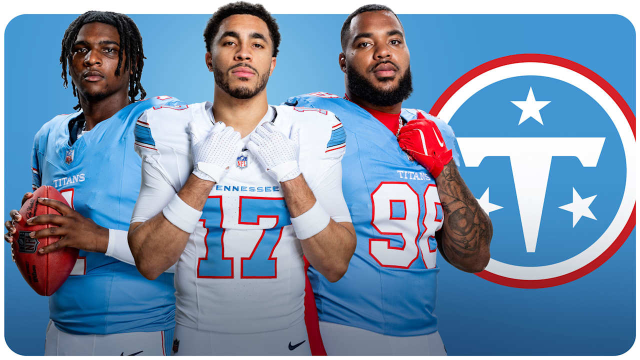
-Titans blue jerseys and white pants/britches will be the primary look at home, with white jerseys as the primary road look, either with light blue or white pants/britches. The Titans will also have the option of wearing white at home games.
At home, the word TITANS is stitched on top of the numbers across the chest plate, and the away jerseys have TENNESSEE in the same place.
The light blue jerseys will feature white numbers outlined in red, and the white jerseys will feature light blue numbers outlined in red. Numbers will appear on the front and back of the jerseys, and on the shoulders.
The light blue, or Titans blue, color is unique, and one that was clearly popular with players, and fans. The team discovered this through uniform sales with the throwback Oilers jerseys, and through fan surveys and focus groups.
“I think that Titans blue is a really bold color, a really powerful color,” said Erin Swartz, Senior Vice President of Brand Marketing with the Titans. “Seven other teams in the NFL have navy, but this color is much more unique to us. So, it’s a way for fans to uniquely show their support, and really fill stadiums both home and away with Titans blue to support their team.
“We wanted to give them that tool to kind of stand out, as Titans fans.”
-The primary logo gives a nod to the past, now without the flames. It features a redesigned white “T” inside Titans blue in a circle, with white and red accents, and all corners of the state represented through the familiar three white stars.
The logo will be featured on each side of a white helmet, which will include a white facemask, and a unique stripe across the top.
“I don’t think it’s a departure from anything,” Nihill said of the logo. “It’s more of an evolution of the best of who we’ve always been and who we want to be going forward. We wanted the uniform, and brand of the Tennessee Titans, to be the best of who we’ve always been. And the logo that we’ve worn on the side of the helmet for the past 25-plus years is part of the best of who’ve always been. There’s a clear familiarity, and we wanted that.
“Relative to fireballs and swords and Greek, our hope is Mr. Titan shows up in full gear for the first game this year. That’s been a part of who we’ve been, and those logos instantly become some of the best retro logos in sports. This just brings everything together in a way that feels like it is going to stand the test of time.”
-There are elements of the new uniforms, and brand, that are unique to Nashville, and the state of Tennessee.
The previously mentioned stripe has a Nashville theme – it’s a 6-string stripe that appears on the pants, sleeve, and helmet, and it features navy, white, red and Titans blue.
In addition to the white stars in the logo, three navy stars, located on the back neckline of the jerseys and tucked underneath the arms, represent the three grand divisions of the state of Tennessee.
The Woodblock font on the chest plate is symbolic of Nashville’s creative spirit, traditional print making, whittle letters, and stack to run pressers. The numbers are inspired by traditional collegiate numbers.
Inside the jersey, there’s a collar tab with the word “WE,” and it’s accompanied by Tennessee Tri-Star. The word “We” represents the team’s “We Over Me” locker room mentality.
“When coach (Robert) Saleh came to the team, and we showed it to him, he loved it,” Nihill said. “He loved this idea of ‘”we'” being the last thing that a player sees before they put on their jersey, that this is about the team.”
The Titans also unveiled a secondary “The Football” logo, with the letters TN (or NT for Nashville, Tennessee) and three stars inside a football-shape outline, a cultural representation of the team’s home and community.
Nihill said the organization looked “at everything” before deciding on the franchise’s new uniforms, and brand, a process that stretched across a number of years and incorporated fan, alumni, and community feedback through a number of surveys and focus groups.
Ultimately, the team landed on a look that is uniquely Nashville, Tennessee, and the Titans.
The redesign coincides with changing times in the organization, from a new coaching staff, a reshaped roster, and soon, a new stadium.
“This is something that evolved over time,” Nihill said. “I do hope our fans feel proud when they see it. I think these new uniforms, and all the other brand elements, are something people will respond to, and react to. During this process, the number of times that we heard: “These are the best uniforms in pro sports” weren’t words we were putting in peoples’ mouths – they were saying that to us.
“And now, this is the Titans unform.”