
Netflix made its big Major League Baseball debut as the 2026 season kicked off on Wednesday night with a game between the San Francisco Giants and New York Yankees. And true to form for the streamer, it was a very unique presentation as they look to make their mark in live sports coverage.
Netflix has often talked about wanting to be selective with their live sports offerings and making them a big event. To that point, the streamer has Opening Night, the Home Run Derby, and the Field of Dreams Game. And they are going to try to turn all of those broadcasts into major productions.
For Opening Night, that meant an hour-long pregame show (that at times felt like a giant Netflix infomercial) and extended introductions that pushed the first pitch all the way to 8:25 p.m. ET after an advertised start of 8:00 p.m. ET.
But once the first pitch was thrown, baseball fans had another talking point – the new Netflix scorebug.
Baseball fans are very passionate about their scorebugs. And the Netflix one is unlike any other in the sport.
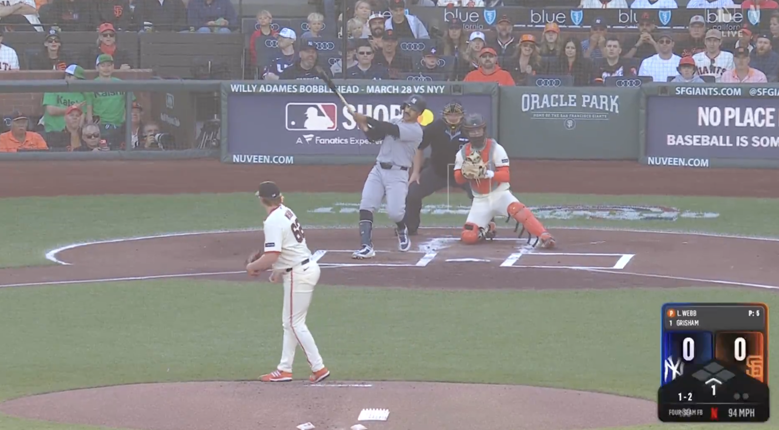
For starters, it’s on the bottom-right of the screen, which is the opposite of a lot of baseball scorebugs over the years. The layout looks almost three-dimensional with the team logos and scores behind the basepaths to denote runners on base. The count and pitch clock are below that with the type of pitch and pitch speed flashing after it is thrown. Above all of that info is the batter at the plate and the pitcher’s current pitch count, that is if you can read it in some pretty microscopic font.
The scorebug looks incredibly sharp, especially with the great picture quality for Netflix. But does it get the job done? That’s where baseball fans and viewers at home aren’t so sure.
I like the aesthetic and concept, but the text is shockingly small. The pitcher and batter text is the smallest I have ever seen on any sports scorebug/lower third. https://t.co/LU0Pgp1ptn
— Jeff D. Lowe (@JeffDLowe) March 26, 2026
Netflix presentation is cool but the scorebug text needs to be much bigger. Can barely read it. https://t.co/vYQ9FiMYQO
— Football Chopz (@Pchopz_) March 26, 2026
do I need to go to the eye doctor or is the text painfully small https://t.co/ncXpvpr3sV
— TOM MARTIN (@tomhasideas) March 26, 2026
A bold choice, usually scorebugs have legible text at a font size that people can see. Will be interesting to see if this new direction works for them. https://t.co/50nWlEeX1b
— Movie Mindset (@lifein4chapters) March 26, 2026
🚨NEW SCOREBUG ALERT🚨
I give it a 6.8 out of 10. It’s relatively clean, but the pitcher, batter, and pitch count font is WAY too small. pic.twitter.com/7m52pm5lck
— Jake Marsh (@JakeMarsh18) March 26, 2026
I like it https://t.co/op6grsYUFO
— Cody Decker (@Decker6) March 26, 2026
I didn’t think a scorebug could get worse than the Bally Sports one
Netflix may have just proven me wrong pic.twitter.com/3gKz2dnJwU
— AT (@BaseballWRLD_) March 26, 2026
https://t.co/fMd3gIcktU pic.twitter.com/8SGXkTVxiQ
— Cha’Mander (@JayUnFazed) March 26, 2026
The Netflix scorebug looks great if you were to just take a glance at it. But it’s simultaneously too big and too small. It takes up a decent chunk of the screen, but some of the fonts are so small that to actually process the information might take a pair of binoculars aimed at your television set. Before they return to baseball later in the year, they might be wise to adjust some elements of the scorebug that could make some big improvements and easy fixes.