
On classroom walls from Lagos to London, the standardised world map shows a shrunken Africa, comparable in size to the United States or China, with an inflated Britain at the centre.
Now African campaigners want it replaced because, they say, the nearly 500-year-old Mercator projection distorts geography by diminishing the world’s second-largest continent because it exaggerates the size of the northern hemisphere.
“It might seem to be just a map but in reality it is not,” said Selma Haddadi of the African Union Commission.
The AU is calling for schools, governments and international institutions to adopt images that reflect countries’ true sizes. She said the present design had long fostered the false impression that Africa is “marginal”, a continent that could be tucked into Russia with room to spare, entrenching stereotypes across media, education and policy.
Africa is sufficiently large that the US, China, India, Japan and much of western Europe could fit into the continent with space left over.
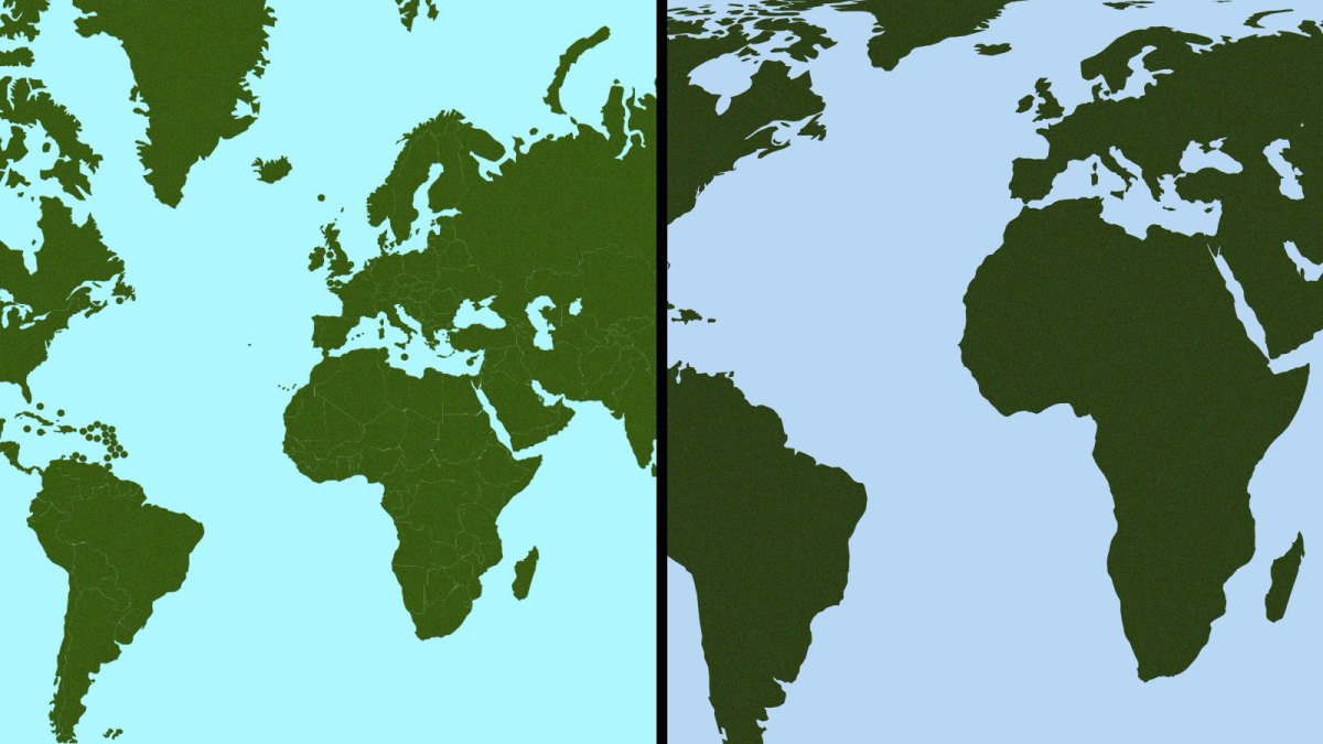
The Mercator projection, developed in 1569 by the Flemish cartographer Gerardus Mercator, began as a tool for sailors. Stretching the lines of latitude, it allowed navigators to plot straight-line courses across oceans — a breakthrough for 16th-century sea travel. By the 18th century, Mercator’s projection dominated world mapping, moving from maritime charts to home atlases and now viewed billions of times a year on Google Maps’ mobile app.
But its design exaggerates the size of landmasses near the poles and shrinks those nearer the equator. Antarctica is rendered so large that publishers often omit part of it and, in the process, centre the world vertically on Europe rather than the equator — which, critics say, gives the global north an exaggerated sense of importance.
The “Correct The Map” campaign has revived the debate over Africa’s true size. Led by Africa No Filter and Speak Up Africa, and supported by the AU, it urges global bodies — including the World Bank and the UN — to adopt the Equal Earth map, created in 2018 by three cartographers, which campaigners say is a fairer representation of countries’ shape and size.
The case for change is underscored by President Trump’s fascination with Greenland, which on the Mercator map appears to rival Africa in size. Africa is 14 times larger, while Greenland is smaller than a single African country, Democratic Republic of the Congo, where Trump is eyeing mineral deals to counter China’s dominance.
Trump, who floated the idea of acquiring Greenland during his first term, told reporters he was struck by its apparent scale. “I love maps … and I always said, ‘Look at the size of this. It’s massive! That should be part of the United States.’” Canada, another country he has suggested annexing, also appears far bigger than its actual size.
A World Bank spokesman said that it already used the Equal Earth or “Winkel tripel” for static maps.
Moky Makura, executive director of Africa No Filter, said: “The current size of Africa is wrong. It’s the world’s longest misinformation campaign, and it has to stop.”