
Urban carbon footprint analysis
On average, the research revealed per-capita annual GHG emissions of 4.9 tCO2eq (SD = 1.2, CV = 0.24). Electricity was found to be the most significant contributor, accounting on average for 45% of per-capita emissions, followed by transportation (26%), solid waste management (12%), consumables (12%), water supply (3%), and wastewater treatment (2%). Nevertheless, total per-capita emissions vary widely across the analyzed cities, ranging from 1.76 to 7.28 tCO2eq.
When plotted against population size (Fig. 1), pronounced variations in the magnitudes of per capita and absolute carbon footprints (CFs) are observed across cities. The mean per-capita CF (4.9 tCO2eq) is represented by a dashed line, providing a benchmark for comparing cities. In absolute terms, the top 10 cities account for 52% of the total emissions, with cities such as Jerusalem and Tel Aviv-Yafo accounting for 13% and 10%, respectively. Noticeably, while some cities exhibit high per capita and high absolute emissions, others demonstrate contrasting patterns, such as high per capita but low absolute emissions or vice versa. A detailed city list is provided in Supplementary Table 1, with additional alternative visualizations (bar chart and map) in Supplementary Figs. 1 and 2.
Fig. 1: Urban carbon footprints across Israeli cities (tCO2eq/cap and MtCO2eq).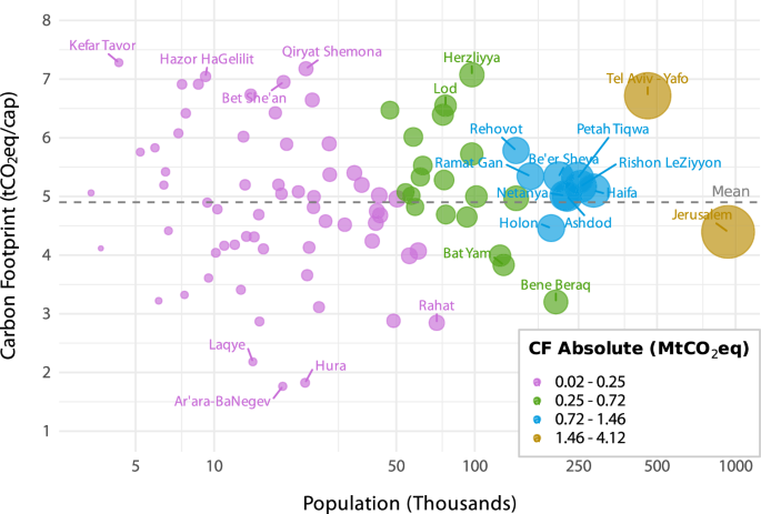
The y-axis shows per-capita carbon footprints (tCO2eq/cap), and the x-axis shows population size on a logarithmic (base 10) scale with actual values displayed on the ticks. Each point represents a city, with symbol size proportional to its absolute carbon footprint (MtCO2eq). Cities are categorized into absolute footprint ranges using Jenks natural breaks. The dashed line marks the mean per-capita footprint (4.9 tCO2eq), providing a benchmark for comparison.
Figure 2 illustrates the distribution of per-capita GHG emissions across the analyzed footprint categories. Electricity is the primary source of emissions, with a mean of 2.23 tCO2eq per capita (range: 0.33–3.89). It is followed by transportation at 1.30 (range: 0.46–2.44), waste at 0.60 (range: 0.21–1.31), consumables at 0.58 (range: 0.21–1.25), water at 0.13 (range: 0.04–0.22), and wastewater at 0.10 (range: 0.03–0.27). The Coefficient of Variation (CV) represents inter-city variability within categories, revealing moderate variability for electricity (0.35), transportation (0.28), waste (0.32), consumables (0.31), water (0.23), and wastewater (0.40). Varied emissions characteristics are observed across the analyzed cities, evident in both total per-capita and absolute emissions (Fig. 1) and within individual footprint categories (Fig. 2). Detailed per-capita and absolute values are provided in Supplementary Tables 2–3, respectively.
Fig. 2: Per-capita GHG emissions by footprint category across Israeli cities (tCO2eq/cap).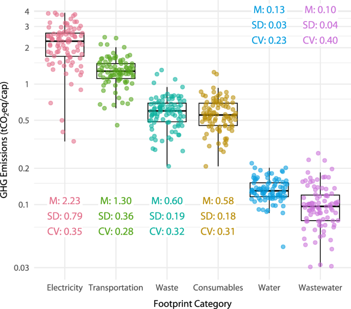
The y-axis shows per-capita GHG emissions (tCO2eq/cap) on a logarithmic (base 10) scale with actual values displayed on the ticks. Each point represents a city. Footprint categories are arranged from left to right according to their mean per-capita emissions. For each category, mean values, standard deviations, and coefficients of variation are displayed, indicating both central tendency and variability among cities.
To further explore the characteristics of urban emissions, as a base for effective tailored mitigation strategies, three city-level indicators representing socioeconomic, spatial, and spatial-economic dimensions were examined. While indeed some associations can be found, these are quite limited, emphasizing the complexity of urban emissions drivers. Both “functional urban density” and “peripherality index” showed weak or negligible correlations with per-capita emissions, and were not statistically significant (τ = -0.14, p = 0.05; τ = 0.02, p = 0.83, respectively). Income per capita showed a moderate and statistically significant positive correlation (τ = 0.45, p < 0.001), suggesting a link between affluence and higher per-capita emissions. However, this was the only indicator displaying such a pattern, and even here, the strength of the relationship was only modest. Full scatterplots of the examined indicators are provided in Supplementary Fig. 3.
Taken together, these findings indicate that while socio-economic and spatial indicators may offer partial insights, they are insufficient on their own to guide policymakers on urban mitigation advancement and shed light on the differing emissions levels across cities. For instance, several cities with relatively low income levels, such as Qiryat Shemona, Hazor HaGellilit, and Bet She’an, exhibit noticeably high per-capita emissions. Therefore, relying solely on generalized indicators to guide urban mitigation planning may overlook city-specific emission characteristics.
In light of this, the analysis proceeds by clustering cities based on their actual total per-capita emissions intensity, independent of assumed socio-economic typologies. This approach enables a more differentiated understanding of emission patterns. It supports the development of mitigation strategies rooted in each city’s specific emissions composition, beyond its socio-economic classification or spatial location.
Figure 3 further synthesizes the results into city-level emission profiles, showing the proportional contribution of each footprint category to total per-capita emissions (left panel) and the relative deviations from each category’s mean value (right panel). Cities are grouped into four clusters based on their total per-capita carbon footprint (tCO2eq/cap). The analysis identifies diverse urban emission compositions, ranging from low per-capita emissions (C1) to higher rates (C4). Cities in the lower cluster (C1) exhibit diverse dominant emission sources with no consistent pattern across footprint categories while maintaining per-capita emissions below national averages in most categories. While such cities display relatively low per-capita emissions, they could still benefit from targeted strategies to decrease emissions in areas that contribute considerably to their overall CF. Overall, higher cluster cities (i.e., C3, C4) display a dominance of electricity and transportation emissions in their profiles, with most cities surpassing the mean emissions intensity of these categories.
Fig. 3: Urban emission profiles and relative deviations of analyzed cities (tCO2eq/cap).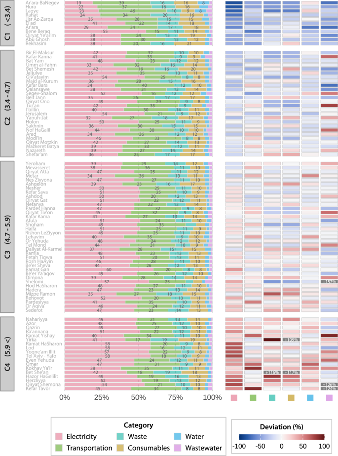
The left panel shows the proportional contribution of each footprint category (electricity, transportation, solid waste management, consumables, water, wastewater treatment) to total per-capita emissions, with cities ordered by ascending per-capita carbon footprint. The right panel presents a heatmap of relative deviations from each category mean value, expressed in percentages. Red shading indicates positive deviations (above the mean), blue shading indicates negative deviations (below the mean), and gray marks outliers exceeding 100% deviation. Cities are grouped into four clusters (C1–C4) based on their total per-capita carbon footprint.
Footprint categories: in-depth analysis
Electricity consumption is the primary source of urban emissions. Residential and public-commercial sectors contribute nearly equally to the per-capita electricity footprint, accounting for a mean of 51% (M = 1.14 tCO2eq/cap, SD = 0.34) and 49% (M = 1.10 tCO2eq/cap, SD = 0.59), respectively. However, city-level profiles vary widely, with residential contributions ranging from 13% to 82% and public-commercial contributions from 18% to 87%. Recognizing these differences facilitates the development of city-specific interventions that target each city’s dominant sector, promoting more effective mitigation. A detailed city-level breakdown is provided in Supplementary Fig. 4.
Figure 4a presents per-capita electricity emissions and their relative deviations from each sector mean, providing a benchmarked perspective on urban electricity consumption. Cities in cluster C1 exhibit the lowest per-capita emissions, particularly in the public-commercial sector, and consistently fall below the sector mean in both residential and public-commercial emissions. In contrast, cluster C4 cities demonstrate significantly higher per-capita emissions across both sectors, with several cities exceeding 100% deviation in the public-commercial sector emissions. Intermediate clusters (C2 and C3) show more diverse profiles, reflecting variations in electricity consumption patterns among cities.
Fig. 4: Electricity and transportation per-capita emission profiles and sectoral deviations (tCO2eq/cap).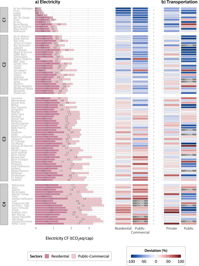
a Displays per-capita electricity carbon footprint compositions, with residential and public-commercial contributions shown in stacked bars. Adjacent heatmaps indicate deviations from each sector’s mean value across cities. b Presents heatmaps of per-capita transportation emissions, distinguishing private and public transport, with deviations shown relative to sector means. Red shading marks above-mean values, blue marks below-mean values, and gray marks outliers exceeding 100% deviation.
Transportation is the second-largest contributor to urban emissions. Private transport emerges as the dominant source of these emissions across all cities, with a mean of 93% (M = 1.21 tCO2eq/cap, SD = 0.37), highlighting it as a key area for mitigation and policy focus for achieving a significant reduction in transportation-related GHGs. Public transport contributes only 7% (M = 0.10 tCO2eq/cap, SD = 0.08). Across cities, private transport emissions range from 62% to 100%, while public transport contributions vary from 0% to 38%. A detailed city-level breakdown is provided in Supplementary Fig. 5.
Figure 4b presents the relative deviations of per-capita transportation emissions from each sector mean, providing additional insights into urban transportation emission patterns. Total per-capita emissions range from 0.46 tCO2eq/cap to 2.44 tCO2eq/cap, with cities in cluster C1 exhibiting the lowest emissions. In contrast, higher-cluster cities generally show higher emissions, though some cities within these clusters display relatively low emissions, adding nuance to the overall trend. Examining the emissions intensities with respect to each sector mean showed that cities with high or near-average private transport deviations generally exhibit lower public transport ones, and vice versa. This pattern suggests trade-offs between transportation modes and emissions, emphasizing the interconnected role of public and private transit in shaping emission profiles.
Emissions resulting from solid waste management and consumables consumption were assessed using city-level waste quantities and composition data as a proxy. The cities’ per-capita waste emissions range from 0.21 tCO2eq/cap to 1.31 tCO2eq/cap, while consumables emissions range from 0.21 tCO2eq/cap to 1.25 tCO2eq/cap. Overall, lower cluster cities generally exhibit relatively low per-capita emissions in both categories, while cities in higher clusters show more elevated values.
As for waste-related emissions, landfilling accounts for 99.2% of the per-capita waste footprint with a mean of 0.6 tCO2eq/cap (SD = 0.19), while collection and transfer contribute only 0.1% and 0.7%, respectively. Further examining the consumables footprint, plastic consumption accounts for the highest per-capita emissions linked to materials across the analyzed cities, with a mean of 0.30 tCO2eq/cap (SD = 0.10). This is followed by metals (M = 0.09, SD = 0.03), paper (M = 0.07, SD = 0.03), diapers (M = 0.06, SD = 0.02), cardboard (M = 0.05, SD = 0.01), and glass (M = 0.02, SD = 0.01) follow. These consumables account for approximately 51%, 15%, 12%, 11%, 8%, and 3% of consumable-related emissions, respectively.
The per-capita water emissions range from 0.04 tCO2eq/cap to 0.22 tCO2eq/cap (see Fig. 3 for relative deviations). Emission levels vary modestly across the cities with no clear discernible pattern, indicating a relatively consistent level of water consumption. Residential use accounts for a mean of 69% of per-capita emissions, with 0.09 tCO2eq/cap (SD = 0.02). Public services contribute 10% (M = 0.01, SD = 0.01), commercial and healthcare services 7% (M = 0.01, SD = 0.01), and infrastructure water loss 14% (M = 0.02, SD = 0.02). Lastly, the wastewater footprint was found to be the smallest component across cities, with per-capita emissions ranging between 0.03 tCO2eq/cap and 0.27 tCO2eq/cap.
Examples for “Tailored” GHG mitigation measures
Based on the analysis of urban GHG emissions portfolios, specific potential “tailored” measures can be related to each city. The following paragraphs present a few examples extracted from the analysis, illustrating the potential of the advanced framework to signal mitigation directions based on each city’s portfolio. It starts by demonstrating the identification of cluster-level emission characteristics and then illustrates several key mitigation categories: renewable energy sources, water, solid waste management, and wastewater treatment.
As appeared from Fig. 3, cluster 1 cities are characterized by relatively low overall emissions rates. In localities such as Hura, Ar’ara in the Negev, Lakiya, Rahat, and Jisr az-Zarqa, transportation is a significant source of per-capita emissions (ranging between 22% to 37%). However, the previously presented transportation analysis and figure (see Fig. 4b) shows that per-capita emissions from public transportation in these cities are well below the sector mean. This is an outcome of poor public transportation infrastructure. It follows that advancing GHG mitigation in cluster 1 cities requires attention to improving public transportation, which could reduce overall transportation-related emissions.
Incorporating avoided GHG emissions from local photovoltaic (PV) solar use within the framework has allowed for evaluating potential utilization rates and their contributions to GHG reduction. The mean utilization rate of available solar potential across the analyzed cities was only 3.5% (SD: 3.7%, range: 0.0–17.7%), resulting in a mean GHG reduction of 1.8% (SD = 2.2%, range: 0.0–10.2%). Due to the non-normal distribution of the variables, Kendall’s Tau correlation analysis was employed. This analysis revealed a statistically significant positive relationship (τ = 0.73, p < 0.001) between solar utilization and GHG reduction, indicating a substantial untapped potential (see Supplementary Fig. 6 for a visual representation of the distributions and correlation). This pattern also held consistently across all emission clusters (τ = 0.59–0.82; all p < 0.01, three clusters p < 0.001), suggesting that the relationship is not limited to specific city groups. Notably, 8.7% of the analyzed cities are not utilizing their available solar capacity. This includes cities such as Giv’atayim, Qiryat Ye’arim, and Jisr Az-Zarqa, which result in no GHG mitigation gains. For these cities, targeted measures to expand rooftop PV deployment could yield immediate and measurable benefits. In contrast, certain cities, such as Bet She’an (17% utilization, 9% reduction) and Arad (11%, 10%), demonstrate how increased solar uptake can be translated into considerable GHG reductions.
As part of the water footprint analysis, Fig. 5 illustrates the contributions of various sectors to each city’s per-capita water consumption emissions, displayed as 100% stacked bars. Overall, it is evident that residential water use emerges as a dominant source in nearly all profiles. However, each city’s water use composition is somewhat different, highlighting potential for more sector-specific measures based on specific consumption patterns. For instance, commercial and public services are relatively large contributors in cities such as Mitzpe Ramon, Yerhoham, Or Aqiva (each 34%), and Qazrin (31%), suggesting that efficiency efforts in these sectors could yield considerable benefits. Moreover, while water loss is negligible in most cities, it constitutes a substantial source of emissions in several cities within clusters 1 and 2, such as Ar’ara-BaNegev, Laqye, and Bir-El-Maksur. In such cases, targeting infrastructure upgrades to minimize water loss could yield substantial emission reductions alongside water security improvements.
Fig. 5: Sectoral contributions to per-capita water consumption emissions across cities (tCO2eq/cap).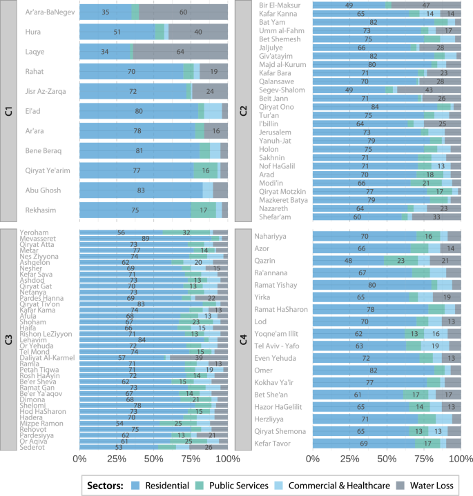
City-level water supply emissions shown as 100% stacked bars, broken down by sector: residential, public services, commercial and healthcare, and infrastructure water loss. Percentages within bars indicate each sector’s proportional contribution to per-capita water-related emissions.
The solid waste analysis pinpointed city-specific opportunities to mitigate downstream end-of-life emissions. While transfer emissions are lower than those generated from landfilling, there remains potential for reduction through optimized site allocation. By mapping each city’s transit and landfill facilities, we identified instances where waste is transported to distant sites despite closer alternatives, leading to unnecessary emissions. For instance, Haifa currently sends its waste 242 km to the Efa landfill; however, utilizing a nearer available facility could reduce transfer-related emissions by 89% (from 1307 to 142 tCO2eq per year). Conversely, several cities in Israel’s central region experience extended hauling due to a lack of nearby disposal facilities, rather than inefficient routing. For these cities, a suitable intervention would involve the establishment of a regional landfill or transfer station, although such a measure would require national rather than municipal action. A map illustrating landfill and transit sites is available in Supplementary Fig. 7.
The wastewater analysis relied on applying facility-specific emissions factors, each tailored to the characteristics of the treatment facilities. This approach enabled a more in-depth analysis of emissions. The findings indicate notable differences among treatment technologies. Cities employing intermediate treatment methods tend to demonstrate higher per-capita emissions (M = 0.19 tCO2eq/cap, SD = 0.04) compared to those utilizing advanced tertiary (M = 0.10 tCO2eq/cap, SD = 0.03) and enhanced mechanical biological treatment (MBT) methods (M = 0.08 tCO2eq/cap, SD = 0.03). An ANOVA test confirmed these differences to be statistically significant, F (2,89) = 40.07, p < 0.001. Scheffe’s post-hoc analysis further revealed that the per-capita wastewater emissions in cities using intermediate treatment are significantly higher than those in cities that implement enhanced MBT (diff = 0.10, p < 0.001) and tertiary treatment (diff = 0.08, p < 0.001). Supplementary Fig. 8 illustrates the distribution of emissions by treatment type. These results underscore the potential benefits of upgrading treatment facilities to reduce wastewater emissions. Furthermore, all cities exhibiting an exceptionally high positive deviation from the mean per-capita wastewater emissions (as indicated in Fig. 3)–such as Shelomi (+157%), Qiryat Shemona (+126%), and Kefar Tavor (+124%)–utilize intermediate treatment methods. For these cities, transitioning to advanced treatment methods could present significant and immediate opportunities for emission reductions.