
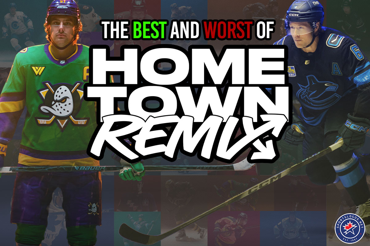
On Monday morning, the NHL and Fanatics gave us the gift of thirty-two brand new uniforms all at once, and now that we’ve had a couple of days to clean up the wrapping paper from that exciting morning, it’s time to sort through the haul to decide which gifts we’re keeping and which ones we’re boxing up and sending back from whence they came.
Three of us here at SportsLogos.Net, Andrew Lind, Glenn Cook, and I, each picked our best and worst of the Hometown Remix collection and shared our overall impressions of the program. Do you agree? There’s a comments section below for exactly that. Do you disagree? Well, listen up here, mister… You can comment below too, I guess.
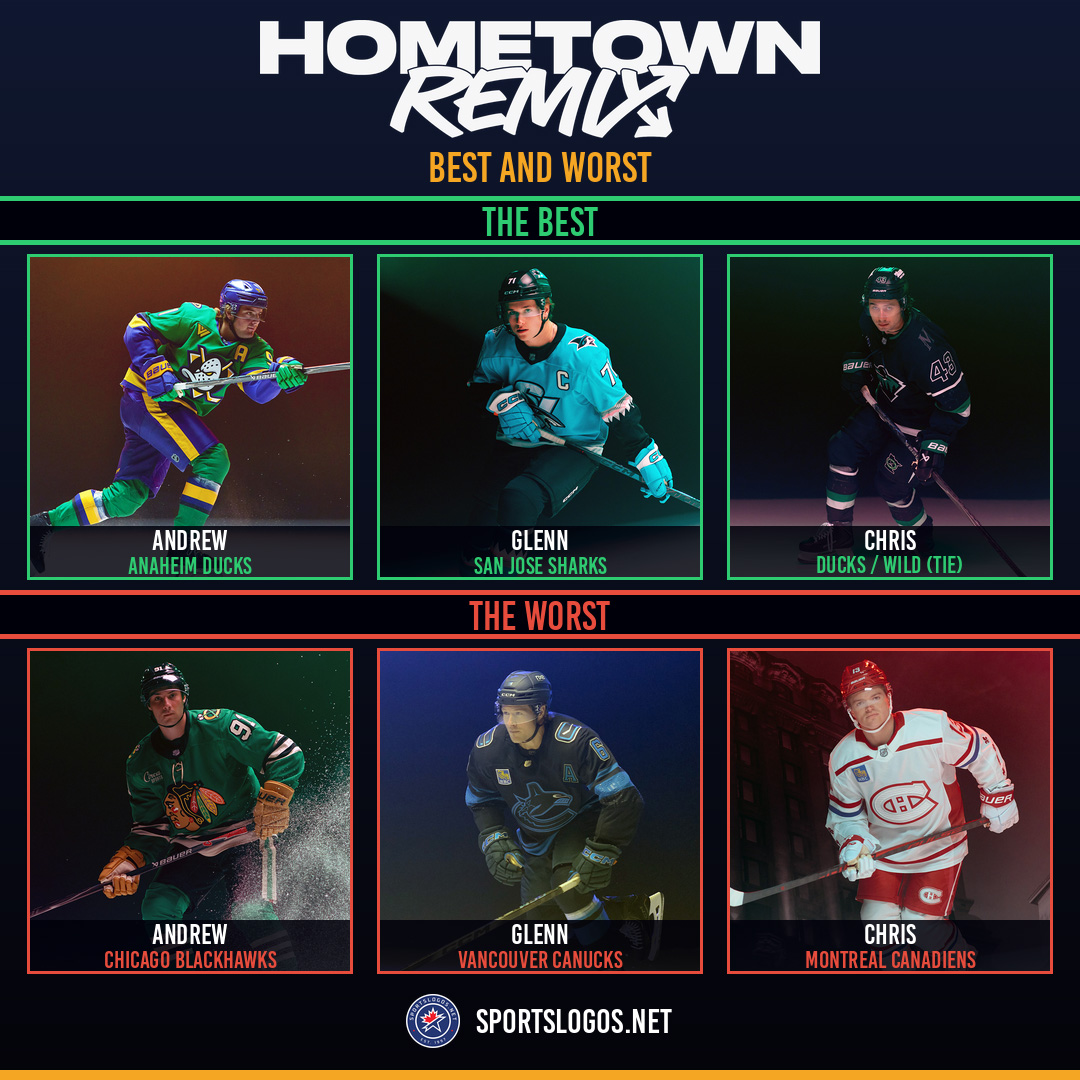
The BestAndrew Lind: Anaheim Ducks
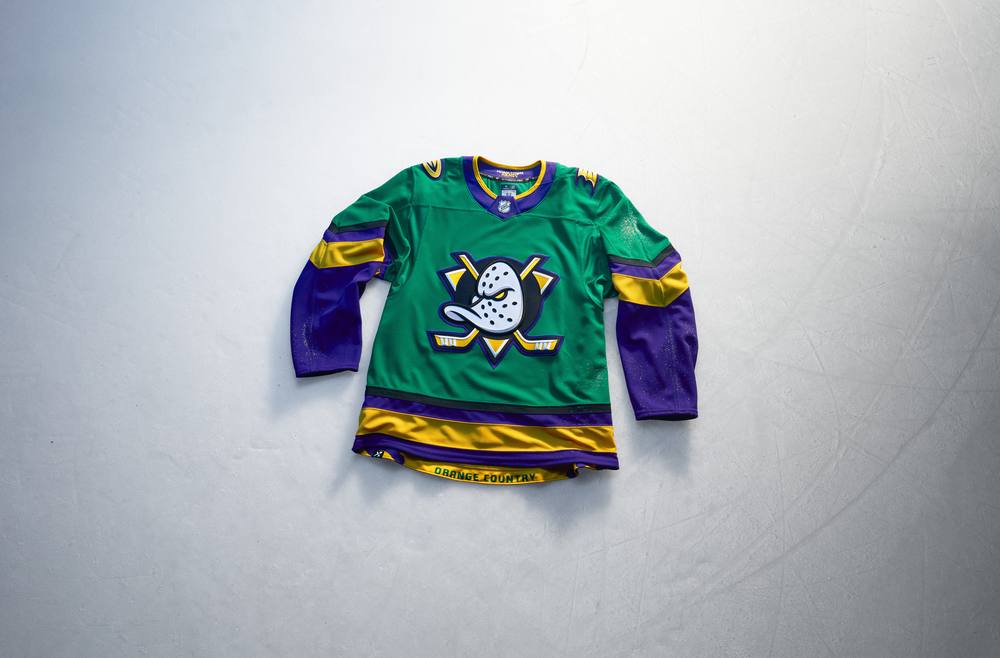
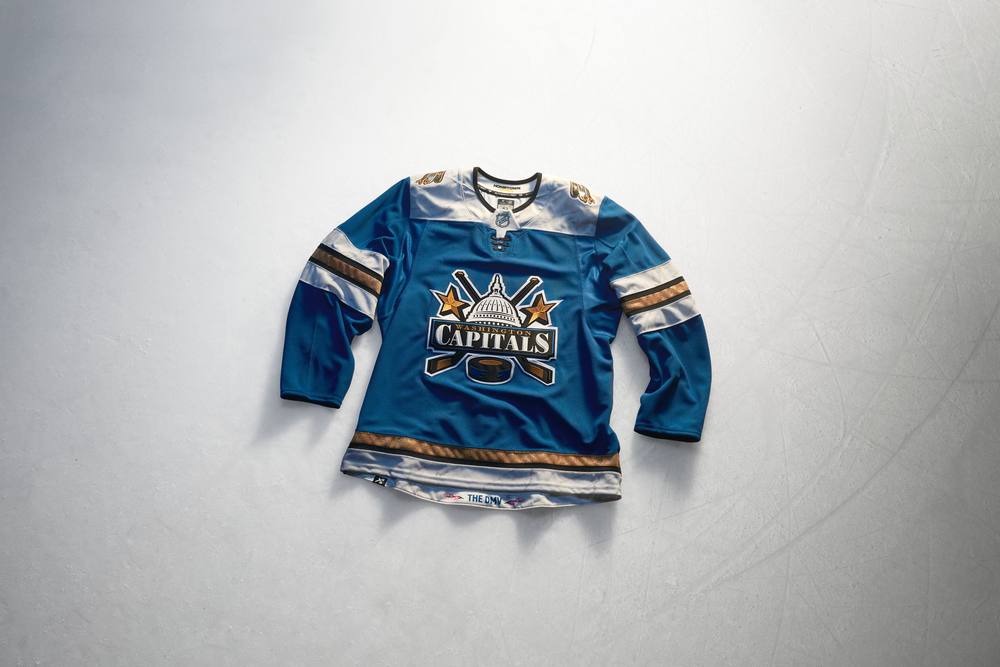
As someone who grew up religiously watching Disney’s The Mighty Ducks movie trilogy and the animated series, I cannot help but immediately be drawn to Anaheim’s Hometown Remix design. The vibrant green, deep purple and athletic gold colour scheme combines the first movie’s uniforms with the actual Ducks’ inaugural set, which subsequently appeared in the gold medal game of the second movie. I wished for nearly two decades that they’d bring back their original duck-in-goalie mask logo on a full-time basis, and while they did that in 2024-25, this furthers my belief that they also need to scrap their orange, black and metallic gold colour palette for this nostalgic look. “Quack, quack, Mr. Ducksworth!” That said, my other favourite designs include (in no particular order) the Columbus Blue Jackets, Florida Panthers, New York Islanders, Seattle Kraken, Vegas Golden Knights and Washington Capitals.
 Glenn Cook: San Jose Sharks
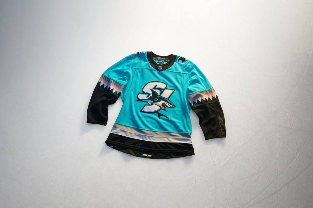
Although I was a Calgary Flames fan as a kid, the San Jose Sharks made quite the impression on me when they joined the NHL in 1991. The colours, the logo, the wordmark, the whole package hit me just right. My closet and walls were filled with teal-and-black pennants, caps, sweatpants and T-shirts. So the Sharks’ Hometown Remix jersey really scratches a nostalgic itch for me. The lighter teal is still recognizable as part of San Jose’s brand, and the shark teeth in the striping bring just the right level of whimsy. It feels like an emphatically positive answer to the question, “What if the Sharks were founded 30 years later?”
 Chris Creamer: Anaheim Ducks/Minnesota Wild
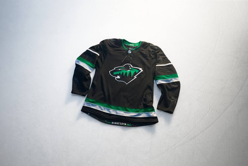
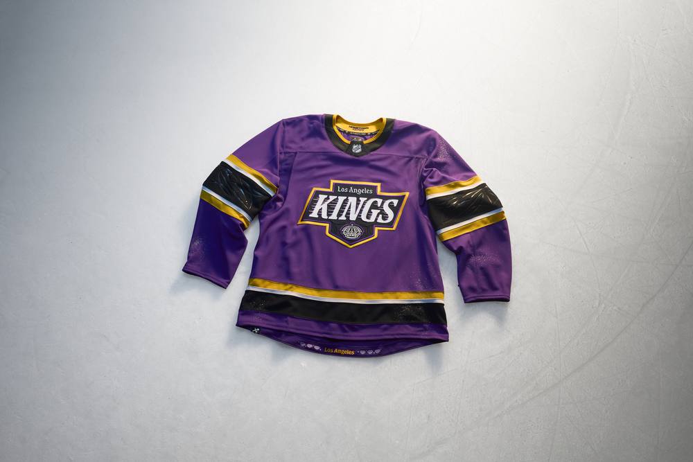
There were so many great and unique designs here that it’s tough to single out just one, so I’ll mention a few that really caught my eye. First is Anaheim’s; this is a team with a fun logo, and they are begging for a uniform to match that energy. This does that. From the bright green, gold, and purple colour scheme to the wink-and-a-nod to the “unofficial” inspiration for this design, there’s nothing to hate about this design and everything to love. Ten out of ten, no notes aside from, “wear this beyond the single season.” I’m also quite fond of the Minnesota Wild design, and how it’s literally a progression of their usual home and road set, moving forward in time from the wilderness sunset to the wilderness night; the moon replacing the sun in the logo, the constellations in the sleeves, and the split-colour back numbers are all beautifully done. My only wish for that design would’ve been green sleeve numbers or a shoulder patch that’s actually visible (I’d rather there be none than a black-on-black patch). The Los Angeles Kings design was particularly striking in person; that vivid shade of purple was impossible to ignore, and of course Florida nailed the assignment; their jersey screams “Miami Hockey.”
 The WorstAndrew Lind: Chicago Blackhawks
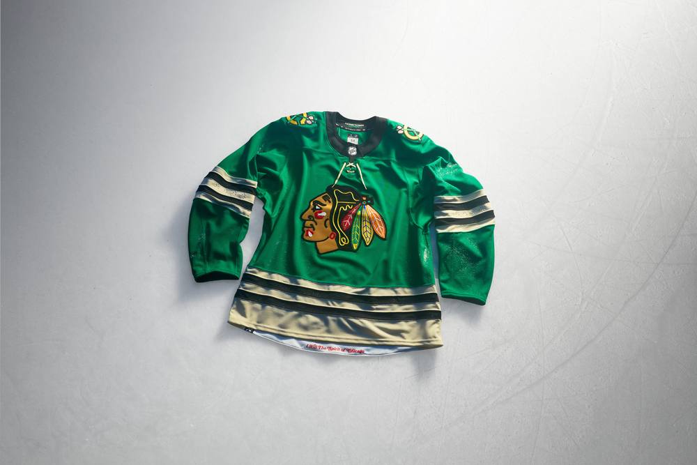
The Blackhawks didn’t put much effort into their Hometown Remix design, simply replacing the shamrock on the right shoulder of their old Reebok-era St. Patrick’s Day warm-up sweaters with four stars from the Chicago flag on the sleeve stripes. Other than that subtle detailing, which is impossible to see from any distance, the uniforms ignore the city’s classic architecture and rich cultural history by recycling that design. Not to mention, the Blackhawks have a heated rivalry with the Dallas Stars, dating back to their time as the Minnesota North Stars. While that cooled off a bit following the Stars’ relocation, the logo is the only thing stopping the Blackhawks from looking like they’re wearing the Stars’ home sweaters.
 Glenn Cook: Vancouver Canucks
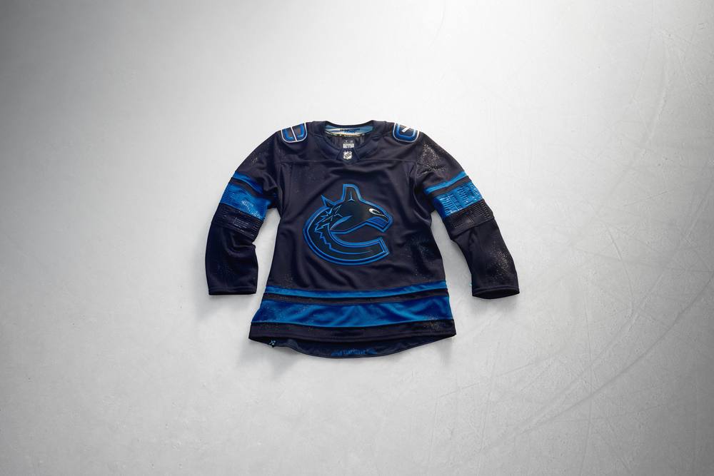
This was close for me between Edmonton and Vancouver, but the Canucks sank to the bottom of my rankings because at least orange stands out more on a black base than blue does. The striping and crest on Vancouver’s sweaters are just a muddy mess. The white incorporated into the shoulder patches and numbering redeems them ever so slightly, but I wouldn’t be sad to see these jerseys sink to the bottom of False Creek and never resurface.
 Chris Creamer: Montreal Canadiens
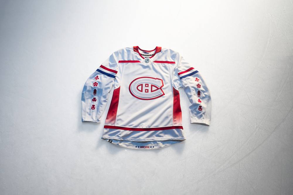
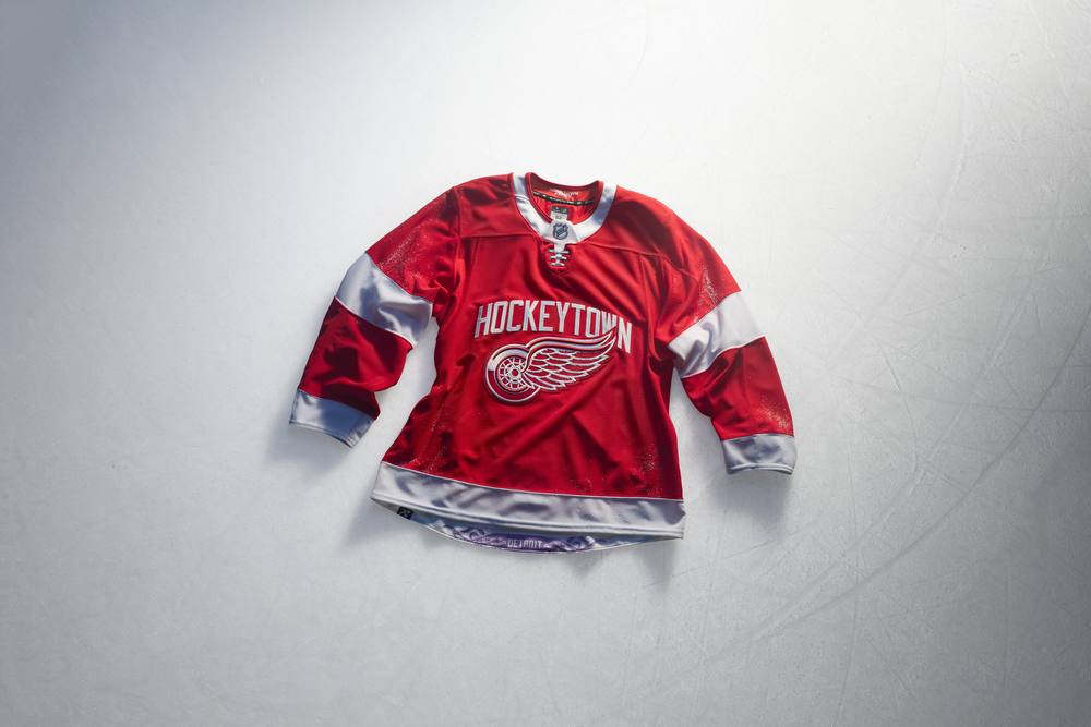
I don’t think any of these are awful by any stretch, but I was certainly disappointed by what Boston, Detroit, Edmonton, Montreal, and Vancouver came out with. While Boston, Detroit, Edmonton, and Vancouver were mostly “meh”, with the Canadiens, I wasn’t a fan of the overall direction they went with, especially that gradient up the sides of the jersey; it doesn’t match the rest of the design and seems like it was thrown in just because they needed something there. Recolouring the classic “C” from red to white-on-white was also a bit of a head-scratcher (though the 3D horizontal lines within it looked pretty darn cool in person). It’s not all bad for the Habs design; I thought the tribute to the flag of Montreal was well done, and the incorporation of the fleur-de-lis into the bottom of the player’s numbers was also a nice touch. As for the rest of ’em, Detroit’s simple addition of “Hockeytown” arched over their winged wheel was, let’s face it, lame; it’d have been better to just opt out of the program and wear the usual home reds. Edmonton spilled oil all over their jersey and called it a day; hopefully they have enough Dawn over there to clean it all up. Vancouver needed another colour in theirs; a little green trim would’ve made a big impact, and it would’ve popped right off that very dark navy blue. Boston’s tribute to the local university scene is a nice idea, but it’s hard to get all that excited about a wordmark and a number. The Stars tried this for a few seasons, and it’s been rightfully forgotten over the years.
 Overall ImpressionsAndrew Lind
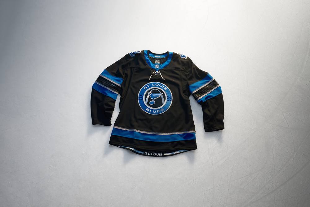
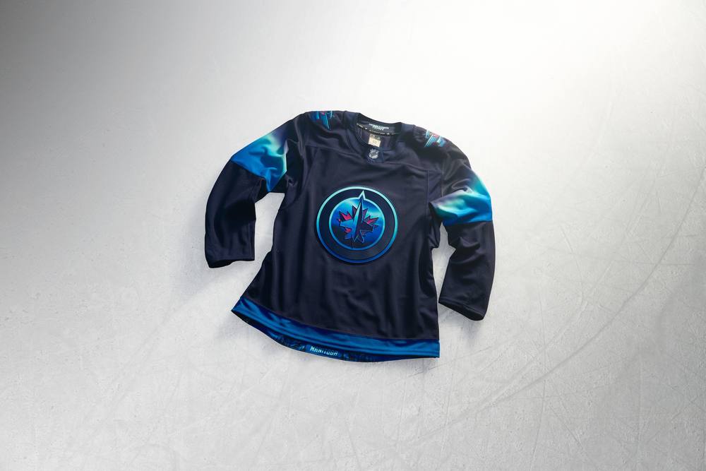
While there are few designs that stand out, as I mentioned above, most of the uniforms feel templated. For example, the Edmonton Oilers, Minnesota Wild, Nashville Predators, New Jersey Devils, St. Louis Blues, Tampa Bay Lightning, Vancouver Canucks, and Winnipeg Jets all have brightly coloured logos and stripes against a dark base. There’s nothing that makes each design unique or ties it into the city they represent or ties it into their franchise history, unless you squint at the finer details that you’d only see if you have the jerseys in hand. The teams that fully embraced their city or uniform/logo history will be remembered while the others… well… let’s hope they try harder next time.
 Glenn Cook
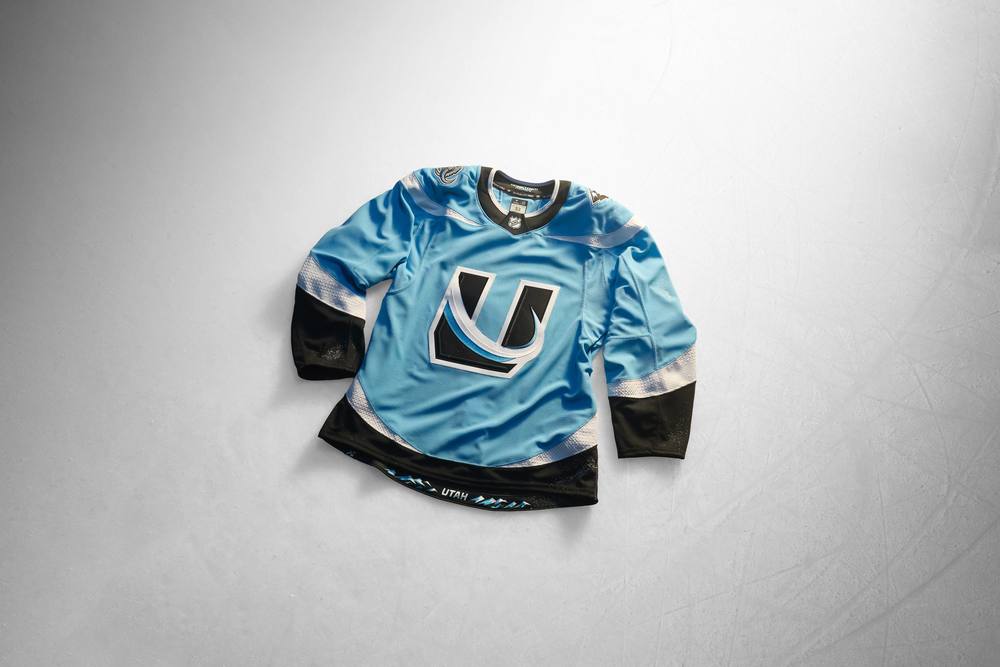
Since there’s no long-term commitment with these sorts of alternate jersey programs, they give teams licence to take big swings, so I appreciate the risks with bright colours and bold designs that teams like Utah, Washington, Anaheim, Los Angeles and Florida took with their Hometown Remix sweaters. It’s a shame so many other teams defaulted to black or grey. The vast majority of these designs will likely not last more than a season or two, though, so those grey and black teams might get another kick at the can at that point. But let’s enjoy the ones that push the boat out while looking good while they’re around.
 Chris Creamer
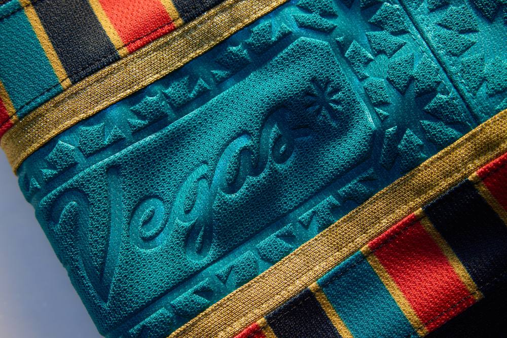
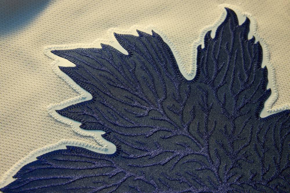
A very successful program overall, the Fanatics team certainly did their research to make each of these designs unique to the team, the region, or in many cases both. The debossing techniques in the sleeve striping and many of the crests and numbers are proof of how small details can make a big impact, as well as a good reminder to those viewing digital mockups of leaks to be patient and wait for the official release before passing judgment. These uniforms do really need to be seen in person to truly be appreciated, and the details included in each design definitely make it feel like you’re getting your money’s worth in owning one. My only complaint about the program overall is that it’s too short; these uniforms need to be worn for multiple seasons, and there’s honestly no good reason why they shouldn’t be, aside from perhaps creating scarcity and trying to drive up immediate demand in the market (which would be a terrible reason to drop these so quickly). I hope to see many of these implemented as alternate uniforms in future seasons (Utah, New Jersey, Florida come to mind), while there are even a few I’d like to see developed into a full-time home/road set, such as Buffalo or Anaheim.
Now it’s your turn: best, worst, and the one you’d make permanent. The comments are open, but only for the bravest of the brave.
This week’s podcast is here, which includes my one-on-one conversation with Dom Fillion, VP for Creative, Design & Innovation with Fanatics, about the development of the NHL’s new Hometown Remix uniform program.
Check it out: https://t.co/duylD7sQxO
— Chris Creamer | SportsLogos.net (@sportslogosnet) November 4, 2026 TUTO Hockey logos & uniform history →See every TUTO Hockey logo and the full team history on SportsLogos.Net.