
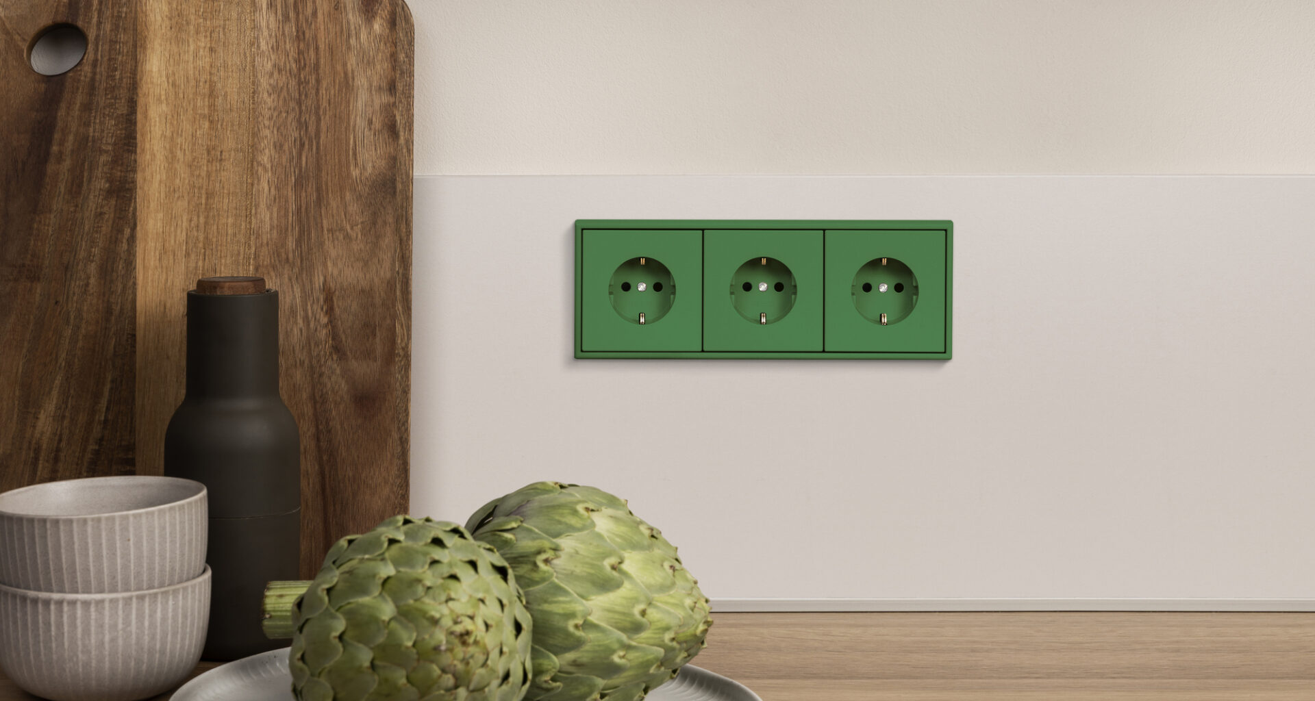
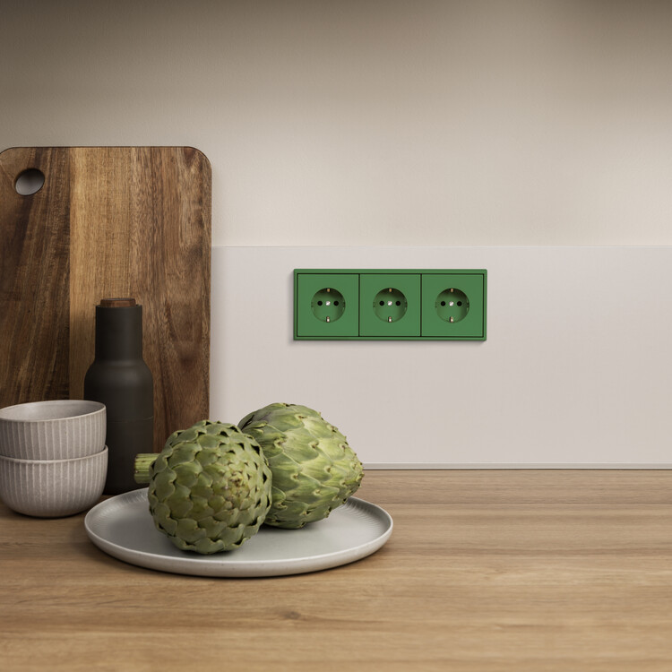
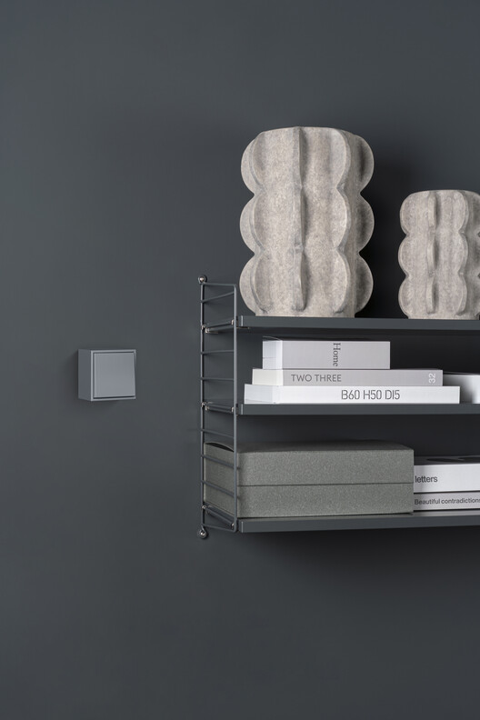
 LS 990. Image Courtesy of JUNG
Share
Or
https://www.archdaily.com/1032921/switching-perspective-how-63-colors-interact-with-architectural-spaces
In architecture, the effect of color is rarely neutral. It has the power to calm or energize, to expand or compress space, to unify or divide. Far from solely being a decorative layer, color is a tool that architects, interior designers, and designers use to structure atmosphere and perception. Alongside light, material, and proportion, it is one of the most precise instruments available for guiding spatial experience. When treated deliberately, it becomes a system — one that allows designers to articulate relationships between spaces, establish moods, and create continuity across various scales.
Color is not limited to paint. Surfaces, materials, finishes, and technical elements all carry chromatic weight. Yet in practice, color often remains uneven across the finest details — switches, sockets, intercoms — frequently appearing as neutral interruptions. This gap highlights a broader question: if color is to be considered a true architectural tool, should it not extend to every detail, no matter how small? Addressing this, German manufacturer JUNG has extended Le Corbusier‘s Polychromie Architecturale to electrical installations, allowing essential building components to speak the same language as the surrounding architecture.
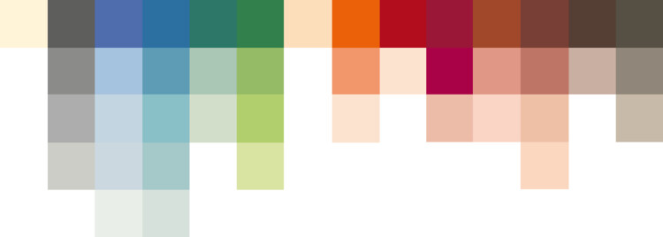 Le Corbusier color palette of 1931. Image Courtesy of Les Couleurs® Le Corbusier®
 Le Corbusier color palette of 1959. Image Courtesy of Les Couleurs® Le Corbusier®Polychromy as Spatial Design: Integrating Color in Architecture
Theories of color compositional balance have long informed design across disciplines. Few have explored this as systematically as Swiss-French architect and artist Charles-Édouard Jeanneret, better known as Le Corbusier. His Polychromie Architecturale, developed in 1931 and expanded in 1959, offers a palette of 63 finely tuned architectural colors designed as a coherent system rather than a set of isolated tones. Rooted in natural pigments, these colors were organized into series and keyboards, allowing architects and designers to combine them harmoniously to evoke specific moods and atmospheric effects — calm, vibrant, or expansive.
For Le Corbusier, color was inseparable from space. His palette was designed to shape perception of depth, to intensify or soften light, to structure the character of space. Almost a century later, these tones remain timeless. Their natural base, subtle gradations, and inherent combinability make them as relevant in contemporary interiors as they were in modernist housing or civic architecture.
This challenge of carrying color consistently into the smallest elements of design — beyond walls and surfaces — has been addressed in recent years by German manufacturer JUNG. Since 2014, the company has partnered with Les Couleurs Suisse AG, the exclusive licensor of Les Couleurs® Le Corbusier®, to translate the Polychromie Architecturale into the realm of modern electrical installations.
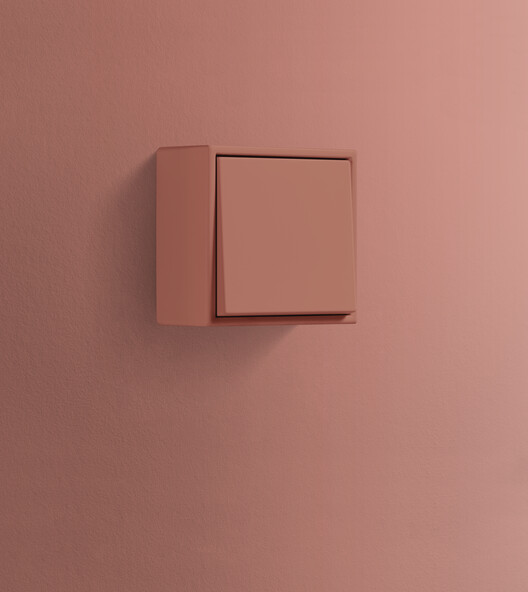 LS Cube. Image Courtesy of JUNG
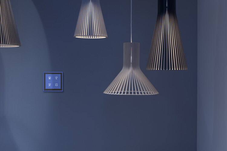 LS Touch. Image Courtesy of JUNGFrom Surfaces to Systems: Le Corbusier’s Palette in Modern Installations
The starting point was the LS 990 switch range, offered in all 63 shades of the Le Corbusier palette. Each piece is hand-lacquered to capture the matte quality and depth of the original tones. What began as a singular gesture has grown into a comprehensive design strategy: treating color as integral to technical components, not as an optional finish.
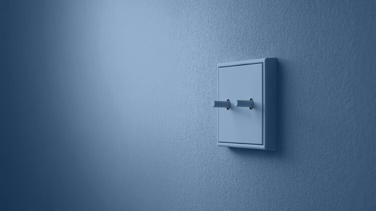
JUNG extended the palette to the LS 1912 toggle switch, a model that revisits the earliest form of electrical installations. Its sleek metal body and rocker arm recall the tactile charm of retro toggles, while its KNX-capable version integrates seamlessly into smart building systems.
Where flush installation is not possible, the LS Cube, optional as a switch, socket, dimmer, motion detector, or KNX component, brings the same chromatic precision to surface-mounted elements. Its housing, available in all 63 colors from the Le Corbusier range, can either blend subtly with exposed concrete, timber, or painted surfaces, or stand out as an accent.
Creating chromatic continuity from the exterior entrance to the interior space, JUNG’s door intercom system demonstrates how even highly functional elements can be absorbed into architectural color concepts, ensuring that thresholds are as deliberate as interiors.
Together, these products in the field of electrical installations form more than a catalogue. By translating Le Corbusier’s timeless palette across all these installations — bridging the journey from the classic LS 990 toggle switch to an advanced LS Touch digital panel — JUNG ensures that color remains a consistent, connecting past, present, and future.
 LS 1912. Image Courtesy of JUNG
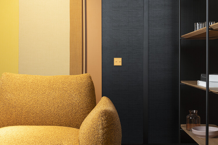 LS 990. Image Courtesy of JUNG
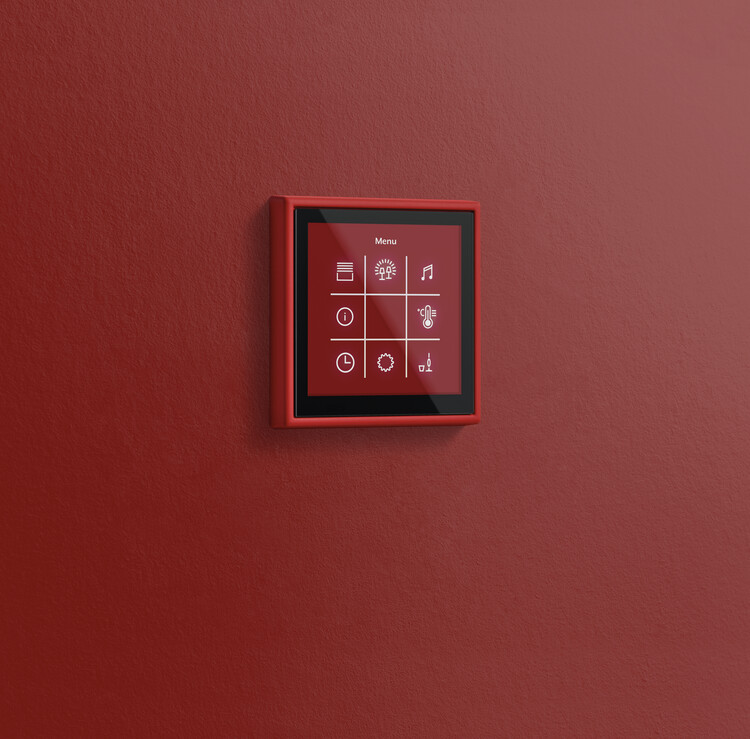 LS Touch. Image Courtesy of JUNGArchitectural Continuity: Color as a Cohesive Tool
Color in architecture is much more than decoration; it is a tool and creative force. Le Corbusier recognised this when he developed his polychromy. Manufacturers like JUNG don’t simply offer the availability of colored details, but the idea that color can be applied consistently across every architectural layer. By aligning technical solutions with architectural palettes, the design integrity of a space remains intact. Reaffirming that architecture is not only about form and function, but also about continuity and the creation of environments where every element, no matter how small, contributes to a coherent architectural concept.
From a soft gris moyen toggle switch to a deep rouge vermillon intercom, from a subtle vert jaune clair touch panel to a bleu céruléen cube set against exposed concrete, these details allow architectural color to be most powerful when it is consistent, systematized, and present in every scale of design, becoming participants in the spatial composition.
 LS Cube. Image Courtesy of JUNG