
“There are two levels of pink,” she says. “There’s pink that is on the red side, more of a beautiful feminine pink, and then you have the other pink, more on the brown side, that earthy, dusty pink you see in the Northern Territory, a washed-out and beautiful earthy colour.”
Loading
Interior designer Greg Natale is no stranger to the charms of pink.
“It’s one of my favourite colours,” he says. “It’s feminine and soft, it’s a fun colour. It’s a pretty good neutral and it does go with a lot of other colours. I particularly love it with red – pink is in the same family but it softens the red.”
Natale says the advantage of softer pinks is their versatility, whether you are looking for a colour to team with materials like timber or gold, or you want to subtly lean into a retro aesthetic.
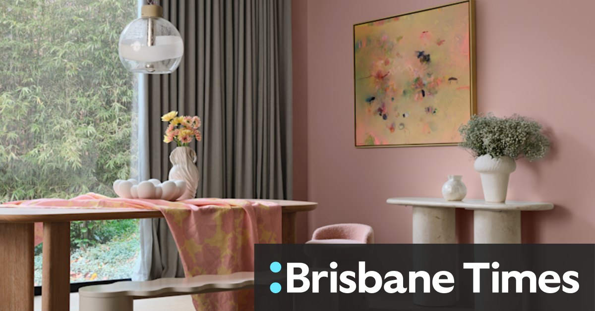
Pink plays well with others in this dining space from a home in Toorak by Greg Natale.Credit: Anson Smart
“Pink, grey and black look beautiful together,” he says. “It’s very ’80s, but it still looks great.”
Loading
This year’s forecast by Dulux includes an array of pinks teamed with everything from equally soft sage greens through to more robust aubergines, petrol blues and chocolate browns. It even partners well with colours which some might blanch at using in interior spaces, like chartreuse.
“Chartreuse and soft pink is absolutely beautiful,” she says. “It gives me that ’80s vibe, but that is much muddier now.”
Lucena-Orr says it is unlikely this new breed of pinks is going anywhere soon, as more people show they are willing to commit to parts of the home that are traditionally expensive to change.
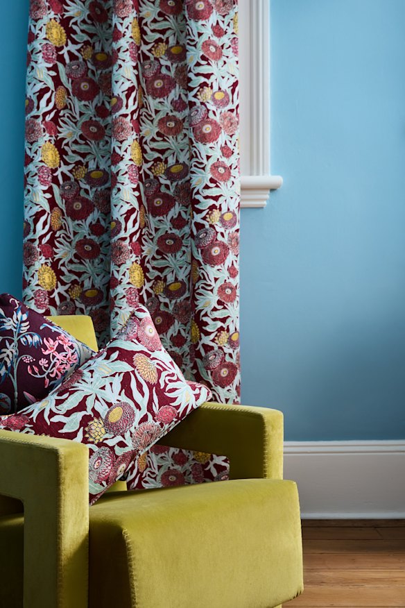
Soft pink works as the perfect neutral, allowing burgundy, sage and gold to shine in the Everlasting Claret cushion from Utopia Goods. A chartreuse velvet chair is the final, triumphant element.
“I am even seeing pinks back in kitchens again. It is so lovely to see in cabinetry again, especially those earth-based pinks,” she says. “We are seeing more pinks being used as neutrals. It becomes that colour you can use as a core colour because it’s so soft and soothing.”
For those a little colour-averse, she says the softer pinks can provide a safe entry point.
“It’s a bridging colour,” she says. “It’s great, especially if you are not familiar with using colour, if you’re moving on from whites and neutrals, it’s a gateway from neutrals into embracing more colour.”
While he loves its feminine charms, Natale says pink has now emerged as a sophisticated choice for living spaces, no matter who lives there.
“Stockbrokers and finance guys wear pink with navy suits now, so even straight men seem to like pink – they wear pink shirts all the time. It’s a beautiful colour.”
Make the most of your health, relationships, fitness and nutrition with our Live Well newsletter. Get it in your inbox every Monday.