
The Bulldogs have unveiled a new-look, simplified club logo ahead of the 2026 season.
Watch every game of the 2025 Pacific Championships LIVE on FOX LEAGUE, available on Kayo | New to Kayo? Join now and get your first month for just $1.
The new logo is the fifth of the club’s history, with the Bulldogs playing under their inaugural shield between 1935 and 1977 before switching to a fresh look in 1978.
That circular emblem remained in place until 1997, when the club adopted a new modern image to celebrate the formation of the NRL ahead of the 1998 season.
WHAT’S GAMBLING REALLY COSTING YOU? Set a deposit limit. For Free and confidential support call 1800 858 858 or visit gamblinghelponline.org.au.
That logo was eventually changed before 2010 when the club returned to its roots with the re-installation of the Canterbury-Bankstown prefix before the newest version was released on Thursday.
The new emblem is a reflection of both the club’s proud history and exciting future, with Bulldogs Chief Executive Officer Aaron Warburton explaining the thinking behind the re-design in a statement.
“This new emblem is more than just a logo – it reflects who we are, where we’ve come from, and where we’re going. It carries forward the fighting spirit that has defined this Club since 1935, while facing the future head-on with confidence and pride,” Warburton said.
“We’re incredibly proud of the design and believe it strikes the right balance between paying tribute to our 90-year legacy and capturing the energy, ambition and unity that will define our future.”
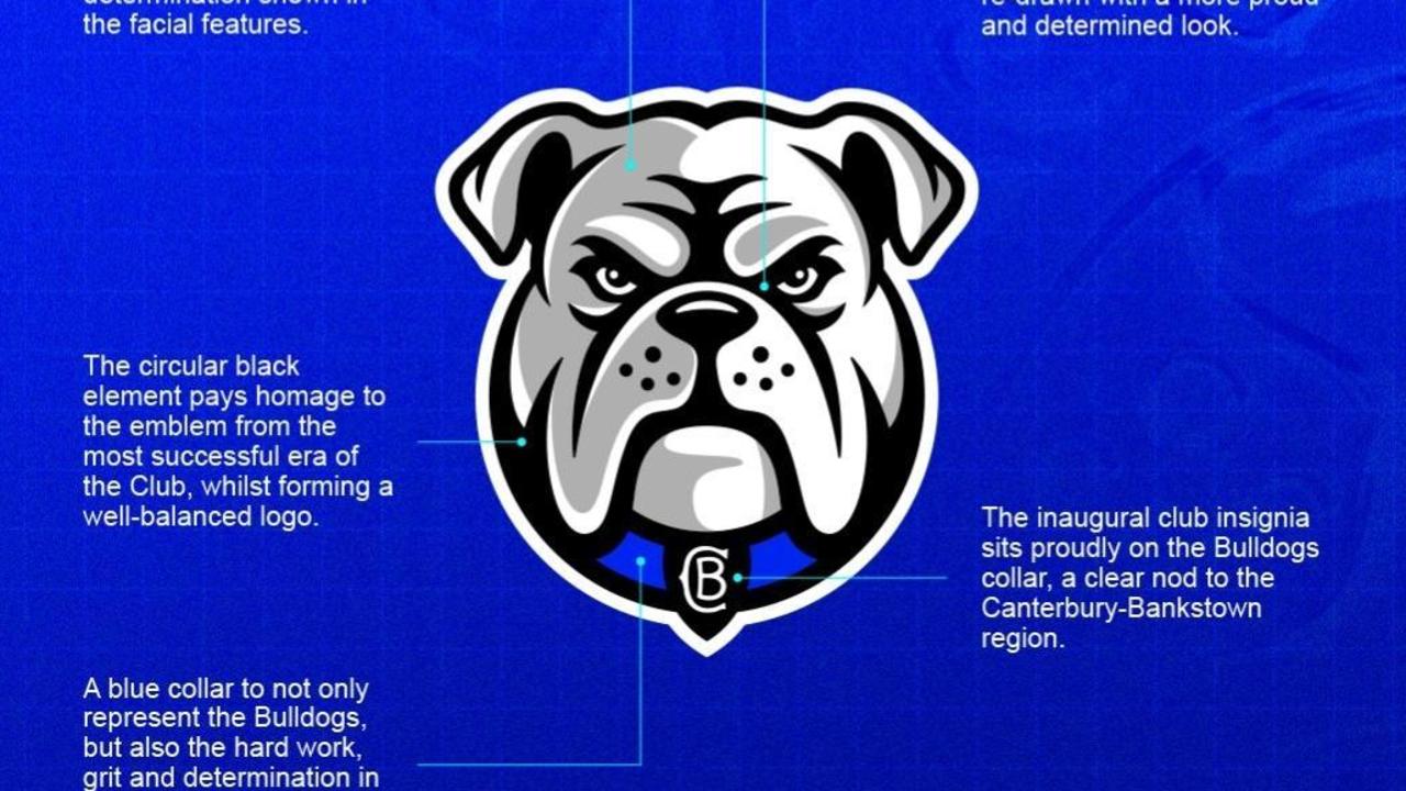
The blue collar on the logo represents not only the club itself but the “hard work, grit and determination in which the area of Canterbury-Bankstown was built”, according to the Bulldogs.
Meanwhile, the inaugural club insignia is also included on the collar as a nod to the Canterbury-Bankstown region.
The circular black element pays homage to the emblem from the most successful era of the club, while the Bulldogs said the grey shading has been used to place “more emphasis on the grit and determination shown in the facial features” of the logo.
The face has also been drawn with a more “proud and determined look”.