
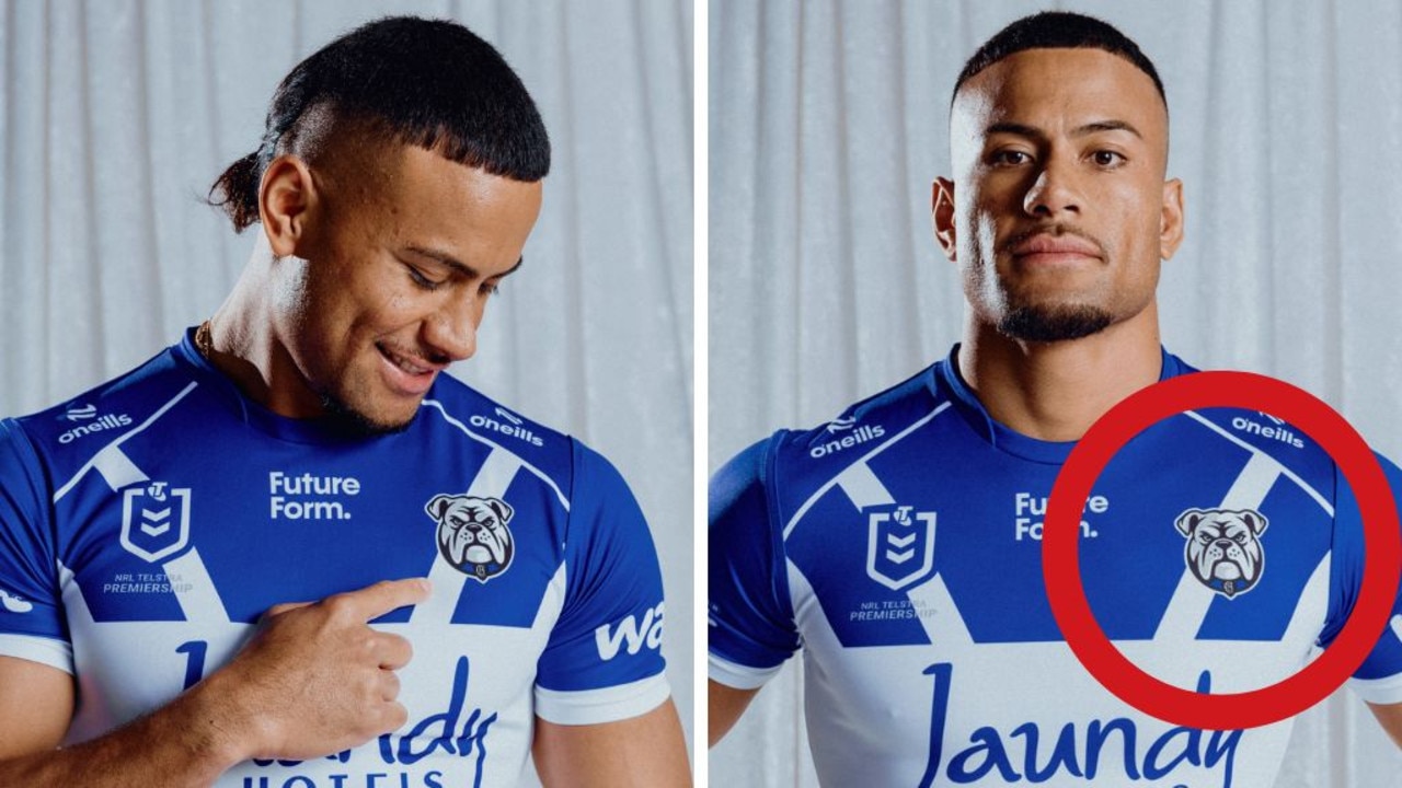
The Canterbury Bulldogs have unveiled a new-look logo ahead of the 2026 season.
The logo is the fifth in the club’s history and replaces the current logo which was adopted back in 2010.
Watch the biggest Aussie sports & the best from overseas LIVE on Kayo Sports | New to Kayo? Join now and get your first month for just $1.
The new emblem will officially come into play from November with the Bulldogs saying the fresh look represents the evolution of the club over the last 90 years.
“Yeah, it means a lot, the new logo. It shows grit and determination … facing our challenges head on. It was a challenging year, this year with everything that we went through,” Bulldgos skipper Stephen Crichton said.
“The new logo shows to all of our fans and other teams and other clubs out there that we are not going to back down.”
Despite the upbeat messaging from the club and players, fans weren’t buying it with backlash pouring in on social media.
Posts on the club’s social media accounts were quickly overran with an outpouring of anger as the fan base slammed the revamped logo.
One Dogs fan said to news.com.au: “The logo looks like Paw Patrol from Temu. Let’s just hope the team plays with the same ‘grit’ and ’determination’ represented in the new logo, as per the club’s announcement.”
Another wrote on X: “I’ve double-checked today’s date and it’s not 1st April. WTAF is that? Where was the engagement with the members? Not happy, Jan!”
A second posted: “Looks purposely marketed for kids. Like maybe for the pups members or something … real step back.”
A third added: “Talk about kicking us while we’re down after the finals loss. The club is going to get hammered on every social media platform this is unveiled on.”
Of course not everyone was left seeing red over the new look with several fans giving it the tick of approval.
One wrote on X: “I like it, we were always going to eventually get a simple design built for the modern era at some point.”
A second added: “Looks better! coming from a rabbits fan. Ignore the whingers, people literally hate any change when it comes to logos and jersey redesigns in rugby league.”
Bulldogs CEO Aaron Warburton said the updated look reflected the passion and the pride of the club.
“This new emblem is more than just a logo – it reflects who we are, where we’ve come from, and where we’re going. It carries forward the fighting spirit that has defined this club since 1935, while facing the future head-on with confidence and pride,” Warburton said.
“We’re incredibly proud of the design and believe it strikes the right balance between paying tribute to our 90-year legacy and capturing the energy, ambition and unity that will define our future.”
The club confirmed the new logo will appear across all Bulldogs platforms, merchandise in line with the launch of the 2026 season on November 1.
“Forged from 90 years of history, facing forward to the future – this is who we are,” the club said in a statement.
“A new look, same heart. Built for what’s next.
“The Bulldogs look forward to embracing this exciting new era – and new look that represents it – with pride, unity, and the unwavering spirit that defines the Blue and White.”
Originally published as ‘Temu Paw Patrol’: Canterbury Bulldogs’ new logo torn to shreds