
If you think about it, the living room is probably the only room that guests in your home are sure to remember — it’s essentially your calling card for all intents and purposes. While other rooms are dictated by the essentials (you need an oven in the kitchen and a toilet in the bathroom), how you choose to decorate your living room is entirely up to you.
You can make a television the focal point of your living room — or don’t! Invest in a spacious sectional or opt for a few crowd-controlling armchairs: The sky’s the limit.
Although you can put whatever you choose in your living room, a fresh coat of paint always manages to get the vibe just right. But with so many options, where do you even begin the search?
To save you some superfluous paint swatches, three designers share their go-to colors — and their picks are interesting. Neutral colors seem to remain the status quo for this common space, but one designer proves that a bolder hue can give your space a jolt of energy. If you’re feeling inundated with options, this is a good place to start.
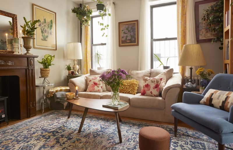
Credit: Photo: Greg Premru; Design: Blakely Interior Design
Light Gray
Living rooms are the ultimate entertaining room, and what better palette for parties, movie marathons, and intimate conversations than neutrals? That’s why Janelle B. Photopoulos of Blakely Interior Design called Benjamin Moore’s Shoreline one of her favorite living room paint colors.
“This neutral light gray leans just a hint warm, which keeps your living room from feeling too stark,” Photopoulous said. “With a light reflectance value (LRV) of 68, it’s light enough to keep the room bright and airy, but has enough saturation to feel like a color versus a version of white, and lets the room decor take center stage.”
That said, a neutral room doesn’t have to be boring. In this Narragansett home, she offset the goes-with-anything gray with a pair of cobalt blue bookshelves, which act as an exclamation point to the easy, breezy space.
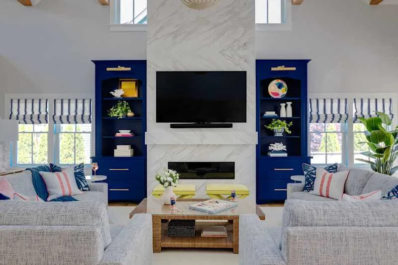
Credit: Photo: Ryan Garvin; Design: Breegan Jane
Bold Blue
Speaking of cobalt, HGTV’s own Breegan Jane says Benjamin Moore’s Bold Blue is on her short list of color obsessions. “I feel drawn to deep, jewel tones that are grounding and have an earthy connection,” she explained. “Bold Blue has a nature-like quality that feels intensely oceanic.”
Another thing to love? Jane said it has the perfect undertones — “not too cool, and not too warm.”
Though Bold Blue can create a particularly glamorous vibe in a smaller living area, it can also work in a bevy of spaces. In fact, Jane shares that she added this color to her son’s bedroom in her new beach house. “I love to paint colors with immersive characteristics, and this one was ideal for the space!” she added.
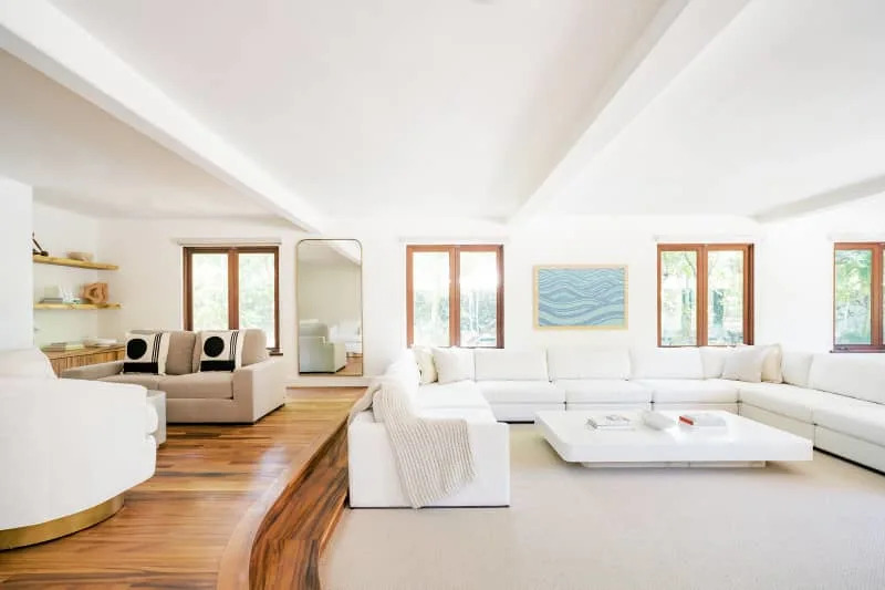
Credit: Photo: Megan Moura; Design: Shaolin Low
A Crisp White
Honolulu-based interior designer Shaolin Low loves white living rooms, and she doesn’t care who knows it. Though finding the right white to suit a space can sometimes be agonizing, the designer shared that Sherwin-Williams’ Alabaster has “never failed” her — and she has used it in a lot of projects.
The magic behind this power pigment, per Low, is its enduring versatility. “It can be used in rooms with no light, rooms with tons of light, and so on,” she explained. “It’s the perfect color that is creamy enough to feel inviting and warm, but white enough to feel clean and modern.”
Looking for more winning white paint colors to use in your space? Check out Apartment Therapy’s guide to our all-time favorite white paint colors, as declared by interior designers.
Design Defined
Never miss the style inspo and recommendations you crave with Design Defined. Follow along each week as our Home Director Danielle shares the best style advice, latest trends, and popular decor finds you just can’t miss.
Subscribe to Apartment Therapy!
Further Reading
Partner: Create Your Own Interior Design Mood Board | Apartment Therapy
Before and After: Black and White Paint Covers Up a Wood Paneling Kitchen
I Tried the $17 Shower Cleaner with More Than 4,000 5-Star Reviews