
OPINION: From basic colours to hip and funky designs, @Rugby365 takes a look at the latest Lions away and training jersey and compares it to those of yesteryear.

As an avid jersey and memorabilia collector myself, I always feel like a kid on Christmas morning when a new hip kit gets released from any team that strikes my liking.
I own around 70 plus rugby jerseys from various teams collected over the past 13 years since the bug bit me to start a collection.
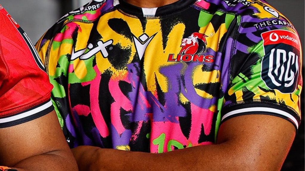
The Lions sported their new signing, Batho Hlekani, in training, which boasts a colourful design.
The article continues below…
Personally, I like it. It’s something new and appeals to the younger generation, such as myself.
The Lions also revealed their away kit at the start of the season, consisting of a graffiti-style print, which had fans divided in opinion.
Traditionalists will debate that the basic style of a team’s colours without sponsors is the better version, whilst teams have opted to reinvent their look to appeal to a younger audience and generate revenue with a bolder, more colourful style.
In the modern day, sponsors are part and parcel of having their brand displayed on a team’s kit, but should the actual design remain plaina and simple or hip and funky?
Which side of the fence are you on?
*Let us know in the comments below…
Image credits: @LionsRugbyCo