
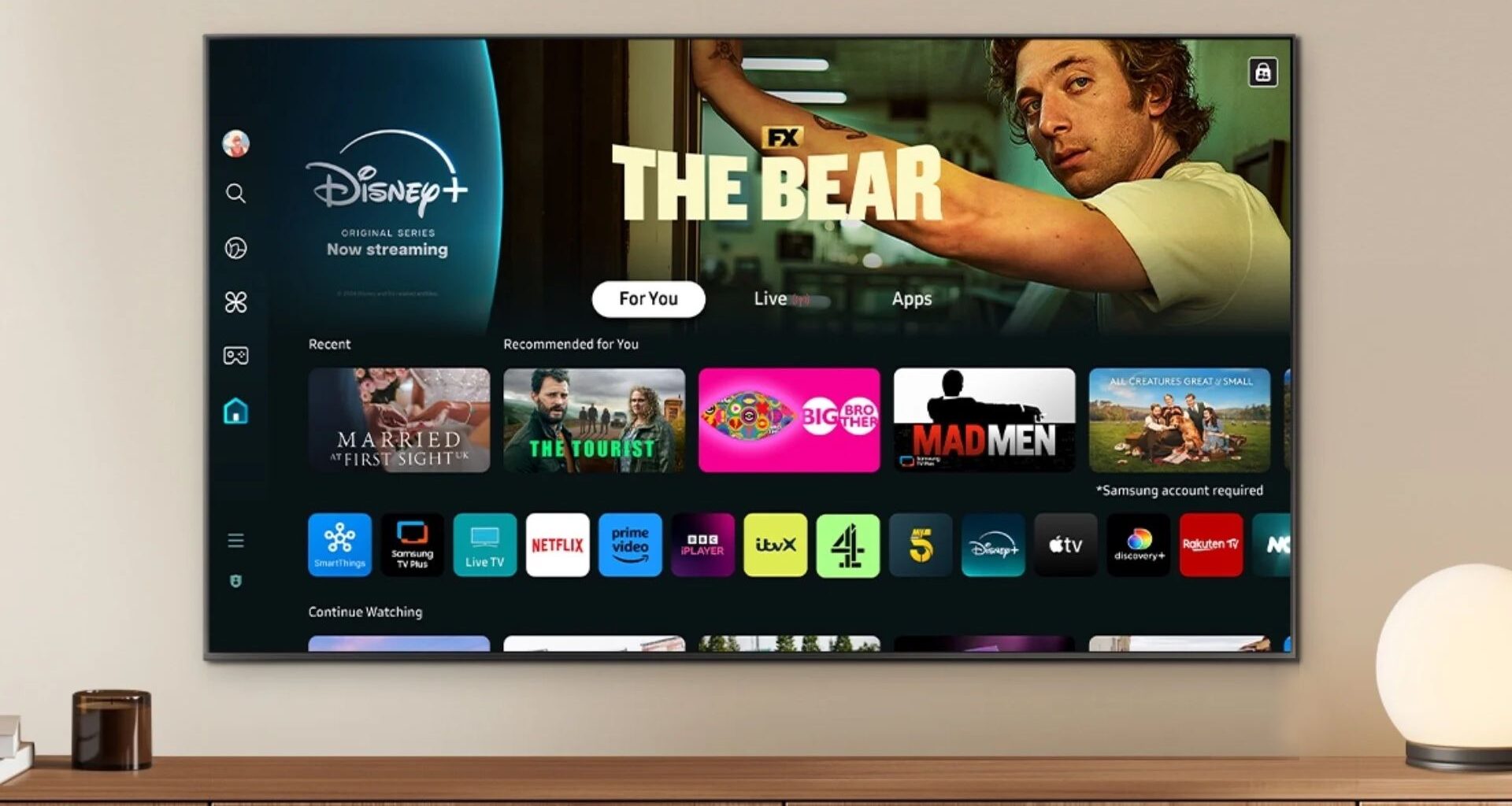
Perhaps the most important quality of any UI design is that it’s unobtrusive. A great UI does its job quietly and simply, fading into the background without announcing itself too loudly – a rule Apple‘s Liquid Glass iOS design has been accused of ignoring lately. But here’s an even more egregious example from Samsung.
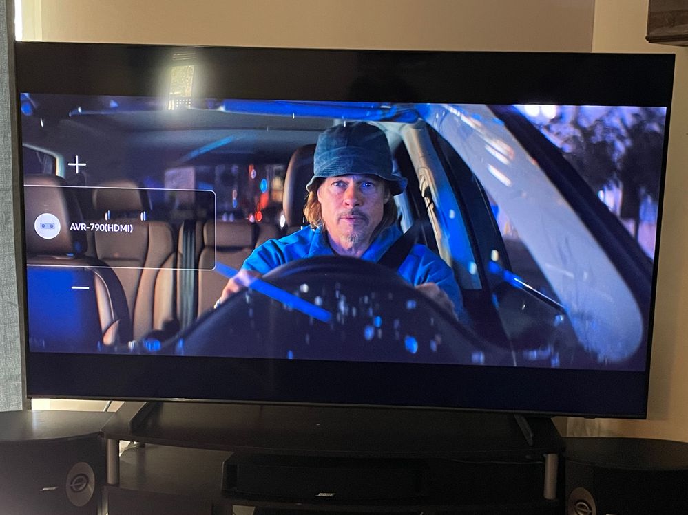
It’s not often that we see a piece of dodgy UI design become the subject of a change.org petition, but that’s exactly what’s happened with Samsung‘s on-screen volume display on its so-called smart TVs – many of which are among the best Frame TVs. The problem? Only that it takes up almost half the bloody screen.
(Image credit: Craig Biffle via change.org)
As well as being the subject of a 26-page complaint thread on Samsung’s own forums, the massively distracting display, which appears every time the user adjusts the volume, has also spawned a petition begging the brand to let users disable it. “On a 77 inch TV this is absolutely gigantic, and is extremely annoying when you have to keep adjusting the volume to accommodate the different levels in sounds during programming,” complains the complainant.
You may like
How do I make this box go away? Samsung TV. from r/hometheater
As the not-so-proud owner of a Samsung TV, I can attest to the ridiculousness of this detail. Fortunately, since I started using an Apple TV box, I haven’t been forced to look at it – Apple’s own volume display is mercifully subtle.
Time will tell if Samsung will ever respond to the chorus of discontent and at least make the display optional. But for now, it belongs in the UI Hall of Shame.