
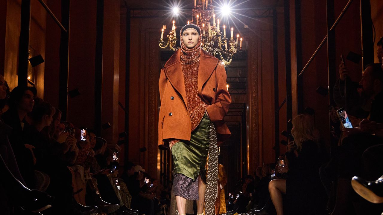
Forget the single-colour, single-trend shorthand we’re used to. This season, the reference point isn’t a Pantone shade – it’s the wide, slightly Narnia-like universe of home interiors. And not the Kim Kardashian and Kanye West school of stark, bone-white minimalism, think closer to Kendall Jenner’s Aspen home, circa 2025: pared-back, but warm – textural, earthy but rich. That’s where summer 2026 finds its palette – shades that are bold, and slightly unusual to see together. Because here’s the thing, we’ve had enough powder blue and butter yellow to last several Instagram video font cycles. The next colour story isn’t coming from fashion at all. It’s coming from the rooms we live in.
From wabi-sabi interiors to Mediterranean maximalism to a full-blown 1970s Italian eclecticism revival, the spaces we live in are dictating what we wear. Walk through a riad in Marrakech and you’ll understand instantly why terracotta refuses to fade – sun-baked, sand-warmed, impossible to replicate under studio lighting. Add to that an olive so deep it borders on bottle green, a chartreuse sharp enough to wake up a whole outfit, a mocha that reads more like burnt caramel than your morning oat-milk order, and a teal so saturated it feels lifted from a peacock’s throat rather than a paint chart. This is colour as language – shades so specific, so richly named, that saying them out loud feels almost indulgent. And this season, they’re leaving the walls and landing straight in our wardrobes, offering a far more interesting way to build an outfit than reaching for whatever palette Pinterest or an Instagram influencer thinks is “it” this season.
But we don’t stop at colour. We throw in prints, patterns and contrasting textures, too – the trick is to go bold, not loud. Think of it as the fashion equivalent of an expertly layered room, the pieces may not immediately appear to belong together, but there is a visual thread running through them. Interior designers achieve this by repeating a colour across different materials, balancing an ornate print with a quieter texture, or using one unexpected shade as a punctuation mark rather than letting every element compete for attention. The result is a kind of calculated chaos – eclectic, but never OTT.
Dries Van Noten has made a career of precisely this kind of tension, bringing together clashing prints, colour, texture and embroidery until the contradictions somehow become harmonious. Picture an acid-green accent slipping casually beneath a beige trench, two seemingly incompatible prints meeting in different shades, and one recurring colour quietly tying the whole look together. It is the same principle that makes a room feel collected rather than decorated, nothing matches perfectly, but everything relates.
Alessandro Michele understood this instinctively at Gucci, where florals, geometrics, vintage references and saturated colour collided without ever feeling entirely accidental. His approach to design was rooted in an uninterrupted flow between old and new – a philosophy that extended even into Gucci Décor, where furniture, wallpaper, textiles and objects were deliberately layered through exuberant combinations of colour and pattern.