
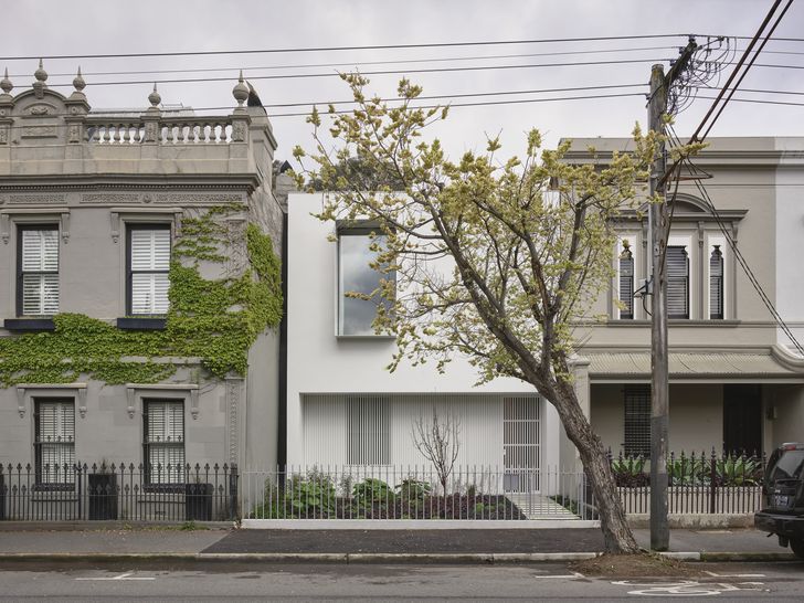
The site of this new terrace home was something of a risky purchase for the owners. Located in the inner-Melbourne suburb of Fitzroy, the existing rundown house was on a street of remarkably intact two-storey row houses and subject to heritage overlays. However, architect Rob Kennon advised the couple that, with the help of a heritage advisor, obtaining permits to demolish the existing residence would be possible. As it turned out, the existing residence – the only single-storey dwelling on the street – was found to be a mishmash of additions and alterations that, over time, had greatly diminished what little contributory significance it might once have had.
With approval to start afresh, the team at Rob Kennon Architects sought to craft a “background building, one that you might initially walk past without a glance, appreciating the details over time.” This goal has been achieved many times over. The home sits so comfortably in its context that it is hard to imagine it has only been there for one year. The team took a raft of cues from the neighbouring houses, among them an austere lack of embellishment that gives most of the homes a “flat” quality that Rob likens to a “painted skin” stretched over the facade. These houses are also adorned with simple verandahs, Victorian railing fences and the iconic pairing of windows to the upper floor. The team nimbly wove into the design contemporary interpretations of all these elements, allowing the home to stand apart while simultaneously fitting in.
View gallery
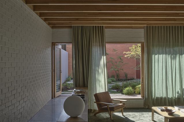
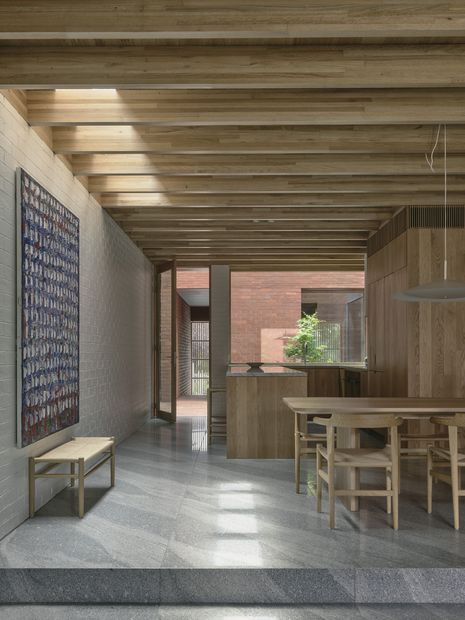
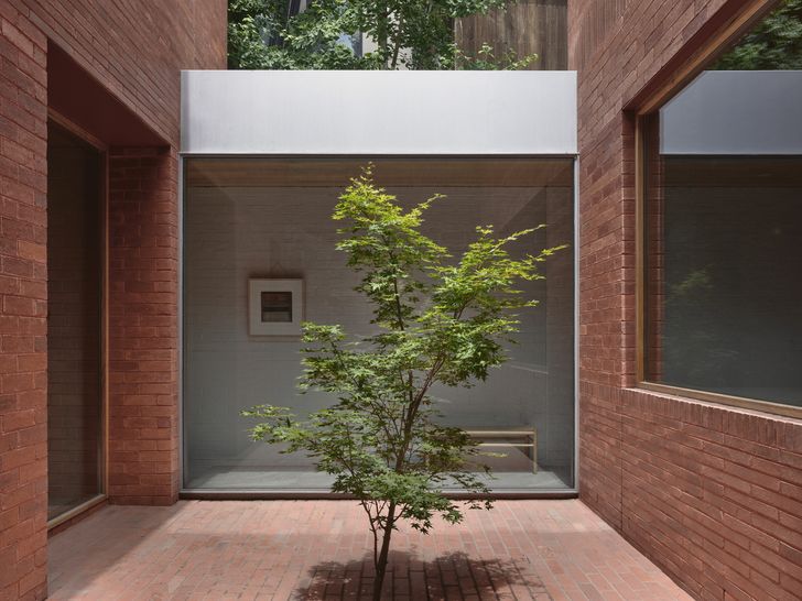
Beyond the veil of the streetscape, there is an immediate and surprising contrast to the sparse facade. The front door – actually a battened steel gate – opens to a rich and textural exterior space: a brick-lined external corridor that leads to a central courtyard before one enters the home proper. This space not only picks up on the rules of row housing by mirroring the adjoining courtyard, but it also turns what is often a poky dead zone into a generous and useable area. It additionally answered a key client wish to have visitors arrive and enter the home at the kitchen.
The courtyard splits the volume into “two towers,” as Rob describes them, with the front tower containing a library and powder room at ground, and a main bedroom on the first floor. Large windows on each floor provide connection to the life of the street, another core requirement of the owners. The second, larger tower houses the more public spaces, including the kitchen and living areas, as well as guest bedrooms. While this division has meant that two sets of stairs were needed, the elimination of the gun-barrel corridors typical to elongated terraces is well worth the small amount of space sacrificed. The lack of corridors means spaces feel wider, connect visually across rooms more meaningfully and admit light deeper into the plan, resolving several of the concerns that the clients had expressed when considering the purchase of a terrace.
View gallery
At each end of the plan, a sunken area punctuates the journey through the home. Furnished with a deep green carpet and warm, solid timber joinery, these areas embrace you and invite a slowing down through the subconscious zoning that a change in level creates, all without having to close off the spaces with superfluous doors.
There is an honest expression of materials and structure throughout, with playful variation in the brick coursing, exposure of the floor joists as ceilings, elimination of plasterboard and the use of large granite slabs both on the kitchen benches and as flooring. It’s all part of a process the practice calls “finding the rules”: seeking the unique materials and/or details for each project, then applying them to bring about a level of cohesion. If one of those rules was creating a beautiful home for happy clients, you would have to say they’ve succeeded there, too.
View gallery