
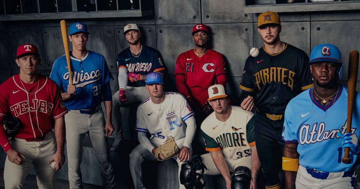
Eight MLB teams on Thursday officially revealed their latest City Connect uniforms, and while the jerseys over the five years of the program have “been polarizing at times,” MLB “envisions them continuing well into the future,” according to Anthony Gharib of ESPN.com. MLB Deputy Commissioner Noah Garden said that the league views the jerseys “as a key part of its ongoing efforts to appeal to younger fans and to capture the spirit … of the game’s newest generation of players.” Garden: “I can’t see us stopping this anytime soon. … Nike’s been an outstanding partner. It was their idea. Fanatics has been able to execute this at a high level for us.” Gharib noted the Yankees and A’s have “yet to participate” in the City Connect series. The A’s likely will “have one in their early Las Vegas years,” though the Yankees’ participation is “still an open question.” One sticking point in conversations with the Yankees has been that their traditional look “is a big part of their branding — but part of Nike’s job is keeping the designs fresh.” Garden on the Yankees said, “I’m hoping to see some flexibility in the future” (ESPN.com, 4/9).
THE REVIEWS ARE IN: Many outlets gave their thoughts on the eight new City Connect jerseys. Here is a sampling of what is being said:
— SI’s Tom Dierberger ranked the Braves’ jerseys as the best of this round, writing they “continue to have the best City Connect jerseys in all of baseball.” He noted the club “struck gold again here.” The Brewers ranked last and he wrote the design of the jersey “is fine, actually,” and the “Barrelman on the sleeve is a nice touch.” Dierberger: “But Wisco? C’mon now. That’s bad” (SI, 4/9).
— YAHOO SPORTS’ Jack Baer also ranked the Braves as the best jerseys, noting the lower-case “a” hat “is going to sell by the truckload.” The powder blue and throwback “Atlanta” logo “is perfect.” He ranked the Rangers last and wrote they “very much looks like a generic college uniform overall” (YAHOO SPORTS, 4/9).
— ESPN’s David Schoenfield gave the Braves his best grade, an A-, and noted the Braves’ original City Connect jersey “was one of the best, even if it was more of just a throwback rather than a new creation.” This “has a similar approach.” The Rangers and Padres tied for the worst grade with each getting a D. The Rangers’ initial City Connect “was a hot mess,” as there was “too much going on, a gothic ‘TX’ logo and the ‘Peagle’ shoulder patch.” The new version “is simpler … and boring.” Meanwhile, the new Padres jersey “kind of feels like a jersey the Marlins might wear.” Schoenfield: “Give me a taco patch, a nod to the San Diego Zoo, a surfing logo, something that connects more immediately to the city” (ESPN.com, 4/9).
— CBSSPORTS.com’s Matt Snyder gave the Pirates uniforms his top ranking and wrote the way those “PIRATES” letters “just seem to bleed downward from the chest is great.” He added, “I love the touch of throwing the actual pirate logo with the swords on the hat.” Meanwhile, he has the Brewers last and wrote the jersey does not “feel like the Brewers.” Snyder: “And ‘Wisco?’ People say that?” (CBSSPORTS.com, 4/9).
— USA TODAY’s Gabe Lacques also ranked the Pirates jerseys first and wrote they are “daunting and haunting, from font to cap.” Both the Pirates and Reds “seemed to draw the short straw the first time around, with unimaginative ‘PGH’ and ‘CIN’ slapped across the jerseys.” The Pirates “got better treatment this time around.” He put the Royals on the bottom of his list, writing the team has “gone from a fountain theme to a… fountain theme.” Lacques: “At first glance, the scheme looks like way too much is going on, though the subtleties pop a little more once you slow everything down” (USA TODAY, 4/9).
— Several of the ATHLETIC’s MLB writers gave their rankings of the new City Connect jerseys, with Padres and Orioles tying for the best and the Rangers ranking last. Johnny Flores Jr. noted the Orioles jersey “ticks all the boxes of what the City Connect initiative can be,” as there are “several tributes to Camden Yards” throughout the uniform. C. Trent Rosecrans wrote the green accents on the Orioles jersey “is gorgeous, the hat is elite and the whole Camden Yards motif is spot on.” Flores also noted the Padres have “been at the forefront of experimenting with different colors” and they have “knocked it out of the park” with both City Connect editions. Meanwhile, Tyler Kepner wrote the Rangers jerseys belong “on a discount rack in Walmart, not on an MLB field.” Kepner: “Feels like a missed opportunity; they should have had more fun with this theme” (THE ATHLETIC, 4/10).