
Richer, more nostalgic interiors are emerging as a defining trend this winter, as colour palettes move away from summer’s brightness and into deeper, more expressive territory.
According to Dulux’s 2026 Colour Forecast, the shift reflects a growing appetite for warmer, more personalised spaces, with homeowners embracing layered tones, texture and a sense of comfort as the cooler months set in.
Among the palettes gaining attention is Dulux’s Evoke range, built around blush pinks, burnt orange, warm golds and deeper, moodier tones.
“The palette is perfectly suited to autumn, creating a cocooning atmosphere that mirrors the season’s comfort, reflection and retreat,” Lauren Treloar, Dulux colour and design manager, said.
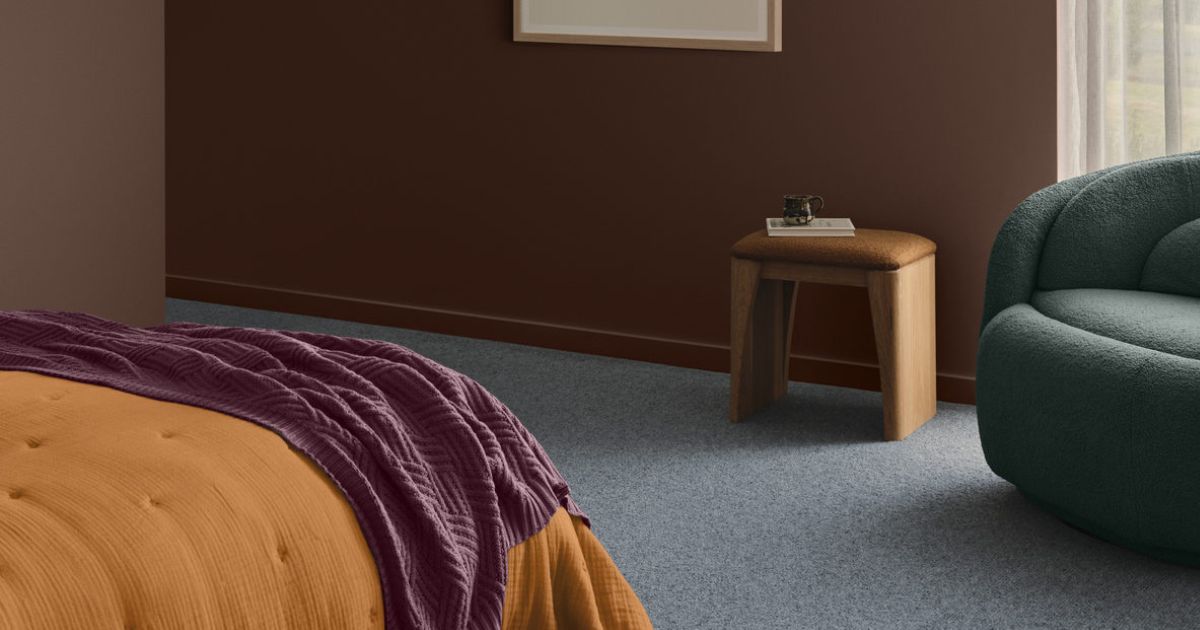
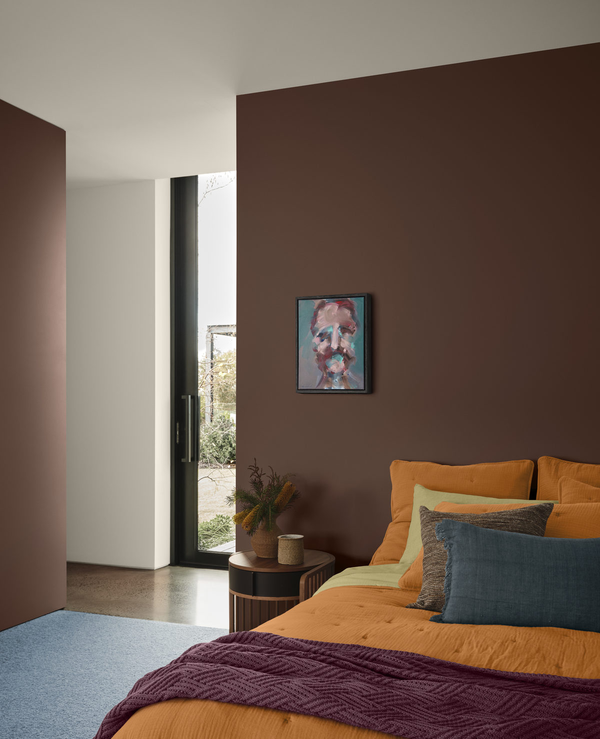 The bedrooms lean further into deeper tones, creating more enclosed and restful spaces. Photo: Lisa Cohen. Styling by Bree Banfield.
The look taps into a growing appetite for maximalism and individuality, with cottage-inspired details and a return to “nana chic” – nostalgic, character-filled spaces that favour layering over restraint.
It also provides an easy entry point for adding warmth as the temperature drops.
Treloar said the approach allows for both subtle and bolder applications of colour.
A recent project shows how the palette can be applied, with stylist Bree Banfield working alongside the Dulux colour team to rework a modern family home.
Drawing on influences from the 1950s, 60s and 70s, the design layered colour, texture and vintage-inspired elements to bring warmth and personality into what had been a minimal, light-filled space.
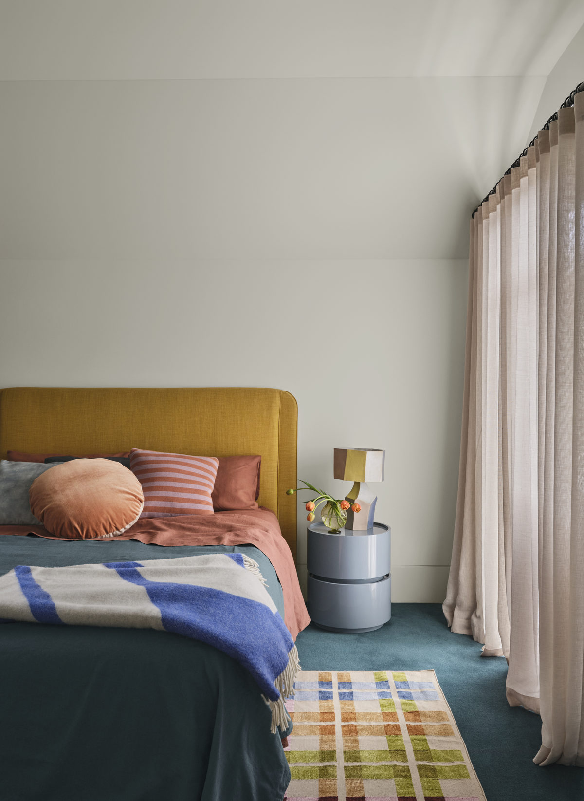
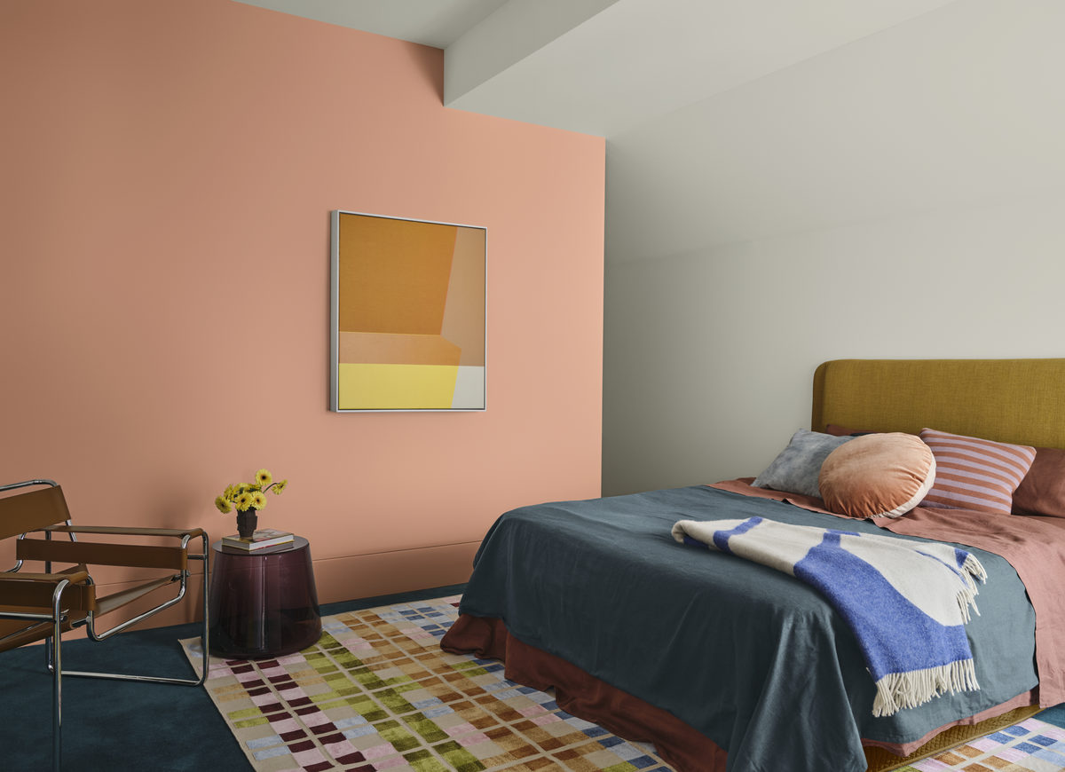 Layering earthy neutrals with richer tones can make a space feel welcoming, conversational and full of character. Photo: Lisa Cohen. Styling by Bree Banfield.
“What immediately struck us about the home was the sense of openness. It was a modern blank canvas, offering clean lines and generous natural light but in need of an injection of warmth and personality that better reflected the family residing within it,” Treloar said.
“The space is primarily used as a central living and gathering area for the family, so our design approach was to layer colour and thoughtful styling to transform it from a neutral and understated room into a welcoming, character-filled environment.”
In the dining area, warmer tones anchor the space, complemented by softer surrounding shades and layered decor that blends vintage, handcrafted and contemporary pieces.
Banfield said proportion was key when working with stronger colours. She recommends choosing one or two mid-tone colours as a foundation and layering deeper hues to create smaller, but impactful moments.
 Stylist Bree Banfield believes you shouldn’t be afraid to include something unexpected in your spaces, like a vintage find, a sculptural lamp or patterned upholstery. Photo: Lisa Cohen. Styling by Bree Banfield.
“Work with texture in the same way,” she said. “Velvet, glass, mid-tone timbers and handcrafted pieces help emphasise the eclectic spirit of the palette.
“Don’t be afraid to include something unexpected – a vintage find, a sculptural lamp or patterned upholstery.
“Dulux Evoke is all about individuality and emotional warmth, not about matching everything perfectly.”
The bedrooms, meanwhile, lean further into deeper tones, creating more enclosed and restful spaces. Rich browns, soft neutrals and tactile materials add warmth and depth.
Treloar said the transformation highlights how colour can influence how a home feels and functions.
“By layering earthy neutrals with richer tones, the space now feels welcoming, conversational and full of character,” she said.
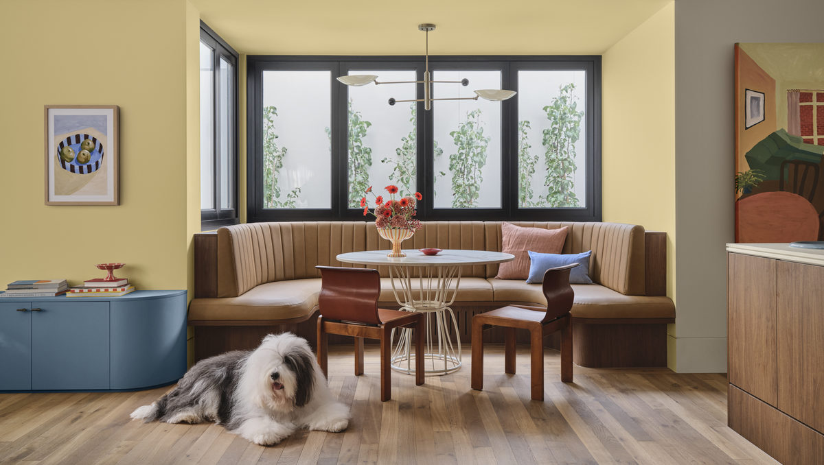 In the dining area, warmer tones anchor the space, complemented by softer surrounding shades and layered decor that blends vintage, handcrafted and contemporary pieces. Photo: Lisa Cohen. Styling by Bree Banfield.
“The colours create a cocooning atmosphere that encourages connection and comfort, transforming the home into a place where people naturally want to gather and spend time together.”
Texture also plays a central role, with materials such as velvet, marble, glass and darker timbers helping soften stronger colour choices.
“Leaning into tactile materials will enhance the mood,” Banfield said. “Velvet, faux fur, marble, glass and mid-tone or darker timbers all pair beautifully with this palette.
“Curved or sculptural shapes help soften the depth of colour and keep the room feeling warm and inviting rather than heavy.
“And don’t shy away from mixing eras or styles – the blend of vintage, handcrafted and contemporary pieces is part of what gives Dulux Evoke its eclectic and expressive personality.”