
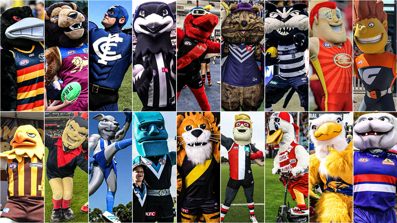
If you’re a team, you’ve got to have one; a mascot is a defining part of a team’s fandom and, in some cases, helps usher in a new wave of fans during their childhood. The idea behind them is to empower and believe it or not, they are still a representation of the club’s image.
When I was a kid, I had a love for mascots and their image, whether it was waiting in line for a picture, collecting their footy cards or waiting till they made the journey around to the ground for a high-five and picture.
Advertisement
By using what’s left of my childhood wonder, I set out to rank each club’s mascot based on creativity, design and overall feel to see which ones in the league stand out as the best.
Carlton Blues – Captain Carlton
Do I really need to say much just by looking at? To be fair to Carlton, it’s pretty tough to come up with a mascot for a club called the Blues, but the effort here is still abysmal. They’ve gone for a superhero approach with the costume and it couldn’t be any more genetically lazy to inspire their fans.
Advertisement
Gold Coast Suns – Sunny Ray
At least the Suns have a traditional full mascot suit and not just some guy wearing a mask with a giant logo on his chest. It’s still a pretty shocking effort for a team literally called the Suns, you have your symbol there, why not just get a sun suit, some shades and call it a day?
Melbourne Demons – Checker
Pretty sad drop-off to go from the intimidating all-red Ronald ‘Dee Man’, to now just a human suit with horns on and no red, no intimidating factor, just a mischievous looking bloke with a cheesy grin and spiked hair. Poor form, Melbourne, poor form.
Advertisement
St Kilda Saints – Trevor ‘Saint’ Kilda
Based on Trevor Barker, St Kilda’s mascot is a decent attempt at making an angel-type figure, even though it’s really just a ring over his head. They’ve also gone a superhero direction that I don’t really get context-wise and it just comes across as a cheap way to empower him more.
Fremantle Dockers – Johnny ‘The Doc’ Docker
Sorry Freo Fans, Dokka the Quokka isn’t being counted here due to not technically being the club’s main mascot. That goes to Johnny Docker, who’s just a stereotypical surfer dude that is at least trying to be on theme in matching the Dockers theme of the water.
Advertisement
Port Adelaide Power- Tommy ‘Thunda’ Power
Yikes, this one gave me a scare. The bulging teal eyes with the black dot in the centre are tough to look at for a while and the mouth shape that goes on him looks like Thunda’s about to chomp down on some serious nightmares.
Essendon Bombers – Moz ‘Skeeta’ Reynolds
Bit of a controversial one here because I respect the creativity and the bomber hat, but it’s just the face on the mosquito itself that’s weird. It’s almost too humane and doesn’t fit the look of Skeeta, who doesn’t have anywhere near the creative facial structure like the animals further up on the list.
Advertisement
Greater Western Sydney Giants – G Man
For what they had to work with, the Giants made this one work better than most. There’s a big mouth here that implies the Giant features and it’s an all-orange approach with the hair that make him standout compared to the other humanoid mascots.
Geelong Cats – Half Cat
How the mighty have fallen. Probably the biggest downgrade of any mascot on the list, Half Cat, formerly known as Tomcat, used to have a unique design and intimidating appearance about him, compared to now, where he’s just a pudgy, bland kitten.
Advertisement
North Melbourne Kangaroos – Kanga
In the spirit of talking about downgrades, look no further than North, who juiced up their previous brown coloured boxing Roo to now look like a mix of a car and a steroid commercial.
West Coast Eagles – Rick ‘The Rock’ Eagle
Can’t go wrong with just a simple feathered Eagle that has a chilled smile and eyes that don’t pop out of the face. It is a bit of an uncanny valley effect if you look close enough, but face value, this is a win for a simple yet effective image.
Advertisement
Sydney Swans – Syd ‘Swannie’ Skilton
Swannie here is a lot more kid-friendly and even has some accessories thrown in, so as not to be too lazy by just having the Swan. The hat and glasses also give her that beachy Sydney identity.
Richmond Tigers – Tiger ‘Stripes’ Dyer
Kind of a missed opportunity here by not making the Tiger yellow and black, so I’m marking Richmond down for that. Regardless, Stripes still has a kingly look about him while still appeasing to families, by not falling into the creepy category like others on the list.
Advertisement
Brisbane Lions – Roy the Lion
Brisbane has hit the perfect mark in not making the mascot too scary for kids while still being intimidating. The mane isn’t too fluffy or distracting and the headpiece is a great shape. The only downside I’d say is the uncanny eyes that dart off to the side.
Western Bulldogs – Woofer
Giving the Bulldogs bonus points here for being the only club with an actual living mascot thanks to the bulldogs Caesar and Sunny, who attend every game. Though Woofer himself has a great design that gives him some personality.
Advertisement
Hawthorn Hawks – Hudson ‘Hawka’ Knights
There’s a lot of personality to this one and it’s one of the few that has remained faithful to the cartoon version of the mascot. One of the best headpieces with the feathers layering down and eyes that give the Hawka a nonchalant way about him.
Collingwood Magpies – Jock ‘One Eye’ McPie
It’s a Magpie, true to the name, with the black and white colour pattern across the arms that blends seamlessly with the guernsey. Not much to criticise about this one except the humanoid hands that prevent One Eye from reaching the top spot on the list.
Advertisement
Adelaide Crows – Claude ‘Curls’ Crow
A mix of what makes the Pies and Hawks mascots great, this Crow’s faithful to the bird with both hands and thin legs that resemble those of its animal. The beak is expressive, and the eyes, which match Adelaide’s red, do a great job of adding the intimidation factor that few teams get right.