
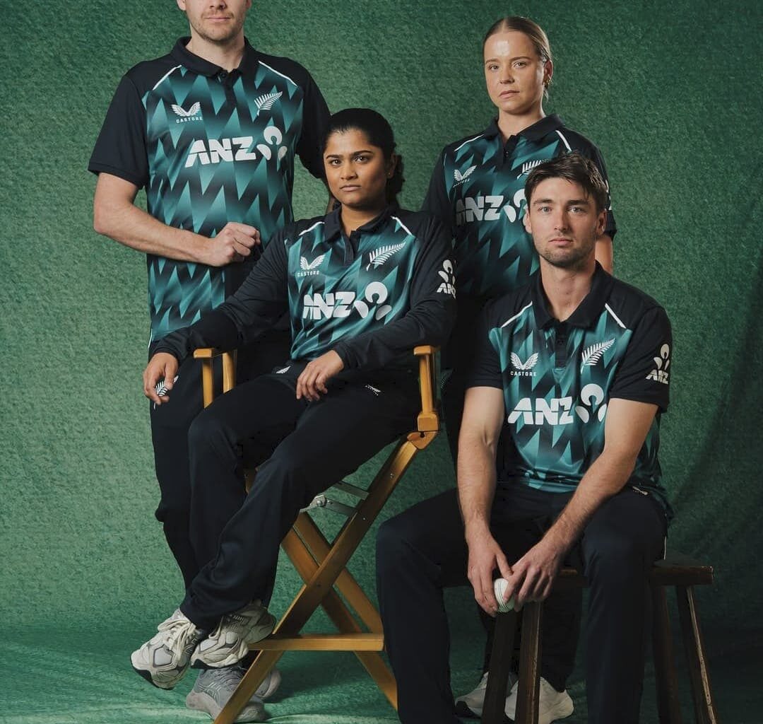
NZC unveils Castore-designed T20I kits for Blackcaps and White Ferns, featuring bold teal chevron patterns and modern performance tailoring.
New Zealand Cricket (NZC) has launched new T20I jerseys for its international teams, the Blackcaps and the White Ferns. The players will don the T20I jerseys in the upcoming home T20I assignments this summer. The sports design for the kits were undertaken by Castore, which is currently serving as the commercial partner of the NZC.
A Tint of Teal Green Becomes the New Edition in the NZ T20I Kit
The latest T20I jersey from New Zealand Cricket is a break from the gentler shades of past campaigns, courtesy of Castore. The continuous motif is a jagged chevron pattern in teal-to-black tonal shading, a broken-up, angular “artistic” design that seems like shards of glass or abstracted fern fronds. The panel is in a zigzag position across the chest and torso and is surrounded by solid black sleeves and a black collar of another colour, providing the kit with a solid vertical anchor point.
Fresh summer. Fresh fit.
The 2026/27 BLACKCAPS & WHITE FERNS T20I kit by Castore Sportswear 📷
Shop now | https://t.co/QmhJAXWWoV#BetterNeverStops pic.twitter.com/s8hR9UCccr
— BLACKCAPS (@BLACKCAPS) September 21, 2026
The colour scheme (a deep forest green background with a teal accent) prevents the all-black jersey from becoming an all-black shirt. Structurally, it is a collar of the polo style, with a three-button placket, reminiscent of traditional cricket tailoring, and not a crew-neck sport cut, giving the kit a hint of heritage, almost gentry, style over the jingoistic print.
The Silver Fern logo, Castore’s falcon and the ANZ mark are used sparingly and are appropriately sized to not steal the limelight from the print. In terms of an overall impression, this is a kit that is both technically correct for performance wear and, at the same time, offers an obviously New Zealand-style graphic identity – minimalist national pride that is contemporary and blunt.
What Is the Main Difference Between the New and the Last t20i Jersey?
The contrast between the previous New Zealand kit and the current one is significant. The former design, which appears on the black background, is a minimalist design: a nearly plain black polo shirt with a faint fern-leaf print that appears only at the bottom of the torso and is rendered in subdued navy tones. Trims, such as collar piping and cuff bands, use the same royal blue for a clean corporate finish, with graphics clearly in the background of the block colour.
 Blackcaps will adorn the new jersey from the five match T20I series against India · Credits: via Instagram @blackcaps (L) and Instagram @icc (R)
The new jersey does not compromise in this way. The “fern” pattern that was almost a subtle gradation at the hem has been playfully reworked as a bold, broken teal chevron pattern that spans the front of the shirt from collar to waist. The new outfit has white piping on the shoulders and a teal-green accent instead of the previous blue accents (no coloured cuffs). There is a three-button placket, but the overall graphic intensity is much more prominent; this is a kit that should be shot and recognised from a distance rather than worn. The Blackcaps will be wearing the new jersey from 22 October 2026, when they will be locking horns against India in the 5-match T20I series.