
Fashion brand & Other Stories has debuted a new logo that has divided design fans. Known for its elevated high street style, the brand’s new identity feels like an underwhelming corporatisation of its signature attitude – a trend we’re increasingly seeing in contemporary rebrands.
While the best rebrands will often make a big change, there’s a fine balance to preserving a brand’s identity while also keeping it feeling fresh. & Other Stories’ new look is a prime example of a rebrand gone too far, leaving a generic new identity that feels like a stranger.
(Image credit: & Other Stories)
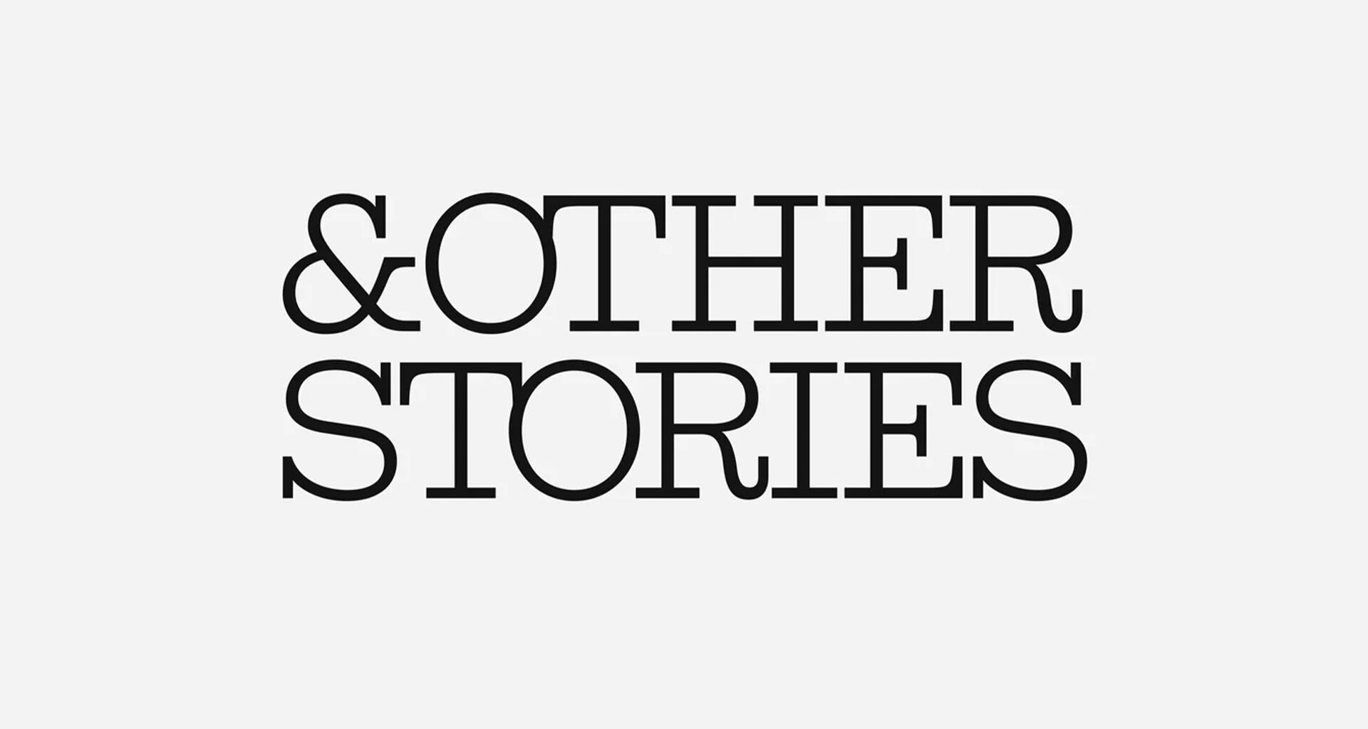
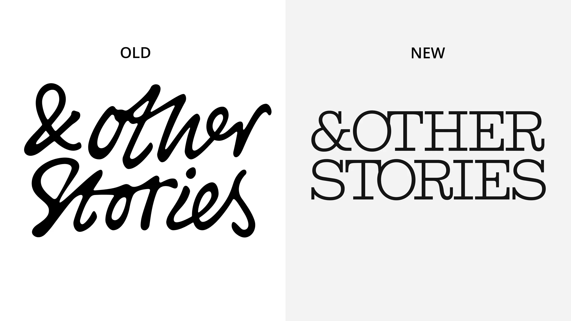
In line with its refined style, the old & Other Stories logo featured chunky script font with a bespoke appeal that felt elevated and chic. The new design replaces the brand’s calligraphic logo with a uniform typewriter-style serif that feels clean but stuffy, losing the brand’s personality.
You may like
Over on Reddit, design fans debated the new look, with many criticising the updated logo. “Overcorrection. They needed to improve legibility, but they threw the baby out with the bathwater,” one user commented. “Holy s**t that’s dry. The kerning is awful,” another critiqued, while one user added, “Doesn’t feel like an upgrade, the old logo had personality, this one feels flat and generic.”
While there’s an argument to be made about the new logo’s improved legibility, it’s disappointing to see the brand lose its uniquene appeal. The minimalist logo trend is spreading across numerous brands, from fashion to tech, making generic, characterless logos the norm. However, with trends constantly in flux, I’m hopeful that we’ll see brands embracing more creative design soon enough.