
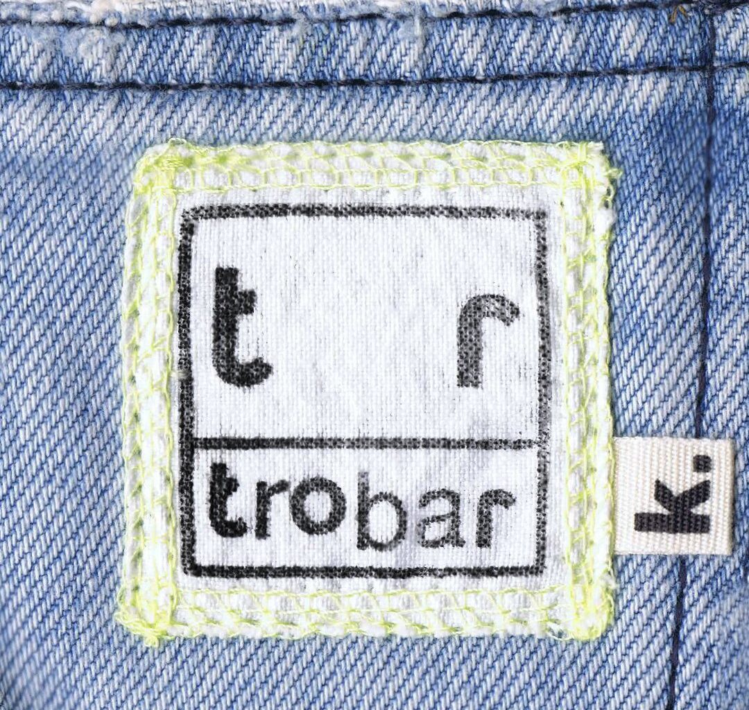
Elements of visual decoration and illustration also enhance this feeling of discovery, like the hand-drawn lines and strokes that adorn pages of menus and apparel labelling, connecting various elements. While these marks may initially come across as whimsical and random, there’s usually a logic to their application, as seen in a deconstructed version of the logo that links its letters in a numbered, dot-to-dot-like system.
The brief came to the studio via Mireia Campos, a strategic and creative consultant. As the space was going to double (or triple) up as a bar, restaurant, gallery and shop she was clear that the project would be a lengthy one, with lots of deliverables and applications, but Paula wasn’t warned off and the studio took the project in their stride. They aimed to treat each element of the as an “artwork in its own right”, says Paula, “curated and designed to connect with the visitor in a specific way, at a specific time”.
One such example is Trobar’s menu, which Paula describes as “a project of its own”. Rather than simply approaching it like your bog-standard double-sided card, Paula and the team proposed something much closer to a piece of editorial, or a book. It’s divided into several booklets, of grey blue and white paper, then all bound together with a neon yellow ring binder. On the design, Paula says: “It had to be a highly structured piece, easy to understand, very readable, and simultaneously a piece of art. Achieving that balance – something perceived as a unique, artistic object while still being intuitive enough for someone to instantly understand that taco prices are per ‘unit, or that certain cocktails are only available downstairs – was a complex task.” Not only was the menu an important object, it also became something of a testing ground for all of the many “ingredients” of the identity, a means to make sure they “communicated cohesively”.
With so much time spent in the ideation and planning stage, Paula is letting various ephemera and ideas lead her down new paths, if the Trobar identity has taught the designer anything its that “sometimes it’s important to recognise that the design phase – and jumping into the design programs – should come only at the very end.”