
Steam is testing its new storefront redesign, offering a neater and more organized user interface.
This redesign aims to make the storefront less overwhelming and, thus, easier for users to find what they want.
The first change brought up with this redesign is the removal of the left column on the page, which originally contained all the links. Steam has combined that column with the blue menu bar that would come out from the top of the page. This is to reduce clutter and provide easy access to places users visit frequently, like the Recommendations and Browse tabs.

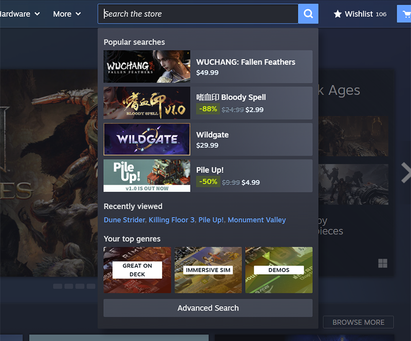
The search panel on the redesigned storefront was also changed. Alongside the search bar, it now shows popular searches among other users and games you have personally viewed before. The search bar itself allows users to search categories, tags, and publishers with a variety of filters to hone in on their search. Although these features are not new to the platform, they are now much more easily accessible than they were before.
The Steam categories tab is now entirely personalized for the user. It shows them a wide variety of games from their top genres and across multiple tags from the games they play.

This redesign is still in testing, only accessible through Steam client beta participation, and many aspects are subject to change as it receives more feedback.
Image Source: Steam
Source: Steam
MobileSyrup may earn a commission from purchases made via our links, which helps fund the journalism we provide free on our website. These links do not influence our editorial content. Support us here.