
I don’t know about you, but I’m constantly searching for ways to make my home feel more unique to me. After all, I’m the one living here. And color is easily one of the most expressive ways to do so.
While we often turn to color trends or designer-approved palettes for room color ideas, there’s a much more unexpected yet tailor-made place to start: your birthstone. You’ve heard of Color of the Year, but what about colors of the month?
From January’s deep, velvety garnet to December’s cool and luminous turquoise, each month comes with its own gemstone – and while they’re fun to wear, their distinctive hues lend themselves beautifully to the home, too. So, are you ready to discover yours?
Best picks for you
Discover Your Birth Month Color Match
Some of the birth month shades read grounding and elegant, while others are vibrant and uplifting, but all offer a fresh lens for choosing paint colors and home decor. And unlike trend-led palettes, birthstone colors carry a sense of personality and story to work with.
Whether you’re searching for your signature color or simply love weaving richer meaning into your rooms, these shades are a great place to start choosing a color scheme for your home that with real meaning.
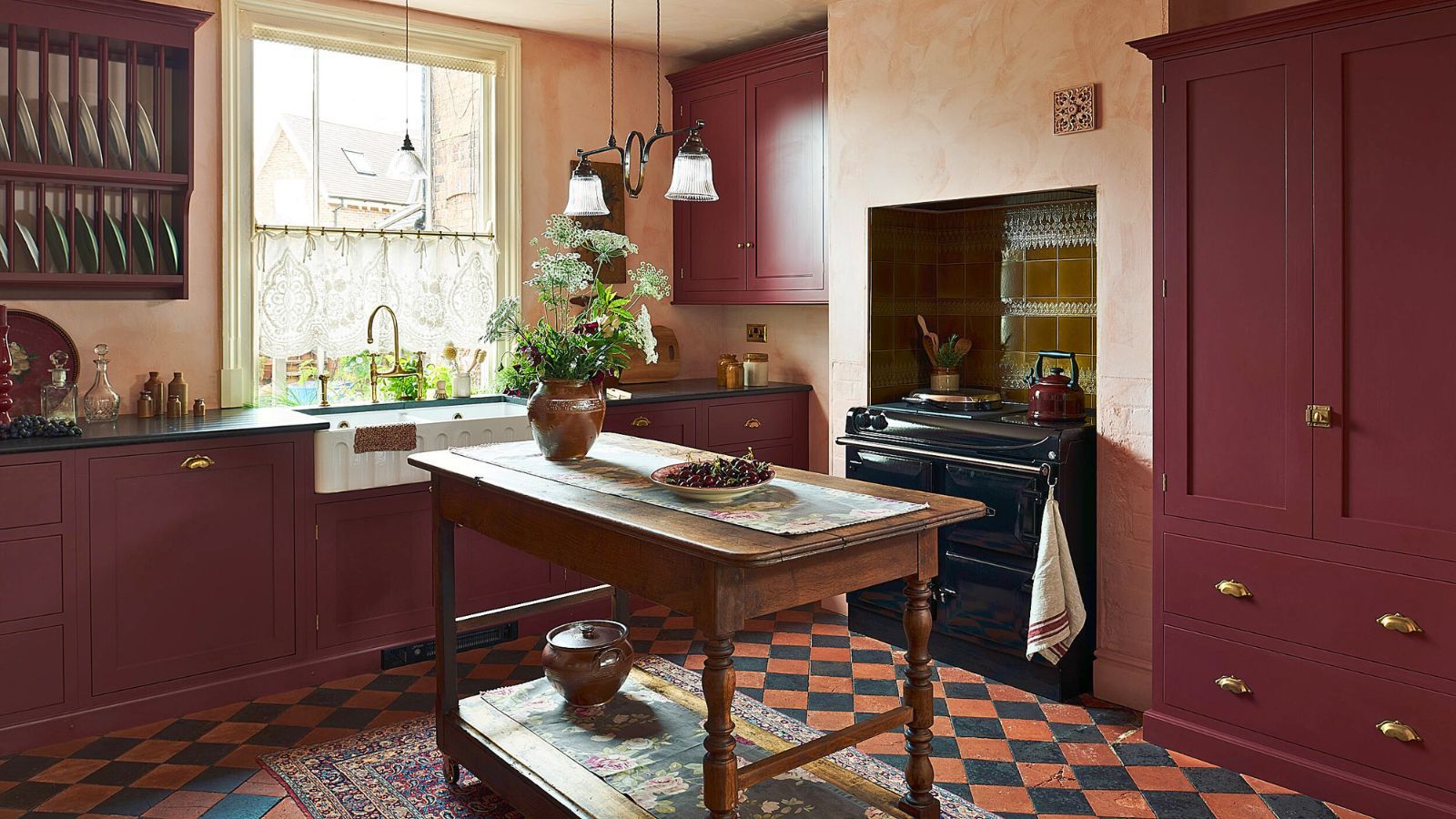
January: Garnet
(Image credit: deVOL Kitchens)
Inspired by the richness of garnet stones, January’s palette is all about depth and warmth. Think oxblood, merlot, and burgundy. These shades are super enveloping, making them ideal for rooms where you want an intimate, cocooning feel – like dining rooms, home libraries, snug rooms, or a bold powder bathroom.
If you’re brave enough to go bold, a color drenching a room in a rich burgundy paint like Arras by Little Greene, Benjamin Moore’s New London Burgundy, or Preference Red by Farrow & Ball will create a luxe effect. Prefer to go a little more subtle? Add some wine red hues with some unexpected red accessories that add a pop of warmth. This glossy red Bobbin LED Lamp from Anthropologie is top of my wishlist.
February: Amethyst
(Image credit: Lore Group)
February’s birthstone, amethyst, translates into interiors through serene lilacs, mauve, and soft purples. These tones bring a calming quality to a room, making them perfect for bedroom color ideas, as seen above in this hotel bedroom, reading nooks, or spa-like bathrooms.
Use lavender in larger doses if you’re after a romantic feel, and try shades like Calluna by Farrow & Ball, Timeless Lilac from Behr, or Sherwin-Williams’ Lite Lavender paired with warm neutrals, brushed brass, and natural linen textures. For a lighter touch, introduce amethyst shades through retro-style glassware like Estelle’s Rose & Amethyst Wine Glasses from West Elm.
March: Aquamarine
(Image credit: Studio Peake / Alexander James)
March’s palette brings together aquamarine and sea-glass tones for an instant punch of tranquillity. These hues are fresh yet soft, ideal for coastal decor or smaller spaces that benefit from a light, airy feel.
Painting walls in aquamarine creates a luminous wash of color that feels restorative, and some of my favorite blue-green hues include Behr’s Aqua Breeze, the soft Palladian Blue by Benjamin Moore, or Farrow & Ball’s Vardo for a punchier tone. To keep the look modern, pair it with sandy neutrals, pale oak, and wicker accents, like in the uplifting kitchen above by Studio Peake.
April: Diamond

(Image credit: William Jess Laird)
Diamond is perhaps one of the trickiest stones on the list. For April babies, I’d encourage you to lean into tones of icy whites, grays, and silvers and steer clear from anything that sparkles. A touch of chrome decor or stainless steel (add H&M’s Stainless Steel Tray to basket) is perfect for minimalist spaces or rooms that rely on light to bring them to life.
The best white paint shades to consider are Loft White by Little Greene and Pure White by Sherwin-Williams, as well as these cooler-toned gray paints like Passive by Sherwin-Williams and Oystershell by Benjamin Moore. If you’d rather keep things subtle, introduce some mirrored or glass accents instead.
May: Emerald

(Image credit: Farrow & Ball)
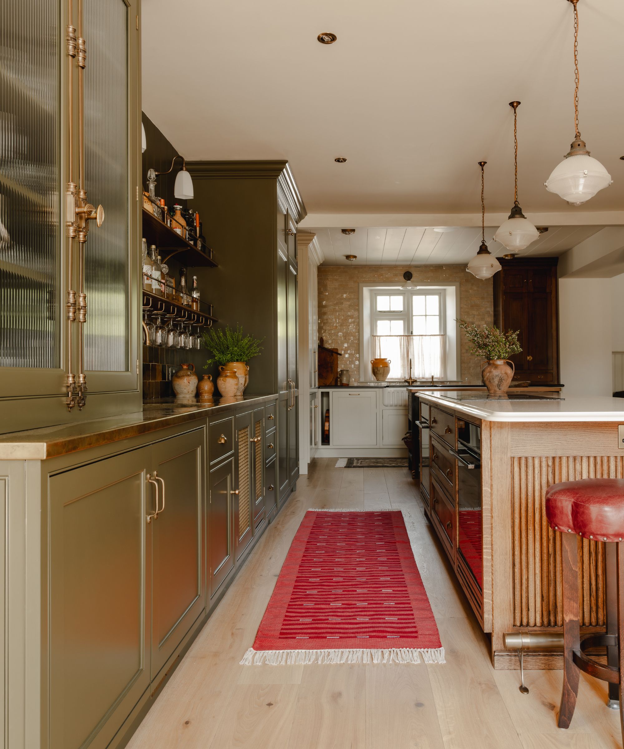
Emerald’s lush, saturated green channels the richness of nature, making it one of the most versatile jewel tones to decorate with. Use deep emerald or forest greens for dramatic cabinetry, like a home office or your kitchen cabinet color, or try a bold stripe on your walls or textiles. The result is grounding, sophisticated, and full of character.
Benjamin Moore’s Emerald Isle is a true jewel-toned green to try, while Farrow & Ball’s Emerald Green reads a little lighter, and Little Greene’s Dark Brunswick Green gives a darker approach. This verdant hue pairs beautifully with brass, walnut, and cream tones for a classic combination. The Orcino Green Marble Fruit Bowl from CB2 adds a striking yet natural touch.
June: Pearl
(Image credit: Future)
June’s pearly birthstone inspires a palette of iridescent whites, warm oyster tones, and soft shell pinks – subtle hues that feel timeless and elegant. Pearl shades have a natural softness that works beautifully in calming spaces, enhancing light and bringing an iridescent depth to any room. They’re particularly suited to bedrooms and bathrooms where you want a restful backdrop.
Pearl paints can vary from cool (Pearl Colour by Little Greene) to warm (Oyster by Behr), with Seapearl by Benjamin Moore sitting somewhere in the middle. Try also layering in accessories such as vintage opaline vases – I love this set of 6 from Chairish – pearlescent glassware or mirrored glass to capture the birthstone’s subtle shimmer.
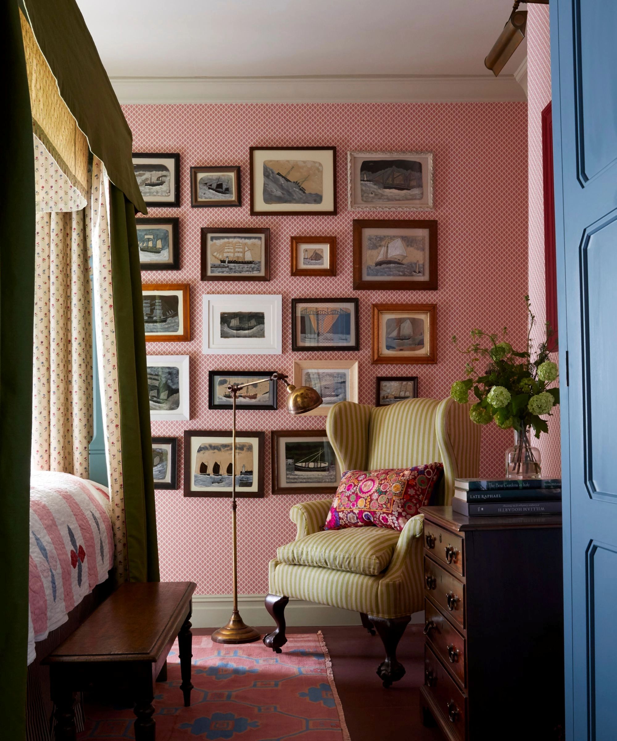
July: Ruby
(Image credit: Interior design by Otta Design / Photography by Jonathan Bond)
July’s ruby red is joyful, warm, and full of energy. Think decorating with reds like crimson, raspberry, and scarlet tones that shine in social spaces like dining rooms, living rooms, or entertaining zones. The bobbin-style Darlene Round Mirror from Wayfair is the perfect playful pop of red.
For a bold statement, consider paint shades like Ruby Red by Benjamin Moore, which is a true paintbox red, the earthier Antique Ruby by Behr, or Ruby Shade by Sherwin-Williams that reads even pinker. For a timeless shade, Theatre Red by Little Greene adds sophistication and drama.
August: Peridot
(Image credit: Weaver Green)
Peridot brings a refreshing hit of citrusy chartreuse and fresh yellow-green that instantly energizes a room. The gemstone itself is a variety of the mineral olivine, and can range from a yellow-green to deeper olive-green tones. These playful, uplifting tones are especially effective in kitchens and even children’s spaces.
Because chartreuse is a statement color, many designers prefer using it in accents, but if you want to really commit, try Peridot by Behr or Citrine by Little Greene on cabinetry or go down the earthier route and choose the best olive green paints like Bancha by Farrow & Ball, which has a slight yellow undertone to give it freshness or Ripe Olive by Sherwin-Williams. Anthropologie’s Velvet Milo Pillow will add some vibrancy to a neutral chair.
September: Sapphire
(Image credit: Adam Macchia / Glenna Stone Interior Design)
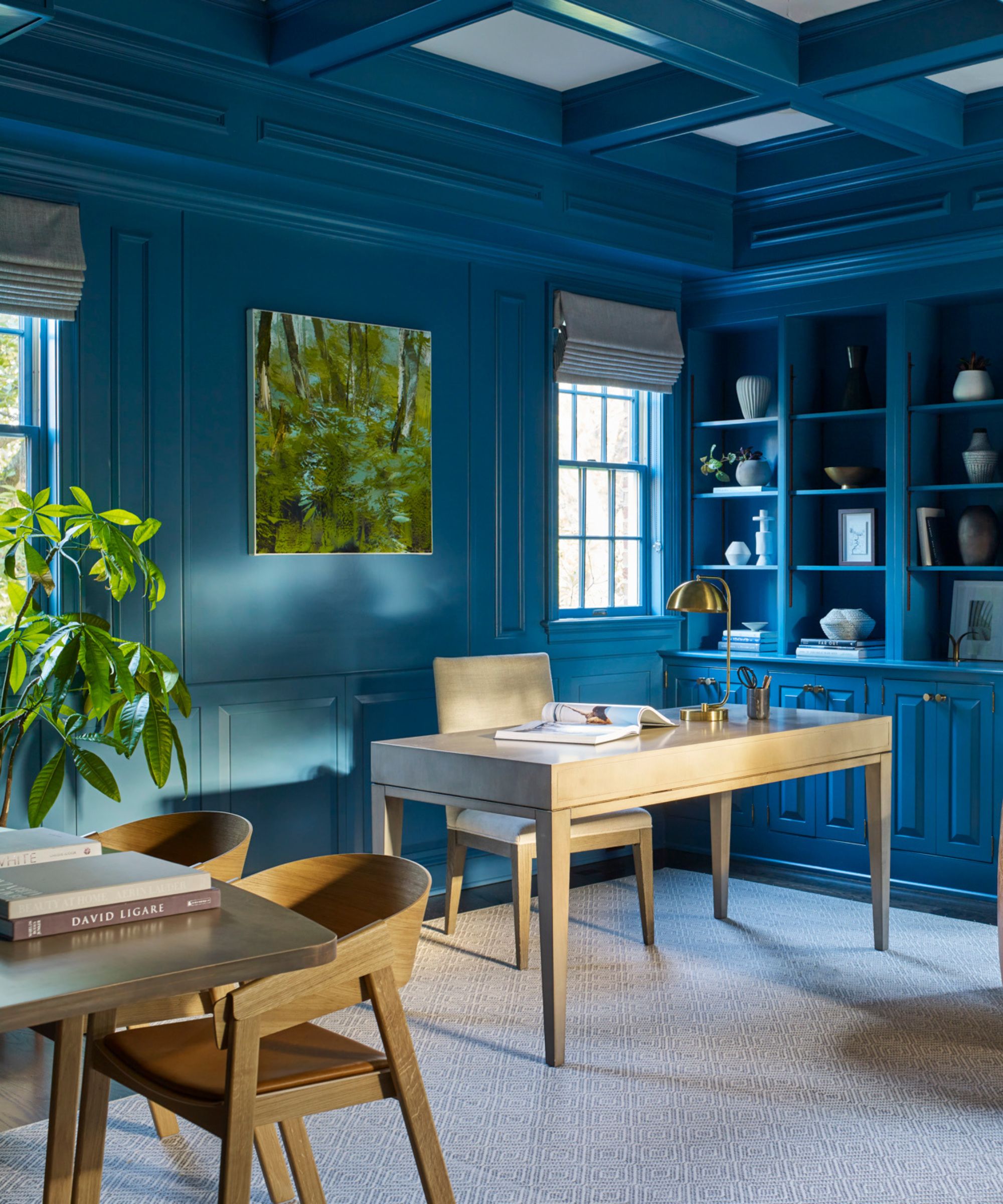
Sapphire-inspired interiors lean into decorating with blues like deep navy, inky midnight blue, and cobalt, all of which bring instant drama to a room. These tones work particularly well in traditional homes and spaces with good natural light.
Paint all four walls for a cocooning feel, or use a vibrant cobalt blue as an accent by painting interior doors, built-ins, or wainscoting in interior designer-approved dark blue paints like Hale Navy by Benjamin Moore, Dark Cobalt Blue by Behr, or the deep Hague Blue by Farrow & Ball. If you prefer something subtle, an inky navy couch or Joon Loloi’s Rosamund Chair in a luxurious velvet can deliver the effect without the commitment.
October: Tourmaline
(Image credit: Nicola Harding Design)
Pink tourmaline brings a sense of warmth and personality to a space, offering a lively alternative to neutrals while still feeling elegant and grown-up. October’s birthstone translates into interiors through vibrant rose pinks, warm berry hues, and soft rhubarb hues – and they’re surprisingly versatile.
For a bold approach, tourmaline pink makes a stunning bedroom backdrop, especially if you introduce texture with this pink Grasscloth Wallpaper from Wayfair. If you prefer a lighter touch, paints like Rhubarb by Benjamin Moore and Carmine by Little Greene bring freshness, while on the dustier side, Setting Plaster by Farrow & Ball is a designer favorite. Layering pinks with warm neutrals or deep burgundy tones creates a palette that feels grown-up rather than sugary sweet.
November: Citrine
(Image credit: Mylands / @sella.concept)
November’s birthstone is the warm-colored citrine, which ranges from a pale yellow to a rich, golden ochre, sometimes with brownish undertones, and is a great way to take this year’s butter yellow trend and warm it up for fall.
Think burnt butter, ’70s amber tones, and honeyed gold shades like Earthy Ochre by Sherwin-Williams, which is on the more subtle end of the palette, Ochre by Benjamin Moore, which gets more golden, or the ever-popular India Yellow by Farrow & Ball. Pair the Rodin Ochre Velvet Dining Chair by Athena Calderone for Crate & Barrel with deep browns, rust, and warm woods for a rich dining room palette.
December: Turquoise
(Image credit: Alex Edwards)
While turquoise might not be an obvious color to decorate with, you’d be surprised by how much designers love this vibrant blue-green. Lively, uplifting, and full of character, turquoise carries an unmistakably joyful energy, making it a brilliant choice for spaces that could benefit from a touch of freshness.
Whether your interior design style leans coastal, bohemian, or more eclectic in your style, turquoise has a way of instantly enlivening a room. For a confident approach, consider using turquoise shades like Sea of Turquoise by Glidden or Turquoise Blue by Behr on a kitchen island, freestanding pantry, bathroom vanity, or even front door. For accessories, Jonathan Adler’s range at Saks Fifth Avenue is full of bright turquoise pieces.
Shop Your Birth Month Colors
Whether you prefer bold statement color or subtle hints, decorating with your birth month shade is a surprising yet personal way to refresh your home. Looking for more unique color trends? These unexpected color combinations should inspire.