
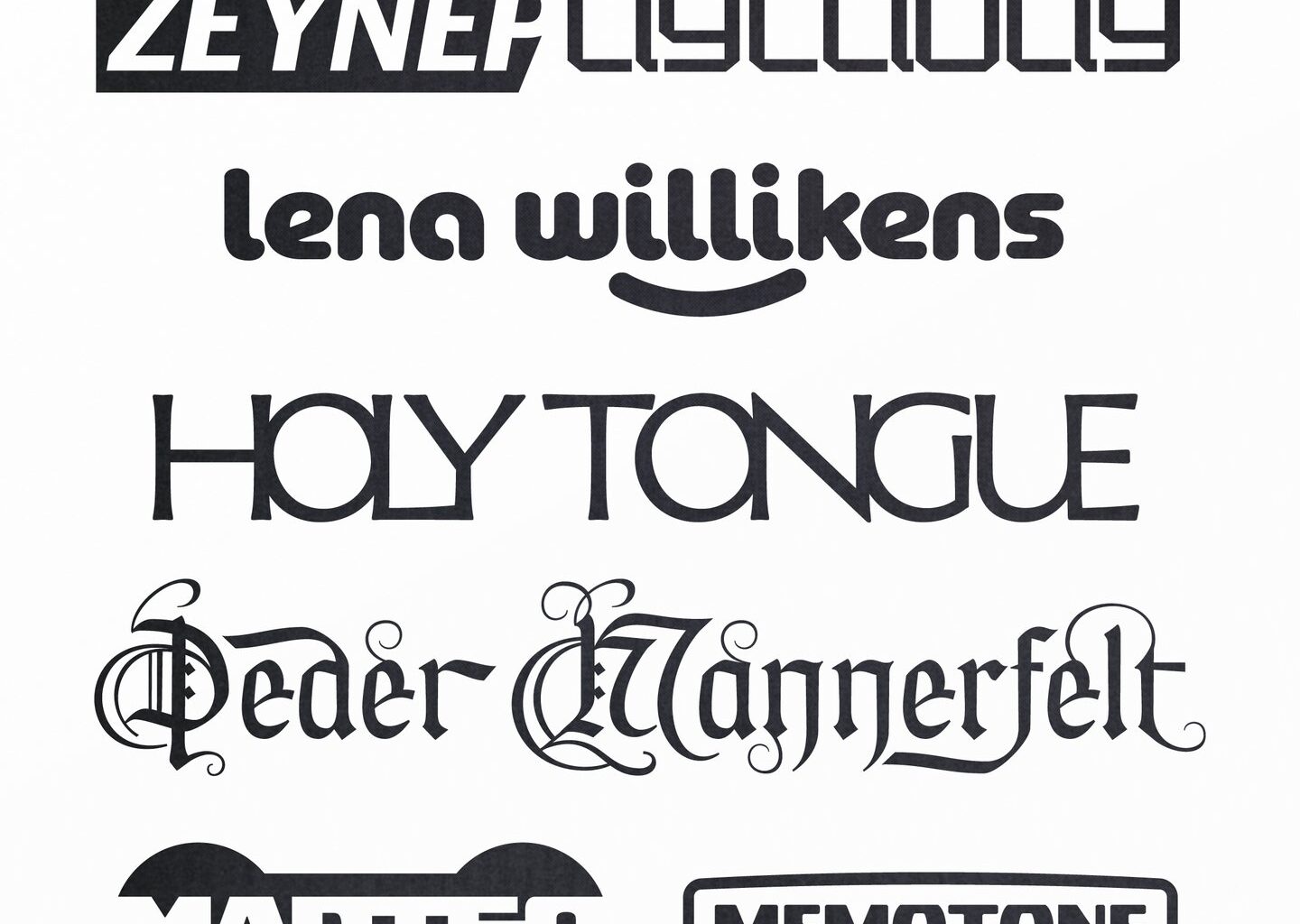
In most of his recent work, the designer draws type from scratch, whittling away at letterforms and building them from the ground up. As a starting point for projects, he sometimes digs into an archive of ongoing observational sketches – or what he calls “a bank of half-baked typefaces” – he’s developed in the quieter moments. Each project has been presenting its own challenges though, and Ciaran never quite knows what will come in useful: “If it’s for Martine Rose, the objective is to add personality or emotion to the garments in a way that fits into her world. If it’s for a gig poster, such as an Accidental Meetings night, the intent is to keep is relevant to the acts on the lineup in a way that stands out in different formats.”
For Ciaran, taking the time to craft custom type styles gives a brand “more freedom with tone of voice”, and nailing this as a vital aspect of a project’s visual direction early on helps him to “avoid using superfluous decoration and fodder later on as a distraction”. Tailoring the suit that letters are wearing allows the designer to craft more of a sense of meaning to any language a client wants to put front and center in a creative commission. The only challenging side to the job is how time consuming it is – “but I use that as an excuse to really slow down and zone out”, Ciaran says. The flow state is easily found by the designer in the sketching and development of these alphabet shaped ideas – stretching out letterforms, tightening up the kerning and rounding corners becomes a speculative and intuitive process all in one.
For logomarks, Ciaran is finding versions that “employ some element of intrigue and mystery” to be the most successful in creating an authentic narrative for a brand; a good gauge of whether something works being whether it can sit by itself in monotone and still hold its own. In his recent project with Quade, a band known for its folky experimental sound, the creative designed the album cover for their recent release: The Foel Tower. “The music itself deals with conflicting feelings of the British landscape and was recorded in Nannerth Ganol Studios, within the Elan Valley – an area that was dammed to make way for the Elan aqueduct that sent water to Birmingham and that also provided a testing site for the bouncing bomb” Ciaran shares. “I wanted to create an icon that fused this destruction and pillaging of nature with a visual language that connotes appreciation and a change in attitude.”
From here the designer’s aim is to stay type-focused and at some point turn some of those “half-baked” sketches into fleshed out typographic projects of his own, getting them out there for others to see, “but for now I’m happy creating bespoke mini-identities and world building”, Ciaran ends.