![]()
Joe Maring / Android Authority
TL;DR
So far, Google’s At a Glance widget for Pixel phones hasn’t isolated its text from your phone’s background.
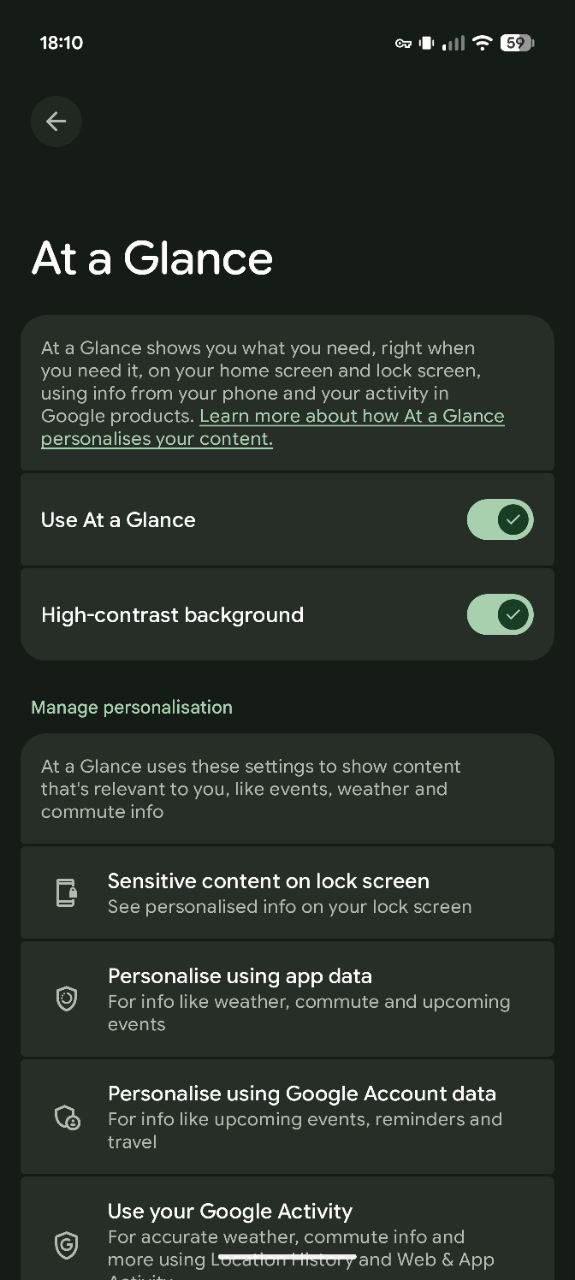
Last year, we saw Google begin work on a new high-contrast mode that helps text stand out.
That’s now finally starting to show up on some user devices.
We ask a lot of our home screen. We want easy access to our most-used apps. We want to customize it with a personal wallpaper. And a lot of us want to add extra info or functionality with the help of a couple well-placed widgets. But with all of that going on, your screen risks getting a little busy, potentially making useful data harder to spot. Last year, we saw Google working to bring a new high-contrast option to its At a Glance widget, and now it appears that it’s finally rolling out.
Don’t want to miss the best from Android Authority?
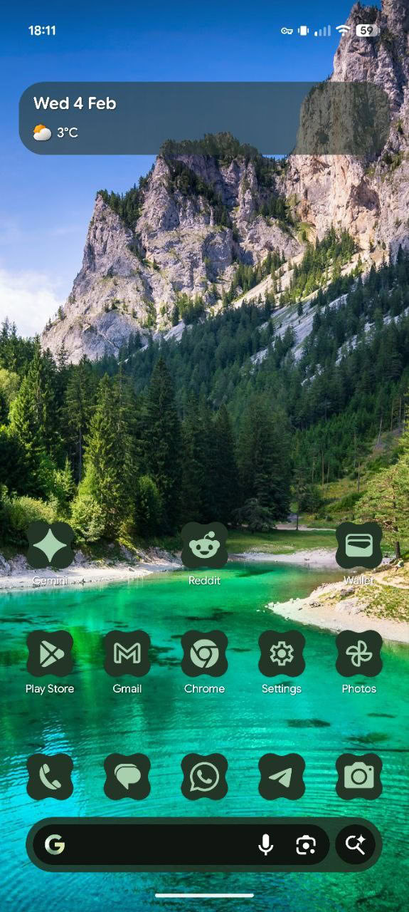
Like many of the best updates to apps, this one’s incredibly simple: The At a Glance widget simply lays down a shaded background that helps prevent its text from disappearing into your wallpaper. It works with both black and white text, and supports the lock screen as well as your home screen.


It’s taken a few months, but we’re now finally seeing reports of it hitting user devices, like Reddit user Natural_Aide_2076‘s earlier this week. While they make mention there of that odd Play System update November issue we spotted the other day, it doesn’t appear that this update alone is sufficient for the option to arrive, and it may also require a server-side switch Google needs to flip for individual users. So far, we’re only seeing this for testers running QPR3.
Hopefully Google keeps that rollout going, because this is one change we’ve been looking forward to for a while. Even if you don’t love the aesthetic of this oval undeath the widget’s text, you’re always free to just leave it turned off — no harm, no foul.
Thank you for being part of our community. Read our Comment Policy before posting.


