
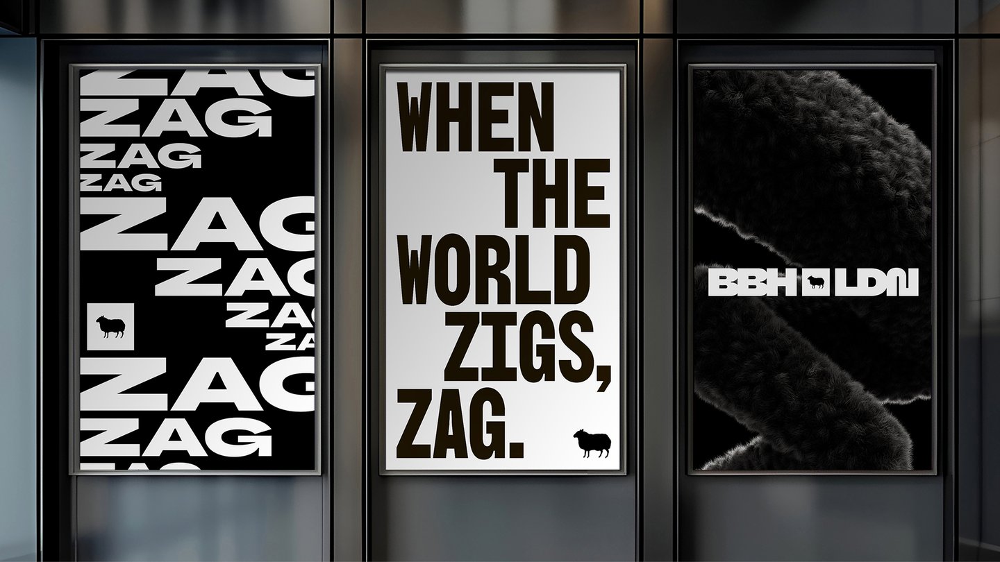
Design director Adam Buckland says that Studio Drama was a massive part of bringing to life the entire project. By sharing references, thoughts, rough sketches and half-baked ideas, BBH and Studio Drama agreed to never play it safe. When something goes well, Adam calls it “zagging”. Chris Nott, co-founder and type director at Studio Drama puts it best: “From day one, this felt like a true collaboration. Together we set out to build a contemporary British grotesque that respected BBH’s heritage while giving it room to push forward.”
“Working with Studio Drama made all the difference. They brought the craft and the confidence to explore properly, and to know when something needed pushing further or calming down,” says Adam. “We made the BBH typeface free to the world. We didn’t want it to just be our difference. We wanted other designers, creatives, people to use it out there in the real world and find their own. That felt like the most honest version of zagging.”
After “hundreds of scribbles”, the team defined the shape of the zag, then CGI gave it freedom to exist in any form, turning it into what Sophie Harper, 3D designer, calls “flexible, ownable brand assets”. Some of the most striking are zags that play with texture, such as a zag that is a melted, swirling Tesco shopping trolley. Another takes the form of a Magnum ice cream – its iconic texture is immediately recognisable, making the zags even more impressive. Each piece of design hardwires BBH’s classic black sheep into the identity.
Oded Shein, motion lead on this project, got to flex new skills using Cavalry and After Effects to create a definitive motion language that fit the BBH mantra. “Every movement in the new visual identity has a reason,” says Oded. “ Type movement ranges from simple and fluid to more complex, zag-inspired gestures, using weight morphs and zag glyphs to bring attention to key words. Curves are set to nearly extreme easy-ease, creating dynamic movement that keeps the excitement and pace high, while allowing match cuts to hit that sweet spot at the peak of the curve.”
Two years in the making, this BBH rebrand is not just a historic moment for the agency, but a testament to the amount of effort put in by the design teams. The motion and 3D was all done in-house, whilst the typeface was in collaboration with outside ideas. In true BBH fashion, this visual identity invites fellow creatives to zag together.