
INT: With a project that is five or six years in the making, how much has changed along the way, and how do you stay motivated?
SM: Luke, Johannes and Chris Lawson (who I share a studio with and who’s working on a book for Schengen), I couldn’t have done it without them, that’s what motivated me, that’s what gave me structure. Conversations with Luke were just exciting, he brought a great energy and curiosity to things.
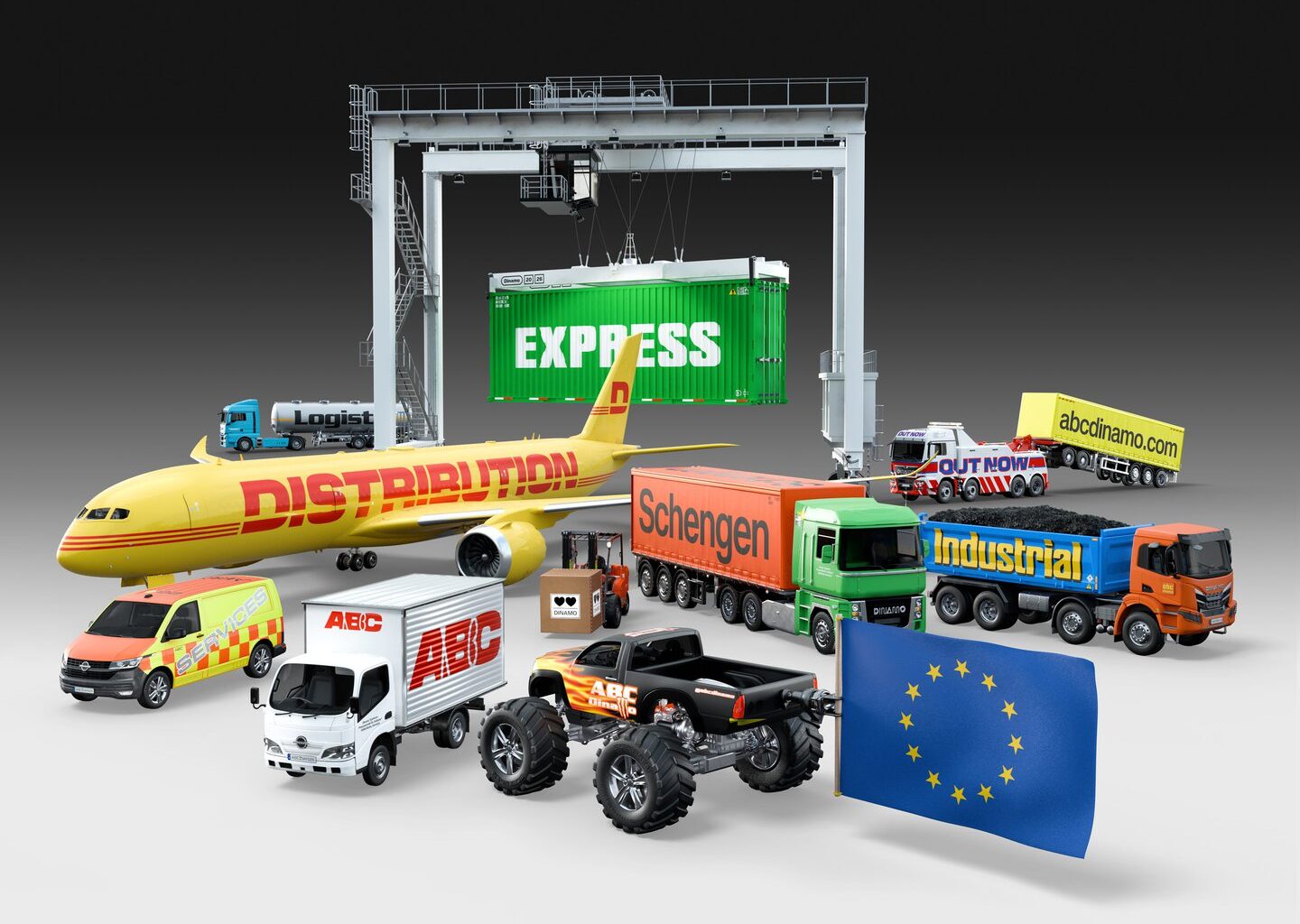
JB: Seb has been orchestrating a symphony with lots of different instruments, lots of different players. In this long process he’s been synchronising the fonts over and over, refining and changing proportions, and I think one of the things that’s also special about Schengen is that you can interchangeably use the fonts. The wishful thinking is that somebody would combine Schengen – different Schengens – like we see on the reference vehicles. In terms of drawing and managing this monster project, you had moments where you had to suddenly rethink a structure or proportion, maybe two years in, and you had to keep updating. How did you go about that, and keep going?
SM: We had to constantly look at the designs in relation to each other, questioning what these different typographic voices are good at, and how they should communicate. Schengen A is really concerned with capturing the tension between Helvetica and Eurostile, but also logically it’s probably the easiest typeface that you’d set in long form, so the spacing and the proportions should work in that space. When we went up to C, the idea was that the spacing got tighter and the proportions and the rhythm got more uniform because when you widen a typeface – if you have very large differences in proportion – then they stop working as well at large widths.
Figuring out that side of the A, B, and C typeface allowed us to move on to Line, Zone and Core because we had a kind of more graphic side and a more usable bookish side. Soon, it became clear that Zone, Line and Core should complement Schengen B and C in their usage.
At a certain point we stopped thinking about making a set of alternates, or a set of shapes that could be used to make everything feel consistent. Like, ‘should the capital of G, of A, B and C be the same as the capital G in Zone, Line and Core in terms of the structure and base form’ – it was quite tempting in terms of driving a really clear line through the design. But it was really freeing, the admission that it doesn’t actually matter whether these are exactly the same form, because it’s about the spirit. Each sub-family, or each family, has its own alternates that relate to its own design. In some ways they’re really their own typefaces, but they’ve been designed in relationship to each other.