
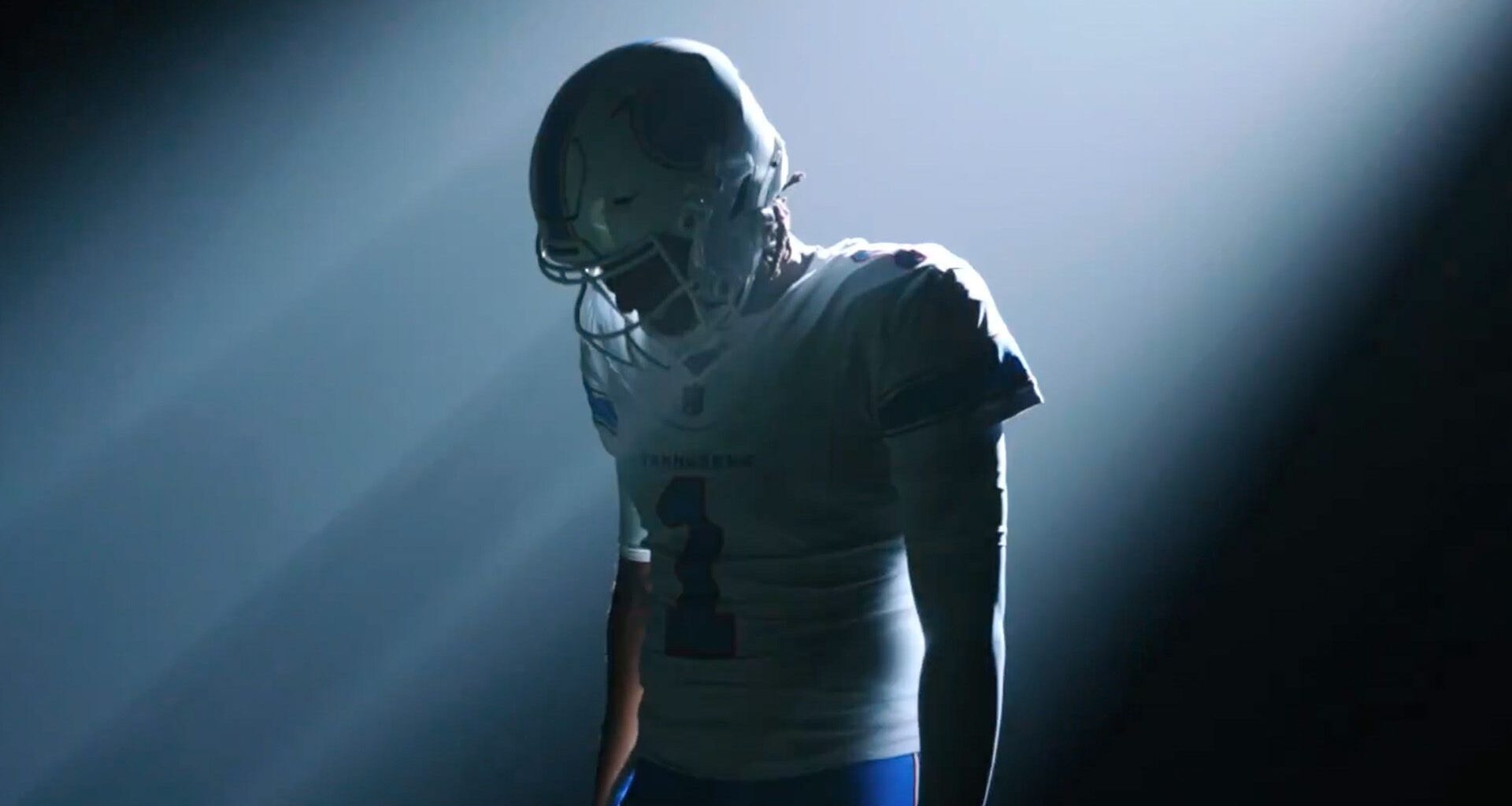
American football stars, the Tennessee Titans, have unveiled a brand new identity to a mixed reception from fans. The lighter, brighter and more playful new look has raised eyebrows for some, with many devout fans disappointed by its simplified identity.
Looking back at the design evolutions of some of the best NFL logos, it’s clear that sports fans are not easily impressed when their team takes on a new look. It’s an understandable gripe, as team logos are much more than empty design – they’re symbols of identity and pride. Get the rebrand wrong, and it’s not just the opposing team you’ll be going up against.
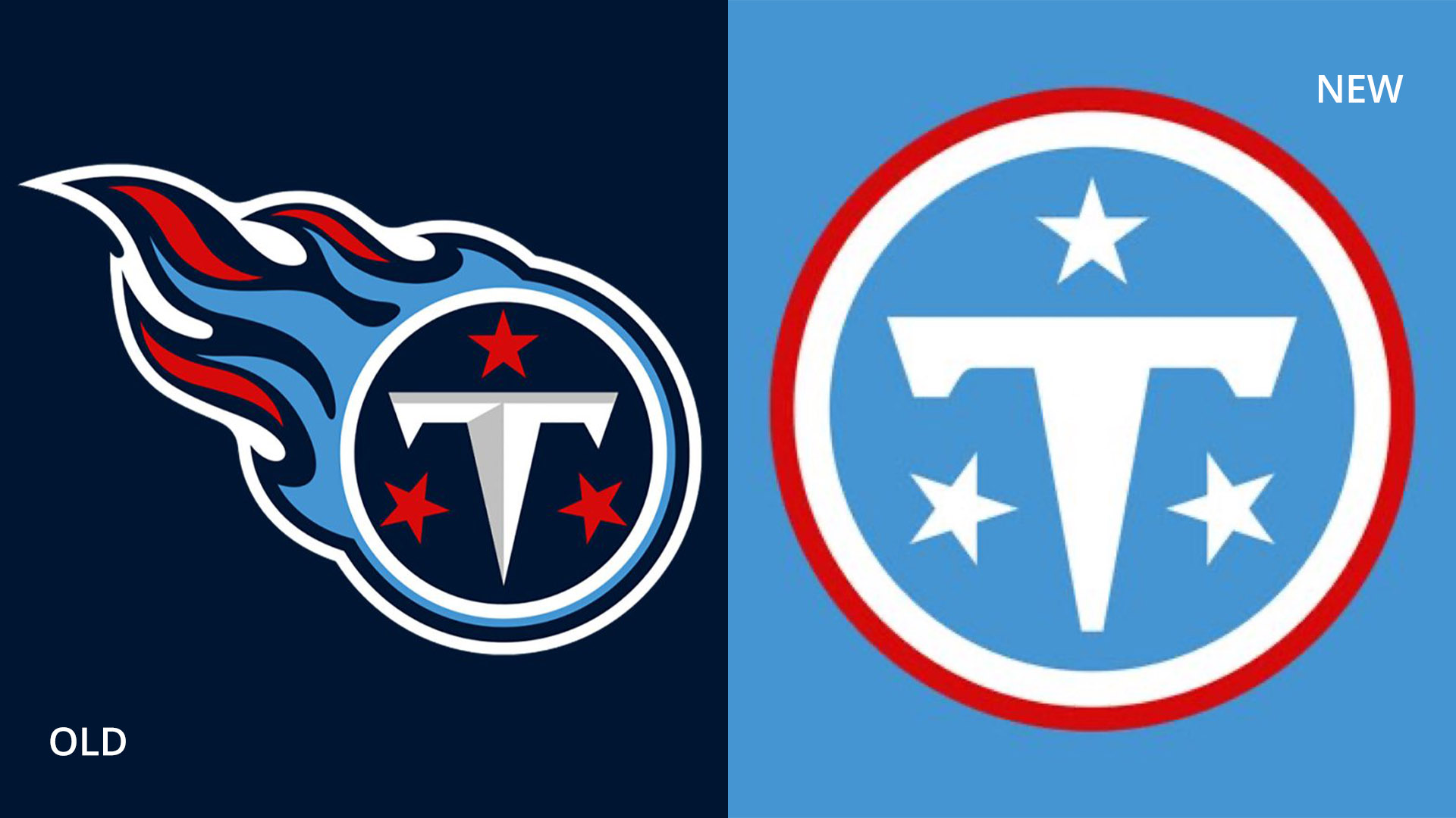
The new Tennessee Titans logo is a brighter take on its predecessor, replacing its broody corporate navy with a soft light blue. Simplifying the design, the new emblem removes the Titan’s iconic flame motif, opting for a simple red outline. (I can’t be alone in thinking it’s giving slight Captain America vibes.)
Article continues below
You may like
“Please give my 4 month old the credit he deserves for drawing this up,” one disgruntled fan wrote. “It’s amazing how logos continue to regress,” another added, while one critic theorised, “Somebody quit in the middle of making the real logo and they assumed it was finished and ran with it.” Others drew logo comparisons, with one fan questioning “What’s gonna be the new logo after Elon sues?” gesturing to the ‘T’ motifs’ supposed similarity to the Tesla logo.
(Image credit: Tennessee Titans)
For more logo news, check out how sports fans used AI to recreate the new Bulldogs logo or take a look at the best sports logos of all time.