
Inspired by a recent article at The Athletic that asked various staff members to name the best and worst uniforms in every NFL franchise’s history, we’ve decided to share our opinion on the same subject.
This eight-part series kicks off with the AFC East and will work alphabetically through the conference before moving onto the NFC. We’d love to hear your thoughts for each team in the comments, as well!
Buffalo BillsBest: 2025 Throwback-Inspired Uniforms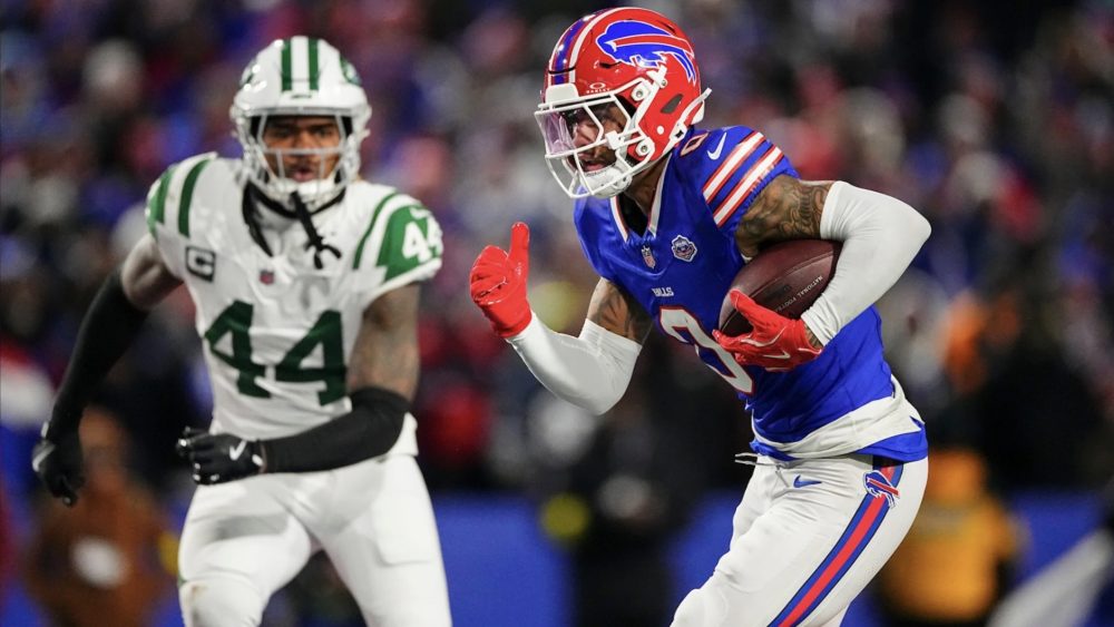
The Bills have never looked better than they did in their final game at the old Highmark Stadium, as they paired their 1987-2001 red throwback helmets with their blue home jerseys, white pants and red alternate socks. It was reminiscent of the helmet’s original run, but the jerseys are a massive upgrade over what they wore at that time.
Worst: 2002-10 Road Uniforms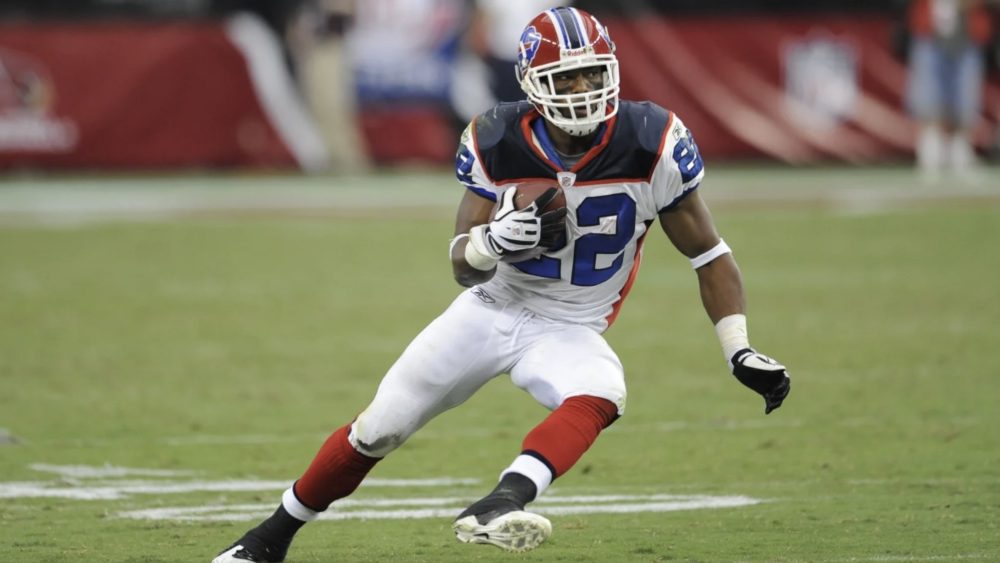
The Bills were a modern mess earlier this century, as they adopted navy blue as a primary color while relegating royal blue to the trim, had contrasting side panels on their jerseys that didn’t match the pants and unnecessarily added silver as an accent color. That road design is worse than the home, though, thanks to the contrasting shoulder yoke.
Miami DolphinsBest: 1994-96 Road Uniforms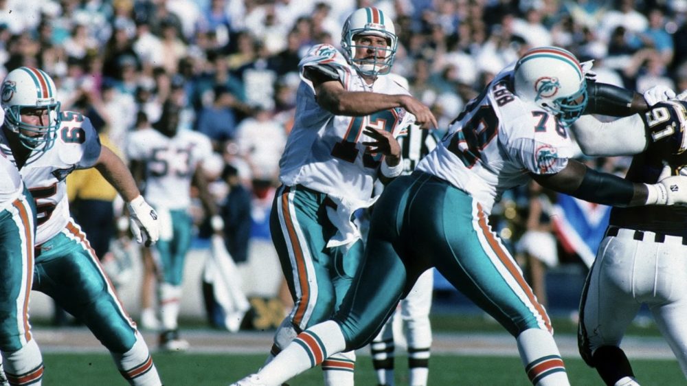
If we’re being honest, the Dolphins have worn several different uniforms that could fit in this spot, but this design gets the nod thanks to the teal facemask, the consistency between the stripes on the helmets, cuffs and socks, the logo on the sleeves and the bold orange stroke around the (perfect shade of) teal numbers.
Worst: 2016 Color Rush Uniforms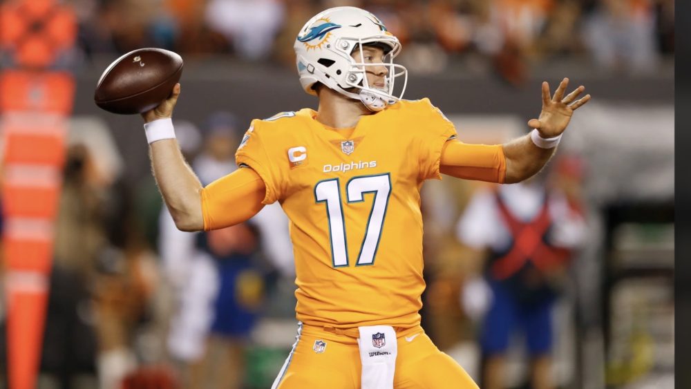
The Dolphins’ wore orange alternate jerseys from 2003-04 and 2009-10 to much fanfare, so their 2016 Color Rush uniforms should have been better received. But when matched up against the deeper shade of orange of the Cincinnati Bengals, they were far too light. Perhaps they would have looked better in the sunlight or under the lights at Hard Rock Stadium.
New England PatriotsBest: Current “Pat Patriot” Throwback Uniforms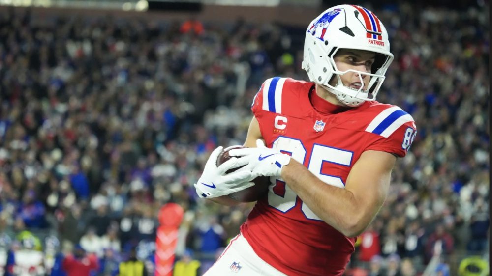
While I prefer the Patriots’ current “Flying Elvis” logo to “Pat Patriot,” there’s something nostalgic about their 1984-92 home look, particularly the consistency of the stripes on the helmet, shoulders, pants and socks. Those details look even better on modern templates, which is why the throwbacks get the nod over the original set.
Worst: 1993 Home Uniforms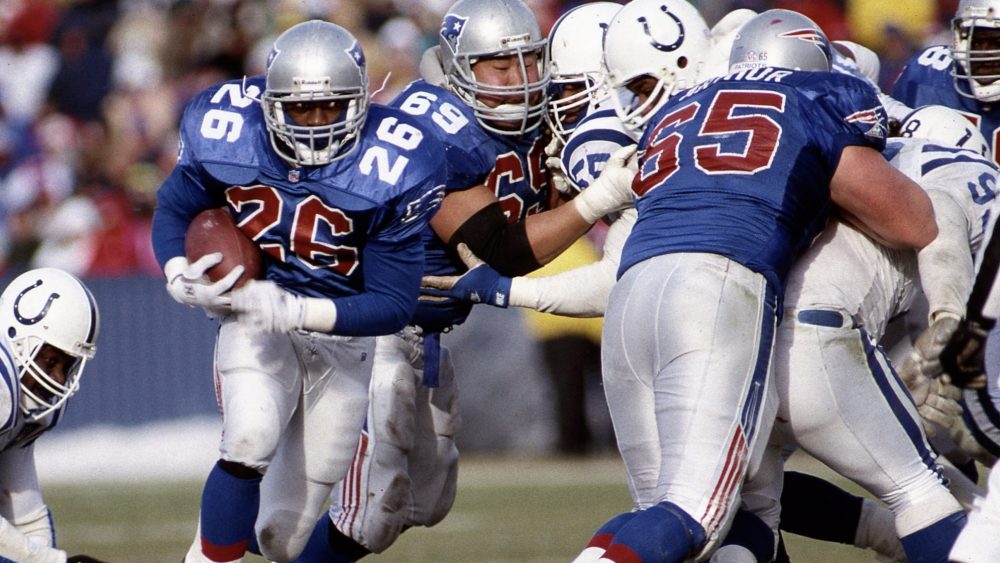
There’s an argument to be made that their dynasty-era uniforms belong in this spot considering they share similarities to the Bills’ uniforms above, but the Patriots’ 1993 home uniforms made them look like a bland expansion franchise, as the silver facemasks, red numbers and logo-inspired pants stripes were replaced after just one season.
New York JetsBest: Current “The Classic” Throwback Uniforms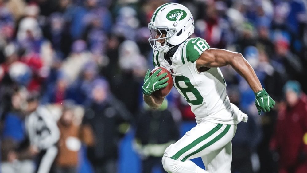
The Jets manufactured the best-looking uniforms in franchise history in 2024 when they combined details from their 1968 design, worn in an upset of the Baltimore Colts in Super Bowl III, with their 1998-2018 road set. They also incorporated their current shade of green, which bridges the gap between their 1968 Kelly green and 1998-2018 Hunter green.
Worst: 2007-11 “Titans of New York” Throwback Uniforms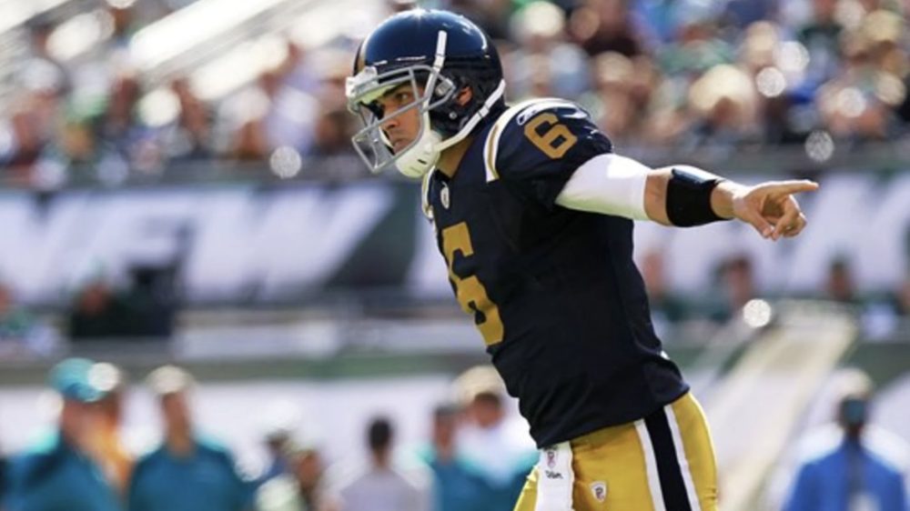
Whereas some teams – like the Patriots above – have benefitted from modern fabrics, the Jets did not have that luxury when they introduced their “Titans of New York” navy blue and gold throwback uniforms, which were based on their original 1960-62 design. In fact, Reebok’s fabric made what could have been a great design look quite drab.
Photos courtesy of @BuffaloBills, @MiamiDolphins, @NFL, @Patriots and @nyjets on X/Twitter.