
This sentiment naturally led the team into typography as a focus for the project, and, consequentially a collaboration with UK-based foundry Frost, in order to build what would become six bespoke typefaces with 48 new styles for Rapha including Rapha Sans, Rapha Serif, Mono and Semi-Mono, in a type-led direction for the brand’s visual world. A connected system of fonts that were capable of moving from campaigns to technical information and digital interfaces, this new typographic fabric was designed to bring Rapha back up to date with a contemporary and technical edge. “As Rapha evolved, its existing typefaces felt too rooted in heritage to fully represent its growing presence within the professional side of the sport,” explains Darren. “We wanted to create something that drew on cycling’s visual heritage without being constrained by it.”
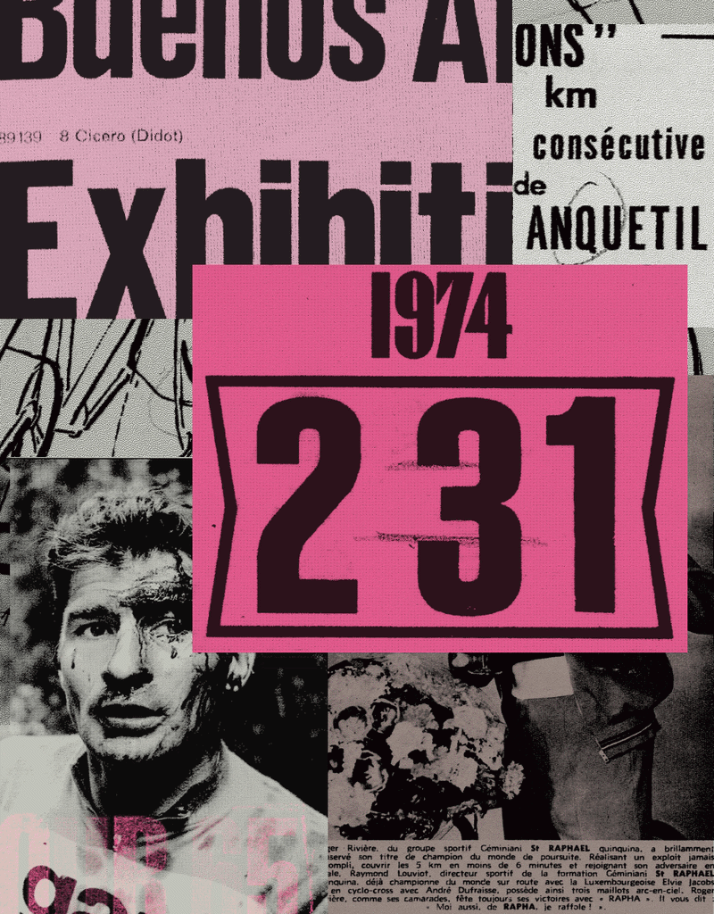
The initial research for the font family was rooted in the sport itself – historic cycling publications, race ephemera, event graphics, race jerseys and even technical manuals were all dug up from Rapha’s archive to imagine new directions. But slowly this search spilt outside the category and the team at Six found inspiration in type-led advertising of the 1970s, 80s, and 90s, “a period when typography often carried as much emotional weight as imagery itself”, Darren says.
Whilst the core script that defines Rapha‘s logo mark still remains, this new set of typefaces offer up something more contemporary: “We wanted the typefaces to feel heritage-informed but not nostalgic,” says Darren. “The goal was never to recreate the past. It was to understand what made those references enduring and build something new from them.” Rather than designing typefaces in isolation, Six and Frost were constantly testing ideas across Rapha’s campaigns, apparel, editorial layouts, digital products, motion and more to ensure the new brand framework was as flexible as possible. The design system aims for type to carry some of the “cadence, tone, and personality normally associated with spoken language,” Darren ends. “The typefaces provide the voice,” he says “But the typesetting is what gives it rhythm and personality.”