
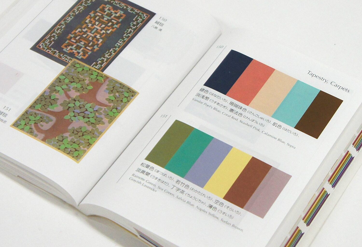
“A Dictionary of Color Combinations” is small enough to comfortably hold open in one hand — and yet few books its size can claim a similar influence on design, art and fashion both within Japan and beyond.
On Instagram, reel after reel has readers flipping through the book’s pages and showing off their creations: an outfit of ecru trousers, a lavender shirt and warm brown leather boots; a room with walls painted shades of deep slate olive and dusky green with a vermillion and crimson daybed; even a glam makeup look of goldenrod, mahogany, mint and deep sea green.
Though it seems designed precisely for the visual churn of social media, the painstaking studies and 300 color paintings that comprise “A Dictionary of Color Combinations” date back almost a century — to printmaker and color theorist Sanzo Wada.
Born in Hyogo Prefecture in 1883 — an age when Japan’s modern, commercial art industry was starting to develop — Wada studied under Seiki Kuroda, one of Japan’s most important educators of Western art theory. He graduated from the Tokyo School of Fine Arts (now Tokyo University of the Arts) in 1904 before traveling through Europe for the better part of the next decade.
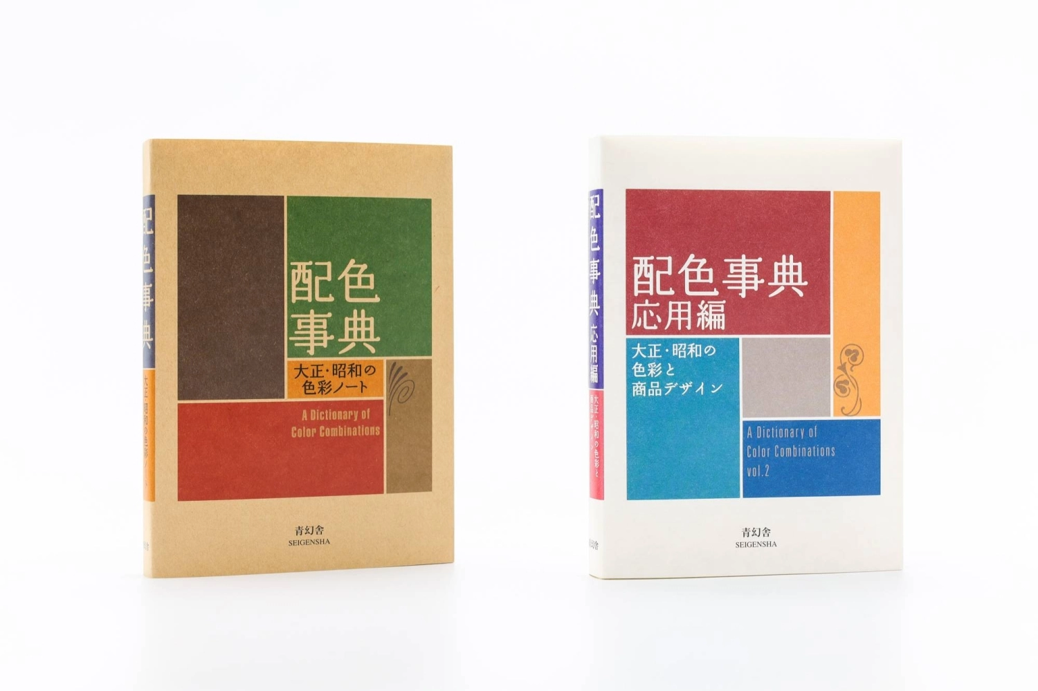
The two volumes of “A Dictionary of Color Combinations” summarize artist and art theorist Sanzo Wada’s work originally published across six books in the early 1930s.
| SEIGENSHA ART PUBLISHING, INC.
Back in Japan, Wada, then a professor at his alma mater, was hired to design an official poster for the 1940 Summer Olympics to be held in Tokyo. Though the Games would be canceled due to the outbreak of World War II, Wada’s poster — a black, white, silver and cream depiction of an athlete and a Buddhist guardian deity gesturing into the distance with Mount Fuji in the background — remains today a symbol of the first Olympic Games to be held in Asia.
Wada also helped coordinate the Heian Period (794-1185) kimono and armor for the 1953 samurai classic “Gate of Hell,” which received an Academy Award for Best Costume Design.
“The way that color is used throughout Japan today is predicated on the lifework of Wada Sanzo,” says Ian Lynam, designer and associate professor of graphic design at Temple University Japan.
Derived from “Haishoku Sokan” (“The Complete Collection of Color Combinations”), six tomes of color studies that Wada published between 1933 and 1934, “A Dictionary of Color Combinations” was published in 2010 by Kyoto-based Seigensha Art Publishing (a second volume followed in 2020) as an abridged introduction to the designer’s work.
In the tradition of the bunkobon (small-format Japanese paperbacks), “A Dictionary of Color Combinations” is pocket-size and engineered for portability. Meant to be used as a quick-reference guide, it demands a fraction of the space of a coffee-table monograph and even includes a selection of swatches made to be cut out and used.
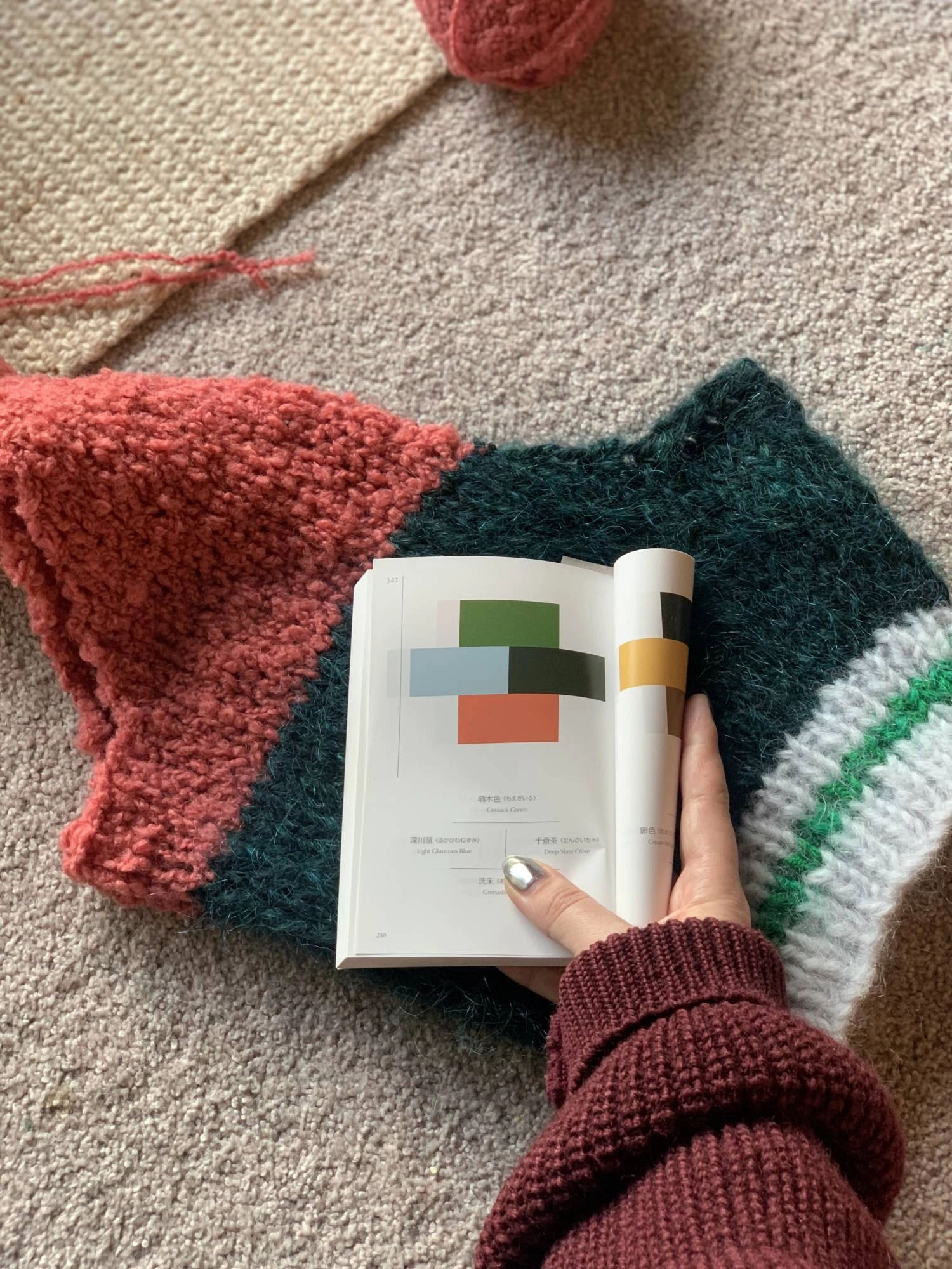
Sydney-based knitwear designer Allie Buckley uses “A Dictionary of Color Combinations” to create vests and other pieces of apparel.
| ALLIE BUCKLEY
Yuko Fukuoka, deputy editor-in-chief at Seigensha, says that rather than the result of a choice to capitalize on a nascent trend, the decision to publish “A Dictionary of Color Combinations” in 2010 spoke to the universality of Wada’s work even 80 years down the road.
“There wasn’t any specific event or a feeling that it ’had to be right now,’” Fukuoka says. “Rather, the underlying philosophy was that color and color combinations are a matter of everyday interest for many people, whether they are consciously aware of it or not.”
Republishing the book entailed more than simply scanning the old pages. Seigensha measured Wada’s original hand-painted swatches with a colorimeter, taking readings from multiple points because the colors were not perfectly even. Then they calculated averages, made proofs and compared numerical data with monitor colors and, finally, the human eye.
Seigensha also preserved Wada’s cruciform arrangement for four-color combinations, even though a more contemporary layout might have placed the colors in a simple row or column.
“This cross-shaped presentation embodies the philosophy, sensibility and originality of its creator,” Fukuoka says.
Despite the painstaking effort, no version, print or digital, may be able to capture exactly what Wada originally painted. According to Lynam, CMYK — the four-color, ink-based model of printing physical materials in a combination of cyan, magenta, yellow and black — can appear “muddied,” while RGB, the red, green and blue light-based system used on screens, can look “far too bright.”
Shades of meaning
Since its republication, “A Dictionary of Color Combinations” has garnered a cult following, particularly among international audiences.
In addition to its fame on social media, New York Magazine included “A Dictionary of Color Combinations” in a gift guide for 30-somethings (“For anyone who has wondered if they can pair, say, the lacquer-red socks, kelly-green skirt, and kabocha-orange blouse sitting in their closet.”) And in 2023, Nike drew on the book’s colorways for a line of sneakers and printed the corresponding page numbers on the tongues.
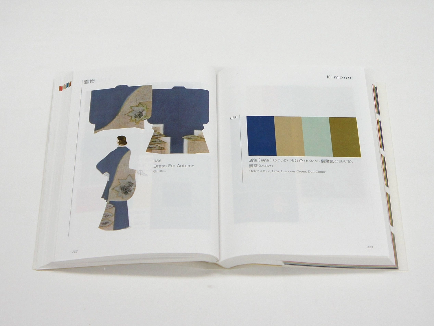
The book even includes swatches meant to be cut out and used by the reader.
| SEIGENSHA ART PUBLISHING, INC.
“We have always believed that color design is universally important across various creative industries,” Fukuoka says. “But we are truly astonished by the global impact it has made.”
One key reason for this popularity is that the book offers an accessible inventory of traditional Japanese aesthetics. To some, the colors, dense with history, read as “essentially Japanese” windows into culture.
Take, for example, “Kyō murasaki,” a rich purple that evokes the aristocracy and nobility of Kyoto, subtly distinct from the bluer “Edo murasaki” of the city that would become Tokyo.
Then there is “kikujin,” an ashy yellow-green named for the national fungus kōji — the mold essential for making miso and sake. Worn by the emperor for informal daily robes, Edo Period (1603-1867) sumptuary laws restricted commoners from donning the shade.
Though the hue reads more like moss or oversteeped green tea, “uguisu iro,” meanwhile, references the Japanese bush warbler, whose distinctive call still marks the start of spring.
“Toki iro” comes from the crested ibis, the “peach-flower bird” of the eighth-century historical chronicle “Nihon Shoki.” Though the last wild crested ibis in Japan died in 2003, their white plumage with flashes of pink beneath the wings and tail when in flight is now a sight that draws tourists in parts of Niigata Prefecture — the result of a successful breeding and reintroduction program.
While Wada’s work can serve as an introduction to Japanese aesthetics, Lynam cautions against overly simplistic interpretations.
“Wada’s color schemes were idiosyncratic and subjective, though he attempted to hybridize historic Japanese approaches to color and Western early modern color theory,” he says.
The books emerged from a moment in the early 20th century when designers worldwide were trying to systematize visual culture — among them, Wassily Kandinsky and Johannes Itten at Germany’s Bauhaus, Herbert Bayer’s proposed “universal alphabet,” and later in 1963, Pantone’s highly influential Matching System.
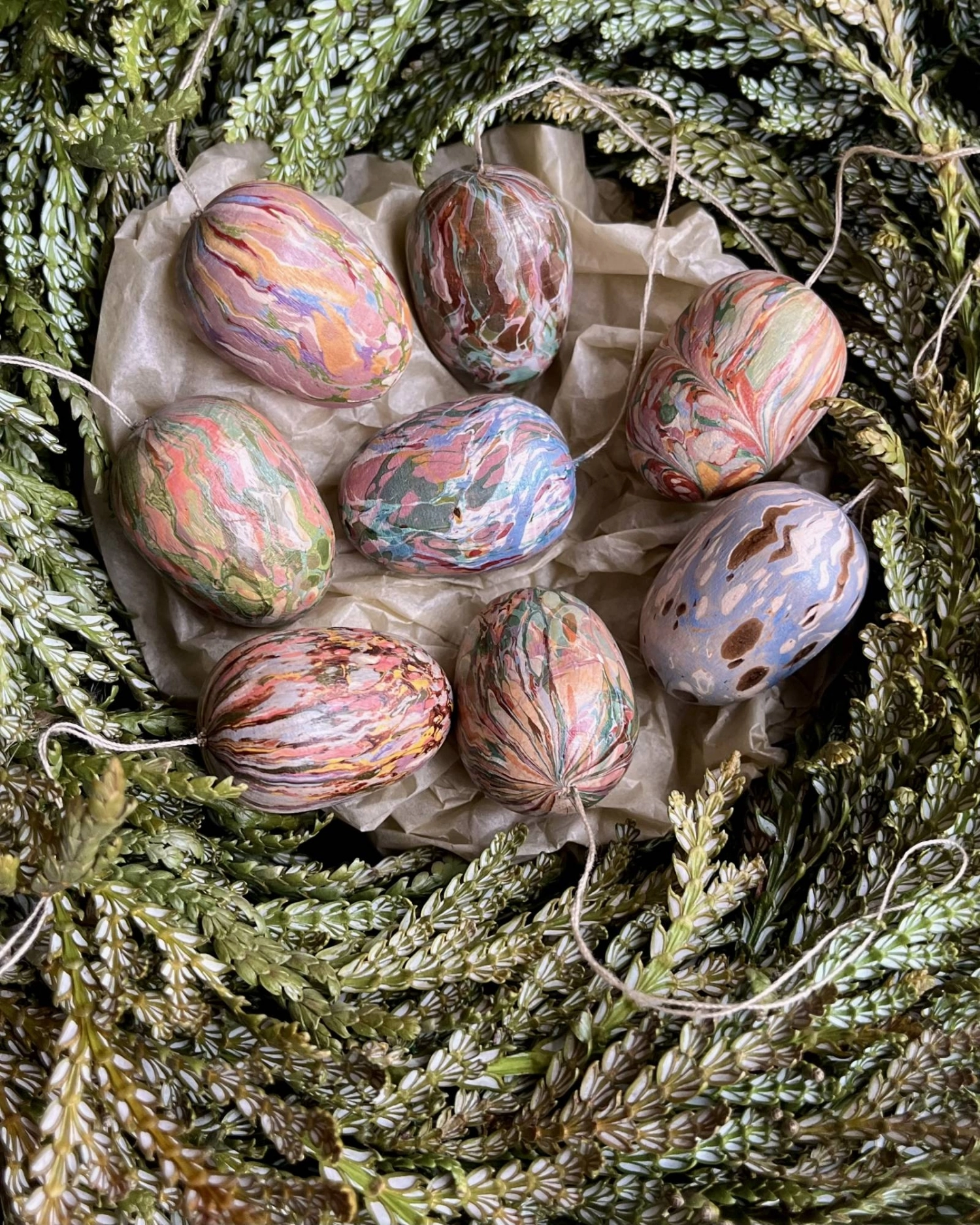
In Sweden, Hannah Aleryd Berg and Carl Krantz put the ideas of “A Dictionary of Color Combinations” to work in their marbling and bookbinding business.
| HANNAH ALERYD BERG
Wada’s work belongs to this climate of cataloguing sensation into usable systems.
“I think that foreign audiences infer some sort of Orientalism-based ’natural Japanese understanding of color’ within the books,” Lynam says. “But most of all, they are: from Japan, about design and affordable.”
A world of color
At the American Book Center in Amsterdam, manager Tiemen Zwaan, 43, has watched “A Dictionary of Color Combinations” become a steady bestseller.
“It is not an exaggeration when I say that we have sold hundreds if not thousands of copies over the last few years,” he says. “Color is such an essential part of daily life that almost everyone can benefit by having a copy.”
Tokyo-based photographer Nathalie Cantacuzino, 37, calls the books a “kind of bible for designers.” To her, the printed page offers a check against the instability of screens.

Sydney-based knitwear designer Allie Buckley says that even though “A Dictionary of Color Combinations” includes plenty of Japanese text, its presentation of colors is universally understandable.
| COURTESY OF ALLIE BUCKLEY
“Colors look so different depending on the screen you have at home, so it can sometimes deceive you,” she says.
In Sweden, Hannah Aleryd Berg, 35, and Carl Krantz, 40, have found an application for the books in their marbling and bookbinding workshop.
“Working in the same medium for a long time can lead to a sort of fatigue as you find yourself repeating the same color combinations over and over,” Berg says. “The books provide a true palate cleanser.”
In one project, Berg and Krantz drew on pairings from “A Dictionary of Color Combinations” to create hanging, marbled wooden Easter eggs. They also bring the books into workshops, where students range from graphic designers to hobbyists and amateurs working with colors for the first time since their early school days.
Meanwhile, Sydney-based knitwear designer Allie Buckley pulls from the book to determine the colors of her knitted pieces — two-, three- and four-color vests among them.
“While other resources tend to overexplain, I really enjoy the simplicity of this book,” Buckley says. “The best part is that you don’t need to know Japanese.
“The colors speak for themselves.”