
Inspired by a recent article at The Athletic that asked various staff members to name the best and worst uniforms in every NFL franchise’s history, we’ve decided to share our opinion on the same subject.
This eight-part series is now halfway through as we wrap up the AFC with a look at the West division before moving onto the NFC. We’d love to hear your thoughts for each team in the comments, as well!
Denver BroncosBest: Current Home Uniforms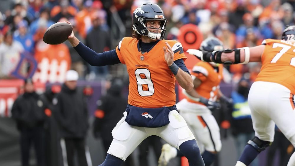
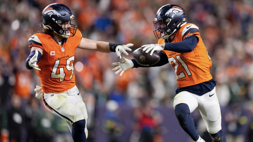
While I know a large portion of the fanbase will say their “Orange Crush” throwback uniforms, I prefer the Broncos’ current logo over their vintage “D” and navy blue over royal blue. The current home look – including their navy blue helmets, orange jerseys and white pants – is a modern evolution of the older set, with a unique shoulder and pants design instead of a common striping pattern, while the navy blue socks balances out the overall look. The ability to switch it up with orange or navy blue pants creates a nice change of pace from time to time but only diverts attention from the best look in franchise history.
Worst: 2009 AFL Throwbacks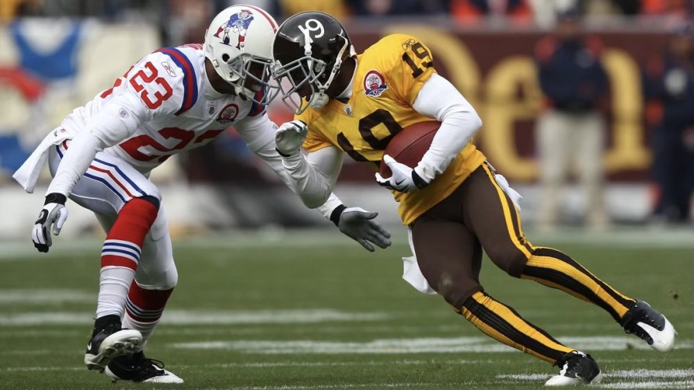
While I understand they’re historically accurate, the 1960-61 throwback uniforms the Broncos wore as part of the AFL’s 50th season celebration in 2009 were easily the worst uniforms in franchise history. Originally purchased from a college all-star game, the uniforms featured brown helmets with white numbers and a white stripe down the center, yellow jerseys with brown numbers, brown pants with two yellow stripes and vertically striped socks and were infamously burned by the team ahead of the 1962 season. A lack of yellow on the jerseys and socks made the road version more palatable when they returned in 2009, but luckily these eyesores only made one appearance that year.
Kansas City ChiefsBest: Current Road Uniforms With White Pants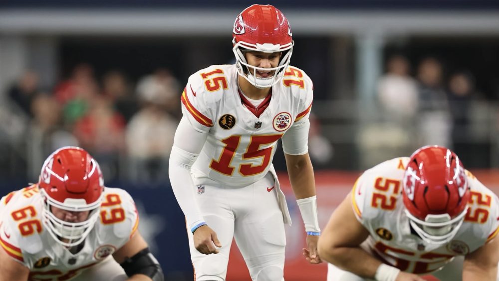
Aside from a few minor changes, including adding stripes to the cuffs in 1968 and moving them to the sleeves in 2012, the Chiefs’ uniform design has largely remained the same since they moved to Kansas City in 1963. That means you’re effectively choosing the best jersey and pants combination from red over white, red over red, white over red or white over white, with the last option recently becoming their go-to look for a late-season primetime or holiday game. Pair that with socks that match the stripes on the sleeves and pants and you have one of the cleanest road looks in the league.
Worst: 2009 Dallas Texans Throwbacks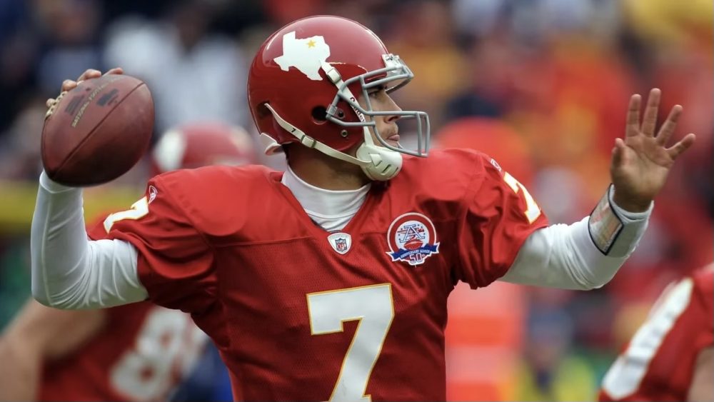
When the Chiefs – who were founded in 1960 as the Dallas Texans – were located in the Lone Star State, it was appropriate for them to have the Texas outline with a gold star marking their location on the sides of their helmets. But when the uniforms were revived in 2009 as part of the AFL’s aforementioned 50th season, it felt strange for the fanbase in Kansas City to celebrate that part of their history. Obviously, there aren’t many other options to choose from when it comes to the Chiefs, but the rest of the uniforms also felt like a stripped-down version of their usual look.
Las Vegas RaidersBest: Current Home Uniforms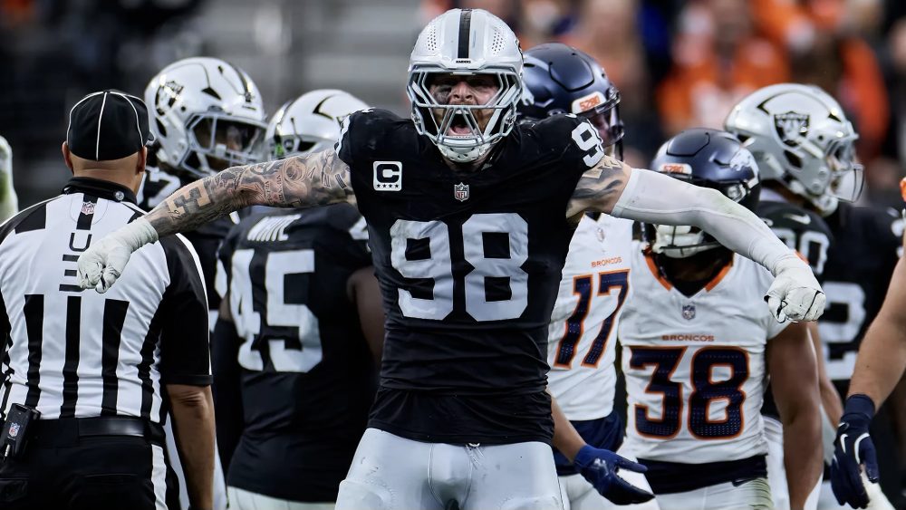
Similar to the Chiefs, the Raiders’ uniforms have largely remained untouched since 1965, with silver helmets that display their primary logo on the sides, black jerseys with silver numbers at home, white jerseys with black numbers with a silver outline on the road and silver pants with a single black stripe down the sides to match the center of the helmets. Ultimately, this decision comes down to whether or not you prefer their home or road look, and if it’s the latter, do you choose their current numbers or their 1963-64 silver numbers with a black stroke, which inspired their 2009 AFL throwback uniforms and 2016 Color Rush design, with the jerseys now being used as an alternate each season.
Worst: 1960-62 Uniforms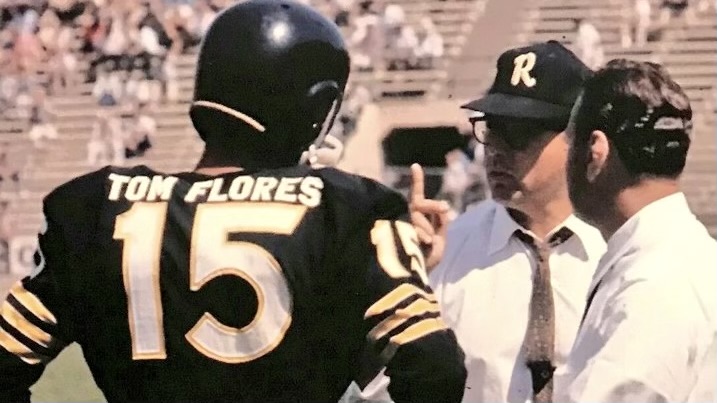
The Raiders’ iconic silver and black color scheme was not adopted until 1963 when legendary owner Al Davis took over as head coach and general manager, as they originally wore plain black helmets, black or white jerseys with gothic-style numbers and gold stripes on the sleeves and striped white pants for their first three seasons. It’s a look that, in hindsight, fits in more with the Pittsburgh Steelers’ history than their own, even though it was a slightly different shade of gold that the Steelers use and that they actually wore black helmets before Pittsburgh. The uniforms also featured the player’s full name on the back, something Davis also stripped down in 1963.
Los Angeles ChargersBest: Current “Super Chargers” Alternates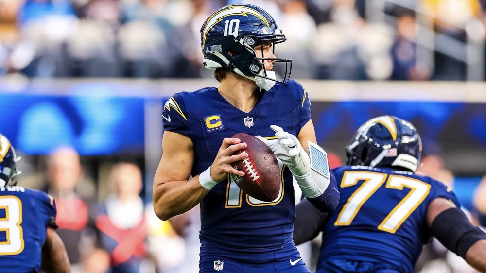
While the Chargers’ standard home uniforms of white helmets, powder blue jerseys and white or gold pants are often named as the best uniforms in the league, I respectfully disagree with that assessment, as I actually give the nod to their San Diego-era navy blue and gold scheme. Their “Super Chargers” alternate uniforms perfectly combine those colors with the great foundational design of their current uniform set, which was introduced in 2020, with simple lightning bolts on the sleeves and pants and their modern number font on the helmets and jerseys.
Worst: Current “Charger Power” Alternates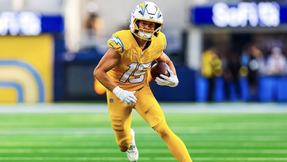
On the flip side, Los Angeles’ “Charger Power” alternate uniforms – which were also introduced last season – were a disappointing addition to a wardrobe that only needed a white road version of the “Super Chargers” set to be perfect. The Chargers’ gold pants already complement their powder blue home and white road jerseys, but when paired with their gold jerseys and socks, it’s simply too much of a good thing. Maybe it’s my bias toward their San Diego-era scheme, but navy blue accents would look better than powder blue, too.
Photos courtesy of @Broncos, @Chiefs, @Raiders, @chargers and @NFL on X/Twitter.