
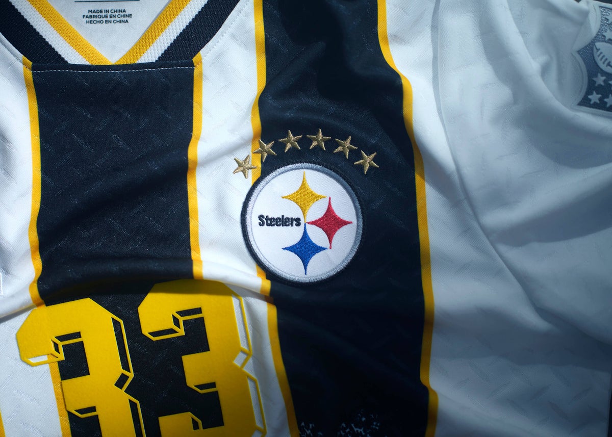
As the North America-hosted World Cup wraps up, another set of crossover jerseys have arrived and with it comes a raft of opinions.
The designs, made by Fanatics, are intended to reimagine “NFL club identity through the lens of football culture and design heritage.” Basically, the intention seemed to be create a selection of shirts that could be worn at the Super Bowl or World Cup final without looking odd.
These shirts will first go on sale at Fanatics Fest in New York City on July 16, then they’ll be available online the following day. Last year’s inaugural edition, inspired by football club kit designs from around the world, were priced at $100 each and quickly sold out.
But which ones are the best among the new batch? I have no doubt that the jerseys I think are great, will be ranked in your bottom five, and vice versa. Let us know how we did in the comments. And check out our previous rankings for the last set of crossover jerseys here.
(Note that the stars above some team logos on the jerseys represent Super Bowl wins in the way they represent World Cup wins on international soccer shirts.)
32 – Cleveland Browns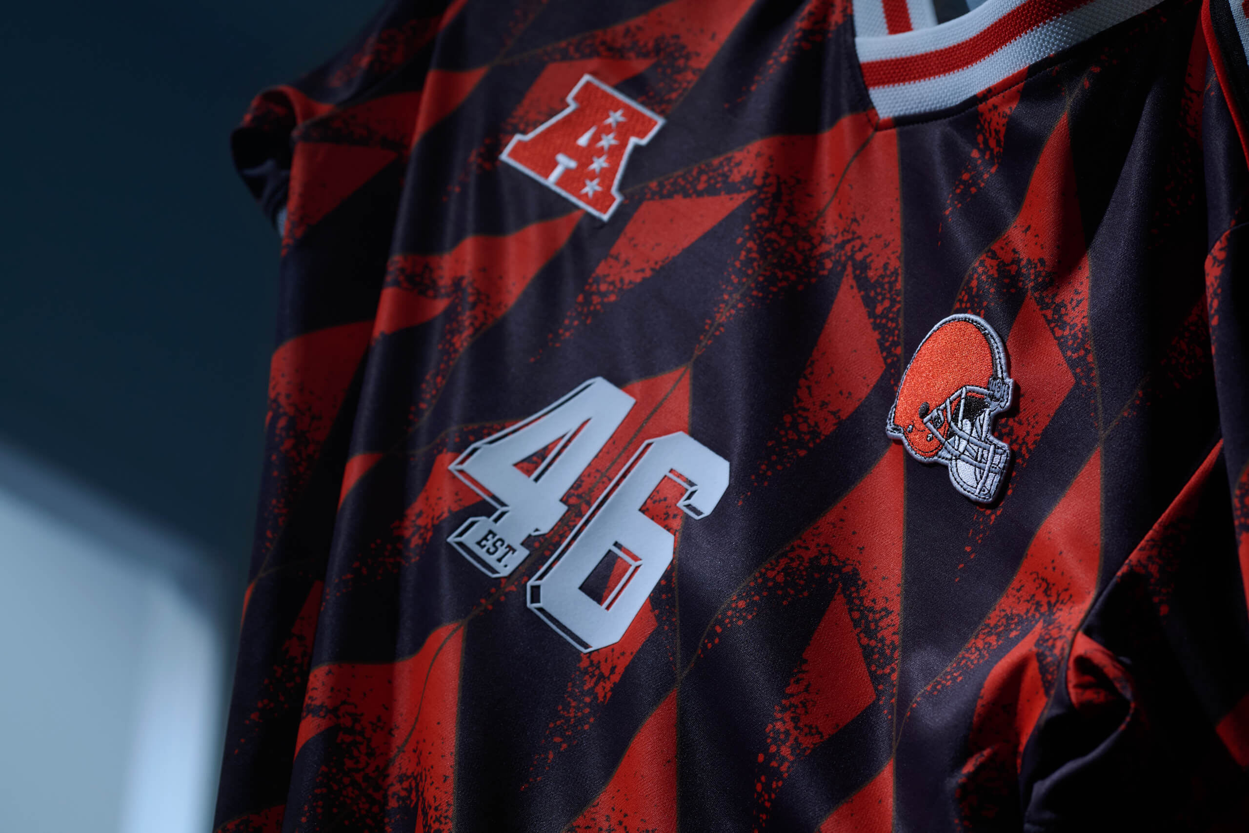
(Photo courtesy of Fanatics)
The Browns jersey looks like the design of a carpet you’d find in a one-star hotel. Everything about this kit screams ‘maybe you shouldn’t have gone with the first half price offer you saw.’
I don’t mind the shoulder area with the “Browns” wording, but this one finds itself on the bottom of the pile. It seems to take inspiration from the Netherlands’ popular 1998 shirt, but swapping vibrant orange for the Browns’ colours is a downgrade.
31 – Tampa Bay Buccaneers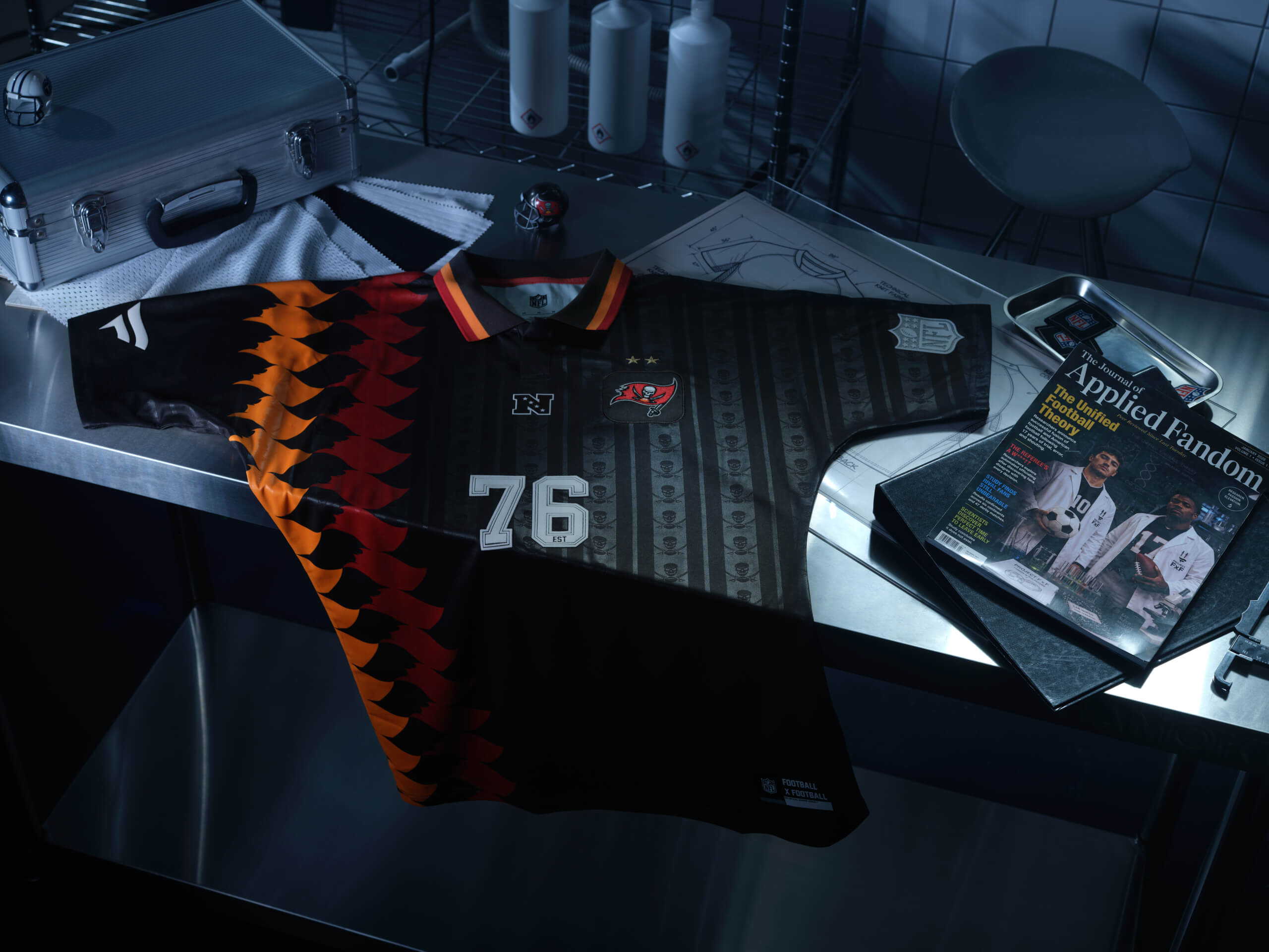
(Photo courtesy of Fanatics)
After you’ve read this article, give your grandma a call and pop ’round for a cup of tea. The chances of her having a tea towel in her draw with a similar design to this are very high.
In its defence, the pirate designs on the black/grey strips are pretty cool. But those orange and red strips, inspired by Spain’s 1994 kits, aren’t doing a lot for me. (Ed. note: This one is easily top 10!)
30 – Dallas Cowboys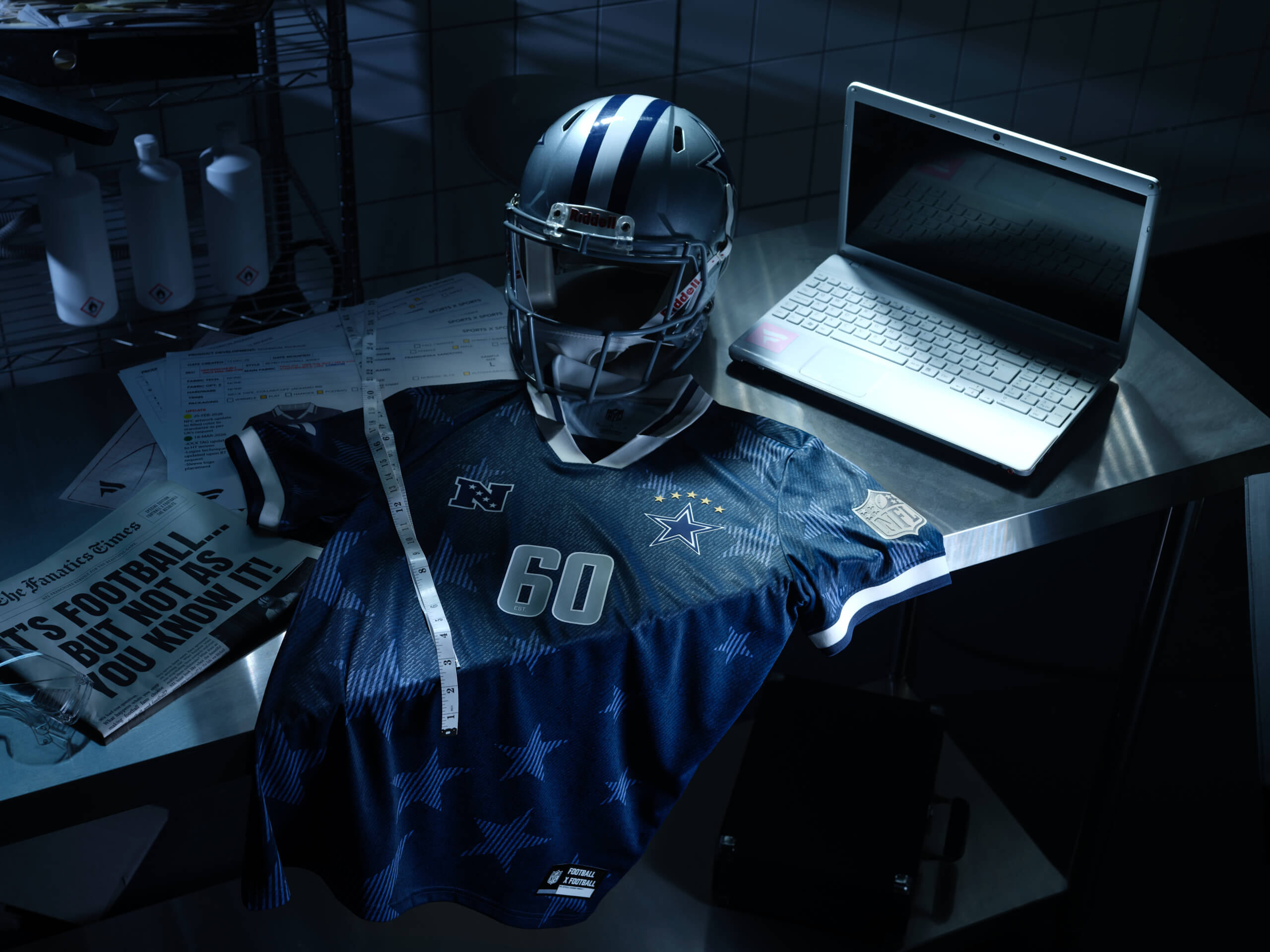
(Photo courtesy of Fanatics)
I want to like this one, I really do. The design is bold, but I can’t help but think I would only ever wear this if I was taking out the garbage or signing for a parcel.
There’s a bit too much going on here. I’m not sold on the star design or the shade of blue. This one clearly draws a direct link between the USA’s opinion-splitting 1994 “denim kit” and “American’s Team.”
29 – Arizona Cardinals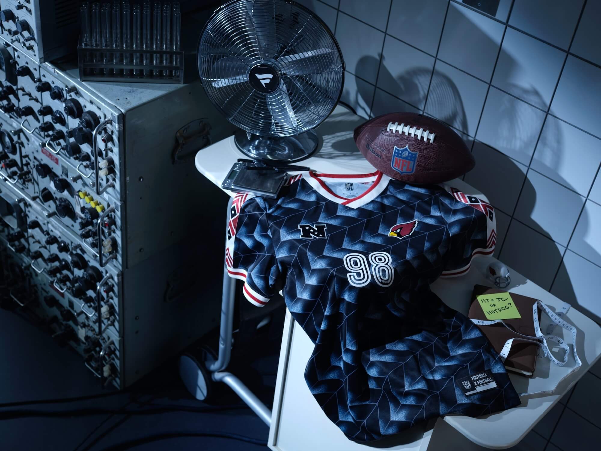
(Photo courtesy of Fanatics)
What in the name of PlayStation One loading screen is going on here?
That black and white background effect, which again seems inspired by Netherlands ’98, is quite similar to the loading screen you would see on the very first PlayStation model. Better than the Browns, but there’s still too much going on here, respectfully.
28 – Seattle Seahawks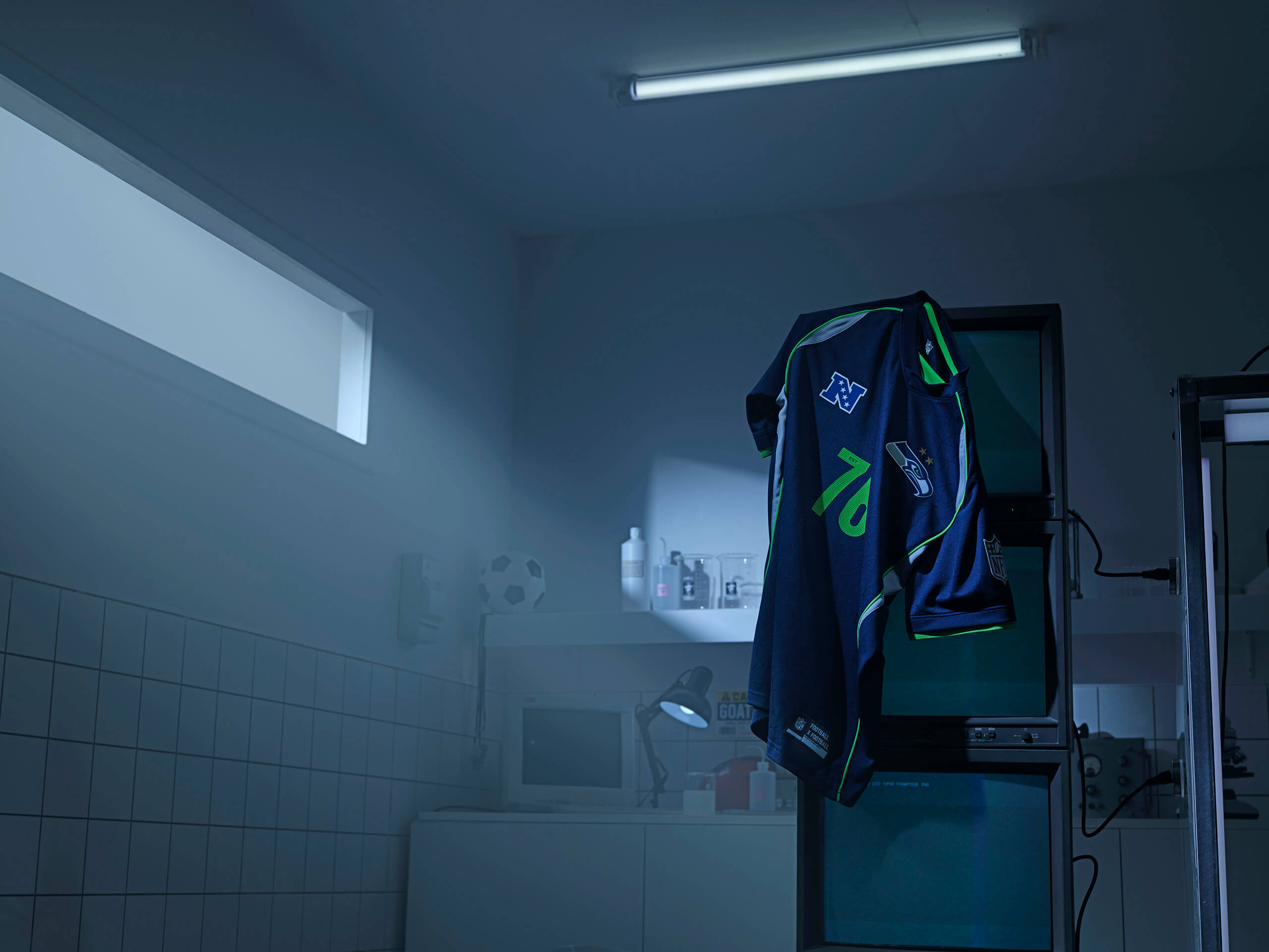
(Photo courtesy of Fanatics)
Fair enough. The Seahawks design is true to the team’s dark blue and slightly-off-putting neon green.
Whilst we can’t fault them for heritage, we can fault them for style points. Looks like the 2006-era Adidas template.
27 – Minnesota Vikings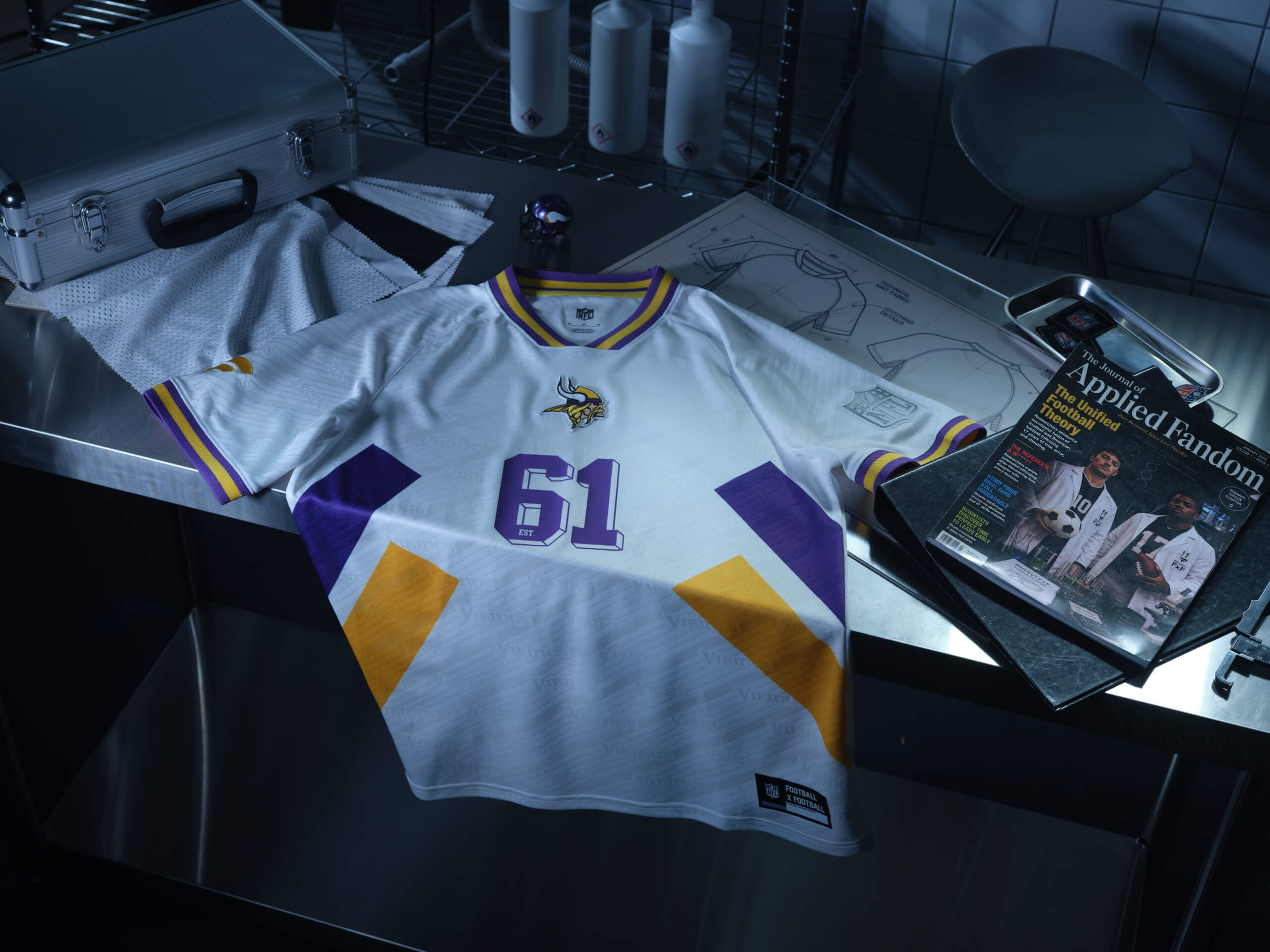
(Photo courtesy of Fanatics)
This one has some Romania 1994 to it, but it looks like something you’d make at school as part of a design technology class. Having said that, there’s a part of me that also kind of likes it, but also, I don’t want to wear something I designed that only got me a C grade back when it was crunch time in exam season.
Due to my indecision, I’ve put this one at No. 27.
26 – Las Vegas Raiders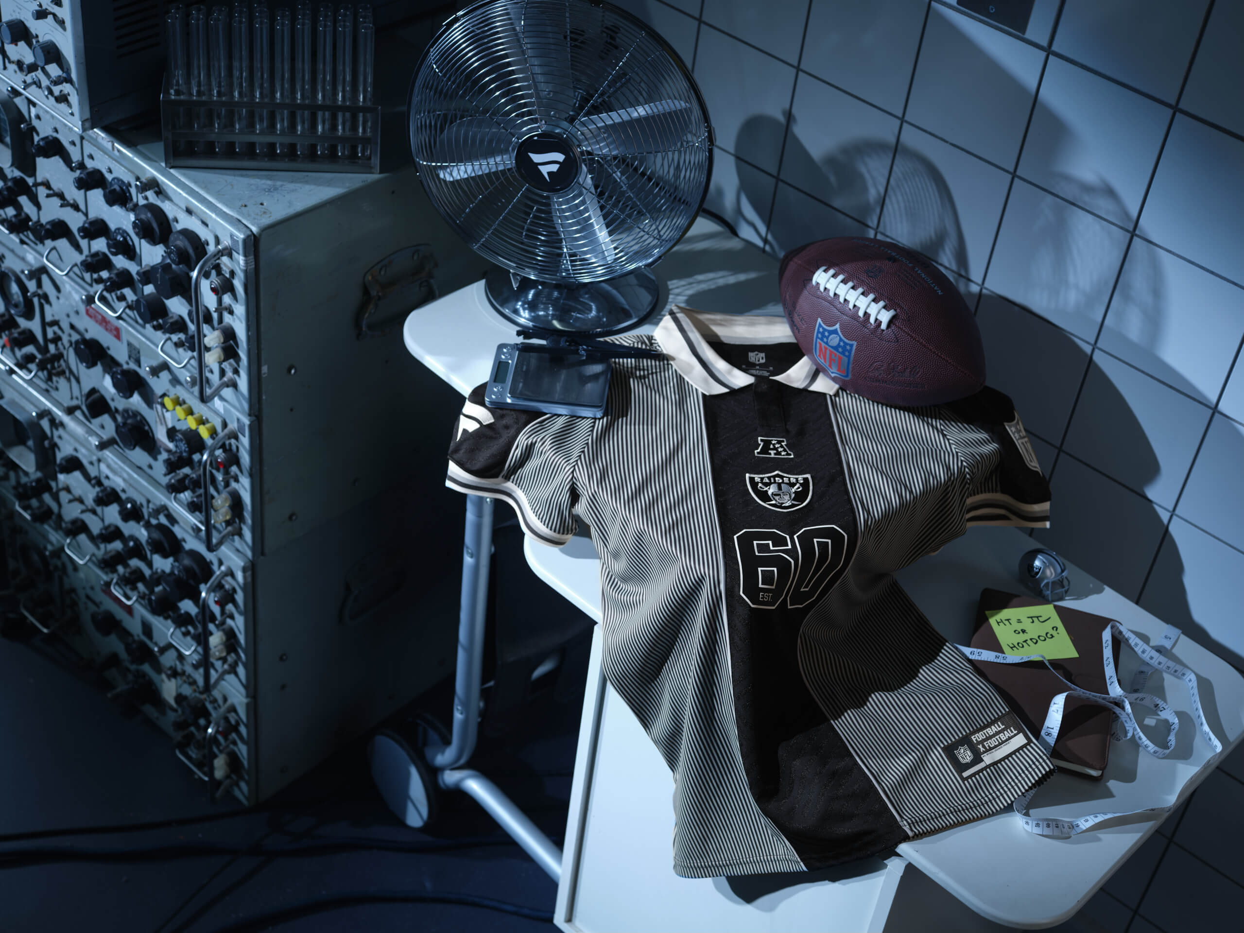
(Photo courtesy of Fanatics)
The younger crowd among us might say that the Las Vegas Referees Raiders are in their ‘officiating era’ after this seeing this kit.
I’m not that interested in walking around looking like a human barcode, although, I do like the strip down the middle.
25 – Atlanta Falcons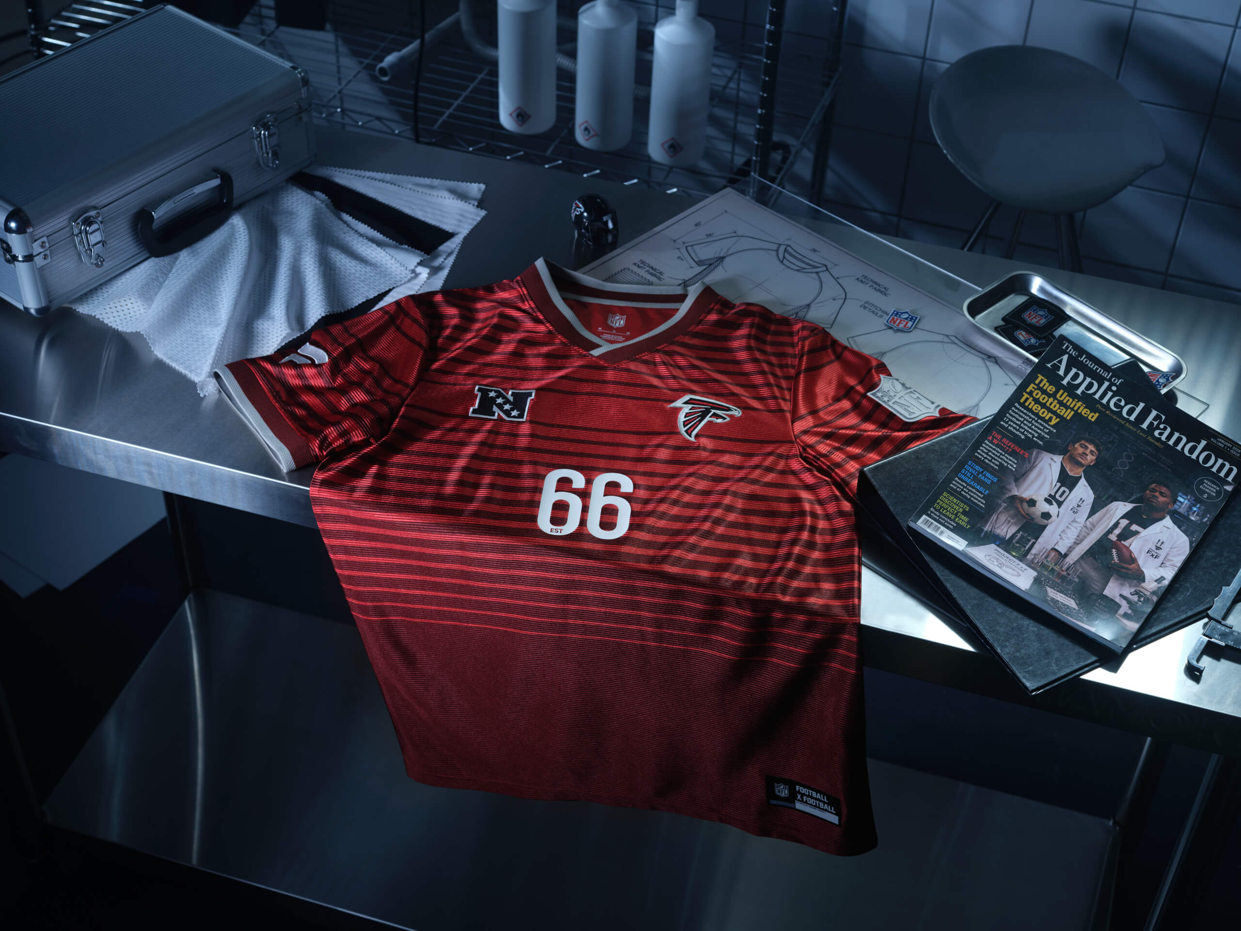
(Photo courtesy of Fanatics)
Have you ever printed something off but then halfway through, you run out of ink? That’s what this kit looks like. The striped effect ends too abruptly for me.
24 – Pittsburgh Steelers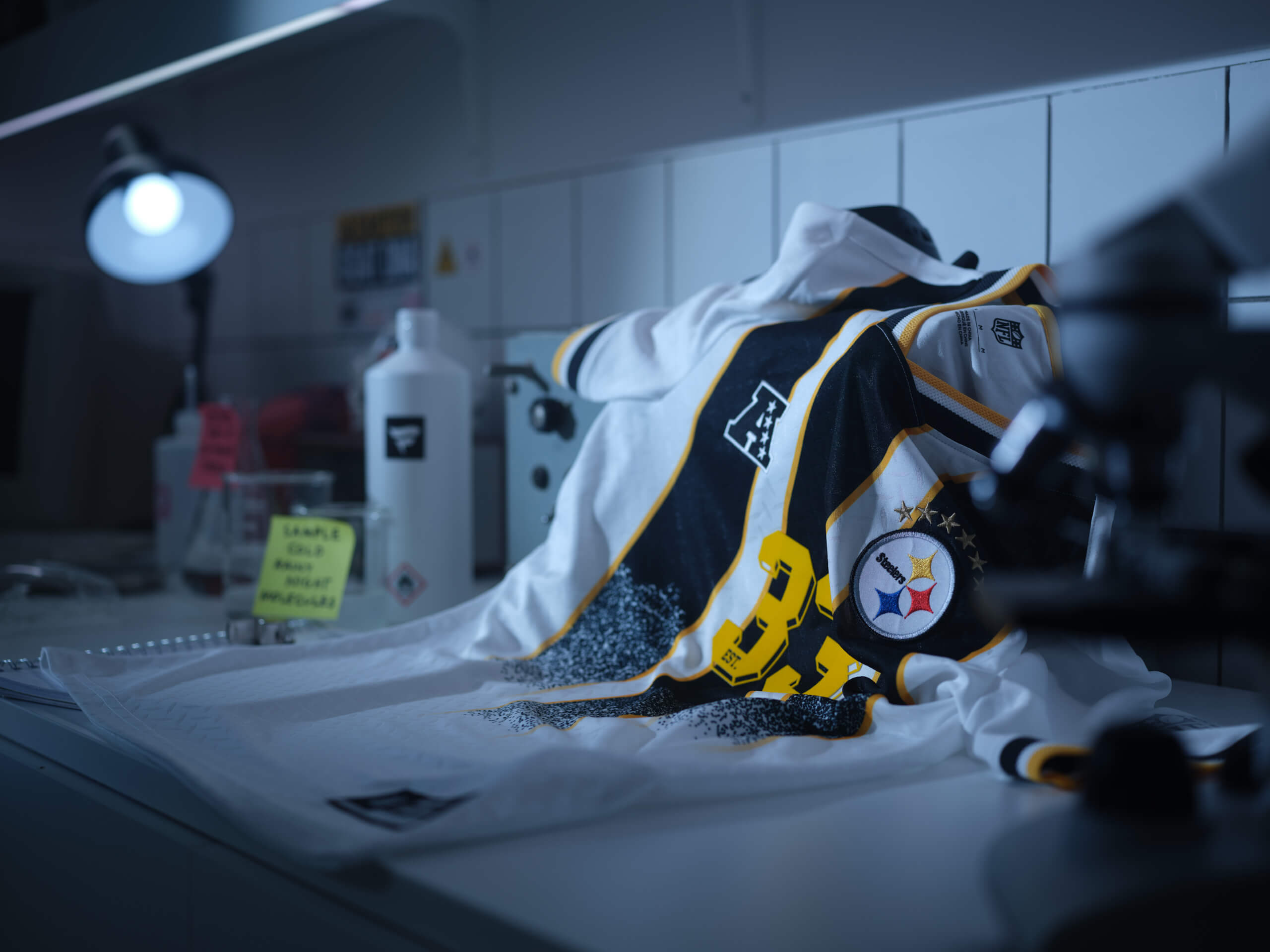
(Photo courtesy of Fanatics)
Can someone check to see if the printers are working in this design office?
I can’t work out if this 1990s Juventus-esque (not a national team, but that’s what comes to mind) design is great or entirely unfinished. Let me know in the comments.
23 – Chicago Bears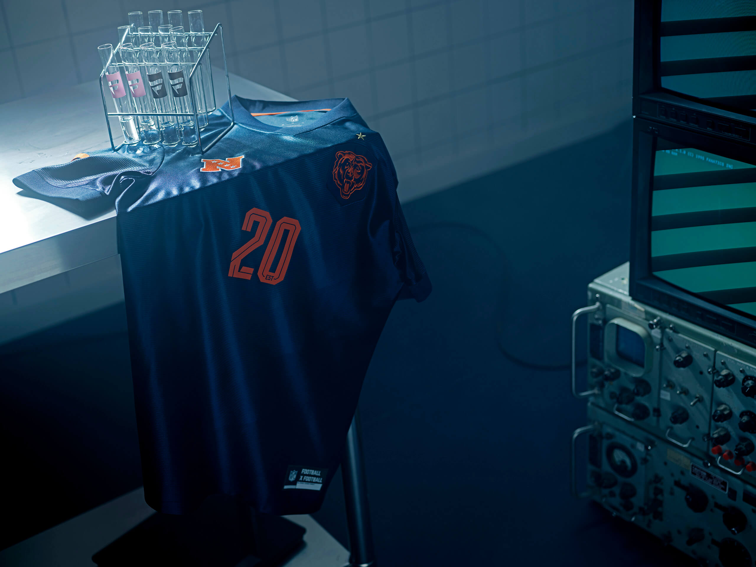
(Photo courtesy of Fanatics)
There’s a really subtle pattern down the front of the shirt that’s hard to make out since it’s so dark, but the designer must’ve pulled an all-nighter, spilt a milky coffee drink over it, went to sleep, woke up and thought “yeah actually why not, this kind of works.”
It’s understated but a very well-put together piece of clothing. That barely visible spilt oat milk vibe running down the middle is holding it back.
22 – Cincinatti Bengals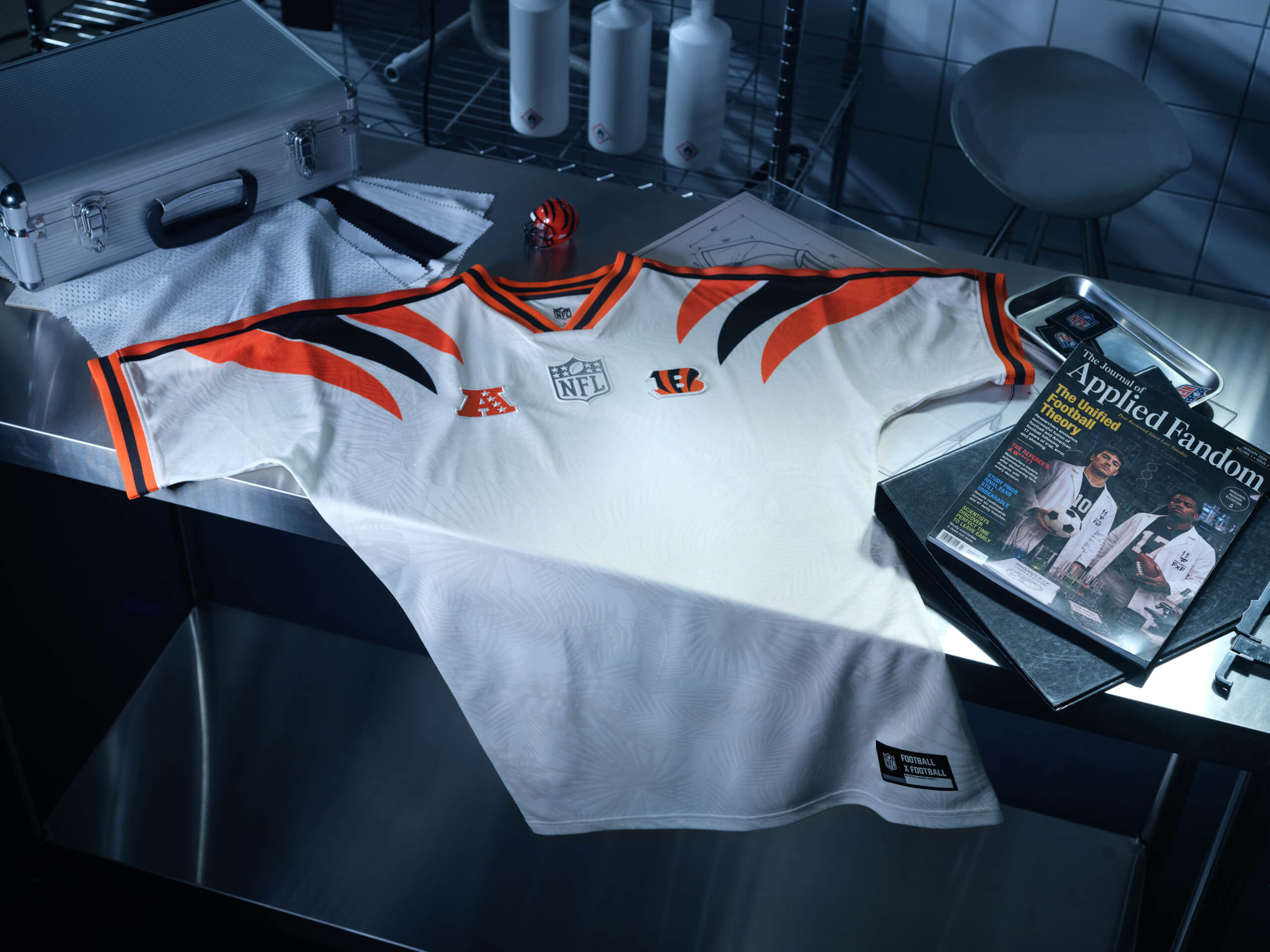
(Photo courtesy of Fanatics)
This one just isn’t doing a lot for me. I don’t feel compelled to wear it.
The Colombia 1990-inspired bengal stripes are nice, but just feels a little too flat for me to get excited about, even with the jungle pattern.
21 – Green Bay Packers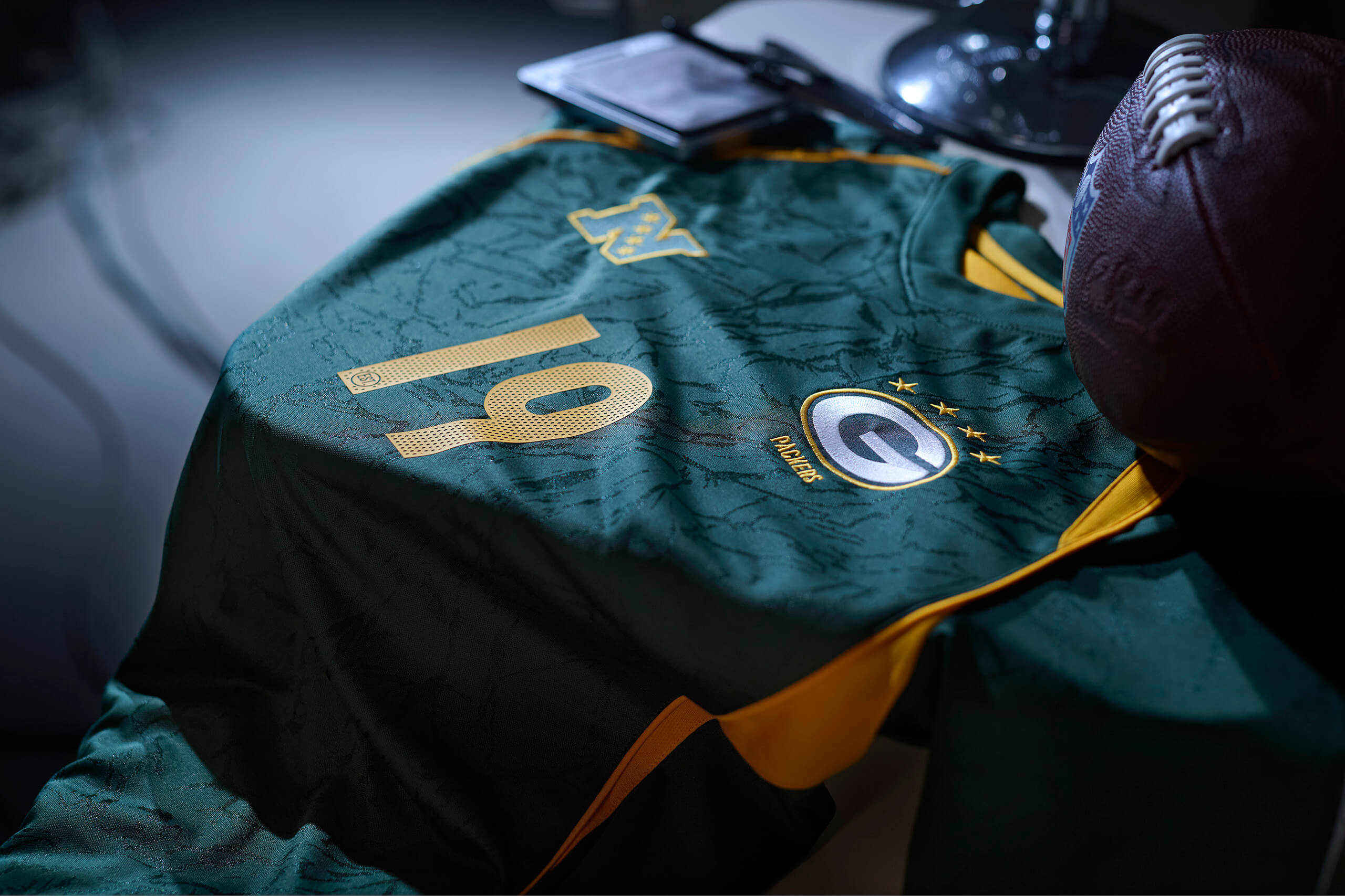
(Photo courtesy of Fanatics)
I know this is “Football x Football,” but this Packers jersey looks like one of South Africa’s rugby kits (maybe the intention was more Brazil 2002?). I don’t mind the contouring, map-like design in the background and the colour scheme is solid.
The good news? It’s a nice piece of clothing. The bad news? It’s looks too much like a rugby shirt, so it loses a few points.
20 – Jacksonville Jaguars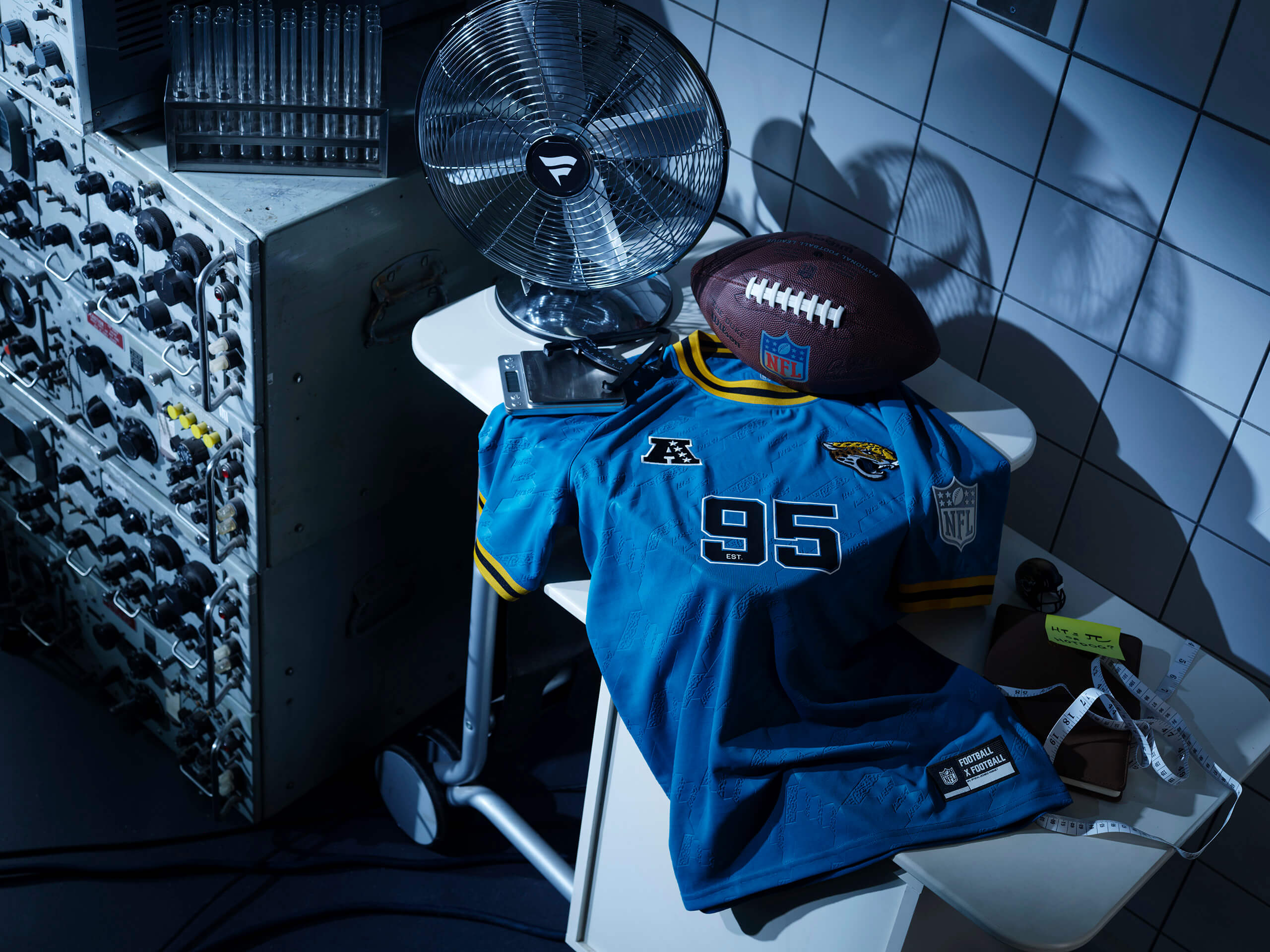
(Photo courtesy of Fanatics)
From afar, this looks great.
Look a little closer, and we’re veering dangerously into tablecloth territory.
19 – Indianapolis Colts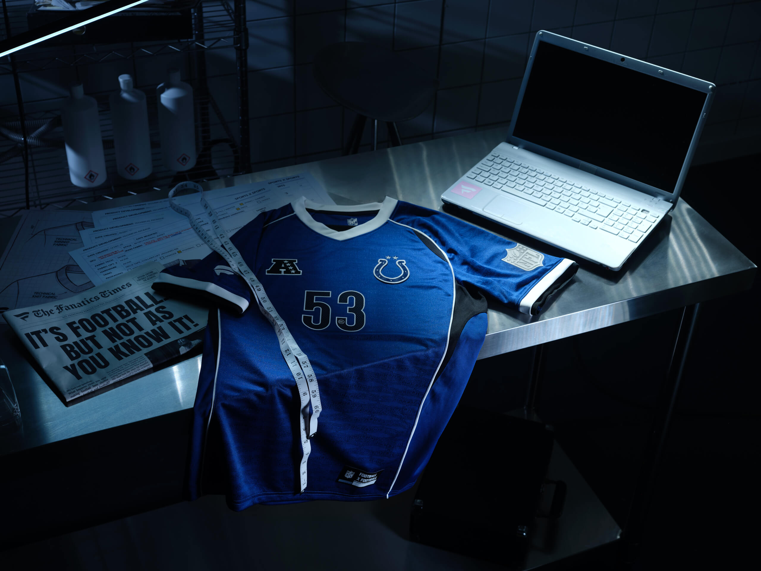
(Photo courtesy of Fanatics)
This looks to be the same template as the Seahawks and Packers, but it brings the same vibe you get when you head into a shop and buy a generic “sportswear” T-shirt.
There’s nothing wrong with it, but also, it lacks the je ne sais quoi that some of these other jerseys provide. Something is missing here.
18 – Philadelphia Eagles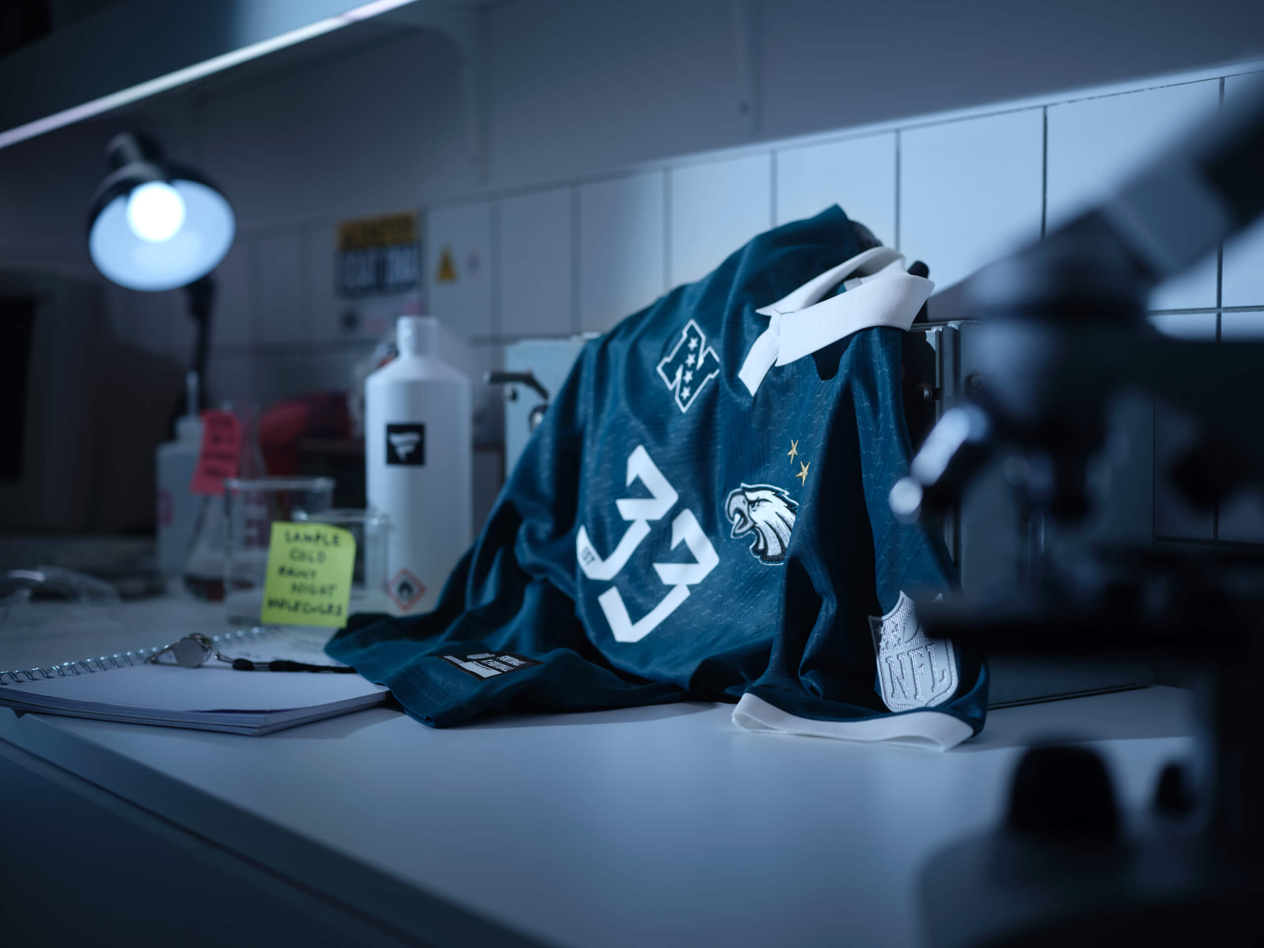
(Photo courtesy of Fanatics)
A classic collared football shirt design. Simple and effective.
It also gives off the vibe of one of those sweat-resistant undergarments that athletes wear, rather than a showpiece jersey, which limits its ranking.
17 – Houston Texans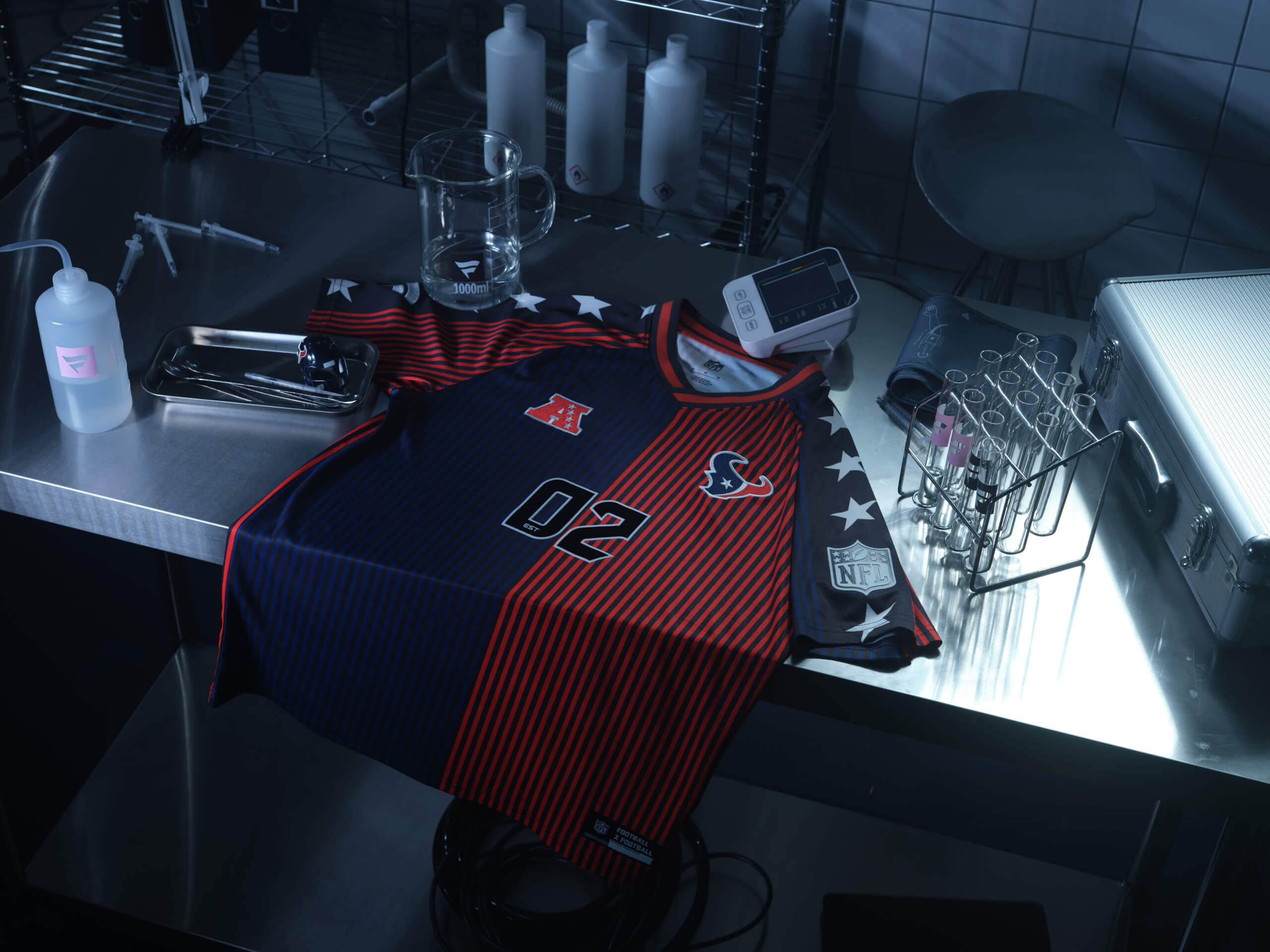
(Photo courtesy of Fanatics)
At first I had this jersey ranked in the bottom five then took another look and thought it was actually pretty good. It’s giving Denmark 1986 vibes.
I keep flip-flopping between this shirt being really cool and far too busy. A middle-of-the-pack rankings makes sense as a result.
16 – Washington Commanders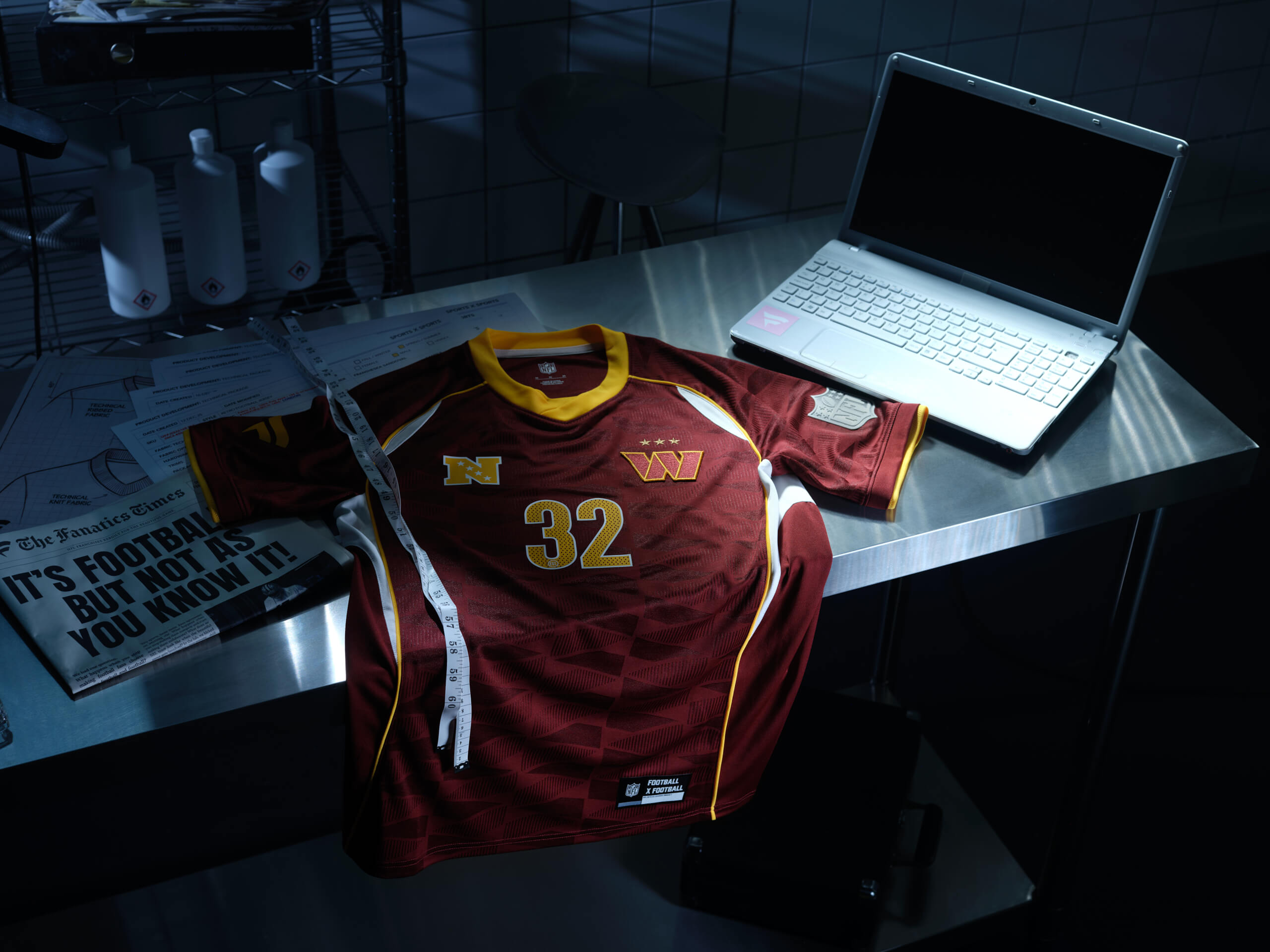
(Photo courtesy of Fanatics)
A solid design and one that mirrors a jersey ranked much higher. You might scroll down and think, why is that one ranked third but this one is in 16th?
The maroon colour is cool, but that razor-like undertone it has takes it slightly in the territory of something that looks like a human skeleton. Good design, not in love with the added detail.
15 – New England Patriots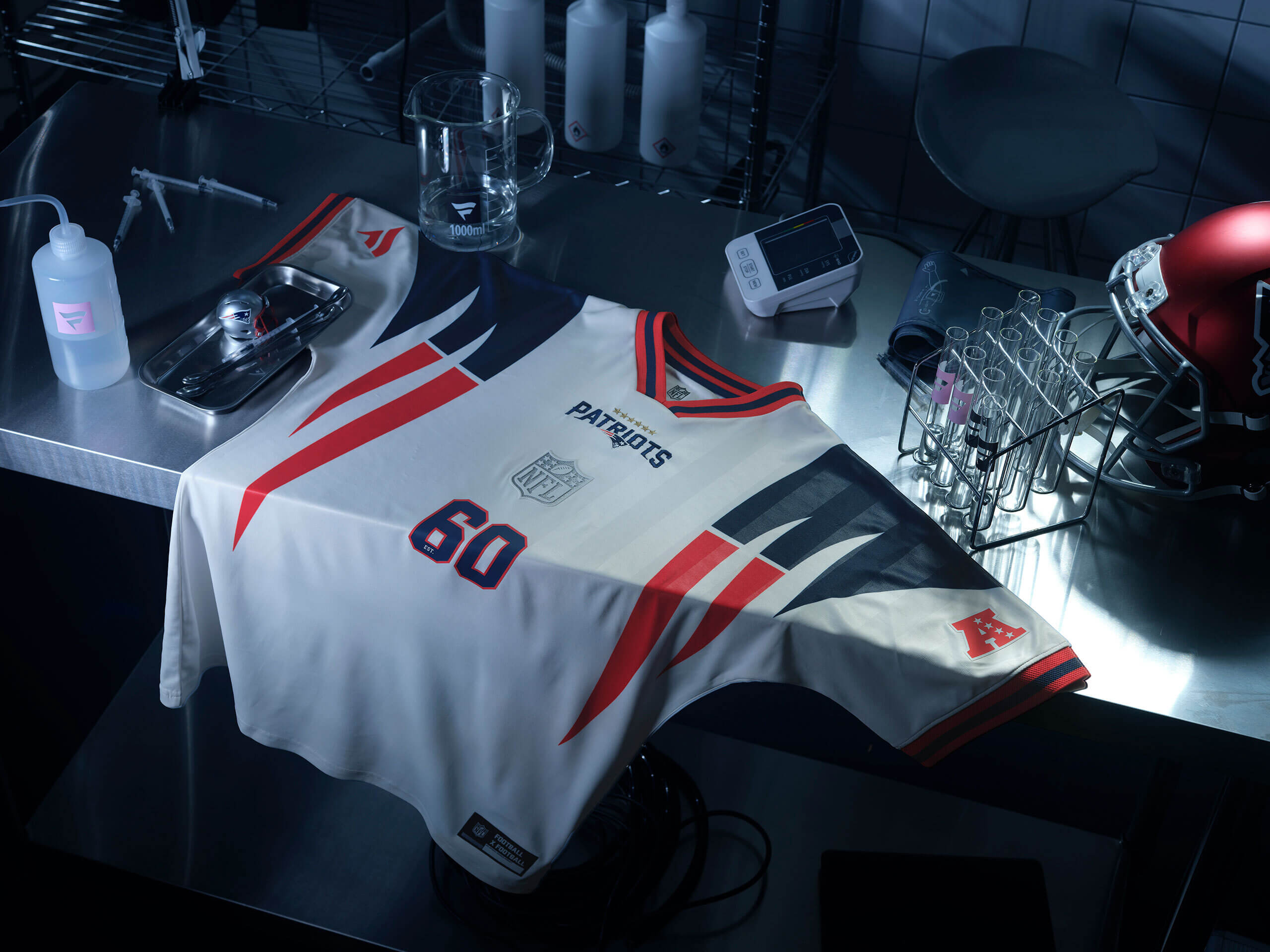
(Photo courtesy of Fanatics)
At first, I thought this jersey was too random. The Patriots logo isn’t based on an animal that has long claws, so what is the link here and why is there a claw-like design running down each side of the shirt?
But then I realized it’s a take on the flowing back half of the Patriots’ logo and I remembered I’m a novice fashion expert typing out words as if I have authority in the space. That said, this one is a pretty cool and worthy of a top-half spot.
14 – Miami Dolphins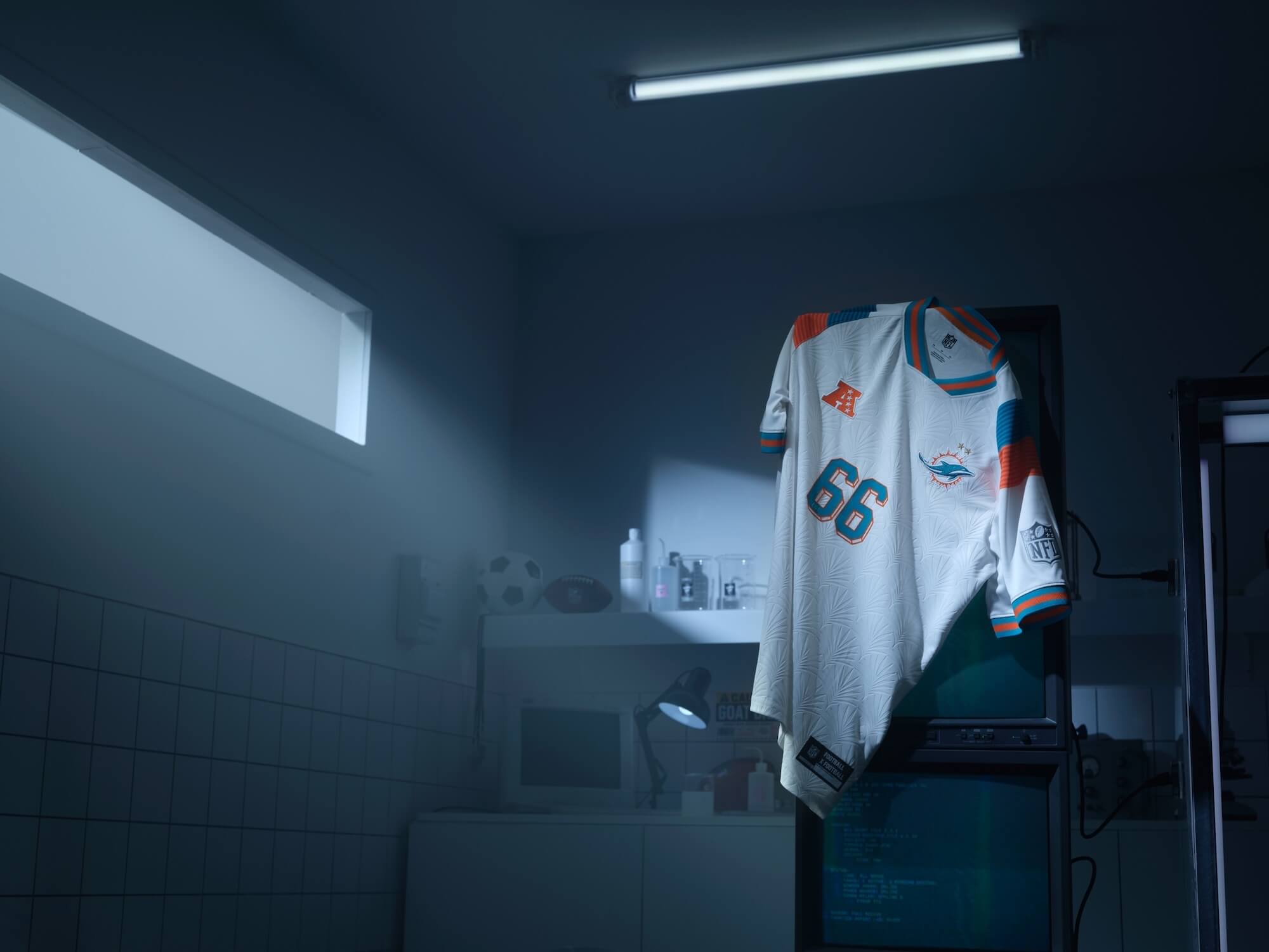
(Photo courtesy of Fanatics)
The palm tree design is bordering on looking like a coaster, but thankfully, it’s on the right side of fashion here.
A sleek, simple design that speaks volumes without doing too much. I like the green and orange colours, as a counterbalance to the predominantly white shirt. Very strong Miami vibe.
13 – New York Giants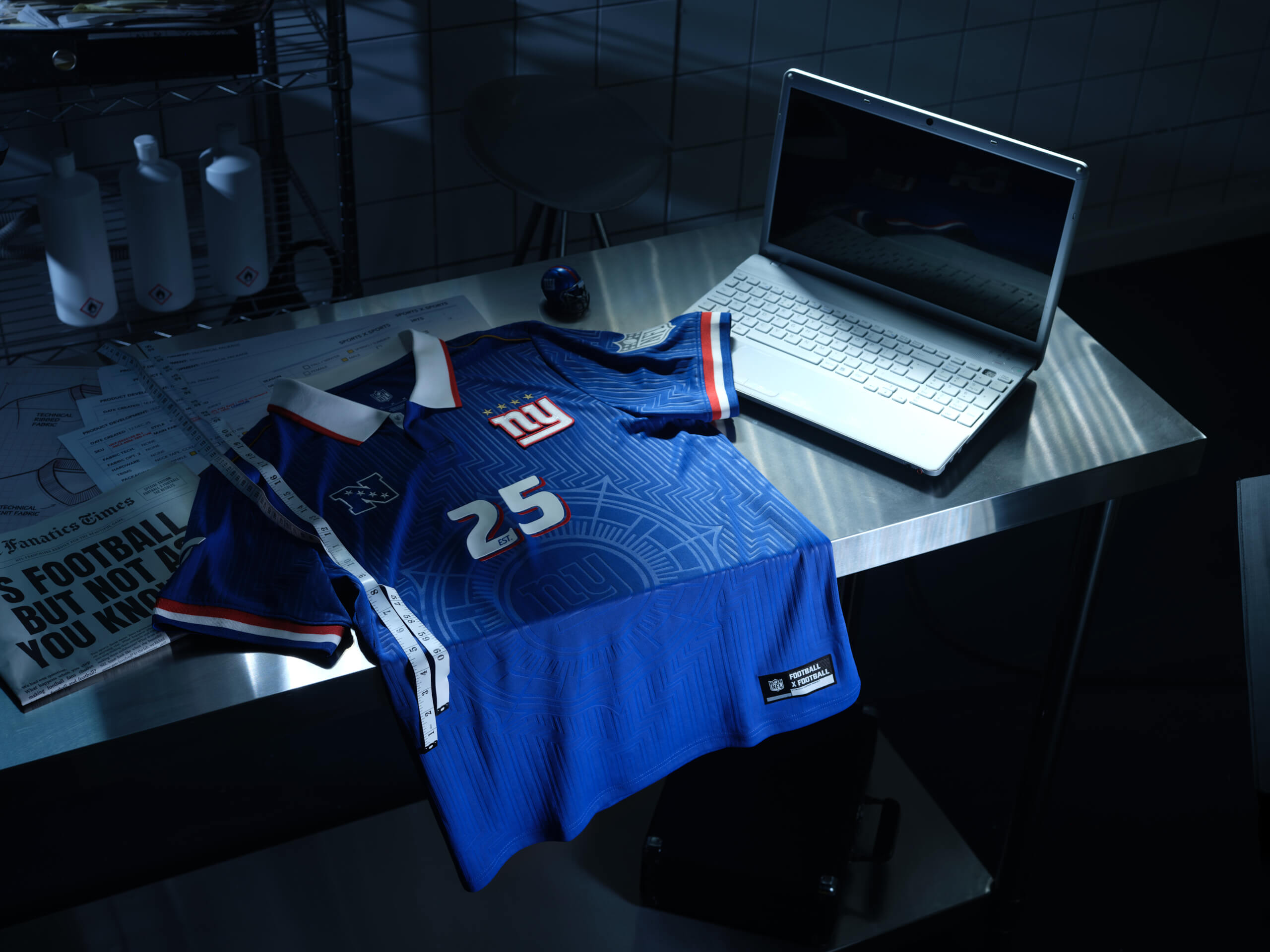
(Photo courtesy of Fanatics)
“Hello, mate, did you forget your compass today? No worries, I’ve got one emblazoned on my shirt.”
Jokes aside, this is a very nice design reminscent of Mexico’s famous 1998 kit, but more art deco than Aztec. It would rank higher but seeing as I have no plans to find my bearings in the wild without the use of GPS, it lands at No. 13.
12 – Los Angeles Rams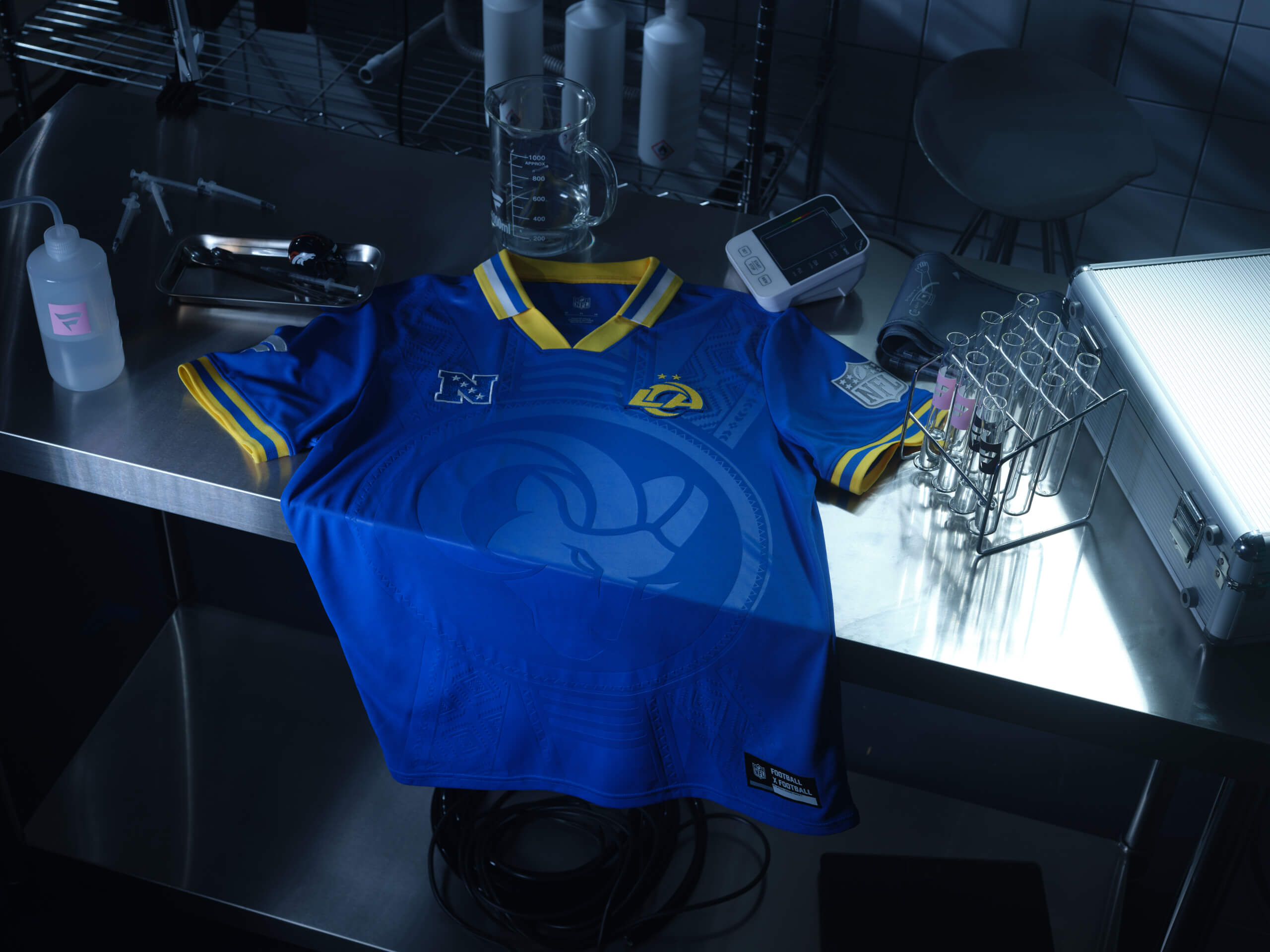
(Photo courtesy of Fanatics)
“Hey pal, I noticed you left your house looking you’re about to embark on a quest from an Indiana Jones movie, so I got this pendant plastered across my new Rams jersey to match your vibe.”
Once again in the vein of Mexico ’98.
11 – Tennessee Titans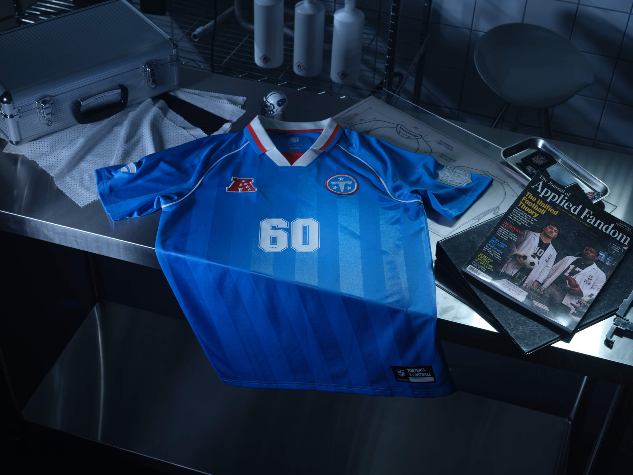
(Photo courtesy of Fanatics)
It might just be me, but I have a few pet peeves with sports jerseys. One of them is, the collar ending, and there being a random little triangle section underneath. It’s not needed, in my opinion, for whatever that’s worth.
If that random red triangle wasn’t here, this would crack the top five, but it is, so it falls outside the top spots with a massive sense of what could’ve been. Looks like England’s 1986 third shirt.
10 – Buffalo Bills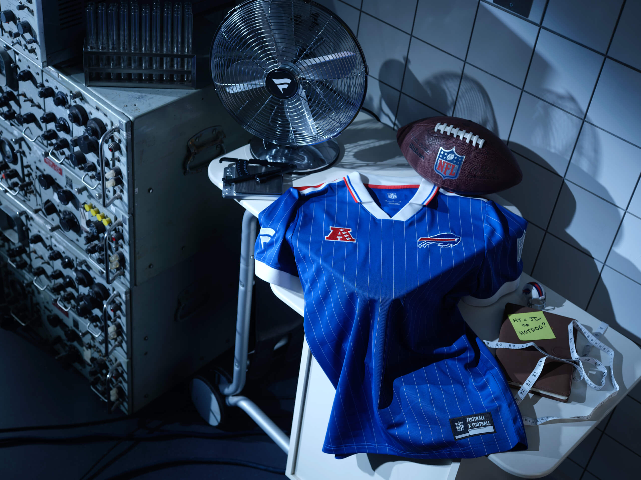
(Photo courtesy of Fanatics)
(See my take on the Titans kit above, and apply it here, only with France’s colour scheme in place instead of a light blue colour).
9 – Denver Broncos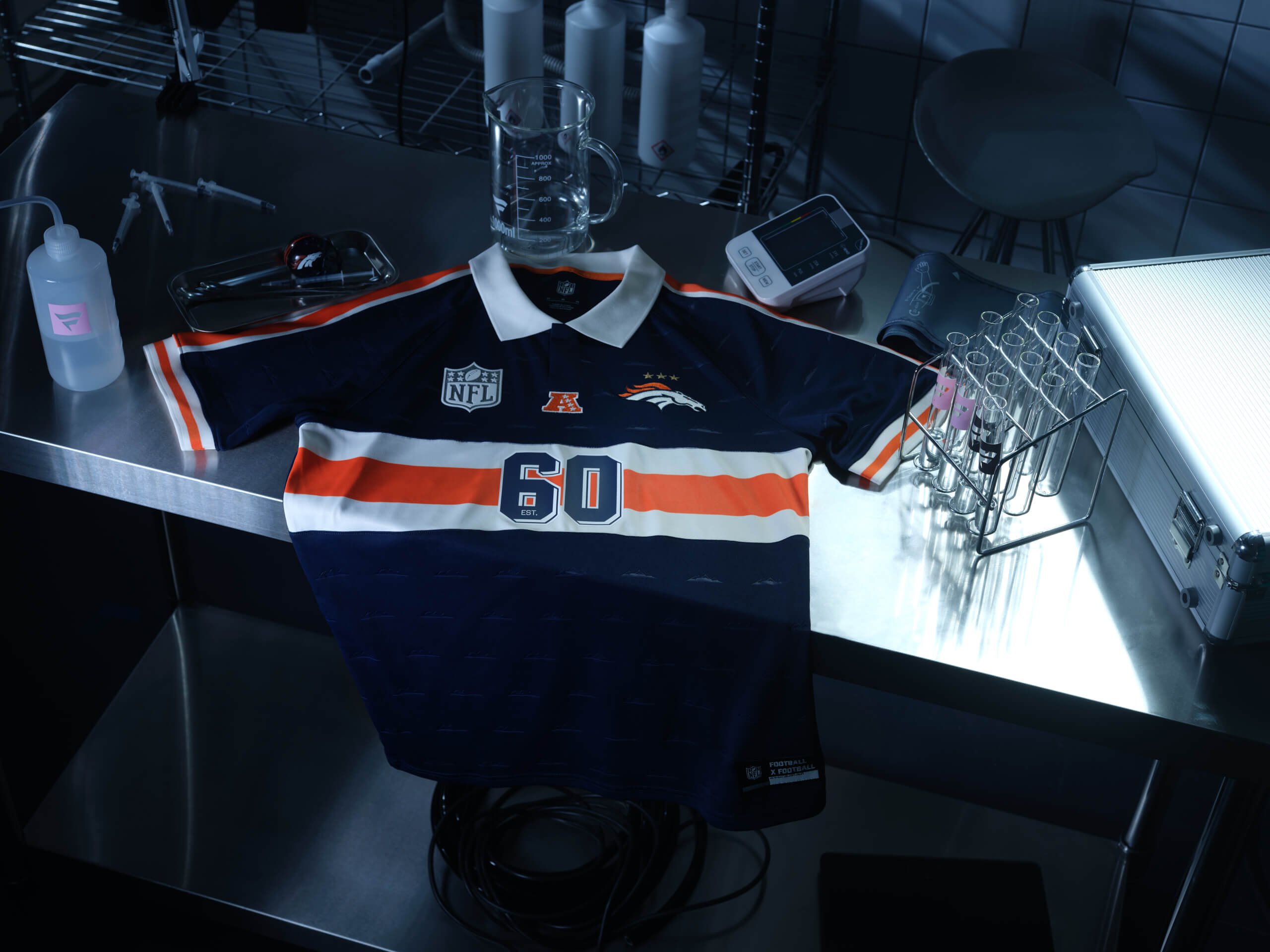
(Photo courtesy of Fanatics)
This one feels controversial. I think a lot of people might have this ranked lower but for me, it’s a great design. The tiny mountains across the shirt are a nice local touch.
So, why is this ranked so highly? It feels unique, and if I was in a shop, it would stop and do a double take.
8 – New York Jets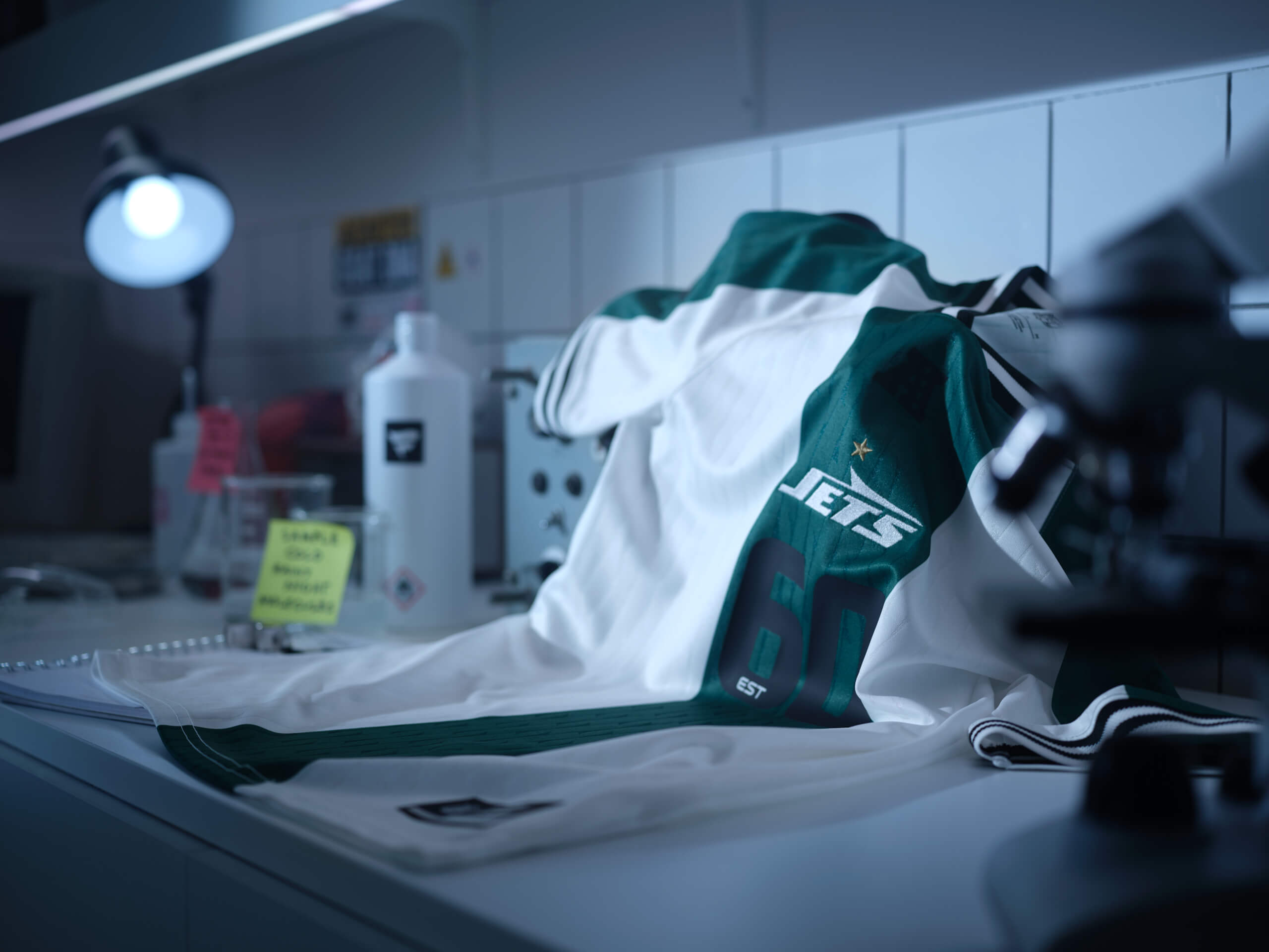
(Photo courtesy of Fanatics)
Say what you want about the Jets’ on-field performance, this kit is top-10 worthy.
The green strip down the middle and across the shoulders work brilliantly and the black and white design on the collar and sleeves create an understated but powerful finish.
7 – Detroit Lions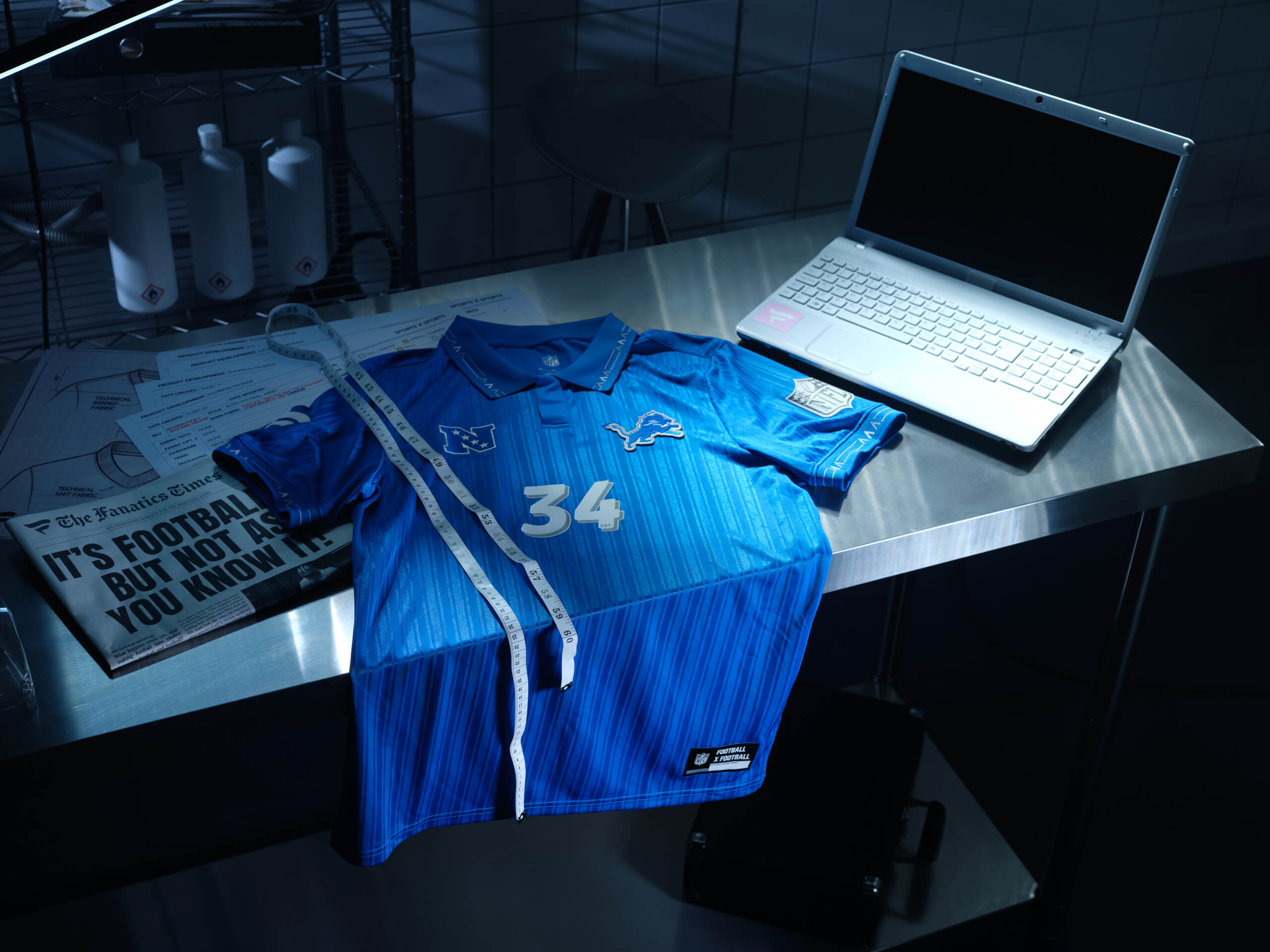
(Photo courtesy of Fanatics)
The details in the collars and sleeve are great, clearly inspired by Italy’s 1994 shirt, and the one-tone shade of blue works well.
It may be slightly too one dimensional to crack the top five, but it’s definitely worthy of a place in the top 10.
6 – New Orleans Saints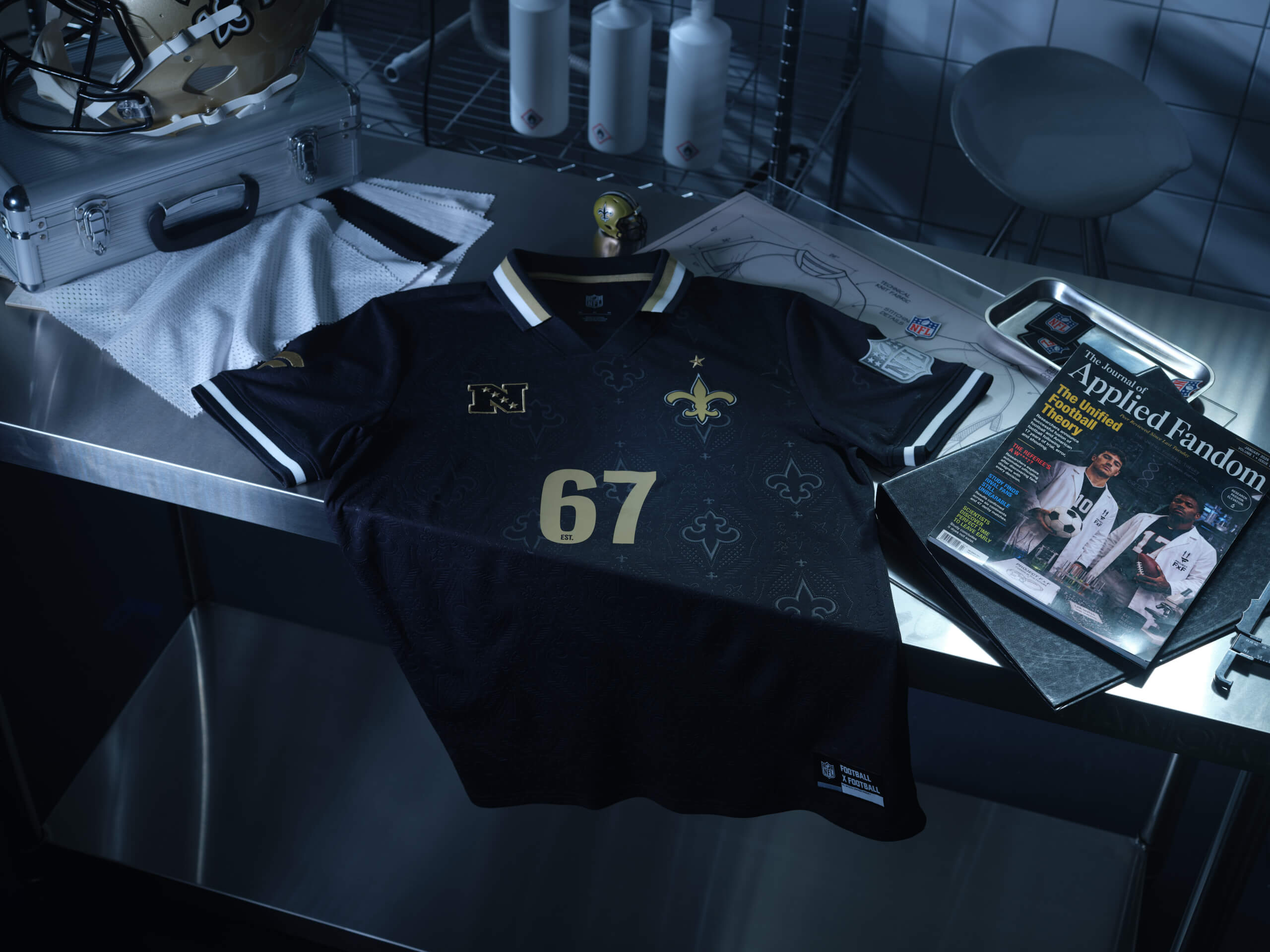
(Photo courtesy of Fanatics)
It’s hard to go wrong with a black, gold and white design.
The Saints logos in the background may be slightly aggressive for some, but for me, an unqualified fashion expert, I think it works well.
5 – Kansas City Chiefs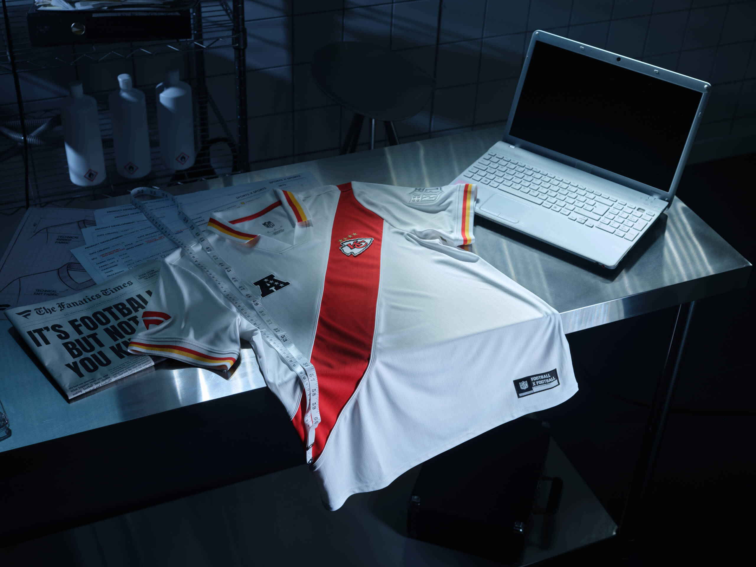
(Photo courtesy of Fanatics)
Reminiscent of a Peru soccer jersey, this is a simple design. The diagonal red strip is enough to add some busyness, while the yellow and red details around the collar and sleeves bring it to life.
If I played golf, it looks like something other golfers would enquire about. I’d feel smug, knowing I had a good taste, then proceed to finish bottom of the rankings, because I am rubbish at golf.
4 – Carolina Panthers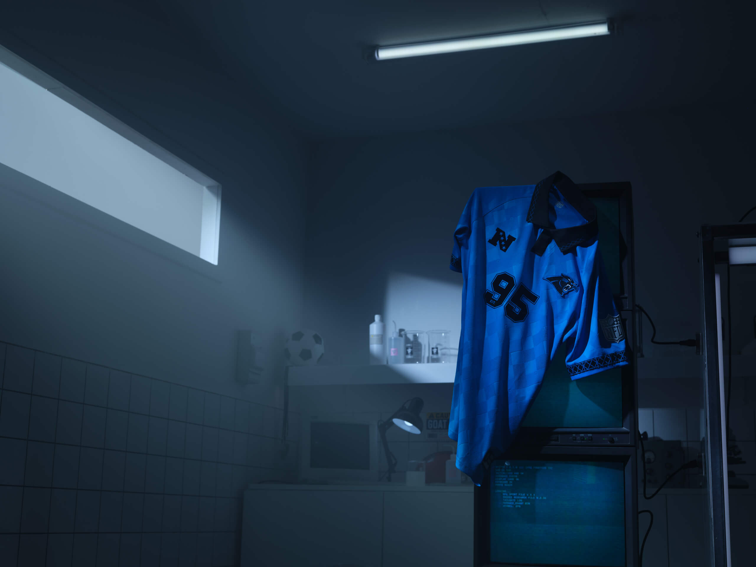
(Photo courtesy of Fanatics)
After finishing second in the last set of Football x Football jersey rankings, the Panthers traded away four first-round picks, thought they found the missing piece, and finished two spots behind their previous ranking.
Some may that’s failure, but it’s a competitive top three. The light blue and black is a combination I didn’t know I needed. This one harkens back to Argentina’s away kits in the ’90s.
3 – San Fransisco 49ers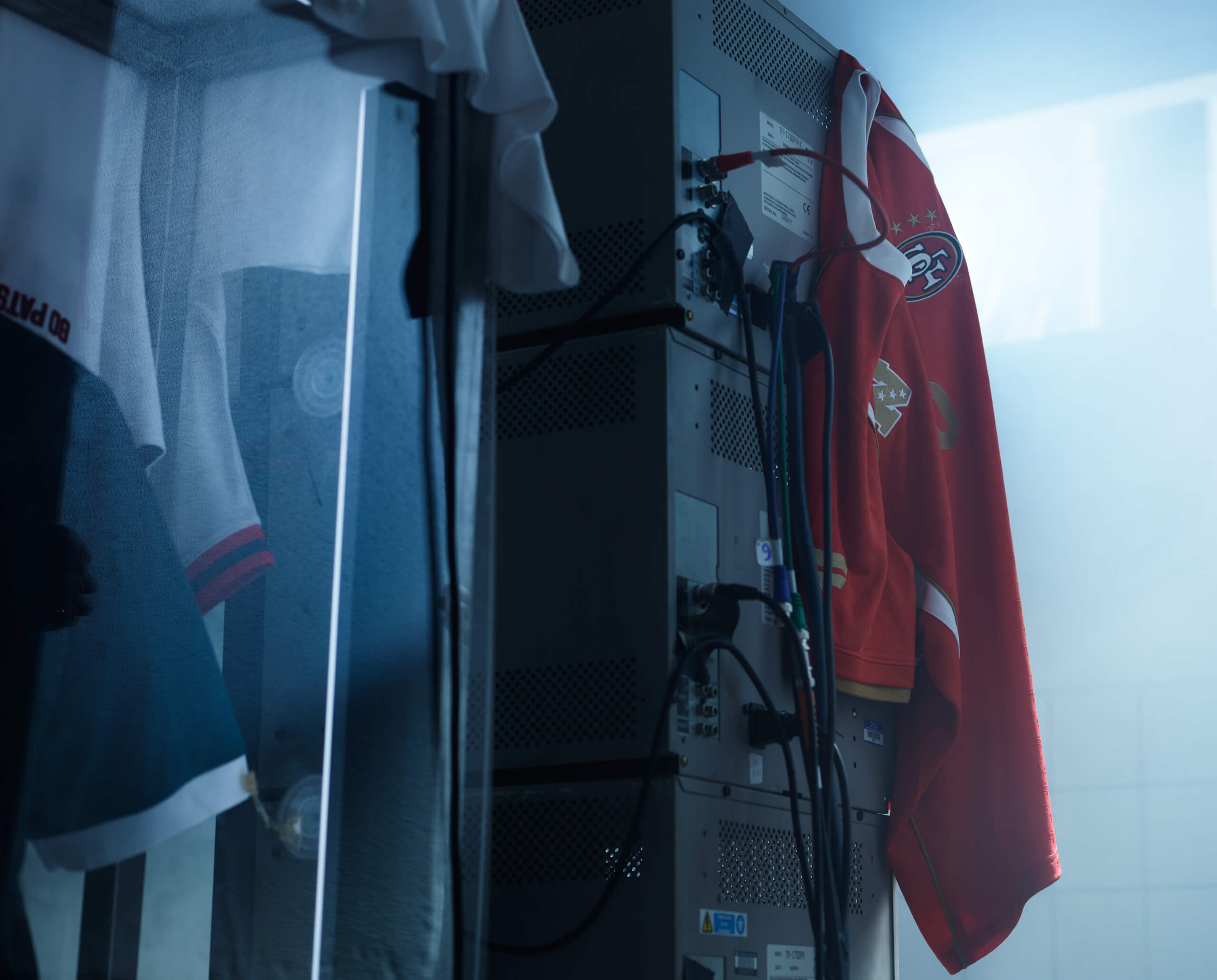
(Photo courtesy of Fanatics)
First things first, the image above admittedly provides little idea of what the shirt actually looks like. But seen in full, haters will say it’s a just a simple red and white design using the same template we’ve seen several times already. And they may be correct, but I would challenge them to find the fault in this kit.
It’s pretty flawless, but lacks a certain level of bravado needed to be ranked in the top two.
2 – Los Angeles Chargers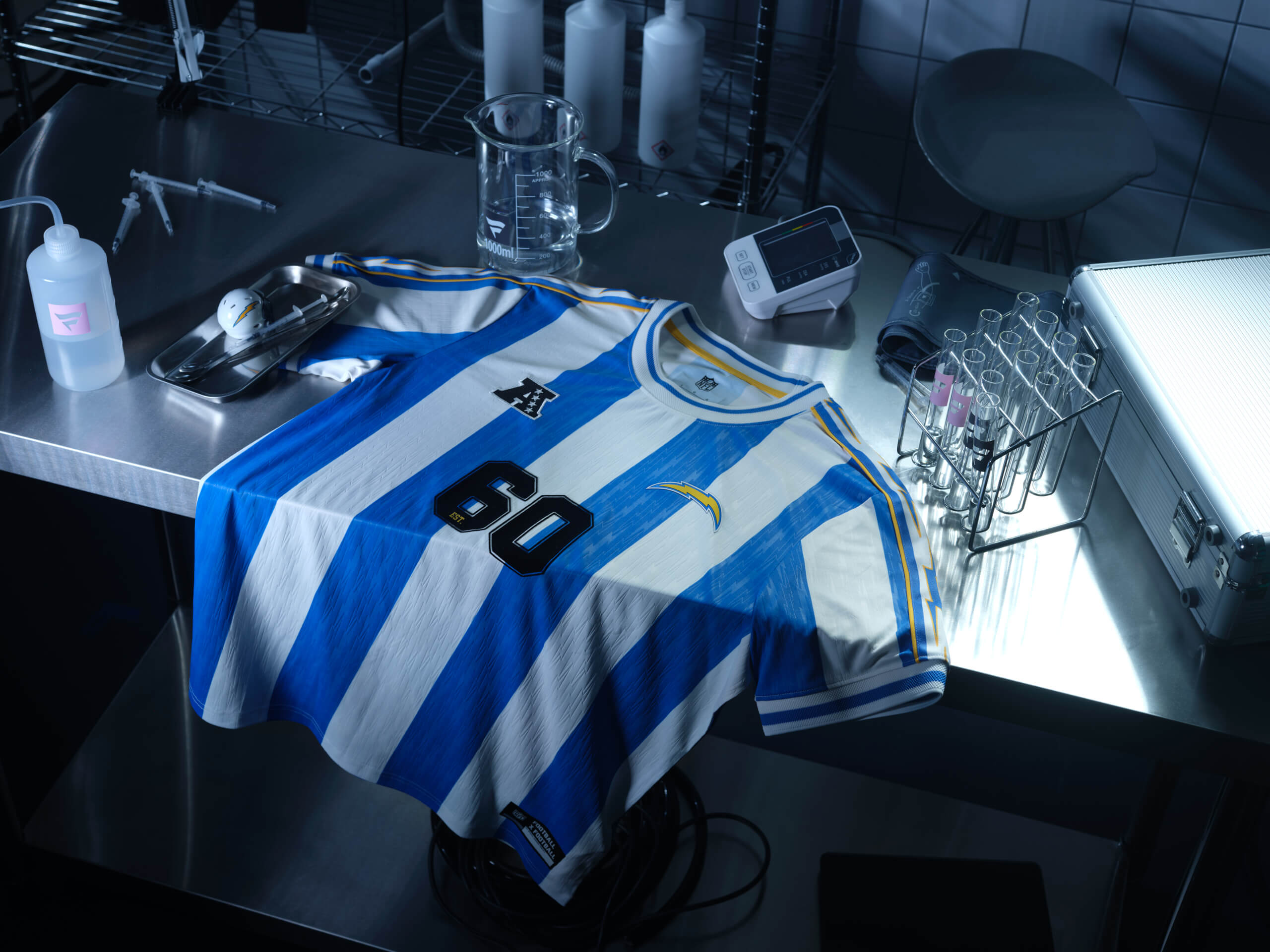
(Photo courtesy of Fanatics)
They say imitation is the highest form of flattery, and here, the Chargers have channelled their inner Argentina fan to re-create a famous strip with a few welcome tweaks.
The blue stripes are a slightly darker colour than the jersey Diego Maradona and Lionel Messi have made famous, and feature subtle lightning bolts. The yellow outline around the shoulder area rounds off a well-put together jersey.
1 – Baltimore Ravens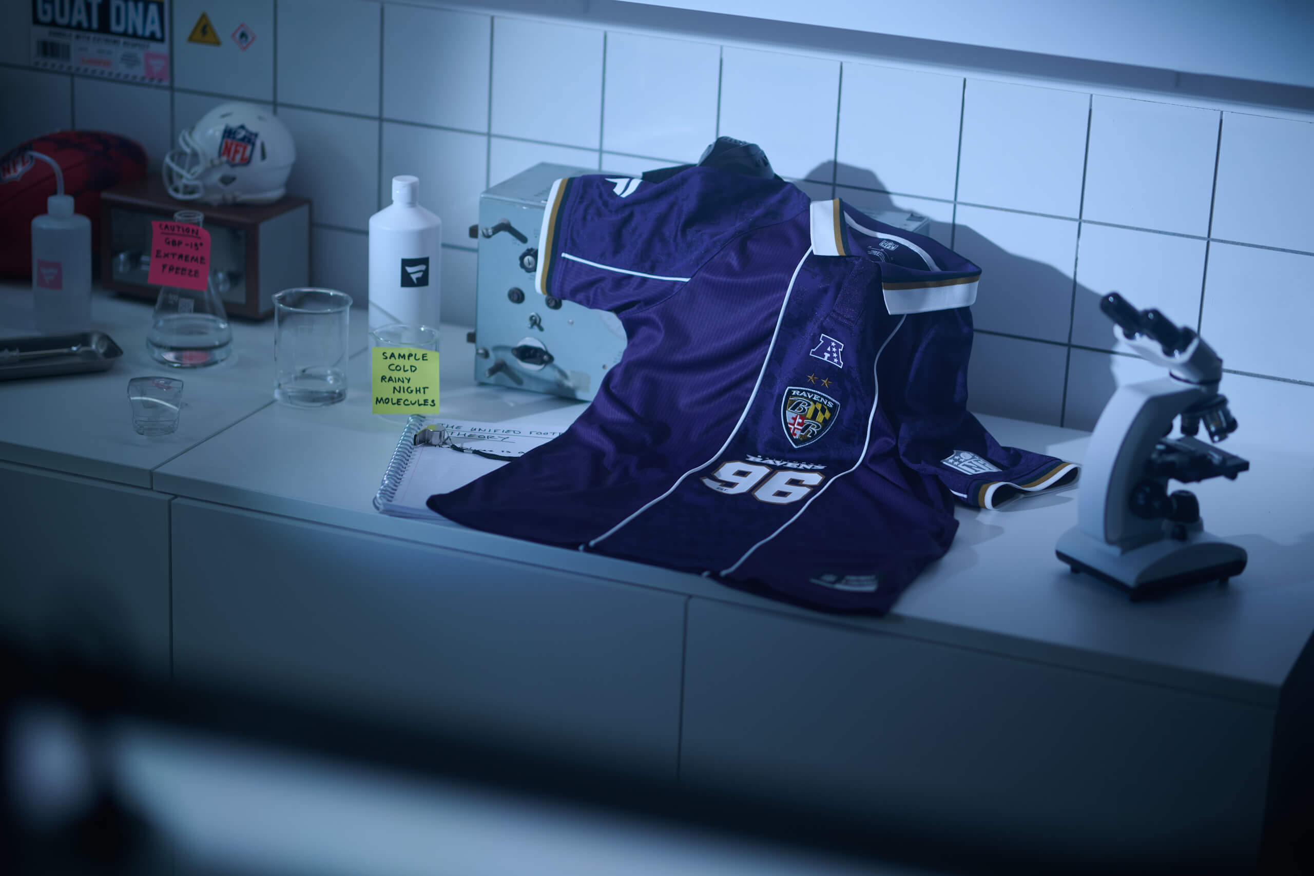
(Photo courtesy of Fanatics)
I’d like to shoutout the designer of the Ravens kit for noticing the stealing the homework from the designer on the Jets kit and improving it.
The strip down the middle and the use of the checkered elements from Baltimore’s flag round off a simple yet effective look, with the white stripes on the sleeves and black and gold collar bringing together a very nice kit that will inevitably rank no higher than No. 20 for a lot of people reading this.
The Athletic maintains full editorial independence in all our coverage. When you click or make purchases through our links, we may earn a commission.