
Follow us
Add us as a preferred source on Google
Newsletter
Subscribe to our newsletter
If there’s been one media format that will define this generation, it’s the podcast. Podcasts have become the modern talk show. Presidential candidates used to sit in front of a live audience to talk to Jimmy Fallon or David Letterman. Today, they’re more likely to appear on Call Her Daddy. In just the UK alone, at least 15.5 million people describe themselves as podcast listeners, and globally, the industry is estimated to have a market value of over £29 billion. So it bears questioning: if podcasts play such a significant role in the cultural conversation today, why do so many of them still look like… that.
Stephen Bartlett, from The Diary Of A CEO, regularly pulls in upwards of 15 million YouTube views on his interviews — and that’s not even counting the several million people tuning in via other streaming platforms. Joe Rogan, perhaps one of the most recognizable names in the industry, has amassed over 30 million views on many of his most popular episodes. For some perspective, the most-viewed episode of SNL from the past decade reached an estimated 6 million people, less than 1/5 of the viewership Rogan is regularly attracting on YouTube alone. And yet, when you look at so many of these shows, with their multi-million-viewer fanbase, the background looks more akin to a teenage boy’s basement than it does to a million-dollar production.
While TV shows and movies regularly use set design as a way of world-building, many of the most successful podcasts are yet to ascend beyond the outdated spinning chairs and neon lights aesthetic. Even though podcasts have moved far beyond the audio-exclusive experience they once were, with major networks like Netflix adding podcasts to their roster, many still seem to be stuck in this purgatorial design style.
Latest Videos FromLivingetc
But, as this format moves more into a visual arena, is this design drought set to end? Harrison Sheinberg, co-founder of Interwoven Studios, the brand behind the sets of some of the most successful podcasts, including Jake Shane’s Therapuss and Alix Earle’s Get Real With Me, thinks so. “Podcasts started as an audio format, so the visual side often came later,” he explains. “Now someone’s first encounter with a show might be a fifteen-second clip. That little window needs to feel like a world you want to spend more time in.”

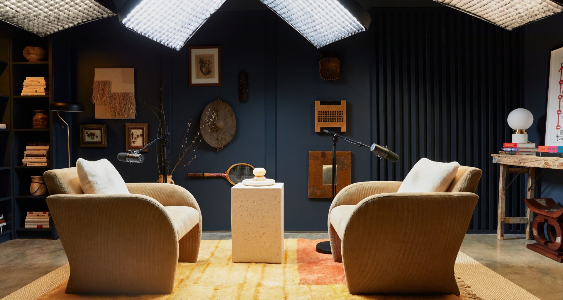
When working on Jay’s studio, Hema placed a focus on hospitality. Jay’s guests needed to feel welcomed and comfortable in the space, something that the dark walls and warm furnishings helped achieve.
(Image credit: Iride Mete. Design: Sagrada Studio)
If you’ve tuned into any number of the most popular shows available today, you’re likely already relatively familiar with the kind of aesthetic we’re talking about.
You may like
It comes in different forms, of course. There’s what the New York Times so aptly defined as ‘manly minimalism‘, a style defined by a gamer-like setup, often accessorized with neon signs and a smattering of non-descript accessories. Perhaps there might be a trophy of sorts, pointing towards some kind of unidentified athletic achievement, or a collection of seemingly untouched books, sporting suitably vague titles. Essential to this setup is the absolute lack of any distinguishable identity behind it. It’s meant for the everyman, an appropriately bland space, so as not to present any sort of challenge or point of tension for its viewers.
But it’s not just the manosphere-type shows that sport this remarkably nondescript design style; there seems to be an equally bland blueprint across the categories. “The standard podcast set has become almost uniform,” agrees interior designer Emily Cunnane. Having worked on several podcast sets now, developing a new vision for what these spaces can look like, Emily is very familiar with what she didn’t want to create. “It’s either the old-school look, with timber, bookshelves and branded coffee cups, or the ‘gaming’ aesthetic: dark charcoal or black walls, grey foam acoustic panels, a neon logo sign.”
When designing the previous studio for Jay Shetty’s popular podcast, On Purpose, designer Hema Persad, from Sagrada Studio, had a clear vision of what she wanted to avoid. This space needed to feel different from the thousands of other podcasts out there, and that meant departing from the “wood, white, and beige” color palette, accessorized with “lots of boucle, bookshelves, and brick walls”, as seen in every other studio.
As monotonous as it is, there is a reason behind the lack of personality found in these spaces. “For a long time, podcast studios were really designed for your ears, not your eyes,” explains Haley Draznin, a former CNN journalist and the founder of The Chat Room, a podcast studio dedicated to changing the standards for set designs.
But as the format grew and evolved into a multi-sensory experience, studios struggled to keep up. “As the format grew, a recognizable template grew with it; the cliché that I refer to as the ‘bricks and books’ aesthetic,” says Emily. It’s understandable why this formula caught on. It’s inoffensive, with a vaguely cozy atmosphere from the library-style bookcases. But it also leaves much to be desired.
What to read next
But now, as podcasts enter their new era, with an increased focus on video content, we’re beginning to see a shift in these spaces.
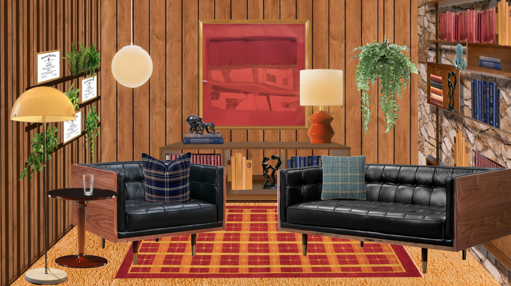
Interwoven Studio’s render for Jake Shane’s studio shows a focus on warmth, texture, and materiality.
(Image credit: Interwoven Studios)
While design neutrality in the podcast world hasn’t disappeared, there are some signs of relief. A few choice podcasters have worked directly with celebrated designers to create a space that actually contributes to the design conversation, imparting something of the personality of the host, and helping define the atmosphere and energy of the show.
For me, no show exemplifies this more than Jake Shane’s Therapuss. The show was recently acquired by Netflix, a major indication of the direction of growth in the genre. But even while it was still a humble YouTube production, Jake’s set was a clear departure from the drab set designs we’d become so accustomed to.
Led by Conner Brock, a designer on Interwoven Studio’s roster, this set was inspired by Jake’s vision of a midcentury therapist’s office. With wooden paneled walls, cool leather sofas, and a heavy mid-century modern design influence, the room looks more like a stylish, modern living room than it does a podcast set.
For Harrison, it was important that the design felt “warm, personal, and a little nostalgic, with room for Jake’s humor.” And every step of the design process kept this goal in mind. “That came through in the furniture, textures, and details,” he explains.
So much of what works about this set is how comforting it feels. “The room was small, but we used that to our advantage. The close quarters suited the therapist’s office idea and made it feel more intimate,” says Harrison. This sense of comfort was integral to the show’s success, and it goes beyond just the viewers’ experience of it. “We designed the green room as part of the experience: a comfortable place for guests to hang out and chat before heading into the back room where we built the set. There’s also a viewing area where both teams can watch together. We wanted the experience to start when someone walks through the door, well before the cameras roll.”
A focus on guest experience was also top of mind for Hema when working on the set of Jay Shetty’s podcast. Though it has since been redone, Hema’s original design, completed back in 2022, set a new standard for what a podcast studio could look like.
With dark, cocooning walls, warm neutral furniture, and a ‘collected’ feel to the decor, this space stood apart from the bright, sterile studios that were prevalent at the time.
This was, Hema explains, an intentional design choice. “Bright lights and a really ‘professional’ setup can make some people nervous,” she says. Instead, “We decided that a darker color palette and a room that felt more like a comfortable den rather than the typical setup, with unique furniture and objects, might make people feel more at ease, like they were just talking to a friend.”
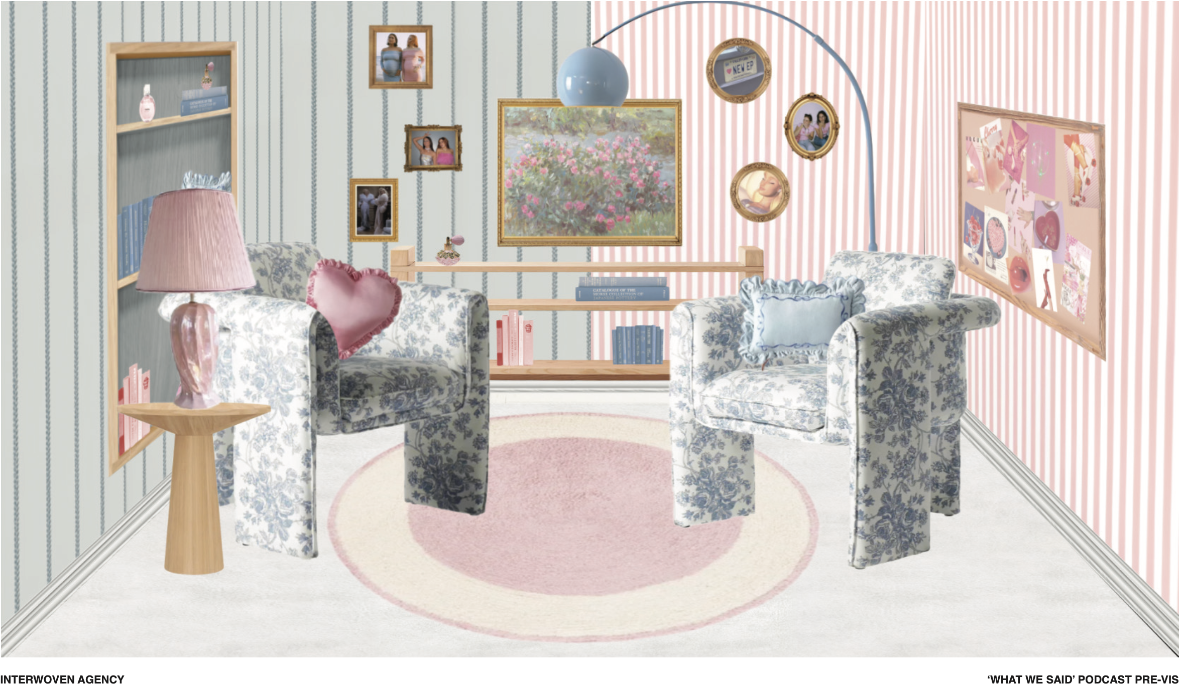
For the What We Said set, Interwoven Studio opted for a color palette of pastels, with light wooden accents.
(Image credit: Interwoven Studios)
This shared perspective is perhaps the defining characteristic of these design-led studios. The idea of the set not only shaping the experience of the viewer but also the guest runs across all these projects, and is a large part of what makes these spaces so appealing. There’s a warmth to them, a sense of reality that you often miss with the stereotypical podcast set.
“A podcast studio has two audiences: the people in the room and the people watching,” explains Emily. “In a regular project, I design for how a space feels to live, work, or spend time in. In a studio, every decision also has to work through a microphone and a camera lens. For example, when working on the layout, we are not just thinking about how to create a comfortable space that facilitates an engaging conversation, but also how this conversation is viewed through the camera, and how to make the viewer feel like they are in the room. There are far more technical considerations than in an ordinary room, so elements like acoustics, sightlines, and glare all come into the picture.”
But when these different variables are considered, what you’re left with is a space that feels honest, like a true reflection of the content. The thing so many people will say about their favorite podcast is how much comfort it brings them, often describing it as something akin to chatting with an old friend, so when the settings for these podcasts also embody that sense of familiarity and comfort, it helps to intensify this feeling.
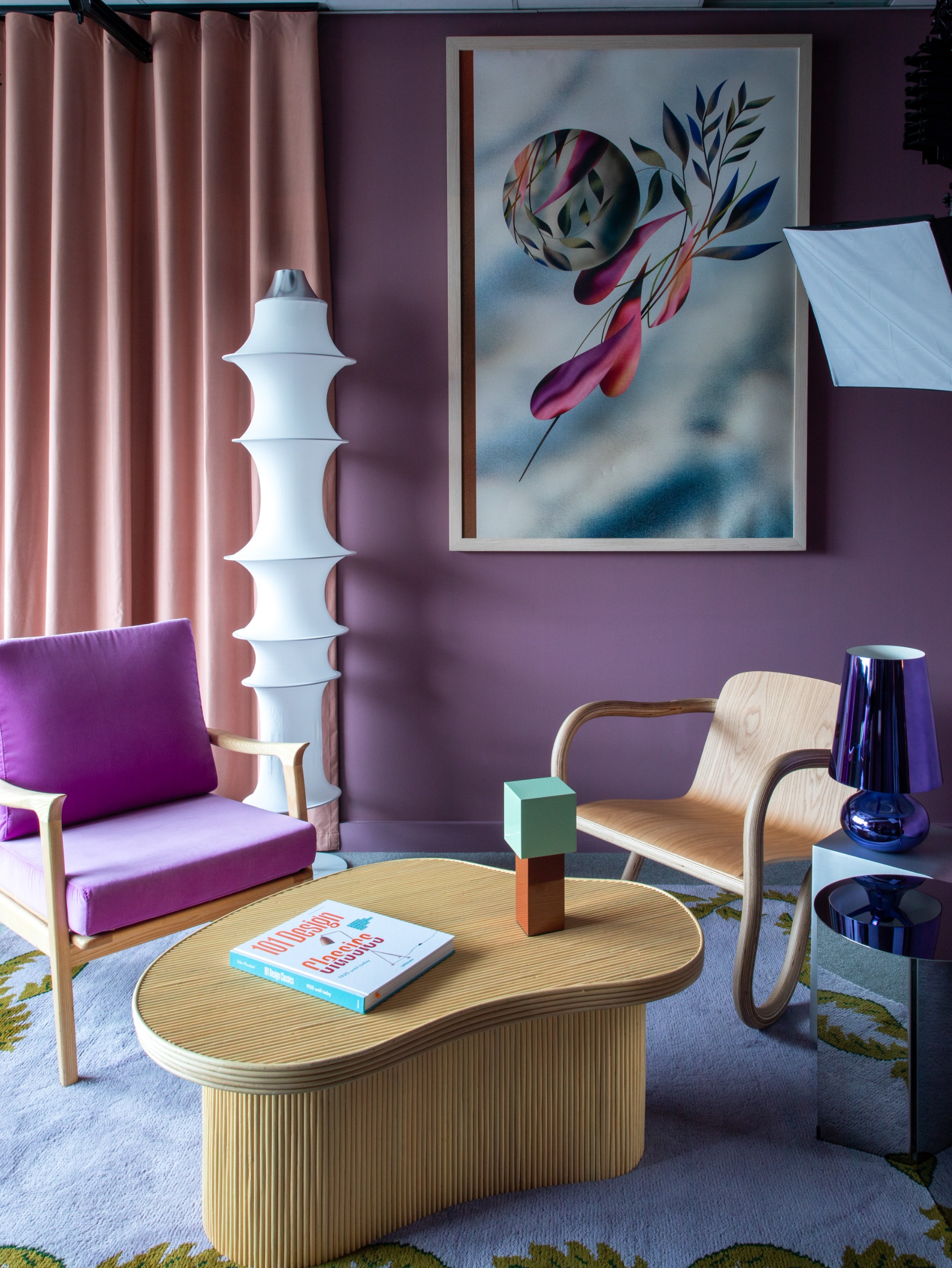
“Mauve walls and blush drapery bring warmth, the soft furnishings quietly do the acoustic work, and a large-scale artwork by Merijn Hos anchors the backdrop,” says Emily.
(Image credit: Ruth Maria. Design: Emily Cunnane)
Now, the format is going through some changes, and it might just be time for the set designs to change alongside them.
As Harrison describes it, at Interwoven Studios, the term ‘podcast’ is no longer enough to encapsulate the breadth of what they’re working on. “It could be a live show on Twitch or a recurring YouTube series. One of our recent projects was just on MSNBC, another is headed to Hulu, and Therapuss is now on Netflix. The lines between these formats and traditional television are blurring. We help creators build their own world, with a format and visual identity they can own, wherever the show ends up living.”
As podcasts take on an increasingly visual identity, the way the sets are designed becomes more integral to the way these shows are perceived. Having a clear point of view or voice isn’t enough nowadays; that sense of clarity and intention needs to bleed into every aspect of your content.
It all comes back to the idea of building a ‘brand’, and having an identifiable aesthetic plays a huge role in this. “The biggest podcasts aren’t really just podcasts anymore. They’re media brands. It’s a 360-degree approach. They’re on YouTube, they’re creating social content, they’re doing live podcast shows, writing newsletters, and bringing in brand partnerships, so visual identity suddenly matters a lot,” explains Haley.
This is exactly why ubiquity of podcast design feels so palpable now. It removes the sense of individuality from the podcast, no matter how unique the subject matter is. If you watch five different podcasts, and they all have the exact same set and interior design style, the chances are they’ll begin to blend together in your mind, losing that lasting impact a show needs.
This is why Interwoven Studios places such importance on customization in their designs. “We build dedicated sets with a specific crew behind them, so the space becomes part of that creator’s identity,” says Harrison. The sets are conceived as an extension of the show itself, a physical manifestation of the content. It’s scene-setting, helping to build a clear mood and atmosphere right from the jump. “The set tells you something about the show before anyone speaks,” he says. “The furniture, colors, and objects give you a sense of the person hosting it. When the room feels comfortable, that can help guests settle in and make viewers feel invited into the conversation.”

Hema spent time scouring antique markets looking for items that felt reflective of Jay and his content.
(Image credit: Iride Mete. Sagrada Studio )
It all comes down to the shift from an audio-first format to something more all-encompassing. As Emily points out, “A considered room signals credibility, care, and a point of view.” It also reflects the growing requirements placed on decreasing attention spans. With such an endless stream of content to scroll through, podcasts need to find a way to keep the viewer engaged, and “backdrops with depth, color and real artwork give the viewer something to rest on without pulling focus from the speakers.”
This is a point echoed by Haley: “We’re all scrolling at a million miles an hour now. If you come across a 30-second clip and it looks beautiful, polished and different from everything around it, you’re more likely to stop.”
As podcasts transition from small, home-grown productions to appearing on major streaming platforms, it’s only time before design-led sets become the norm. “Now that podcasts are getting picked up by Netflix, etc., and more people are watching them like talk shows, the pressure is probably higher to create a set that stands out and is memorable and on-brand for the host,” agrees Hema.
And, if these designers are right, it may not be long until the neon lights and swivel chairs are simply a relic of the past.
Cult Furniture
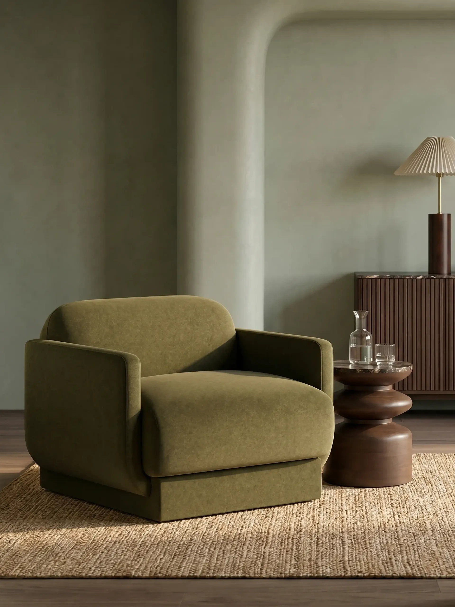
Moss Green Sustainable Mohair Velvet
These moss green armchairs exude that same comforting warmth as the ones in Jay Shetty’s studio.
H&M Home
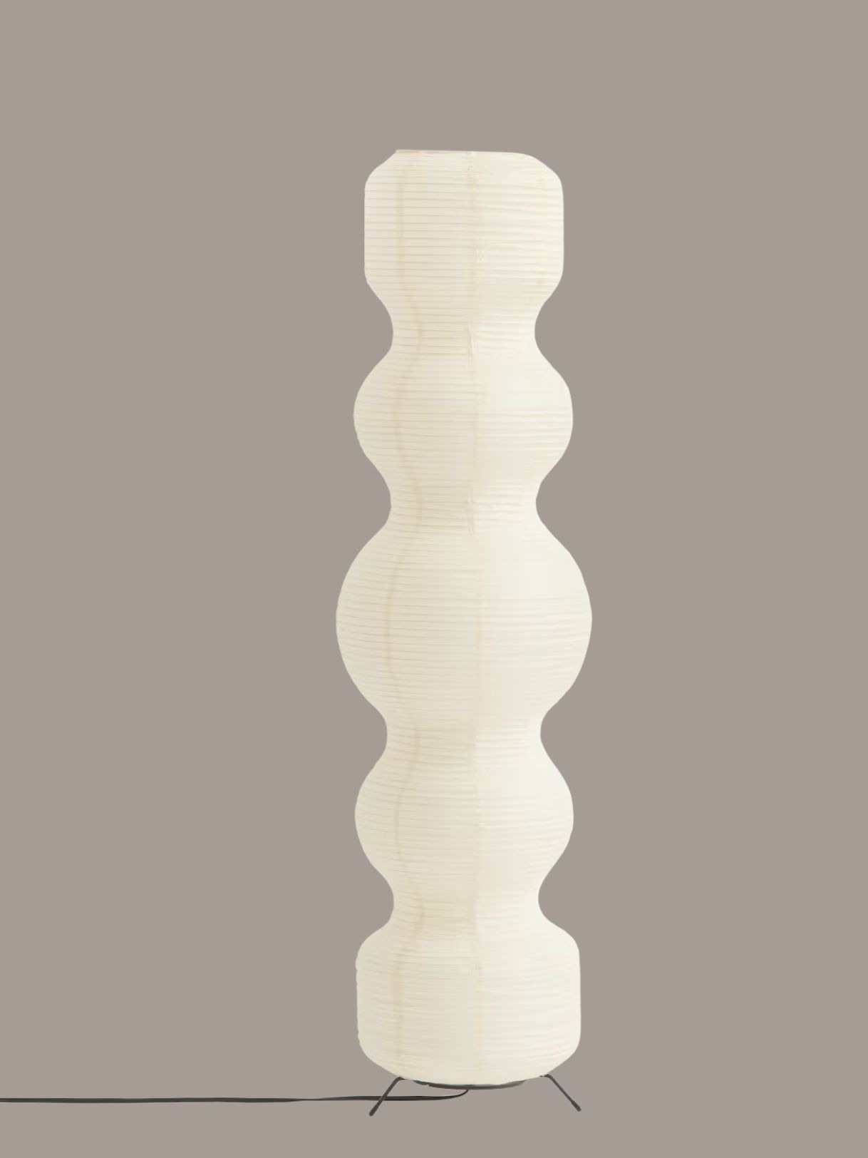
Rice Paper Floor Lamp
Soft, sculptural lighting helps soften the glare of the bright studio lights, and these rice paper ones from H&M look surprisingly expensive.
Soho Home
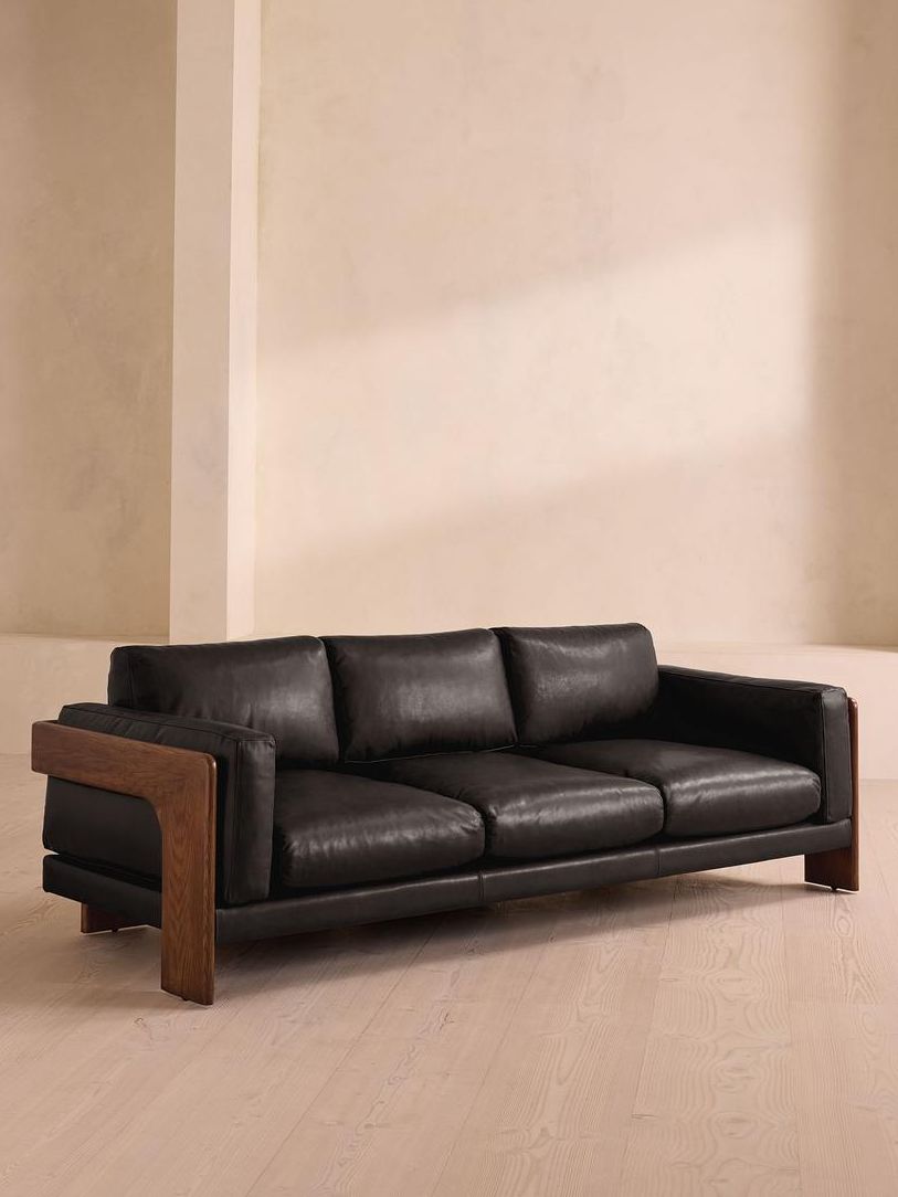
Marcia Three Seater Sofa
With black leather seats and a warm wooden frame, this sleek sofa has the mid-century modern look down, and would fit perfectly in Jake Shane’s studio.
The changing face of podcasts and the promise of a new era of design-led spaces feed into our recent exploration of the future of taste: design is a reflection of our identity, so we look forward to seeing how our favorite podcasters choose to present themselves through this medium.
For more design-centred conversations, subscribe to our newsletter.