
Ohri is experiencing the “30-minute ick factor”. Coined by Alexis Hiniker, a computer researcher at the University of Washington, US, the phrase describes the “wave of disgust or disappointment people feel when they realise they’ve spent over half an hour on a platform they meant to check only briefly”. It’s a classic symptom of “time-loss design” found largely on social media platforms. Or e-commerce apps that tend to recommend related products once you’ve added something to the cart, instead of taking you directly to the checkout. Ohri is concerned she’s now experiencing it on a quick commerce app, too.
It’s not just a time sink, it’s costing her money, too. She orders groceries from the app roughly thrice a week, but the doomscrolling nearly doubles her bill every time. Fairy lights, a table runner, coasters, a plant—just to confirm the app really delivers plants—have all found their way into her cart through this route. Even a vacuum cleaner. “You think this is better than mindless doomscrolling on Instagram because it’s adding value to your life in some way, but it ends up increasing material consumption,” she says.
It all started last October around Diwali, when Blinkit expanded beyond groceries. Ohri was curious. Items that once took three days to arrive via online shopping, could now show up in three minutes; the platform’s “dark store” is only 700 metres from her apartment, she tells us. “Gifting my family members things via Blinkit has become my love language of sorts now,” she adds. Ohri likens her act of gifting via the app to the way people indulge in “pebbling” on Instagram, the ritual of sending Reels or memes to friends as little tokens of affection. The comparisons she’s drawing may not be incidental.
For years, social media and streaming platforms have been finding ways to keep users glued to their apps. YouTube and Spotify “autoplay” the next video, song or podcast. In-app browsers—such as the ones allowing YouTube videos to play within a WhatsApp chatbox—prevent you from exiting the messaging platform. And the infinite scroll—born on TikTok—now powers video feeds on Instagram and X.
What’s striking is how platforms across verticals—social, e-commerce, fitness-tracking, news, beauty, fashion and even professional networking—are finding newer, subtler ways not only to keep us hooked for longer but also de-incentivise leaving them.
X (formerly Twitter) removes link previews to make you less likely to click away. Digital marketers note how LinkedIn throttles posts with external links, nudging users to bury URLs in the comments. Instagram lets you reply to Reels sent via DMs within the Reel itself. You don’t have to go back to your chatbox. The design makes the “social interaction” part seem like a quick detour, something to get out of the way before getting back to the real task: scrolling on to the next Reel.
“All these feel like subtle nudges that eliminate the pause,” says Ohri, whose work explores the intersection of technology, design, and human behaviour. “That ‘break’ where you would normally switch off or close the app… it doesn’t exist anymore. Now, you’re forever contained in their world.”
When author Nir Eyal published Hooked in 2013, he highlighted how tech companies remove friction to keep us hooked on apps, built on a simple loop: “trigger, action, variable reward, and investment”. Today, platforms have evolved far beyond Eyal’s framework.
From removing friction in UI/UX design (user interface and user experience), many platforms are now adding friction at every exit point, thus not just shaping user behaviour but controlling it. It’s no more about whether these apps are addictive, it’s whether they’ve already stolen our ability to choose.
Hooked warned us that “apps were trying to be like bars—places where you’d happily order one drink after another,” says Himanshu Khanna, 38, founder of a Delhi-based design company, Sparklin. “At least bars have a cut-off policy when you have had too much.” Similarly, some apps introduced screen-time nudges, even though they were never aggressively marketed. “But platforms now behave like casinos, building a space—with unlimited free food and no clocks or windows so you lose track of time—to keep you inside for days ,” notes Khanna, who has spent close to two decades designing apps for consumer internet and B2B companies.
Anushka Kulkarni, 24, experienced this app-hijacking behaviour with language-learning app Duolingo’s streaks feature. After maintaining a 775-day streak of learning the German language over the last two years, she noticed, “It was just pushing me every day to keep a streak but had slowed down the learning path. I think the app makers figured if I learn faster, I won’t use the app anymore.” What began as positive reinforcement gradually turned performative. “I uninstalled the app earlier this year as it had become about showing off how long the streak has been going, instead of measuring progress,” says the marketer from Mumbai, who currently works with a fintech platform in Bengaluru.
As the line blurs between user engagement and user manipulation, it forces a deeper reckoning with just how much we should hold platforms accountable for designing the trap, and ourselves for stepping into it.
Forming habits
Apps of all kinds are trying to build “habit loops”. Think “streaks” on Snapchat, language-learning app Duolingo, and fitness apps like Strava, even the NYT Games app. A streaming platform like Netflix offers games to hold attention a bit longer. And so does, oddly, a professional networking platform like LinkedIn.
When Netflix and Linkedin launched their gaming sections in 2021 and 2024, respectively, Neha Mathews did not find it at all odd. “It’s what newspapers have done for decades with crosswords and Sudoku,” says the 33-year-old business development professional from Mumbai. “Maintaining my daily streak on apps like Duolingo, NYT Games and LinkedIn’s games section appealed to my competitive streak. I wanted that badge, that rank, that consistency.”
But then she started to notice something else about this streakification of her life. For a week this year, Mathews got on the Strava fitness app that logs fitness activities and keeps a record of your “streak” as well as lets you see others’ performance. “I think I spent fewer hours running and more hours doomscrolling on Strava to see how friends and family were running, cycling, and being fit so much more than I was.”
Notice how “doomscrolling” appears yet again, this time in the context of a fitness-tracking app trying to pull users into endless loops. Mathews has since uninstalled the app.
Even AI platforms seem to be following the habit loop pattern now, Khanna of Sparklin points out. “Every time you ask GPT something, it answers your query and immediately hooks you with things it can do next for you, related to your initial query. All you need to do is say ‘sure’ or ‘yes’.”
Soon, AI chatbots like ChatGPT, Perplexity and Claude may start nudging users with random notifications, much like Zomato or Amazon, he reckons, like “There are more inputs to XYZ business model since you last asked. Would you like to explore that?”
Can we really call these tactics manipulative though and hold platforms accountable?
“At first, these features feel like nice touches, small conveniences that smoothen the experience. But they’re not really about helping the user. These are behaviour-shaping choices, designed to reduce conscious decision-making and make it easier to fall into longer, more passive app usage,” says Khanna.
In May, American peer-reviewed medical journal Neurotherapeutics published a study involving 7,212 adults from the 1999-2002 cohort which stated that higher leisure screen time (LST) was associated with accelerated biological ageing, independent of the individual’s physical activity levels.
In an emailed response to Lounge’s query on streaks on the app, a Snap spokesperson says, “Unlike features on other platforms that rely on public validation, Streaks are private and focused on personal connection, a reflection of Snap’s commitment to designing interactions that are safe, authentic, and aligned with well-being, not pressure. To remove any potential pressure related to Streaks, we offer free restores, have extended the time frame for a Streak to continue, and this feature is opt-in.” Instagram, Duolingo, Strava, and Blinkit did not respond to Lounge’s emailed queries on the topic.
Can we really call these tactics manipulative though and hold platforms accountable?
Most of these app features fall under what UI/UX designers call “persuasive design”. That is features meant to persuade users into certain actions, often aligning user needs with business goals.
Ankur Rander, CEO of BombayDC, a digital products company, says, “Each of these features comes from studying user behaviour and turning those insights into hooks.” Rander’s work of building digital products also involves building elements of persuasive design for apps. Unlike dark patterns—like hidden fees, tricky subscription cancellations or sneaking items into carts, which are overtly deceptive—persuasive design is a nudge, not a trap, he says.
Companies do tend to prioritise growth over user well-being when designing apps, adds Rander. “Being truly user-centric is expensive. It demands process changes, extra costs, and letting go of established practices. It’s costly in the short term, even if it pays off in the long run—but not all clients are willing to take that long-term view. So, persuasive design will remain acceptable if it balances user and business value,” he adds.
If the feature respects user intent, it feels like genuinely “adding value”, says Adithi Sampath, a tech and product leader with two decades of experience at major consumer internet companies like Meta and Uber. “Features that nudge users, but in service of the platform’s own goals feel like ‘value-add’. But when it’s designed primarily to capture attention or extract value for the company without serving the user’s needs, it crosses the line into being exploitative,” adds Sampath, who currently works as vice-president of product at global auto firm, Stellantis.
Personalised recommendations, nudging towards healthy behaviours, like finance apps helping people save more, fitness apps nudging users to exercise more, price drop alerts or safety notifications feel like value-add to her. Whereas, “auto play, opt-out phrased negatively, social pressure notifications (your friend just surpassed you), feel exploitative,” she says.
In larger, more mature companies, discussions around persuasive design tend to be more structured, often framed around user trust, well-being, or long-term retention, she notes. “In high-growth environments, ethical considerations may take a backseat,” she says.
It makes you see certain instances of persuasive design in a different light. Take Instagram’s in-feed reply to Reels sent via DMs, for instance. “It isn’t just about building higher retention for the app but also funnelling us toward their most monetisable features,” says Bengaluru-based Ishtaarth Dalmia, who works as a marketer at a VC firm. “Because Reels have ads, whereas DMs remain ad-free for now,” he adds.
Two years ago, Instagram head Adam Mosseri revealed on the 20VC podcast that teens were spending more time in DMs than on Stories or the feed, which led him to redirect company resources towards developing messaging tools. However, as more user attention shifts away from the traditional scrollable feed, the platform sees fewer ad impressions, making it harder for Instagram to justify its ad pricing. The move to enable in-feed replies to Reels, adds Dalmia, may also be an effort to recapture some of those lost ad views.
Dalmia has also worked at a popular consumer internet company in his previous stint. He finds it interesting how WhatsApp letting you play a YouTube video inside a chat makes Google lose programmatic ad revenue on it.
Today, “apps are working overtime—not just to build tighter hooks, but to break the hooks of competing apps,” says Aditya Kothari, Bengaluru-based strategy consultant who has first-hand experience of building stickiness for an app as the former co-founder of Chingari, a homegrown TikTok alternative. For instance, Instagram pulls you back into the app after you share something externally—quietly, without showing you a dialogue box blocking access to the other app. It’s so smooth you barely notice the choice to stay elsewhere was taken away from you. “Big tech companies have dedicated teams tracking rising consumer apps. And once a smaller app gains traction, the playbook is simple: buy it, clone it, or crush it,” he adds.
When Snapchat’s Stories became popular, soon every other app had Stories. Delivery apps introduced tipping …now cab aggregators have it. The same happened with short-form videos, and now with micro-dramas: Instagram just announced Reel Series, which lets you link one Reel to the next, clearly a response to the format’s growing popularity. “What has happened as a result is that earlier the slot machine was just in a casino . Now it’s in your home, office, bedroom, bathroom…essentially wherever you carry your device,” notes Kothari.
Ohri, who now buys groceries offline, points out how just a few years ago, doomscrolling was considered a form of rest—a way to switch off at the end of the day and scroll without thinking. “Now, we seem to be unable to do anything without checking our phones in between. People tweet about sitting through an entire movie without looking at their phones as if it’s some sort of a win.”
“You are micro-reacting, micro-thinking about who to send something you saw online on one of these apps to. It has completely changed what ‘rest’ looks like for so many of us,” rues Ohri.
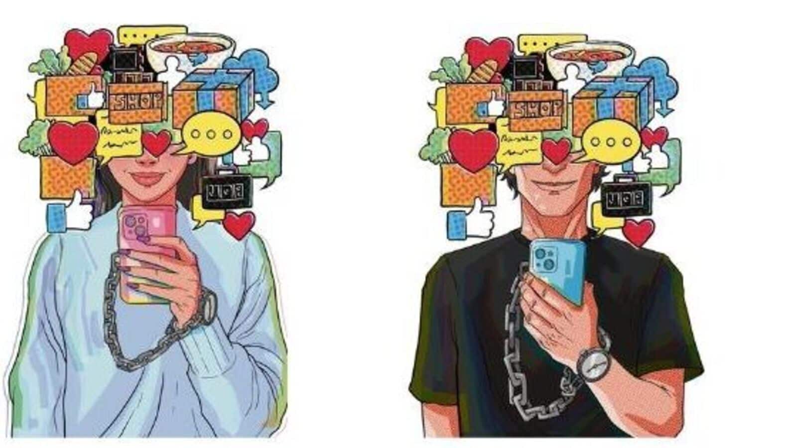
It brings to mind a video essay by author Jonny Thomson, “liked” by nearly 30,000 Instagram users, that Kothari shared with me. In it, the academician, who shares content on philosophical ideas with his 660,000 followers on @philosophyminis, talks about “creeping normality” in the context of technology and its impact on our lives. He describes the concept as when something harmful arrives gradually, each step feeling harmless. “The trick of creeping normality,” he says in the video, “is that it hides the crunch points. None of the concessions seem worth objecting to, until link by link the chain is made.” The worst chains, he adds, are those that appear while you’re looking elsewhere—doing something else. “And before you know it, you can’t move.”
But there are ways to break away from this creeping normality without taking extreme measures like locking your phone away or going on a digital detox retreat. Some content creators have started making content about how apps are hijacking our time and gaining traction for it on the same platforms they hold responsible for said hijacking. They share hacks like switching phone’s homescreen to black-and-white to make screens less stimulating, burying time-sucking apps in folders to add friction, or using minimalist launchers that only display three or four key apps on the homescreen.
Persuasive design may not qualify as a dark pattern yet, which keeps platforms out of regulatory sight, but it is quietly turning user delight into user dreariness. And if platforms can’t be called out for thrusting these slot machines in our faces, the least we can do is refuse to pull the lever.