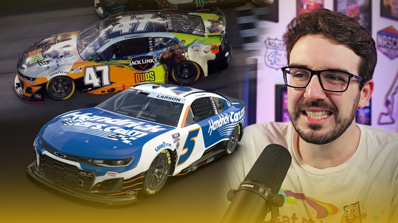
Some schemes pop on track, others leave you wondering what happened between the sponsor meeting and the wrap shop. This time, the spotlight lands on the paint schemes that just did not connect, not the worst of the year, just the ones that missed the mark compared to what came before. From flat colors to strange layout choices to surprisingly empty doors, this list walks through the 2025 designs that could have used a little more flavor, a little more chaos, or, honestly, just a little more anything.
Why did Freightliner go from futuristic and electric to silent and empty, with all that unused space?
How did a betting app paint scheme become a masterclass in clashing colors and bargain bin clip art?
What happened to the food sponsors, and why did the pizza cars look like anything but pizza?
And how did 23XI Racing, the team known for sleek modern looks, drop the most shockingly plain scheme of the season?
Some of these cars had potential, whether it was a clever detail hidden up close or a color choice that almost worked when the light hit it right. But most of the time, they were forgettable, mismatched, or simply bland compared to their predecessors. Fans want personality. They want style. They want something that stands out from 200 miles away. Too many of these did the opposite. Check out the full breakdown and see if your least favorites made the list. Let Eric know which schemes you think deserved a little more love or even tougher criticism.
Watch Also

