
For Canadians, the news that our star GC rider, Derek Gee-West, was official on Lidl-Trek’s squad for the next few years was stellar. Finally, the long protracted contract saga from The Team Formerly Known As Israel-Premier Tech was done.
Aaaaaand then we saw the national championship jersey.
Gee-West, coming off a fourth-place overall finish at the 2025 Giro d’Italia and a national road title, was seen in a…unique jersey. On his previous team–now known as NSN Cycling, the jersey delivered. It resembled a classic design and popped. How great would it be to see the maple leaf going toe to toe, erm, elbow to elbow, with the best riders in the world?
Derek Gee-West and 2026
Unfortunately, due to all the, you know, stuff, Gee-West didn’t race following leaving the team. No Tour du Pologne, no Vuelta a España, no Grands Prix races, no Worlds. But that design was pretty good.
It should be noted, that the design favoured by many pros–Alison Jackson, Olivia Baril, Ben Perry, and more…uses the design previously used by Cycling Canada for the podium jersey. (And you can read about someone’s very strong opinions of that little ditty below.)
Cycling Canada just ruined the national championship jersey
Although some federations are stricter with following the letter of the law when it comes to jersey rules–the UK, France, etc., there are few regulations as to design, as opposed to saw, continental kit like the Pan-Am or Euro champ jersey. So you can kinda do what you want for the Canuck kit. Which is exactly what Lidl-Trek did.
Where’s the leaf?
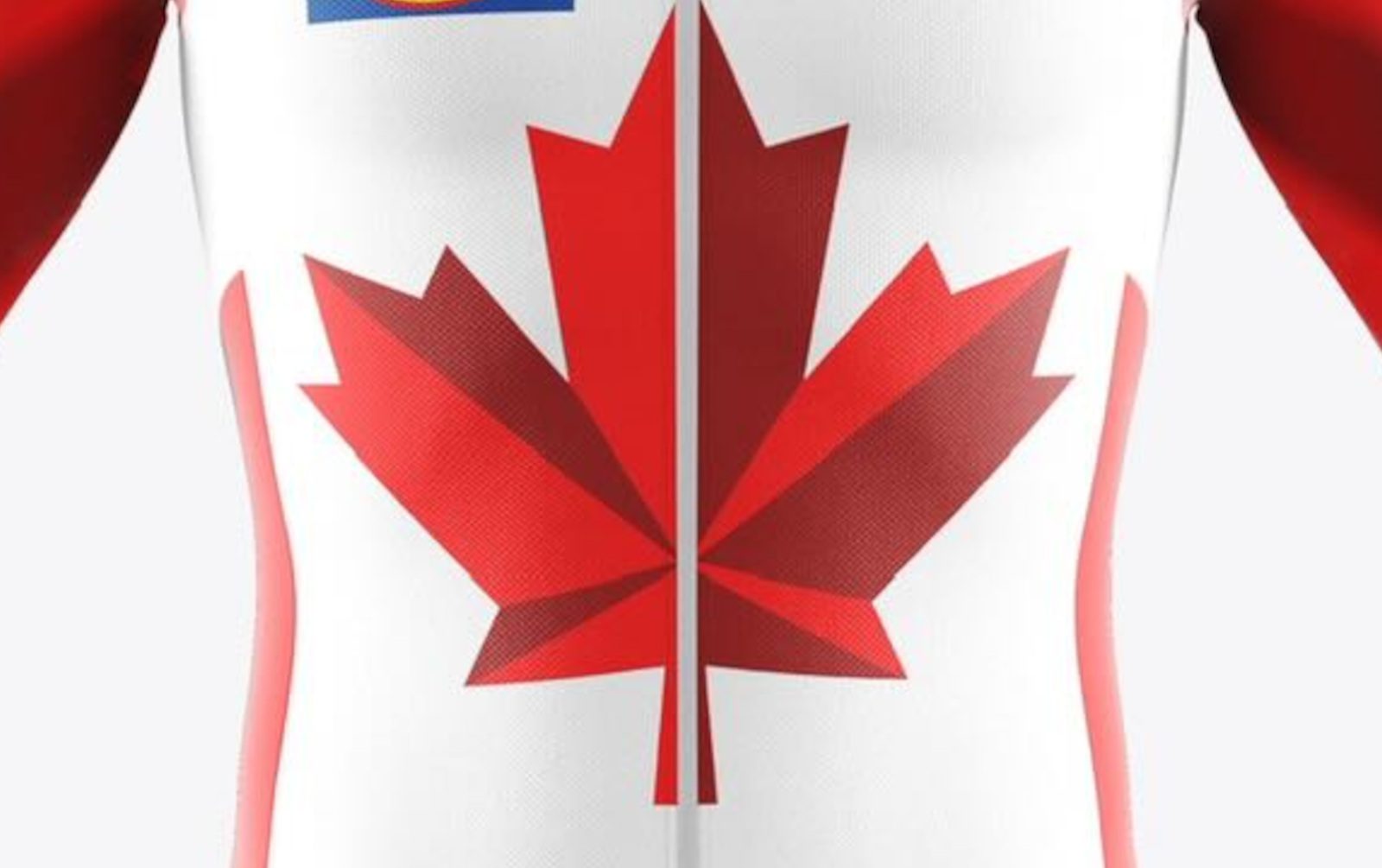
The official Lidl-Trek jersey technically includes Canadian elements, but the execution minimizes their impact. The maple leaf is placed low on the torso, reducing its prominence and making it difficult to identify in race situations. At speed or from distance, the jersey reads as a standard team kit rather than a national champion’s jersey, blurring the visual distinction that such titles are meant to create. Part of the problem may lay with the sponsor placecment, and that’s fair. But some teams–usually French teams, prioritize the flag design over sponsors. Not even if it’s a tricolore. Check out Antoine Duchesnes’ beauty of a top.
So…about that new national champs design (that none of the pros are using)
National champion jerseys across the peloton typically prioritize clarity and symbolism, drawing heavily from flag motifs and established colour hierarchies.
In contrast, Gee-West’s tunic seems…constrained by sponsor layout rather than guided by national representation, resulting in a design that feels subdued and, for many, underwhelming. (Trust me, read the comments.)
A better option
However, God bless the Internet. That gap has been directly addressed by Anthony Debauche, a freelance designer originally from Namur, Belgium, now based in Montreal, who independently produced an alternative design after the jersey’s release.
“I’m just a guy who’s raced bikes in Belgium for years and recently moved to Canada—the most beautiful country in the world,” Debauche said. “As a Canadian cycling fan, I was very upset by the design, like much of the cycling community, so I felt compelled to create something that actually puts respect on the flag.”
Debauche’s proposed jersey places the maple leaf front and centre, restoring it as the dominant visual element rather than a secondary graphic. The design leans into a traditional red-and-white palette, using contrast and scale to ensure the jersey is immediately identifiable as Canada’s national champion kit—whether in a solo breakaway or a crowded sprint finish. And he didn’t just design one, he made a bunch. And they all rock.
Unlike the Lidl-Trek version, the redesign establishes a clear visual hierarchy: national symbolism first, team branding integrated rather than overpowering. The result aligns more closely with how other countries present their champions, balancing sponsor visibility with unmistakable national identity. It just hits.
Why it matters
In pro cycling, a national champion’s jersey functions as both honour and message. It tells fans, competitors, and sponsors who the rider represents before any results are registered. Debauche’s concept demonstrates that it is possible to respect commercial realities while still delivering a design that feels worthy of the title Gee-West carries.
We Canucks are pretty easy-going most of the time. A few things rile us up (check the news), but paying homage to our flag is definitely one of them
Will Lidl-Trek change the kit? Who knows. Should they? Probs. Will a Canadian Cycling Magazine reader start a petition and see what happens? TBD.