

Stephen Headrick / Android Authority
I used iOS for over a decade before fully switching to Android. Even today, my favorite part of iOS doesn’t come from Apple itself, but instead from its third-party app community. My social media feed is filled with examples of beautiful indie iOS apps, crafted beautifully down to the most minute of details.
On Android, however, I struggle to find apps with uniquely designed experiences. As long as the app technically does what it’s intended to do, it gets a passing grade for most people. I’ve long wanted to see that change, and I think the only way that happens is if Google leads from the top. Material 3 Expressive shows Google is recognizing design’s importance more than ever before — I prefer it to Apple’s Liquid Glass — but it only matters if the design system is applied to the apps we use every day. With Google’s very own Fitbit app — the new version that’s still rolling out, so you may not see it in your app yet — I see a shining example of what the future of Android apps might look like, and now I want every app I use to look this good.
Does app design matter to you?
73 votes
Yes, good design is essential.
63%
Yes, but it’s not vital to my usage.
23%
No, I just want an app that does what it’s intended to do.
14%
It’s in the details

Stephen Headrick / Android Authority
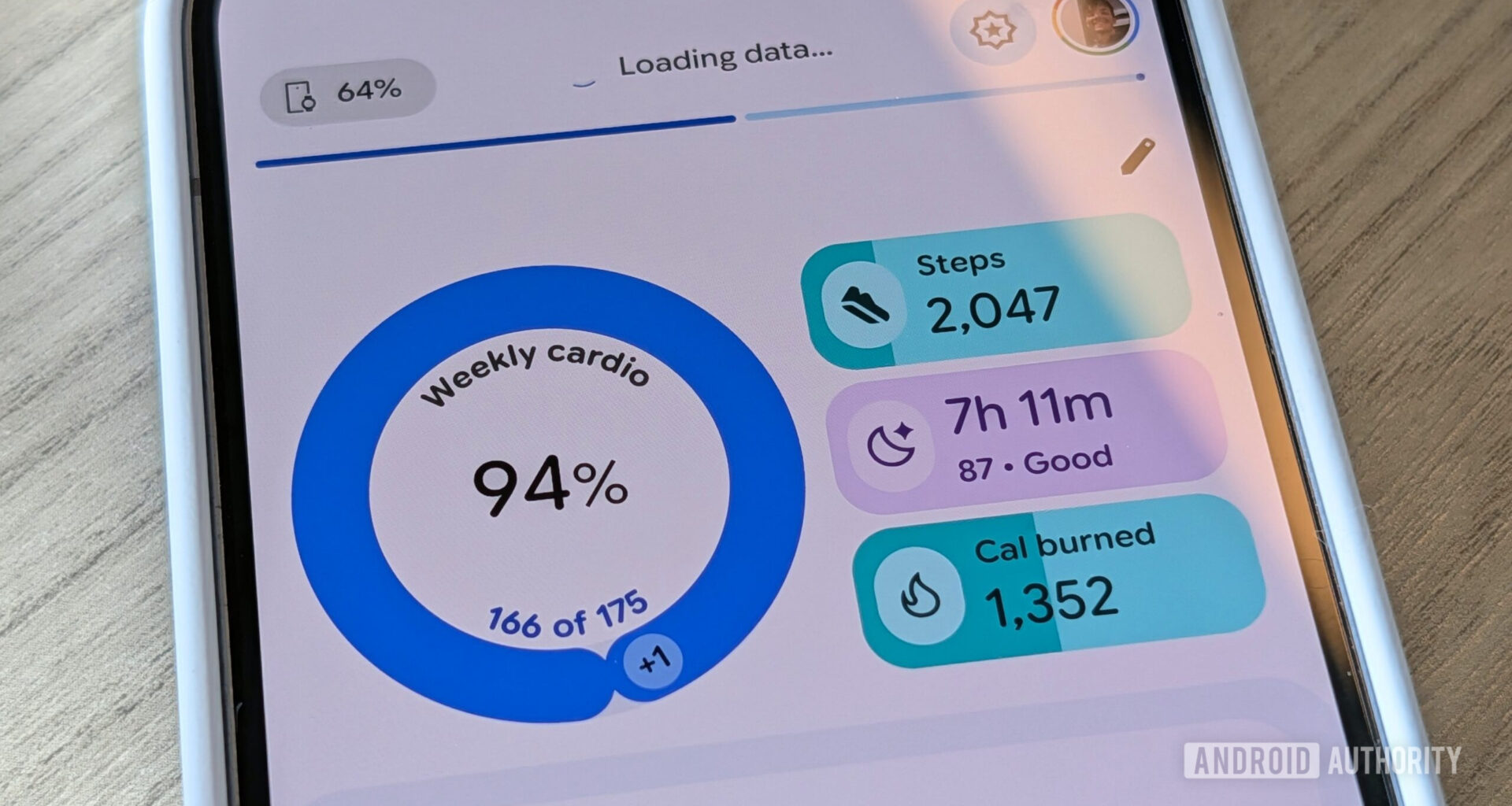
To me, good design is more than meets the eye. It’s a bunch of little things that add up to create an experience that just feels good to use and look at. This can be accomplished through motion design, the colors used in the UI elements, and, of course, the performance of the app.
In Fitbit, you get all three of those design elements right when you open the app. A circle chart is smoothly spinning into place to show your cardio activity for the week. The app quickly syncs the latest data from your smartwatch before you would even think to do so manually, shown by an animated loading bar at the top of the screen. Simple shapes at the top of the screen show the most important fitness data, each filled with a tastefully chosen color. Text size is carefully selected to give hierarchy and clarity to the most important information. All of this is presented right when you open the app, with no lag to slow you down.

Stephen Headrick / Android Authority
Today view animations, slowed down
When you begin to scroll, the floating action button at the bottom right of the screen — a common design element in Android apps — animates with a bouncy snap from its extended state to its smaller state so that it doesn’t get in the way of the information you’re viewing. This button isn’t always so smooth in other apps I use, so it’s noticeable in this app. Just one more small detail that adds to the experience.

Stephen Headrick / Android Authority
The pull-to-refresh animation uses Google’s stock animation designed specifically for Material 3 Expressive, and it looks great. That’s the thing about Fitbit’s design: it’s mostly using elements accessible to any developer in Google’s latest design library. The difference is that it actually took advantage of what’s already available.
The opposite of information overload

Stephen Headrick / Android Authority
Fitbit is also a great example of good design because it needs to present a lot of information in a way that isn’t overwhelming or too dense, and it does so beautifully. Take the Fitness tab, for example. The top half of the screen shows three of the more important overview charts in a way that is simple yet informative enough to get what you need.
That’s the thing about Fitbit’s design: it’s mostly using elements accessible to any developer. The difference is that it actually took advantage of what’s already available.
The exercise days chart is a fun example. For days where you completed a workout, the icon representing a day of the week goes from greyed out with a running person icon to colored in, signifying you completed a workout that day. To take it a step further, if you completed the specific workout from your Fitbit workout plan, the icon changes to represent the workout you did that day — a person lifting weights for the strength training workout, as an example — and the shape of the container goes from a circle to a special shape from the Material 3 Expressive catalog to signify that you stuck to the plan you made. The chart clearly communicates a lot of information using simple icons and shapes, and you can tap into the chart for more details about the exercise days. Again, small details that add up.

Stephen Headrick / Android Authority
Fitbit steps graph animations, slowed down
Perhaps the most important aspect of all, Fitbit feels snappy. There’s no lag when switching between app screens, and most screens have micro animations that make the app feel more robust in everyday use. Aside from the circle graph animation in the main Today tab I mentioned above, the other three tabs (Fitness, Sleep, and Health) have small animations in their charts as well. These animations are a hallmark of modern design, and I think Android apps would feel a lot better to use if more of them implemented this into their experience.
That’s not all, folks

Stephen Headrick / Android Authority
Here’s the thing: Fitbit shouldn’t even be the shining star example, it should be the baseline. We don’t want every app to be a Fitbit copycat; I could even nitpick the animation speed for some elements or the lack of animations between tab screens. The fact is that Material 3 Expressive elements provide all the necessary tools to create a beautiful experience for Android and we need more of that.

Stephen Headrick / Android Authority
I look at what developers like sinasamaki are doing with Jetpack Compose, the standard coding language for Android UI development, and I see what’s possible. That’s the type of incredible design I see all over the place from our iOS friends, and although I can think of at least a few good examples of apps that are trying, it’s very lacking on Android in general.
Looking ahead

Stephen Headrick / Android Authority
You might think, “Why don’t you just use iOS?” There’s a myriad of reasons why I choose Android over iOS, but that’s for another article. I’m now learning Android development, and I hope to be part of the change on Android, but I have a lot of learning to do when it comes to coding.
Kudos to Fitbit for an incredible redesign. When you put the old version side-by-side with this new version, it’s easy to see a very bright future for Android apps. Instead of just being this one app, however, I hope this is the start of a very different world of Android apps going forward.
Don’t want to miss the best from Android Authority?
![]()
![]()
Thank you for being part of our community. Read our Comment Policy before posting.