
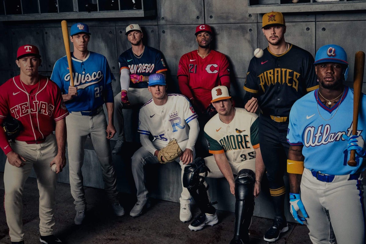
For at least a portion of the remaining MLB season, phrases like “Wisco” and “BMore” will be as commonplace as frozen ropes and batting around. Welcome to the latest batch of City Connect jerseys that eight teams will wear this season.
Since 2021, the City Connect initiative has seen Nike and MLB partner on uniforms that reflect the city and culture of teams. To date, 37 jerseys have been unveiled, with every franchise except the New York Yankees and Athletics having at least one jersey.
We here at The Athletic love a good uniform, and we’ve weighed in on the World Baseball Classic jerseys, MLB’s first batch of City Connect offerings, as well as the best and worst road grey jerseys. Now we’re back to weigh in on the eight new City Connect uniforms.
Our Johnny Flores Jr., Tyler Kepner and C. Trent Rosecrans came together to vote on their favorites. They individually ranked each uniform from 1-8 (1 being the best). Those totals were then averaged and ranked. Each writer’s personal ranking will appear in parentheses next to their name.
Here are their takes, plus the inspiration behind each uniform:
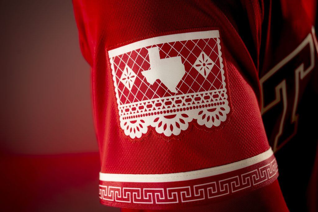
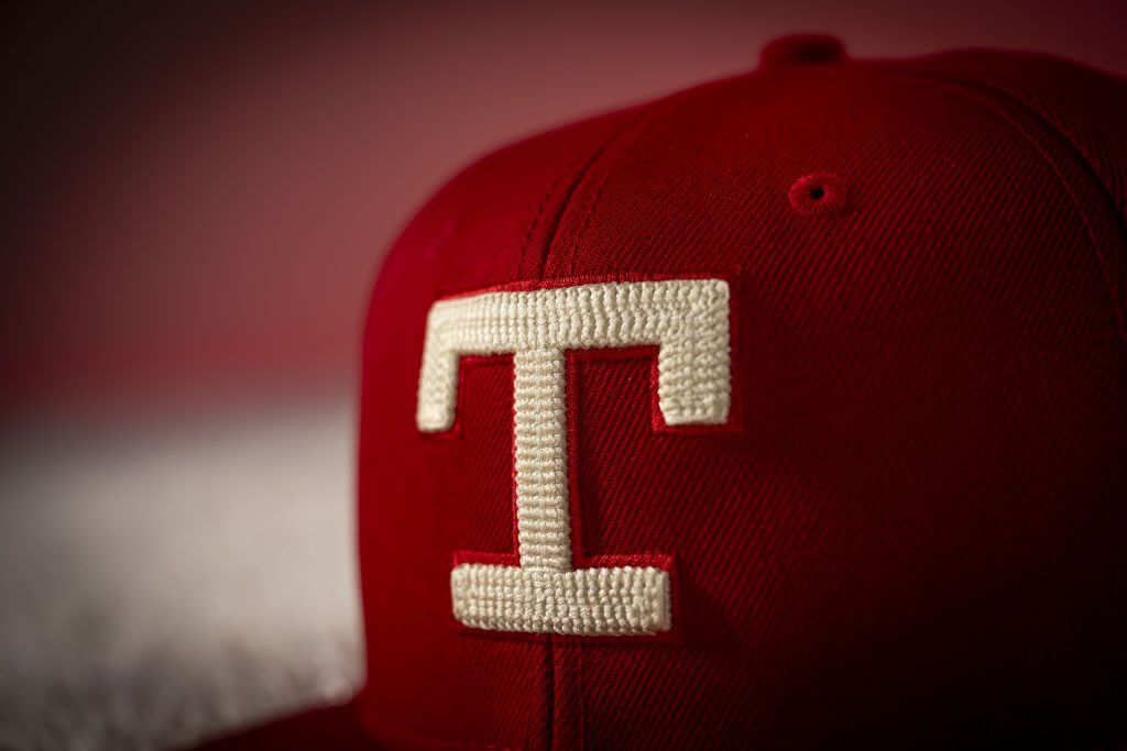
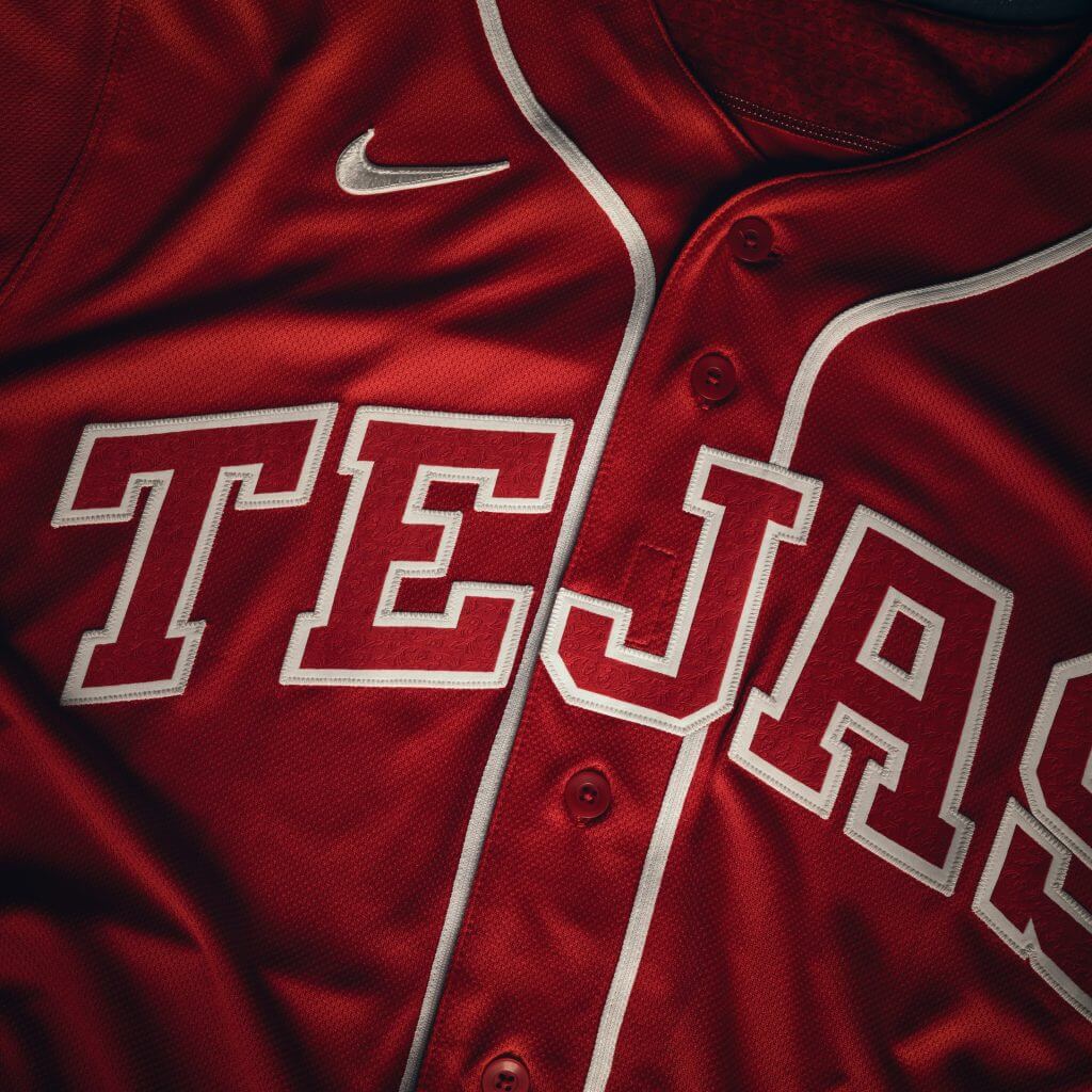
8. Texas Rangers (Average score: 7.66)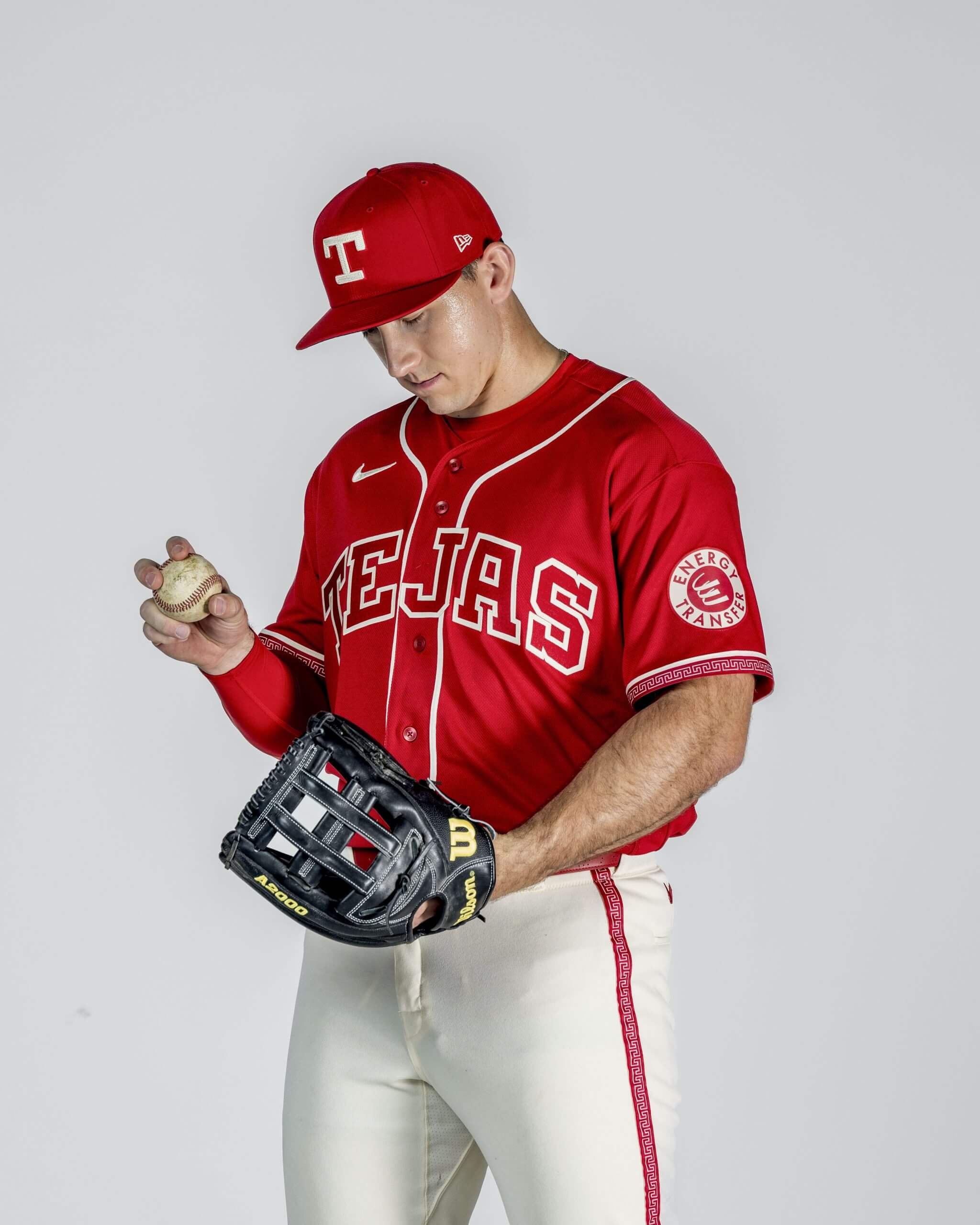
Wyatt Langford poses with the Rangers’ new City Connect uniforms. (Billie Weiss / MLB Photos via Getty Images)
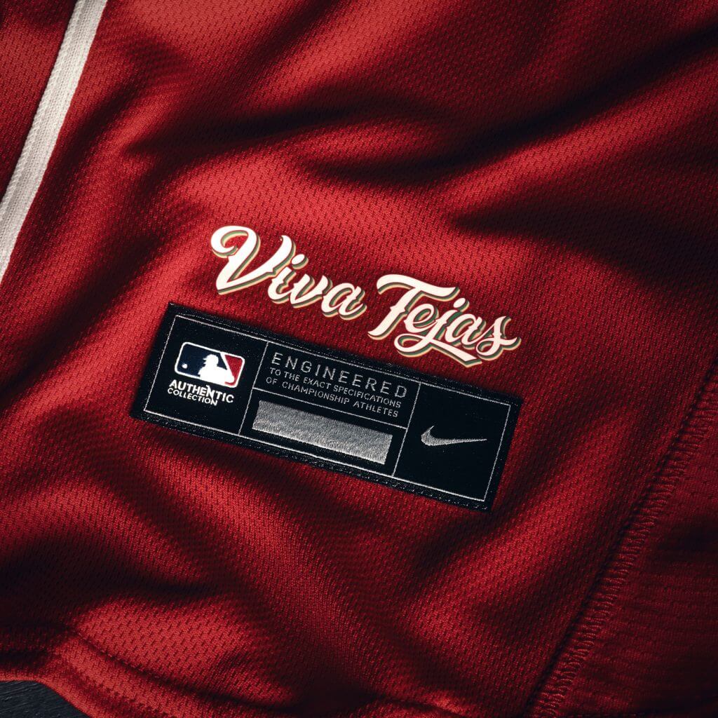
“This year’s City Connect uniform reimagines familiar elements of past Rangers looks while celebrating the Mexican influence woven into the state’s identity — and into the name the team proudly represents.”
Johnny Flores Jr. (7): The Rangers clearly put a lot of thought into paying homage to the Latin culture of Texas, and it shows. Having a tertiary color would’ve helped to break up the red, especially since the lettering is the same color. Putting “Tejas” front and center is smart, though it’s unfortunate that it comes a year after a rather pitiful incident involving a now-pulled vulgar Rangers hat.
Tyler Kepner (8): I like the details on the edges of the sleeves, and I’m a big fan of using Spanish words on jerseys, rather than the lazy “Los Suns” kinds of designs. But it always bugs me when the color of the letters matches the color of the jerseys. It just kind of sits there, flat. Also, the lettering here is too plain. This belongs on a discount rack in Walmart, not on an MLB field. Feels like a missed opportunity; they should have had more fun with this theme.
C. Trent Rosecrans (8): The first version of the Rangers’ City Connect was overthought, but this one feels underthought. The sleeves look cool, but other than that, it’s a fun high school alternate uniform. It’s inoffensive, but I almost want to put bets on whether more will be sold at Ross than at Academy.
Billie Weiss / MLB Photos via Getty Images
Billie Weiss / MLB Photos via Getty Images
Billie Weiss / MLB Photos via Getty Images
Billie Weiss / MLB Photos via Getty Images
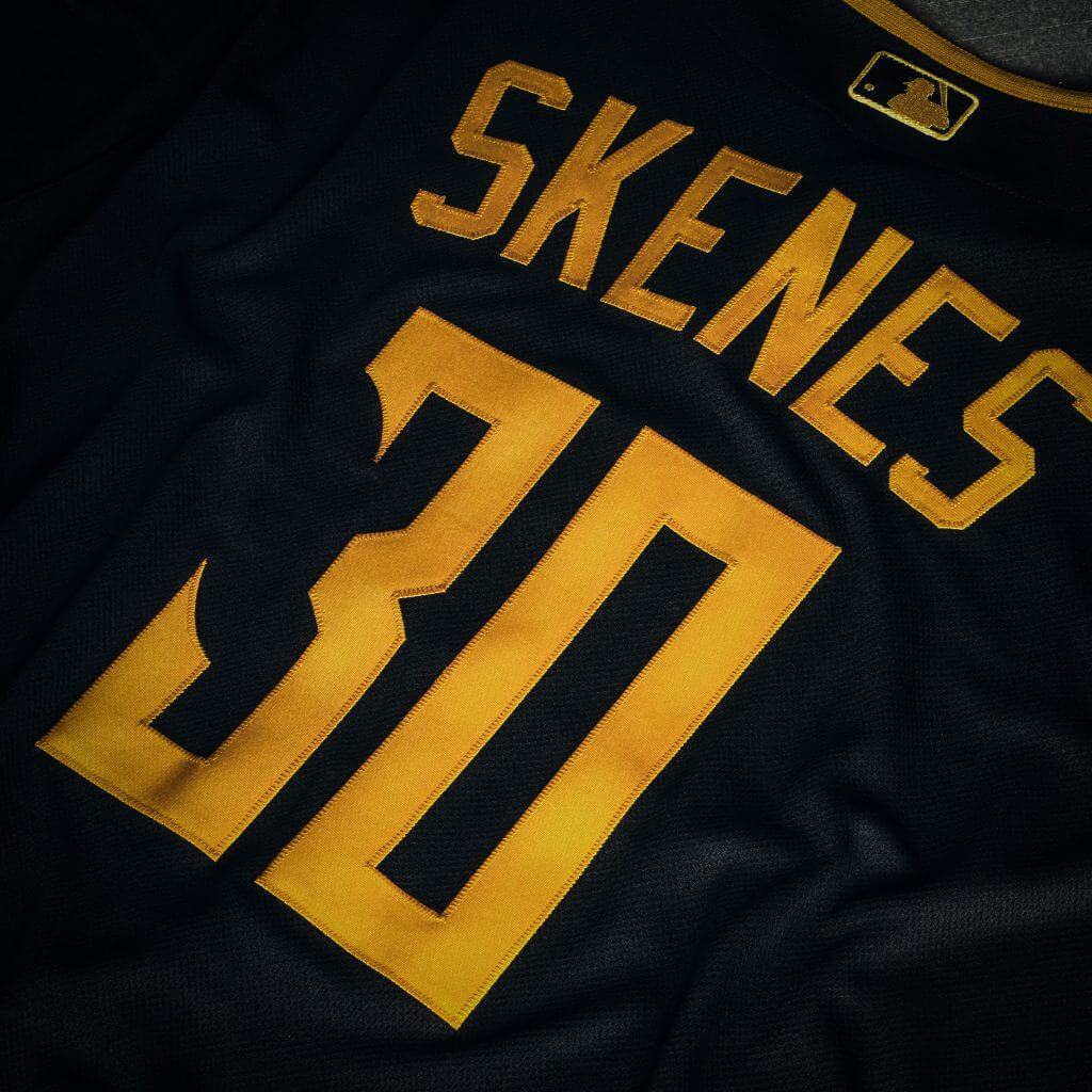
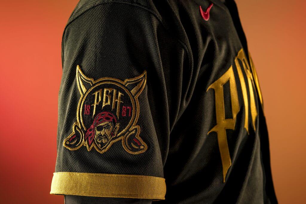
7. Pittsburgh Pirates (Average score: 5.66)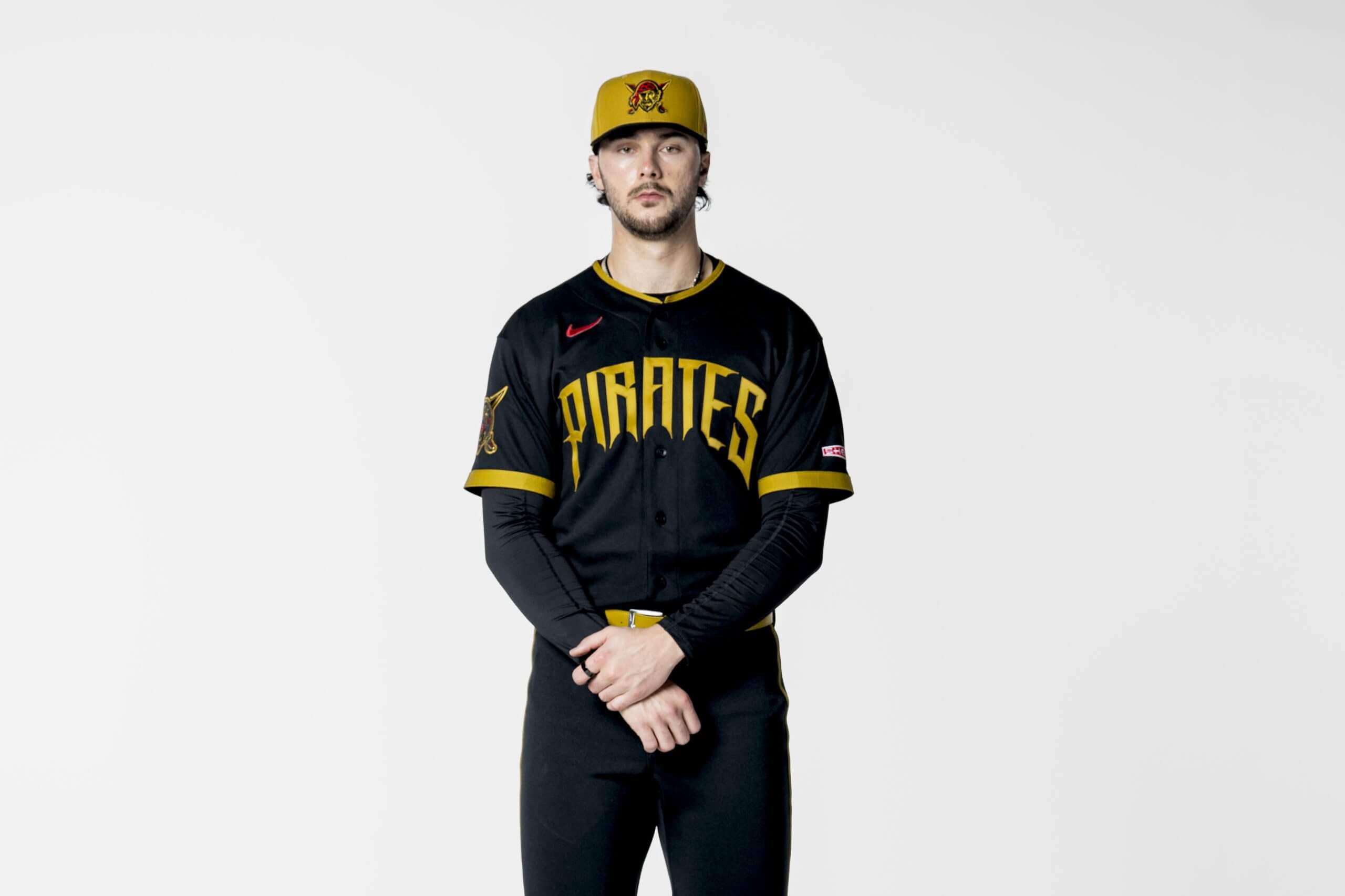
SCOTTSDALE, AZ – FEBRUARY 02: Paul Skenes #30 of the Pittsburgh Pirates poses during the 2026 Nike City Connect shoot at on Monday, February 2, 2026 in Scottsdale, Arizona. (Photo by Billie Weiss/MLB Photos via Getty Images)
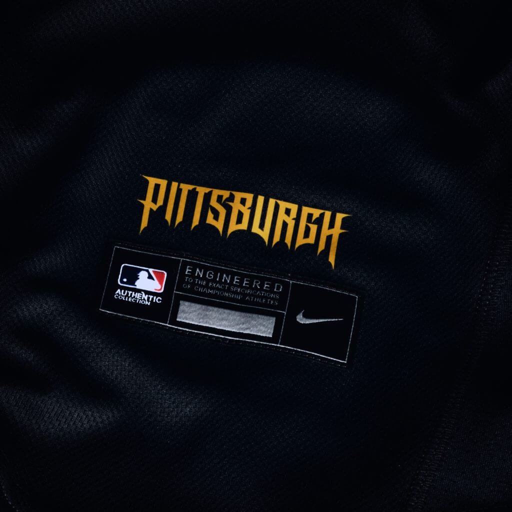
The “uniform embraces the city’s unmistakable black and gold identity, celebrating a unified visual language shared across Pittsburgh’s sports culture.”
Flores (4): The wordmark is very reminiscent of the logo of the 1994 Spider-Man animated series (you know, the one where he couldn’t punch people). That’s a good thing, because I absolutely adored that show. Ditching the PGH of the last City Connects and going all-in on the black and gold theme of Pittsburgh sports was smart. The one thing holding back this uniform set is the hat. In a perfect world, the visor of the hat would’ve been gold and the crown black.
Kepner (6): The last City Connect rollout was heavy on the three-letter city abbreviation thing, and thankfully that’s gone now from the PGH Pirates (and the MKE Brewers). The Pirates made the mistake here of not using a white outline on the wordmark, which keeps it from popping the way their regular black jerseys do. I hate the black pants and don’t love the lettering, but it does fit with the pirate motif. I just wish they’d lured this scurvy rascal off the high seas and onto the uniform. The Bucs haven’t won a pennant since they let him set sail.
Rosecrans (7): Huge “dog ate my homework” energy with this one. Did they forget when the assignment was due until the night before? Let’s change the font on our regular uniform! Done and done. Listen, I like the fact that all the Pittsburgh teams share a color palette, but this is a chance to actually do something different for once. At least it’s 100 times better than the last one, though. (Gradients don’t work, people.)
Billie Weiss / MLB Photos via Getty Images
Billie Weiss / MLB Photos via Getty Images
Billie Weiss / MLB Photos via Getty Images
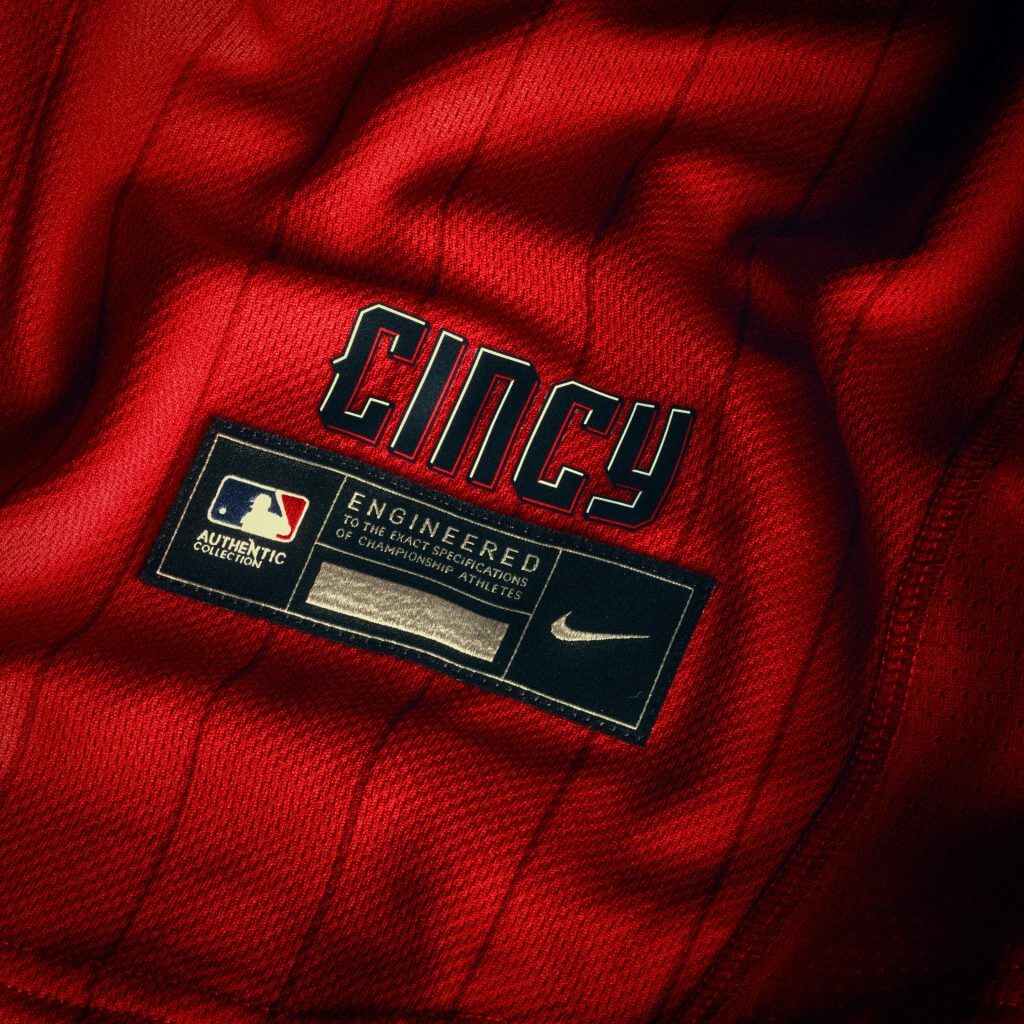
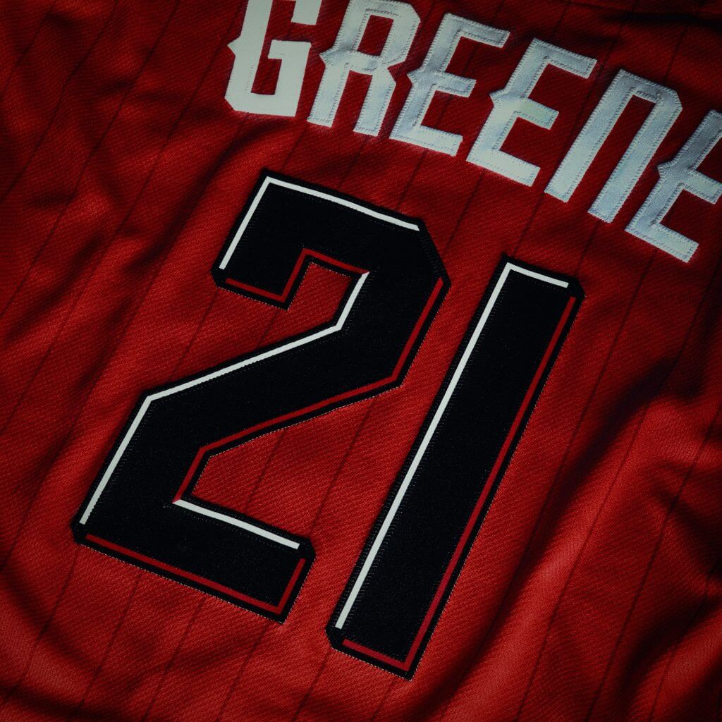
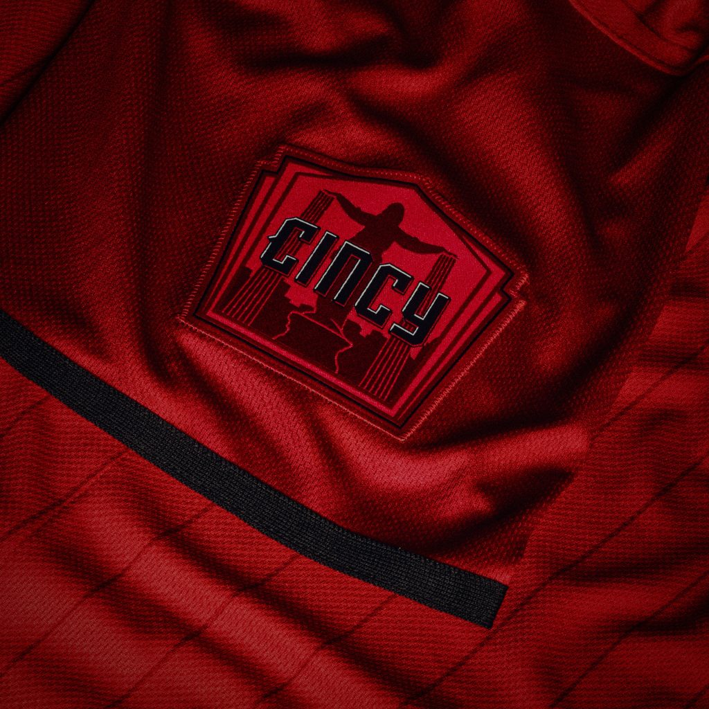
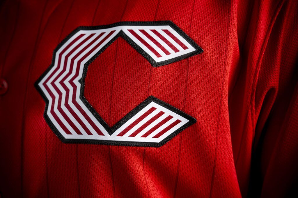
6. Cincinnati Reds (Average score: 5.33)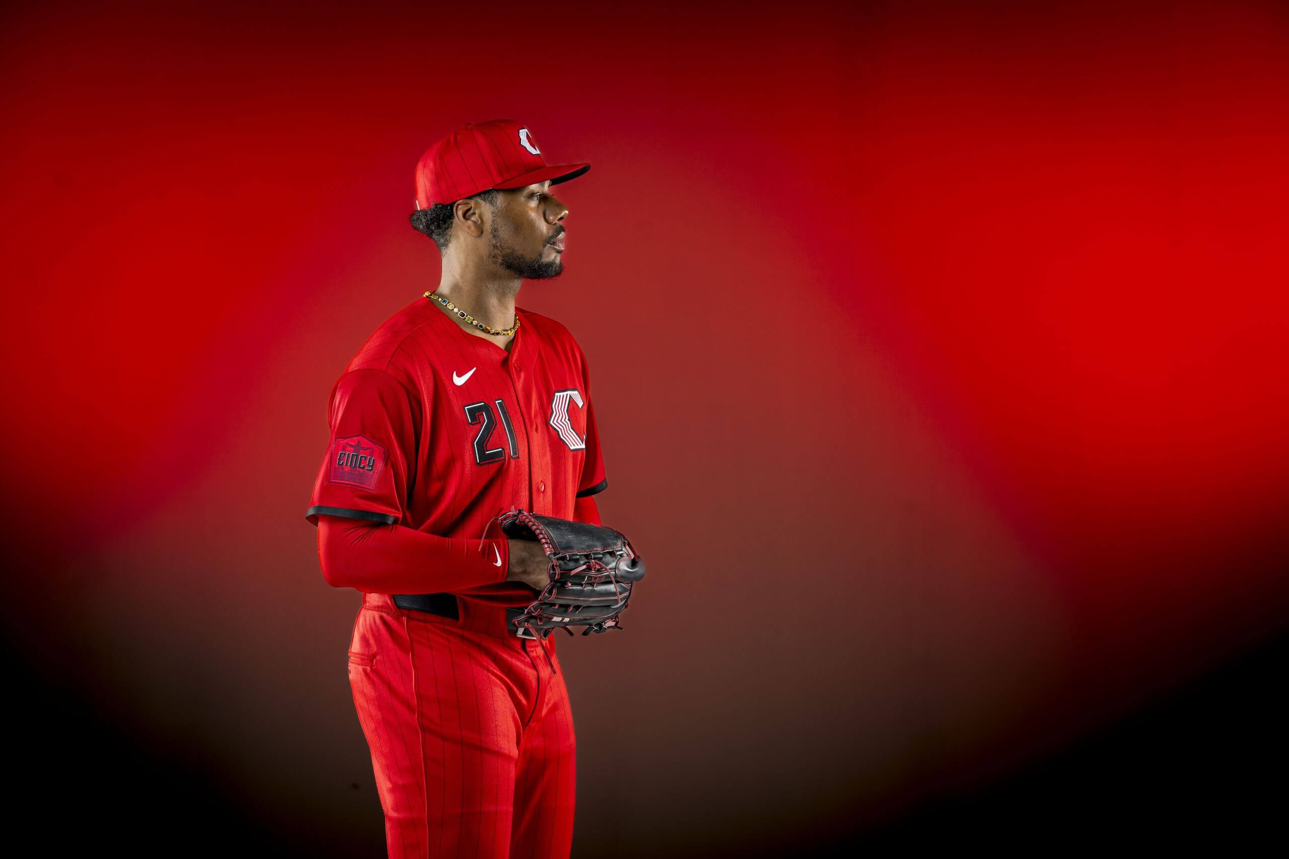
Hunter Greene poses with the Reds’ all-red City Connect uniforms. (Billie Weiss / MLB Photos via Getty Images)
The “uniform evolves the energetic vibe established in the team’s inaugural City Connect edition while embracing the color that defines the franchise.”
Flores (5): Cincinnati deserves major credit for wanting to have all-red everything and sticking with it. The slight hints of black and white break it up just enough so that the club isn’t running around looking like comic book characters, though I wouldn’t totally be opposed to that either. Numbers on the front are always a win in my book as well.
Kepner (7): Look, it’s way better than black lettering on a black jersey with a black hat and black pants. And it’s nice to see the number aligned with the logo on the front of the jersey (looking at you, Royals). The subtle pinstripes work here, and the numbers look cool. But I’m still not feeling that new wishbone “C” logo. And pairing this with red pants will make the diamond at Great American Ball Park look like a tomato patch.
Rosecrans (4): I mean, there’s no false advertising here — the uniforms are red. There are five shades of red, to be exact. The pinstripes aren’t black, but a darker red. The sleeves are a different tone from those two. Like the Reds’ City Connect 1.0, the second edition is better looking in totality than it is in descriptions. As a Queen City resident, I can tell you that the city has embraced the black City Connects, which will continue to be worn on Fridays, and this one continues the look.
Billie Weiss/MLB Photos via Getty Images
Billie Weiss/MLB Photos via Getty Images
Billie Weiss/MLB Photos via Getty Images
Billie Weiss/MLB Photos via Getty Images
5. Milwaukee Brewers (Average score: 5.0)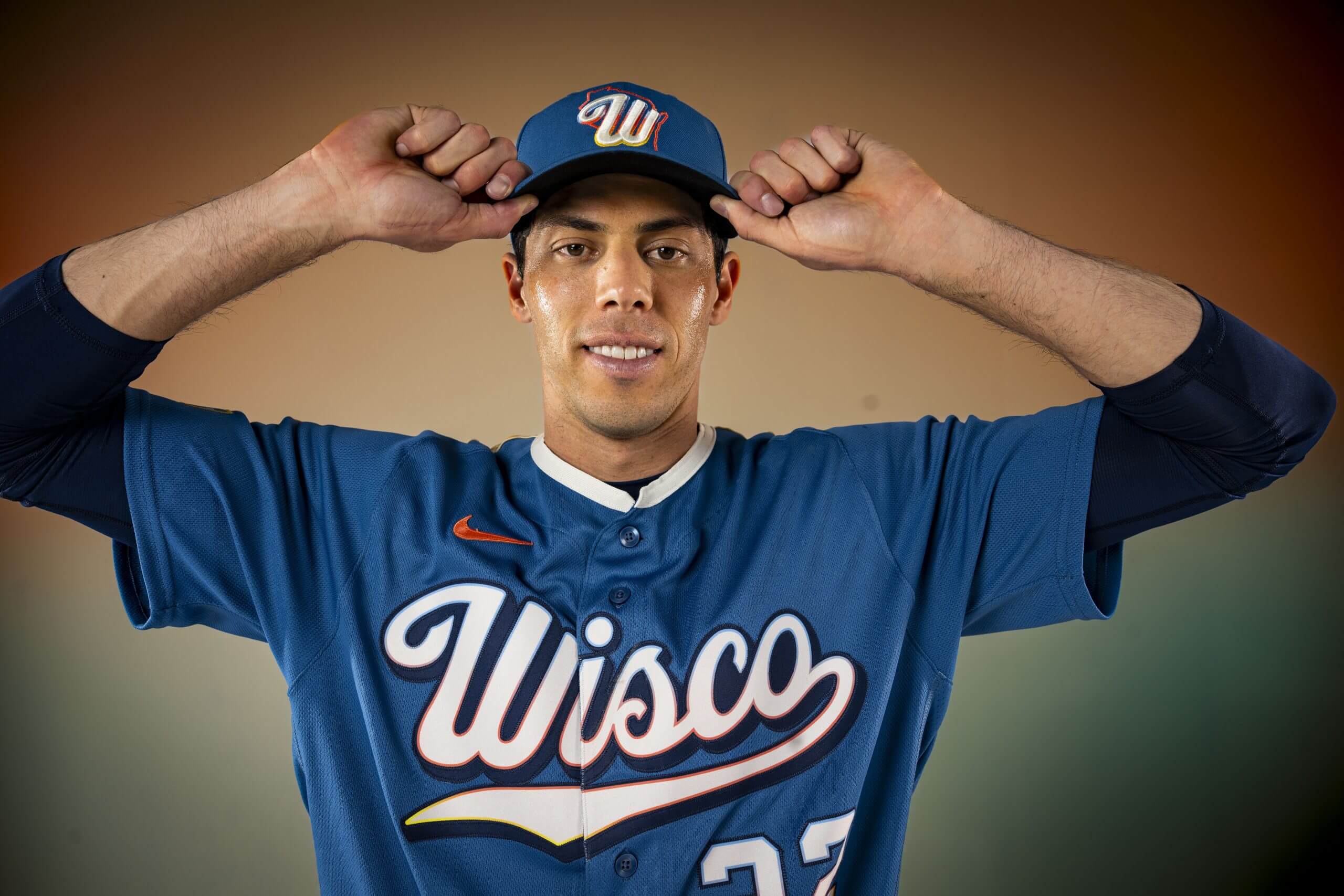
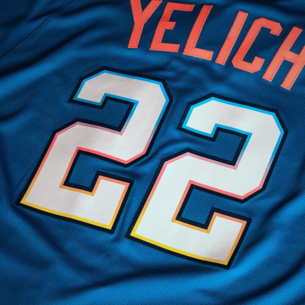
Brewers All-Star Christian Yelich shows off the new City Connect uniforms. (Billie Weiss / MLB Photos via Getty Images)
The “uniform is here to celebrate the entire Badger State, with details that honor the place the club calls home.”
Flores (8): Stop trying to make “Wisco” happen. It just doesn’t work. To me, this is an obvious downgrade from the Brewers’ first City Connects.
Kepner (2): All this time, I thought Barrel Man was a designated hitter, with a bat in his hands and a John Jaha/Daniel Vogelbach build. The new City Connect sleeve patch shows the big fella’s versatility — he’s wearing a glove, snagging a grounder and smiling as he ranges across the entire rainbow-shaded state of Wisconsin.
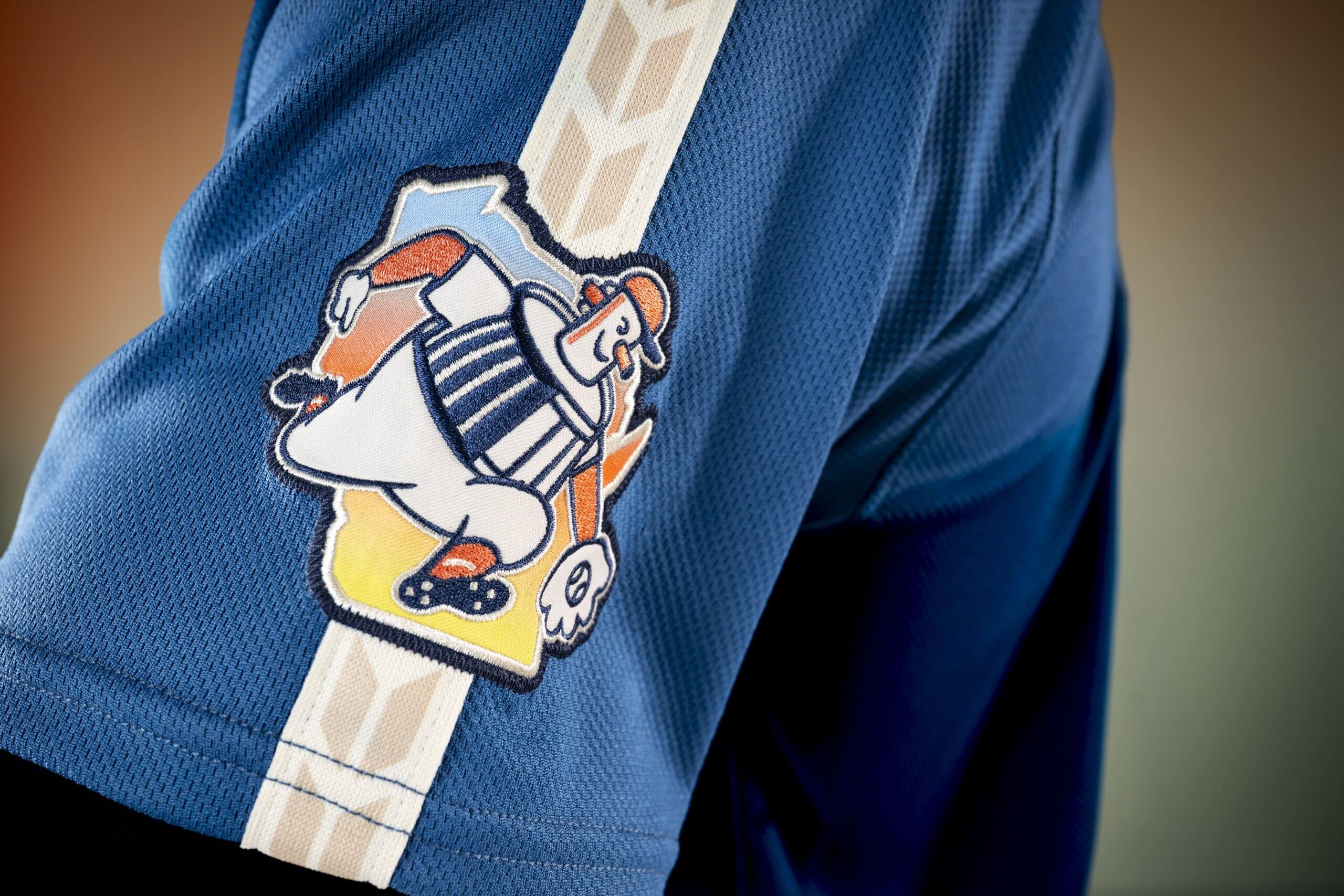
An in-depth look at Barrel Man. (Billie Weiss / MLB Photos via Getty Images)
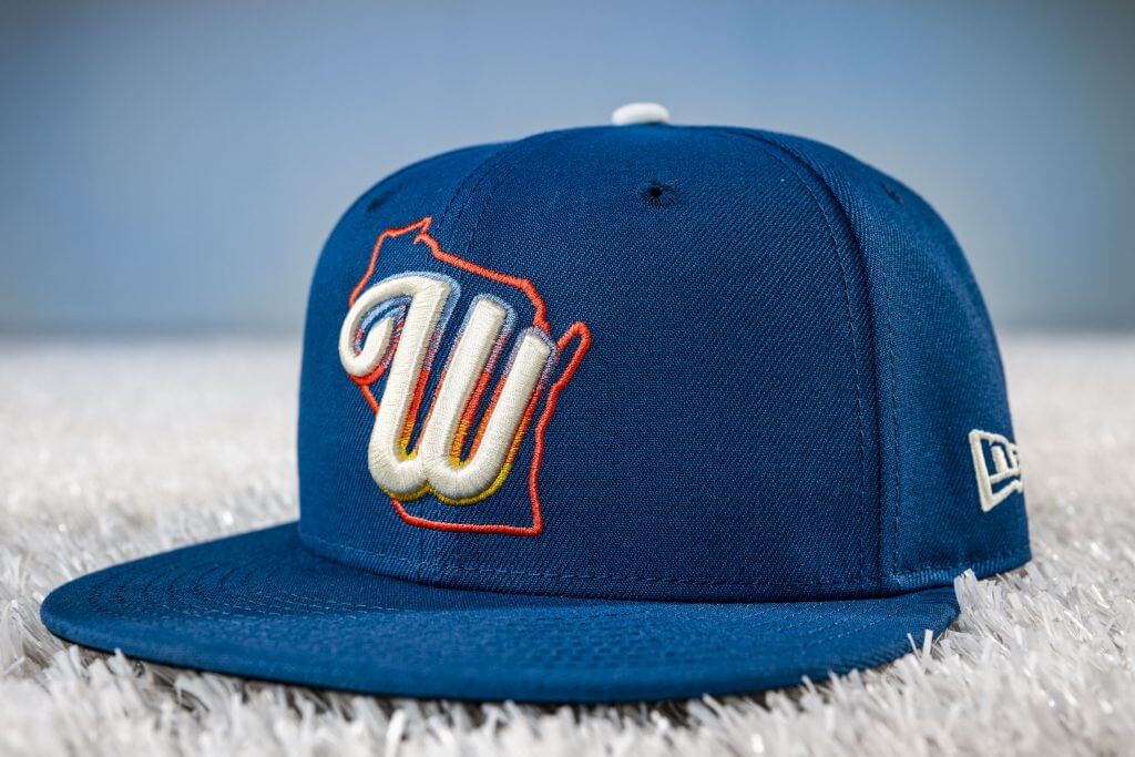
Details like that make this a winning design. I love the simple, elegant cap with the state outline behind a cool curvy “W,” and the wheat-and-barley braid for sleeve and pants piping is genius. I’m not sure how much Wisconsinites really use “Wisco,” but “PHILA” worked for Wilt Chamberlain’s Philadelphia Warriors, so I don’t mind the abbreviation. It’s a little too blue and white — which gives off a bit of a Royals or Dodgers vibe, considering the underlined script wordmark — but overall, this is terrific.
Rosecrans (5): What do the Brewers have against either of their actual names? The first City Connect had the tired “Brew Crew” on the jersey, and now “Wisco”? I’m sure it means something to people in Wisconsin (I mean, it has to, right?), but for the rest of us, it’s just kind of weird. It feels like back in my day when our Little League teams were sponsored by local businesses and my Angels team had a light blue hat that said “Tidewater Feed & Seed.” But I’ll give them credit for the lid — that’s a sharp-looking hat and so much better than the eyesore of the MKE 414 combo.
Billie Weiss/MLB Photos via Getty Images
Billie Weiss/MLB Photos via Getty Images
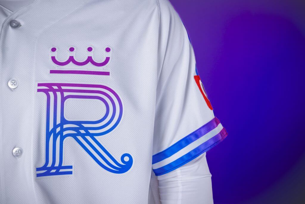
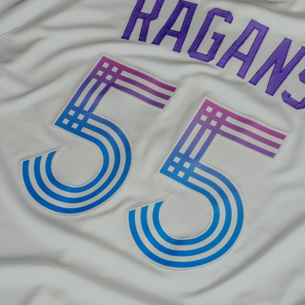
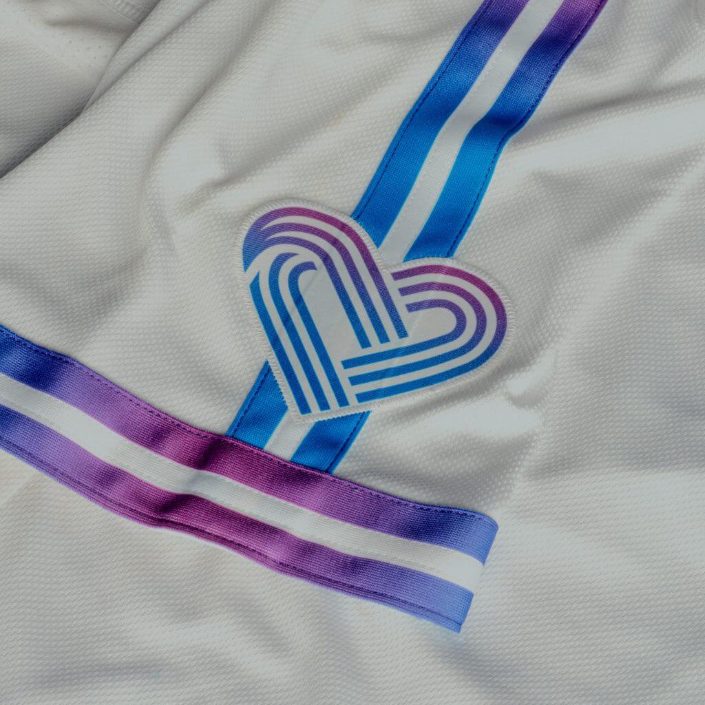
4. Kansas City Royals (Average score: 4.0)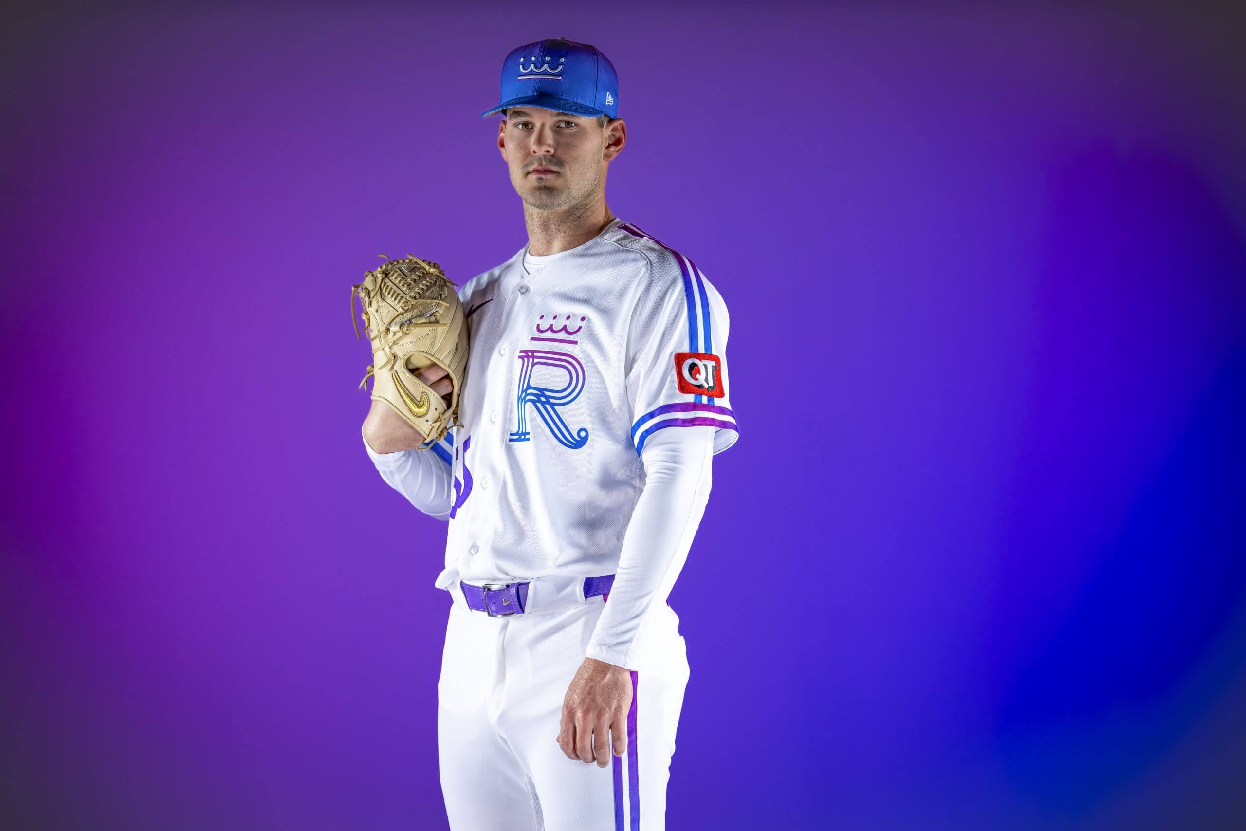
Cole Ragans poses with the Royals’ new City Connect uniforms. (Billie Weiss / MLB Photos via Getty Images)
The uniform “reflects who Kansas City is, what it stands for and the future it’s committed to winning, while capturing the youthful energy of seeing a MLB field for the first time, feeling the Fountain Spectacular’s spray and watching fireworks after a Royals win.”
Flores (2): Purple is such an awesome color, and it’s a shame it rarely gets used in sports uniforms. Here, the Royals show how it can be used masterfully, blending the color with pink to form the underrated fuchsia hue. I love the subtle use of the crown. It’s not as overbearing as it is in, say, Team Netherlands’ WBC uniforms. The heart on the sleeve being a nod to Kansas City’s place in the U.S. is a nice touch without getting too complicated, as these uniforms often do.
Kepner (4): This is a rare white-over-white City Connect design, and the more I look at it, the more it works. The cap logo, with a stylized crown, is strangely compelling; it looks like something from the mid-to-late ’70s, when the Royals were really good. I’m a little weary of the purple, which City Connect pushes with the fervor of Marie from “Breaking Bad” — we also see it with the Mets and Giants, when it really should be left to the Rockies and Diamondbacks. Even so, purple is a royal kind of color, and I love the heart sleeve patch, the shoulder stripes and the Beatles’ call-out (“HEY HEY HEY HEY”) on the inner collar.
Rosecrans (6): I was all on board until the hat. The gradient on the jersey isn’t great, but it kind of works — from Royal blue to the color of royalty. But the hat? Nope. No gradient on hats or helmets in football really work. It didn’t work when the Jacksonville Jaguars did it and it doesn’t work here. The Royals at least tried something and have a white jersey mixed with white pants. Those are all wins. The blue top, white pants softball uni ruined the last one. I’m kind of digging this one (except for the lid, which pushed it down in the rankings for me).
Billie Weiss / MLB Photos via Getty Images
Billie Weiss/MLB Photos via Getty Images
Billie Weiss/MLB Photos via Getty Images
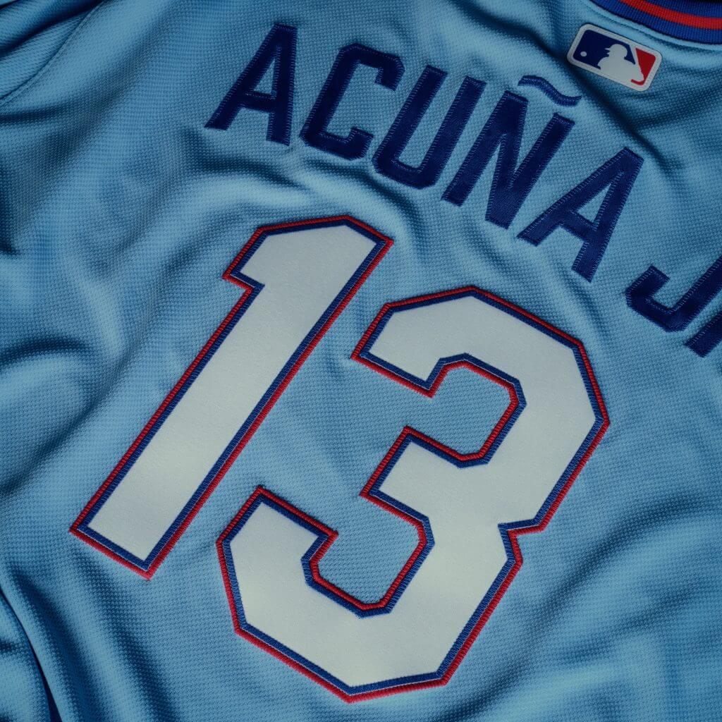
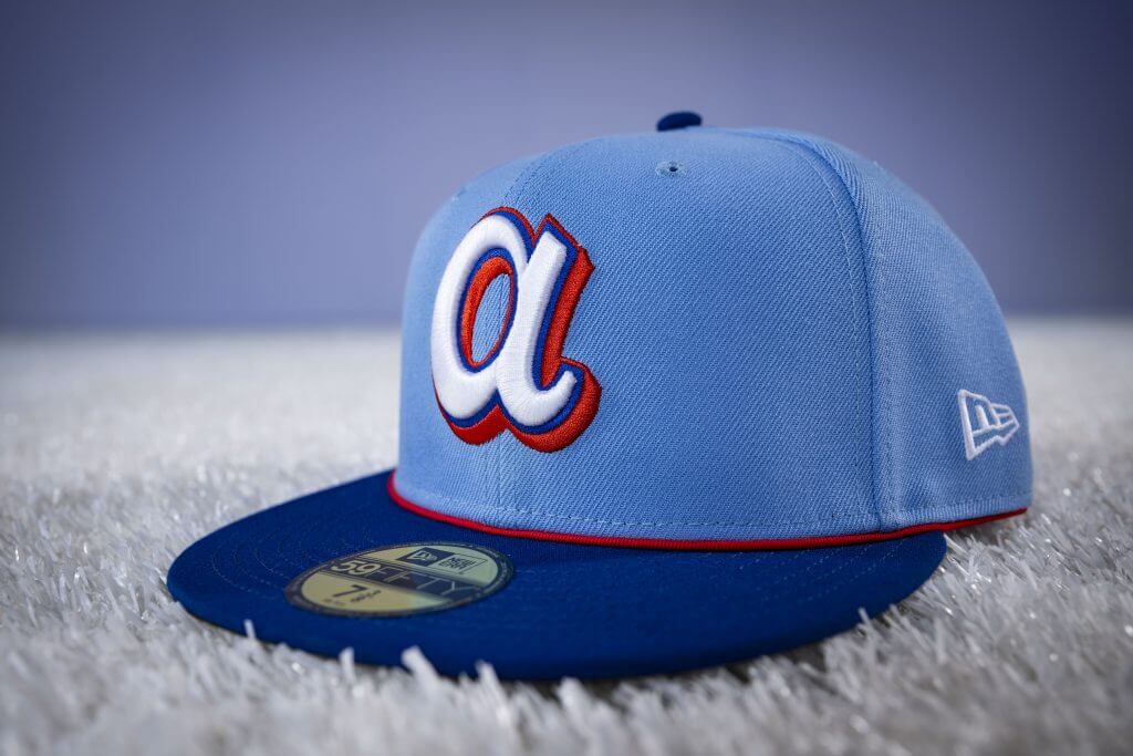
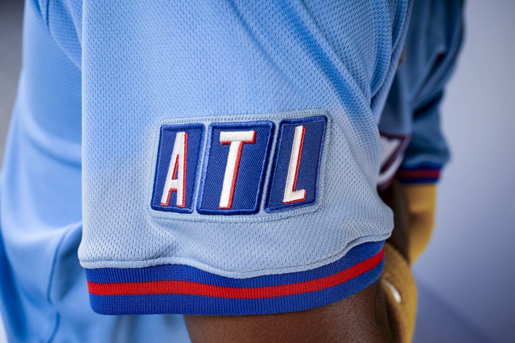
3. Atlanta Braves (Average score: 3.0)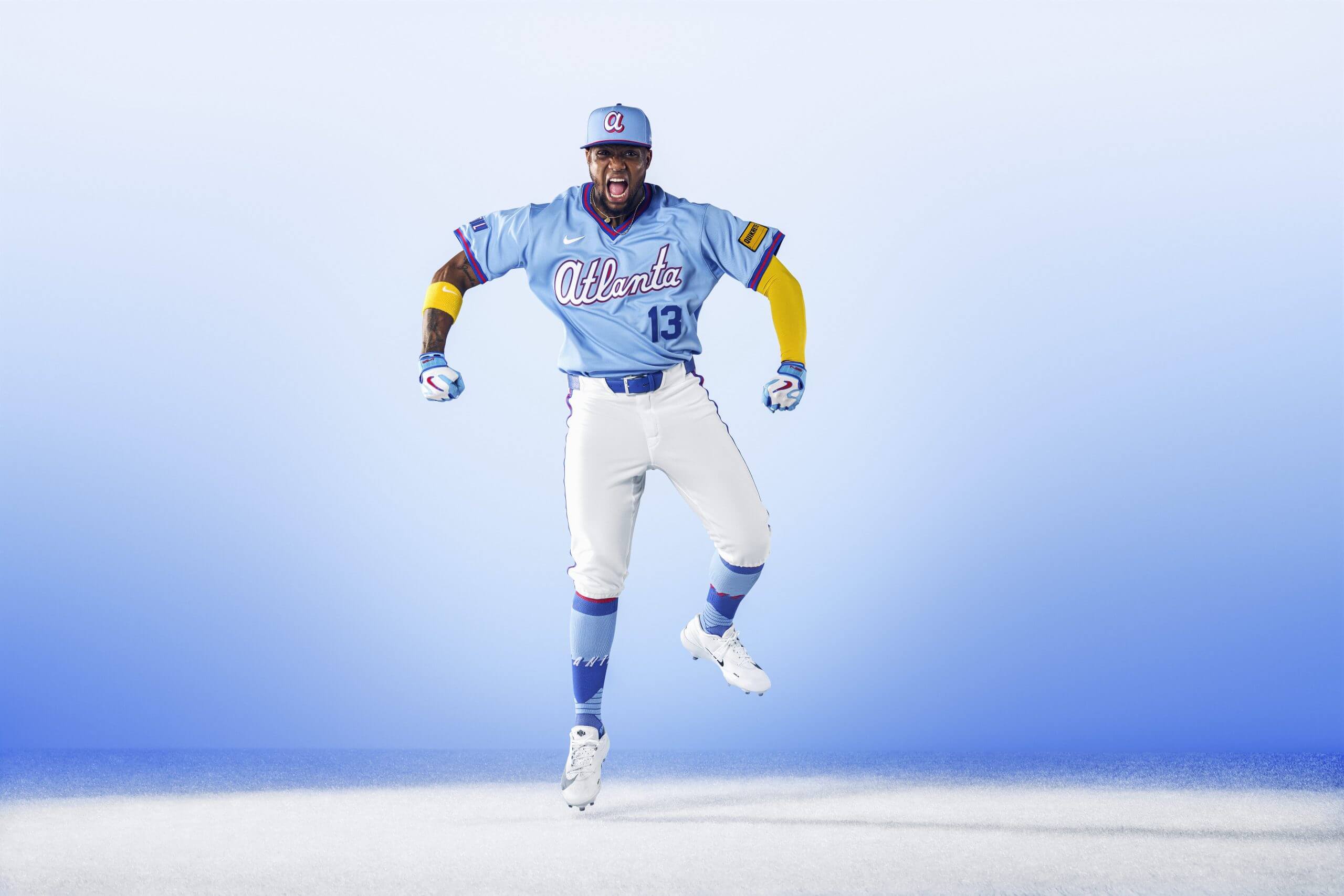
Ronald Acuña Jr. shows off the Braves’ newest City Connect uniform. (Billie Weiss / MLB Photos via Getty Images)
The “design is a nod to the club’s classic 1980s powder blue uniforms, harking back to a time when Braves baseball was a national fixture in households across the country on the superstation.”
Flores (3): The Braves have knocked it out of the park with both their City Connect offerings. It helps that they’ve kept things simple by evolving previous uniforms and then working to pay homage to the city. That stands in stark contrast to other teams that are trying to create a new uniform that is also a tribute. If there’s one thing that excites me the most about these uniforms, it’s the accompanying merchandise that the color scheme and theme will lend itself to. Already, this New Era windbreaker is a must-purchase in my book.
Kepner (3): The City Connect concept would be great if every team followed Atlanta’s lead. First, it was a stylish update to their uniforms of the late Hank Aaron era. Now, the early Dale Murphy era gets its turn on the runway. From the V-neck to the Atlanta script, it’s authentically Braves, dipped in nostalgia for the days when TBS billed them as “America’s Team.” The “ATL” sleeve patch, rendered in the style of the old TBS logo, is a perfect touch. My only issues here are the “Quikrete” eyesore on the other sleeve and my general dislike of the oversized, bubbly lowercase “a” logo on the cap.
Rosecrans (3): For those of us who grew up in the 1980s, this is an instant reminder of the great Dale Murphy poster. I would’ve hated it if it had ATL across the chest, but it works fine as a secondary symbol, especially with the Superstation tie-in. These, like their first City Connects, are fine. Boring, but fine. I mean, I get it, the Nike people had to do eight new ones this year, and sometimes you shoot for fine. Do I like a bigger swing? Sure, but this is a lateral move from their first one, and, like that one, it’s not offensive. It’s like a two-strike single. You’ll take it, but it probably won’t lead to a run. Elite cap, though, which pushed it up in the rankings.
Billie Weiss / MLB Photos via Getty Images
Billie Weiss / MLB Photos via Getty Images
Billie Weiss / MLB Photos via Getty Images
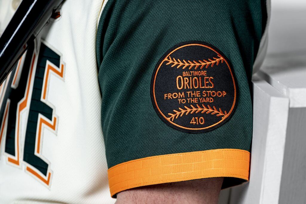
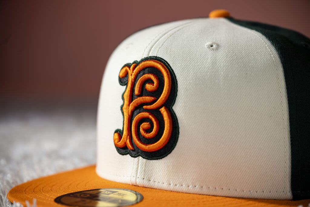
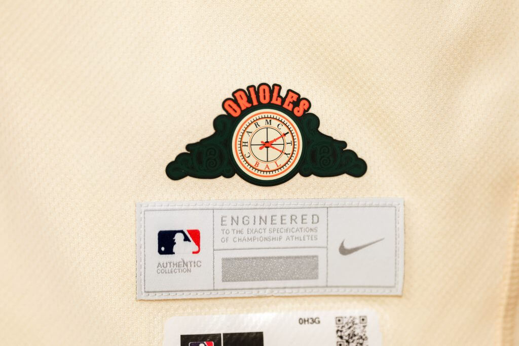
T-1. Baltimore Orioles (Average score: 2.66)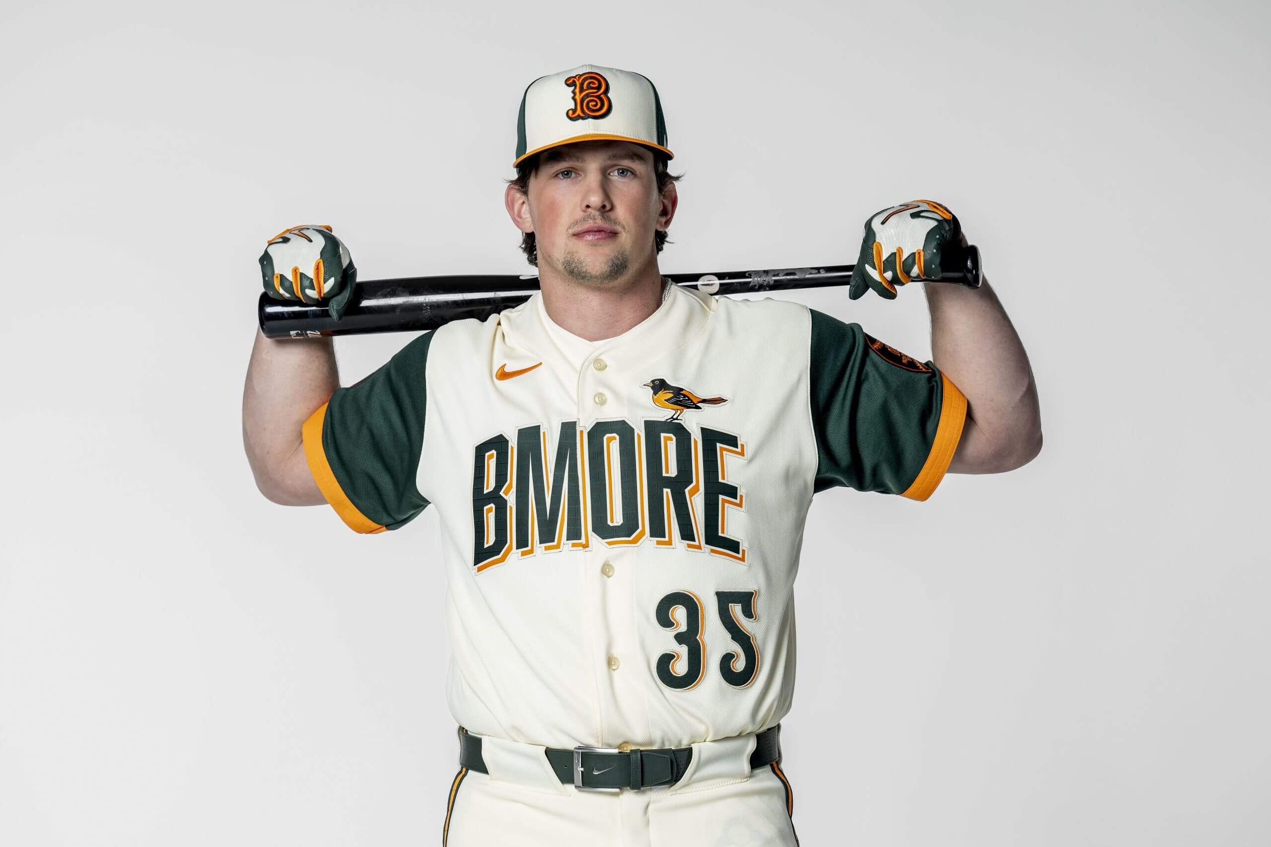
Orioles catcher Adley Rutschman poses with Baltimore’s newest City Connect uniform. (Billie Weiss / MLB Photos via Getty Images)
The “uniform brings the spirit of Baltimore’s beloved stoops straight to the one place they all call home: Camden Yards.”
Flores (6): I really wish the front had anything but “BMore” on it, because, otherwise, this jersey ticks all the boxes of what the City Connect initiative can be. Up and down the uniform are several tributes to Camden Yards, from Eutaw Street to the brickwork down to the scoreboard. In a sea of blues, blacks and reds, it’s nice to see green make the final cut. All in all, it’s a really unique set that’s brought down by the incessant need to coin words and phrases that don’t exist.
Kepner (1): Like Boston’s outstanding Fenway Park tribute jerseys, the Orioles did it right with this Camden Yards-inspired set. The sleeve patch is a delight, mimicking the little discs embedded on Eutaw Street for every homer that lands there. The dark green is a signature Camden Yards color, and the orange brick on the sleeves looks sharp. I’d have perched a 1992-style bird on the letter “R,” since that’s when the park opened, but that is a minor quibble. And given the Orioles’ enduring apostrophe catastrophe on their “O’s” cap, I’m OK going hyphen-less in “BMORE.” All in all, a jersey that takes you back to Rick Sutcliffe on Opening Day, with a really fun 1890s “B” logo for the hat.
Rosecrans (1): BMore? I wish there’d be more letters. We had Cincy, Philly, CLE, PGH, WSH and The Lou (the worst). There are so many good things happening with this jersey — the oriole, the circle sleeve patch, the green and orange color scheme — that are just lost because all I see is “BMORE.” It’s such a shame, because otherwise it’d be an instant classic. The green is gorgeous, the hat is elite and the whole Camden Yards motif is spot on. I want this hat and I want it now.
Billie Weiss / MLB Photos via Getty Images
Billie Weiss / MLB Photos via Getty Images
Billie Weiss / MLB Photos via Getty Images
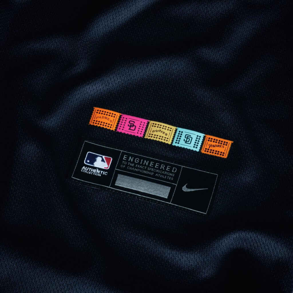
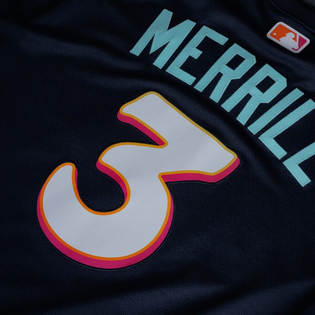
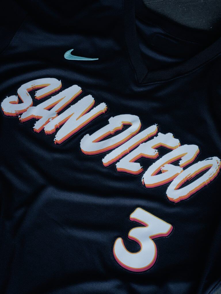
T-1. San Diego Padres (Average score: 2.66)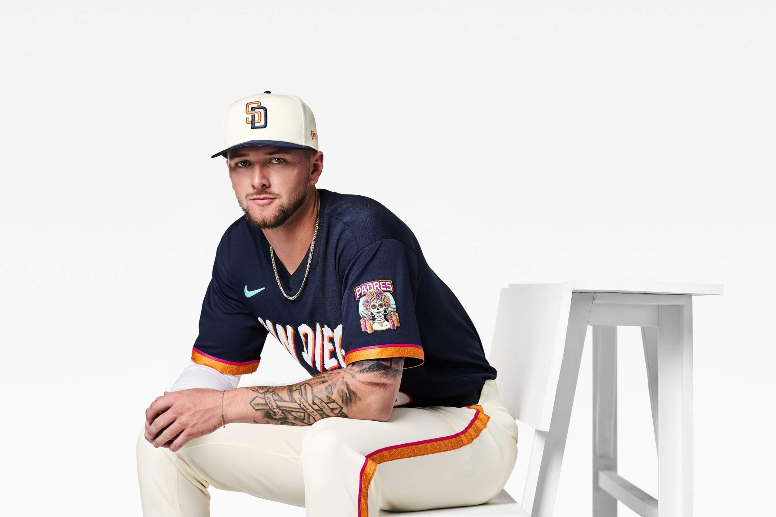
Jackson Merrill showcases the Padres’ newest City Connect uniform. (Billie Weiss / MLB Photos via Getty Images)
The “uniform is a continued celebration of the club’s binational region, culture and traditions.”
Flores (1): Día de los Muertos is a treasured holiday in the Flores household, so seeing it front and center of the Padres’ City Connect uniforms is particularly meaningful. The navy color scheme is a bit reminiscent of those 2000s Padres, which isn’t a bad thing, and the interlocking “SD” logo remains as one of baseball’s best. Since their first City Connect, San Diego has been at the forefront of experimenting with different colors, and so far, they’ve knocked it out of the park. Like I mentioned with the Braves, I’m interested in seeing the merchandise that the Padres will cook up.
Kepner (5): As someone who campaigned hard for the Padres to bring back the brown, I’m wary of navy blue encroachment. That said, while the old sherbet-colored City Connects were fun, they looked like something from a coloring book — imaginative, but better left on paper. While I really don’t like the white hats, this is an overall upgrade that looks more like a baseball uniform and fits into the Padres’ visual tradition, evoking the style of the 1998 NL champions — and you’ve got to love the La Catrina sleeve patch. (Incidentally, the Padres have clearly studied those little shade swatches in the paint store — they call their new colors “bone, obsidian, marigold, aqua, fireberry, and Padres gold.”)
Rosecrans (2): Please take note, other teams — embrace your city, don’t feel compelled to make the city connect vastly different than anything you’ve seen before and give us some bright colors. The Padres understand the assignment in ways those with ugly alternates (Pirates), plain (Rangers) or just lazy throwbacks (Braves) do not. The Padres made one of the better first City Connects and added another banger. The colors bring back thoughts of the blue and orange of the ’90s Padres, but nowhere near as boring and generic as that look.
Billie Weiss / MLB Photos via Getty Images
Billie Weiss / MLB Photos via Getty Images
Billie Weiss / MLB Photos via Getty Images