
Virginia-born graphic designer Addison Copas is fascinated by limitations. In art classes in school, he disliked the “unbridled freedom” he was sometimes afforded, where briefs such as “paint whatever you want, however you want” did nothing for him. When studying type design under Seb McLauchlan at Kingston University, he followed a trajectory of rebelling against the concept-heavy, opting for research-based and technique-focused practices where he could “weigh the worth of his mind and hand against objective criteria, like weight, texture and rhythm”.
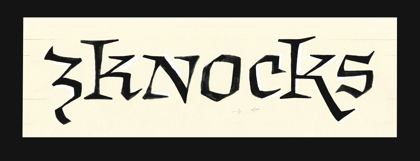
“The fun thing about teaching your subject of study is that you can make adjustments you wish had been made when you were a student; to make that subtle and possibly frivolous change you wish to see in the world. For me, that was designing on paper,” says Addison. “With the exception of exceedingly modular designs, pencil, pen or brush and paper lend themselves to quicker, unconstrained prototyping. If I want to adjust an unsatisfactory curve on a vector, I need to pull around at least four different interconnected points; but on paper, it’s one fell swoop of the pen.” Needless to say, Addison’s work is rooted in pencil and paper practices, and it shows. His work is a throwback to classic letterforms – it feels almost medieval. It’s warm and wonderfully retro in a way we don’t see so much of now, with each project becoming a type of invitation.
Inspired by Czech typographer Oldřich Menhart, Addison channels his “constant wonder” through text type design, which he calls a “severely confined art” – fenced on one side by contemporary cultural conceptions of letterforms and on the other side by the quirks of human sight. “While the painters may abandon centuries of technique accrued in shading, perspective and colour in favour of pursuing their unfettered whims on the canvas – type designers have no such luxury,” says Addison, revelling in the constraints.