
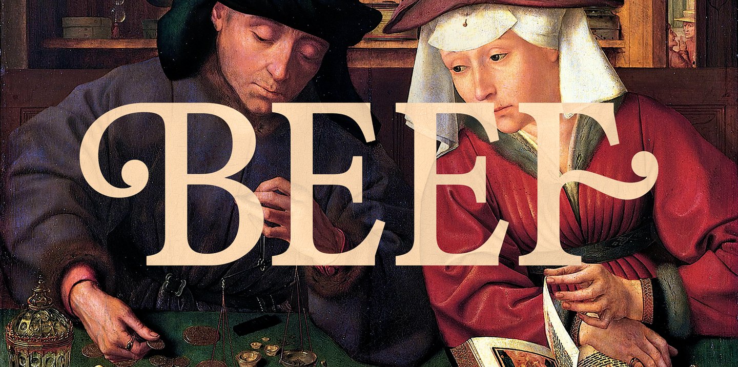
In season two, the ball terminal of ‘B’ in Beef has a bougie personality, mirroring the posh characters traipsing around Monte Vista Point, unlike the bold, vertical font of the first season. The type seems almost wounded, or just about getting there. But it’s really the result of various time periods layered on top of each other. Right from the start, Benjamin and the team knew they would have decorative capitals. In the early process sketches, there is a flourish on practically every variation of ‘BEEF’.
“We took the flourish from Bill Gold’s lettering for Kubrick’s Barry Lyndon, then I incorporated a few moments from the 18th-century punchcutter Jacques François Rosart’s work, specifically, the way certain serifs are treated,” he says. “But we also wanted immediacy. A lot of the Rosart material I was looking at was very high contrast; the thick-thin relationship was quite extreme. I also started looking at newspaper typefaces, such as Monotype Plantin – lower contrast, blunter, greater immediacy.”
Bookman briefly crossed Benjamin’s mind, too, because of all those swashes, but he didn’t want the show’s lettering to feel cheap, like the plastic thank-you bags in American shops that are mostly set in Bookman. The type inspiration from 18th-century punchcutters such as Rosart mirrors the wealthy characters in the show, too. After all, as Benjamin says, “type founding was predominantly an upper-class vocation, with early punchcutters coming from goldsmithing backgrounds”.