
New Logo Unveiled: The Portuguese Football Federation (FPF) officially launched a modernized, minimalist logo on July 1, 2026, which is already present on its digital platforms, signifying a change in its visual identity.
Design Characteristics: The new emblem features a stripped-back interpretation of the traditional Portuguese shield in national colors, notably omitting the intricate details and the traditional cross, resulting in a sterile, corporate aesthetic.
Fan Reaction: The drastic redesign has garnered immediate and widespread negative feedback from Portuguese fans across social media, who criticize its sterile appearance and draw comparisons to a beer brand logo.
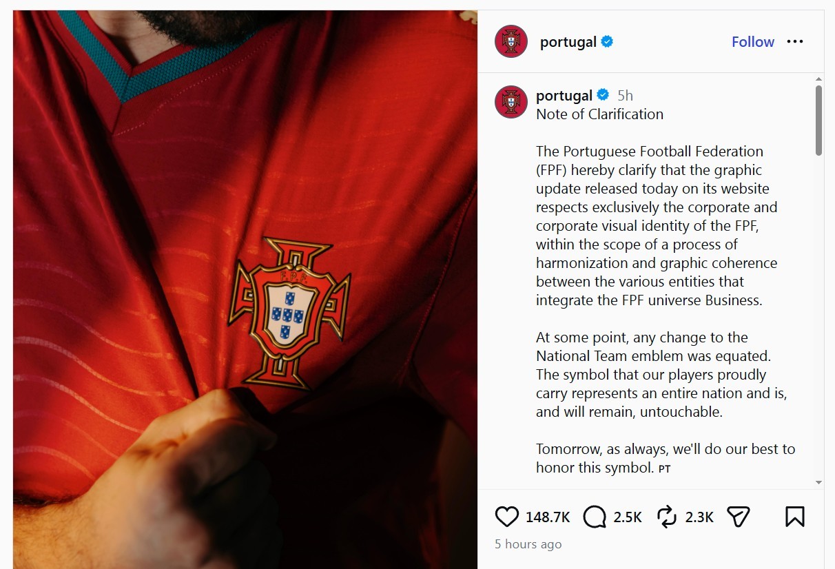
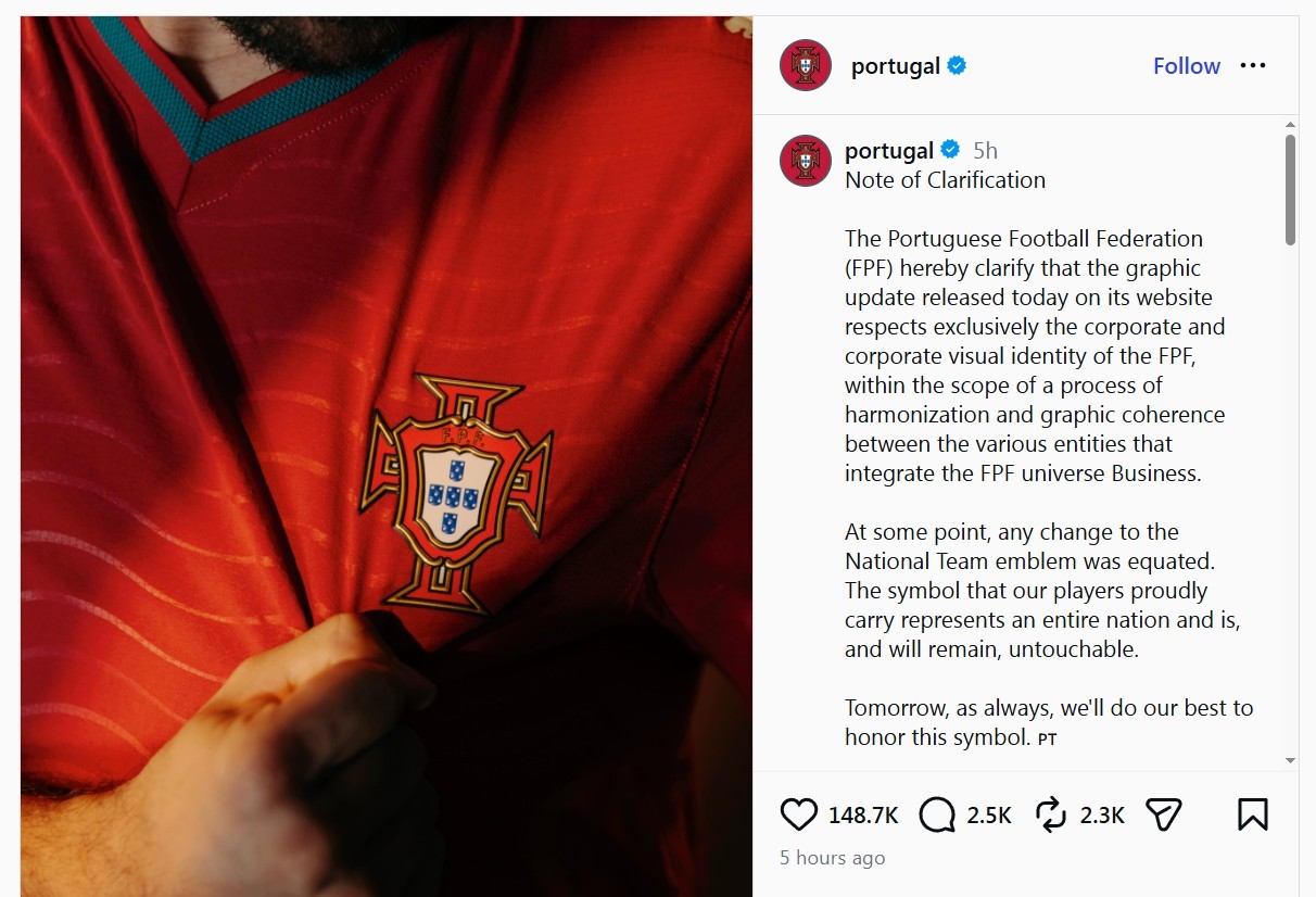
Update: Portugal has released a statement confirming that the new logo is only intended for institutional use and will not appear on the national team kit.
The Portuguese Football Federation (FPF) officially unveiled a brand-new, modernized logo on July 1, 2026. The updated crest has already been rolled out across the federation’s digital platforms, prominently featuring on the official FPF website, marking a significant shift in the visual identity of Portuguese football.
A Stripped-Back Design
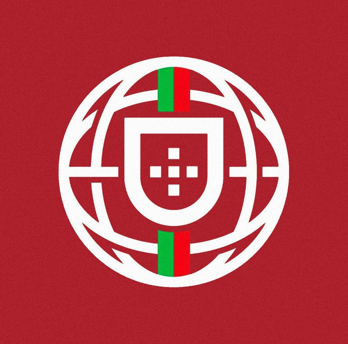
The new emblem introduces a highly simplified and minimalist interpretation of the traditional Portuguese shield. Utilizing the national colors of red, green, and gold, the modernized design strips away many of the intricate, classic details that defined the previous crest. The most notable omission is the traditional cross, resulting in a much more sterile, corporate aesthetic that aligns with recent digital-first rebranding trends across the footballing world.
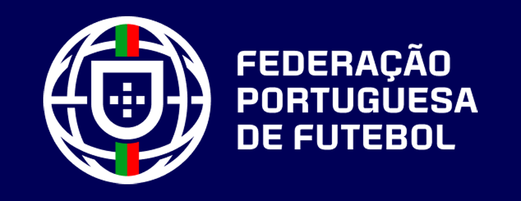
Currently, it remains unclear whether this new logo will be used exclusively for institutional and corporate purposes by the federation, or if it will eventually replace the iconic crest on the Portugal national team kits.
Widespread Fan Backlash
The drastic redesign has been met with immediate and widespread backlash from the Portuguese fanbase. Across social media platforms, supporters have voiced strong disapproval, widely labeling the new crest as a massive downgrade. Many fans have criticized the sterile look, with multiple comparisons being drawn between the simplified shield and the logo of the popular Portuguese beer brand, Sagres.
What do you think about this new Portugal logo? Comment below.