
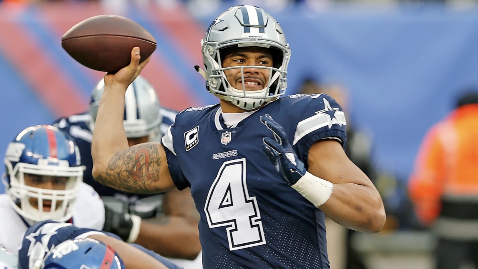
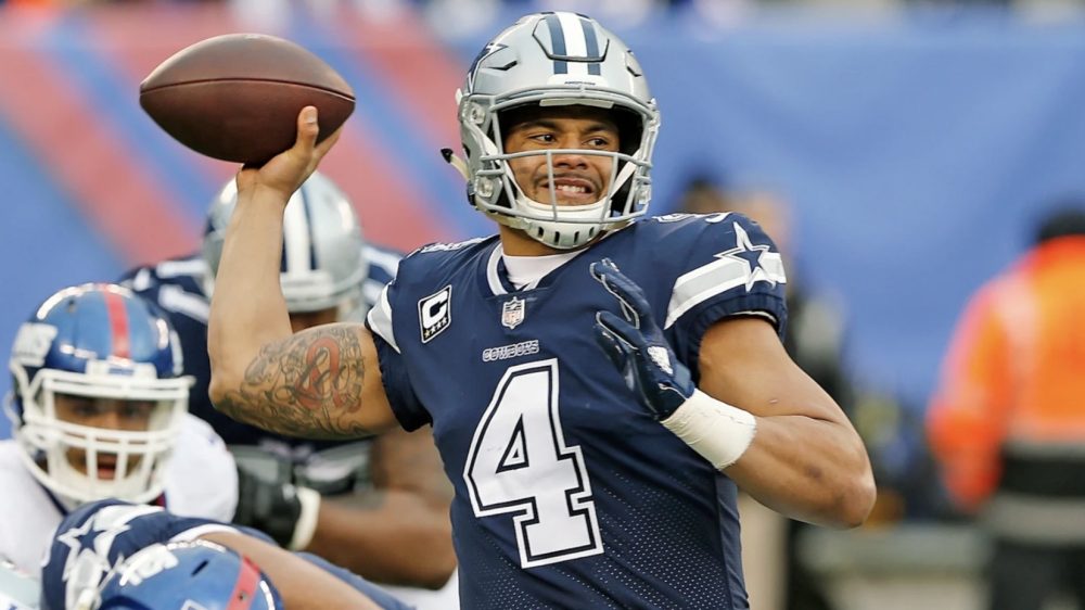
Inspired by a recent article at The Athletic that asked various staff members to name the best and worst uniforms in every NFL franchise’s history, we’ve decided to share our opinion on the same subject.
After kicking things off with the AFC, this eight-part series now moves onto the NFC, where we’ll look at each division alphabetically. We’d love to hear your thoughts for each team in the comments, as well!
Dallas CowboysBest: Current “Road” Uniforms With White Pants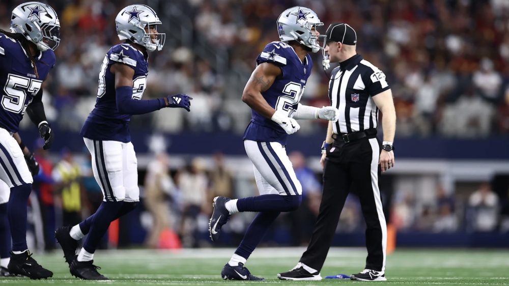
I’ll get this out of the way quickly, but I’ve always believed the Cowboys’ “home” uniforms were overrated, particularly because the helmets have navy blue decals while the numbers on the white jerseys and stripes on the “silver” pants are royal blue. That’s why I’m always happy to see them break out their navy blue “road” jerseys a few times each season, and the decision to pair them with the white pants from their Color Rush uniforms – which feature navy blue and silver stripes – has only taken the look to the next level. They’ve worn this design at least once in each of the last four seasons, something I’m hoping becomes even more common in the future.
Worst: 2012-19 “Seafoam Green” Pants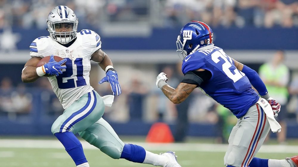
In 1974, team president and general manager Tex Schramm changed the Cowboys’ pants color from a standard shade of gray to a bluish-silver called “Cowboys Star Blue.” Inspired by the interior of a vehicle he saw, Schramm’s goal was to make the pants brighter on the standard definition televisions used at that time. But once Nike took over the league’s apparel contract in 2012, the color had turned to a greenish-gray, which was made only worse by current high-definition televisions. Pair that shade of gray with the Cowboys’ silver helmets and the aforementioned mismatched blues and it’s easily the worst they’ve ever looked. The bluish-gray pants they wear now are better, but I long for color consistency from Dallas’ “home” design.
New York GiantsBest: 1966-74 Home Uniforms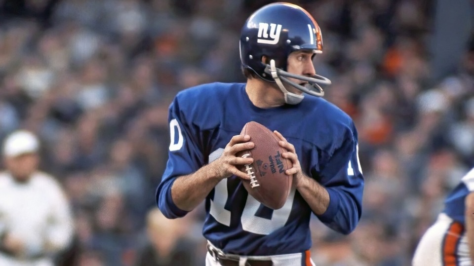
If you read my NFL redesign series this spring, you’d already know where this is headed, as I suggested that the Giants adopt a new design inspired by their 1966-74 uniforms. The home uniforms are not that far off from what they wear right now, but feature a darker shade of blue and a striping pattern on the white pants that mimics the helmets, rather than the blue, gray and red pants stripes they have now. The road uniforms, meanwhile, resemble their current Color Rush design with the same stripes on the sleeves, pants and socks, but featured single-color numbers instead of having a red outline.
Worst: 2024 “Century Red” Throwback Uniforms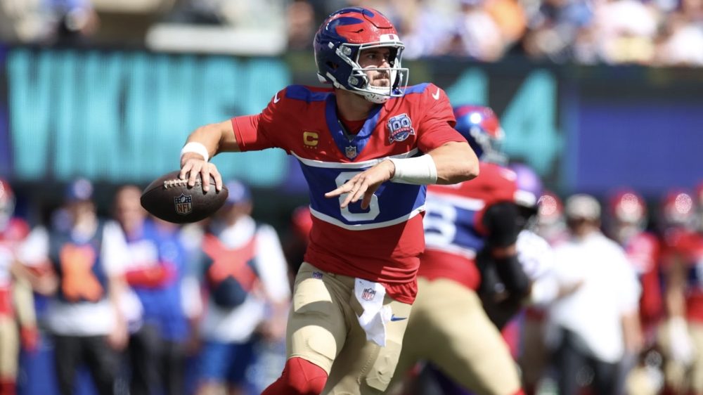
Similar to both of the Pittsburgh Steelers’ 1933 throwback uniforms, I appreciate that the Giants were honoring their history with this design, which combined the winged helmets from their 1937-47 uniforms with the jerseys and pants from their 1933 team that reached their first NFL Championship Game – but that doesn’t mean I have to like it. The stripes simply do not translate to modern uniforms and looked as if the franchise sewed its blue home jerseys in the middle of new red jerseys. And while I understand the historical accuracies, the khaki pants looked even more out of place. Striped white pants might have saved the uniform, though.
Philadelphia Eagles Best: 1999-2013 Home Uniforms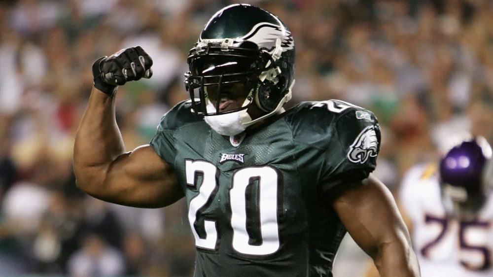
The debate between Kelly green and midnight green is highly polarizing, with older fans favoring the former because of nostalgia and younger fans preferring the latter because it’s a modern color associated with the most successful era in franchise history, including two Super Bowl victories (LII and LIX). I fall squarely within the midnight green camp, though I think the shade was much better during Reebok’s run as the league’s official outfitter, as the dazzle fabric made it appear much darker than Nike’s matte fabric. You might recall the Eagles stuck with the Ripon Athletic template for the first two seasons under Nike (with the Swoosh sewn on) before moving to the Elite 51 template in 2014, and it wasn’t until halfway through the season that the midnight green jerseys were worn because the manufacturer couldn’t get the correct shade.
Worst: 1933-34 Throwback Uniforms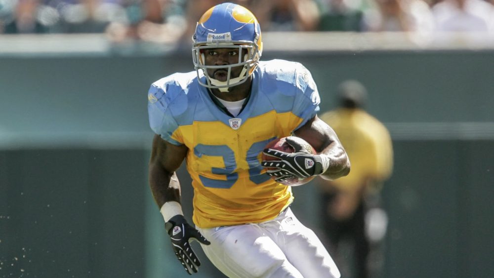
What I’ve learned during this exercise is that the NFL didn’t look very good in the 1930s, which is completely fair since the uniforms were more form than fashion at the time – though I’d like to envision Chris Creamer’s great-grandfather sitting on the sidelines with a typewriter, explaining to his readers that the Eagles chose their original light blue and yellow color scheme as a nod to the Philadelphia city flag. He could have also advised the Eagles’ future front office against reviving the uniforms in 2007, as the yellow helmets with light blue wings, yellow jerseys with light blue shoulder yoke, white pants and striped light blue socks are among the ugliest designs in league history and were thankfully only worn for one game.
Washington CommandersBest: Current Home Uniforms With Gold Pants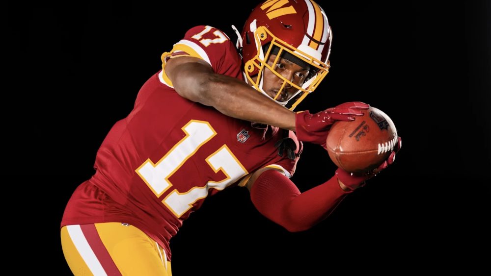
I nearly picked the Redskins’ 1965-67 road uniforms, which featured a spear on the helmets and the perfect shades of maroon and gold, but ultimately settled on their new home uniforms that were introduced the offseason and include the option of gold pants. Aside from the helmet logo and nickname on the chest, the uniforms are nearly identical to what the franchise wore in select games from 2010-18. What ultimately gives the current version the nod is the thicker white and burgundy stripes down the sides of the pants, whereas the previous gold pants had thin Brashier stripes. Washington also wore gold pants from 1972-78, but I prefer the modern cuffs stripes to the more traditional pattern on the sleeves and socks.
Worst: 2022-25 Road Uniforms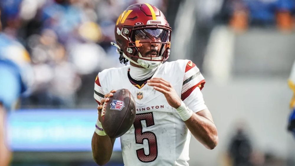
Washington found itself in an unenviable position earlier this decade as it attempted to distance itself from the franchise’s former nickname and logo, and after playing two seasons as the Washington Football Team with stripped-down Redskins uniforms, unveiled a new nickname, logo and uniforms ahead of the 2022 season. None of the designs were good, but the white road jerseys took the cake due to a lack of gold (outside of the Nike Swoosh on the shoulders), as well as the gradient pattern in the numbers and sleeve stripes, which unnecessarily included black so that the franchise could also have a black alternate uniform. Luckily, current ownership was able to erase this mistake rather quickly.
Photos courtesy of @dallascowboys, @Giants, @Eagles, @Commanders and @NFL on X/Twitter.