
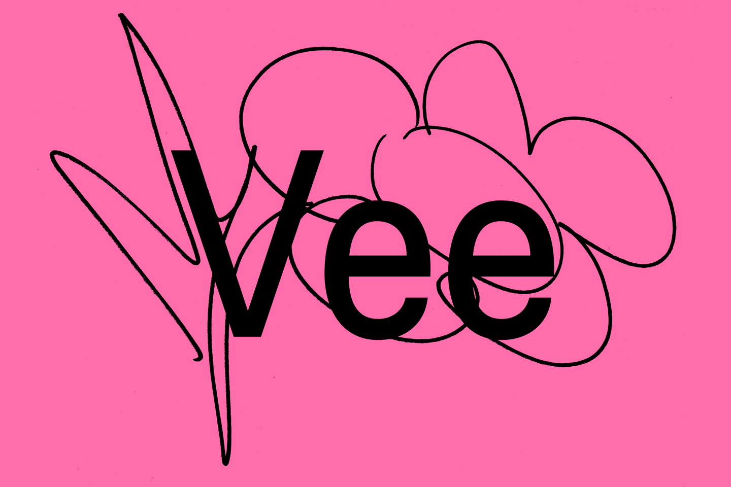
The resulting typeface certainly draws inspiration from Venus – it references its high-waisted capitals, varied terminals ending at irregular angles and slightly condensed lowercase forms, giving it a warm, handcrafted feel. But it also brings with it (like any successful ode to old letterforms) some new qualities of its own. “The aim was something simple and friendly, balancing her slightly raw, amateurish forms with more traditional letterforms,” says Aimur. “We also wanted to retain Laura’s instinct for bold, unpolished shapes alongside the elegance of Venus,” he says. “Vee could be considered Venus’ younger, more mischievous sister.”
To accompany the release, the type foundry launched a publication in close collaboration with Laura titled: Let yourself be bad at things, which contains a conversation between the designers about the origins of the type foundry and the unconventional creative processes that are embedded in its typefaces. “Together, we reflected on the development of Vee through the lens of amateurism, experimentation and curiosity,” says Andree.
The publication acts as a printed specimen for Vee but also provides something more than just showcasing the typefaces function. Whilst we do get to see Vee’s final five cuts in this printed object, the publication’s design is also full to the brim with fun and playful elements – type runs off in all different directions across spreads and letterforms sit atop wonderfully naive illustrations. “Laura has never considered herself much of a drawer, so including her drawings felt fitting. Her crooked horse and three jolly flowers appear alongside 25 drawings paired with snippets from our conversation,” Aimur says. This silliness neatly connects the project’s title with the publication’s visual language: Let yourself be bad at things. “Its theme reflects our foundry’s interest in experimentation, uncertainty and finding paths outside traditional methods,” Andree ends.