
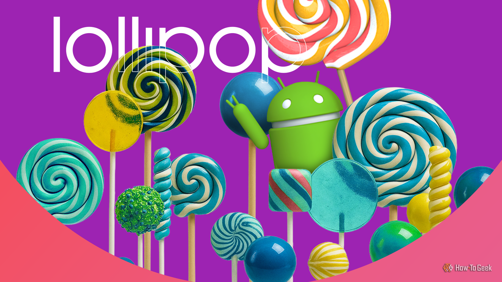
Although Android still receives major updates every year, they’re nowhere near as transformative as those from the early days of the OS. One of the biggest milestones was Android Lollipop, which began rolling out via OTA updates on November 12, 2014. Let’s take a look at everything that made this update so special.
Material Design reshaped how modern UI looks
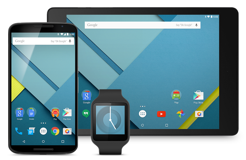
Material Design is a design language that Android 5.0 Lollipop was built around. It was first announced on June 25, 2014, at Google I/O, and I was immediately thrilled when I saw what it looked like. Compared to the design of Android 4.4 KitKat, it felt like a massive leap forward in terms of visual style.
In case you’re unfamiliar with design languages, they are essentially a set of rules that outline how apps, user interfaces (UIs), and the overall experience of using a phone should look and behave.
As its name implies, Material Design is based on the idea of digital “materials” (most notably paper) that mimic real, physical surfaces to provide a sense of familiarity that doesn’t overwhelm the user. It uses geometry, shapes, colors, and clear typography to create a consistent experience while maintaining visual clarity.
Credit: Google
Icon design is another major element that helps Material Design achieve its sleek aesthetics. Icons within apps follow the same general guidelines, giving them a more realistic, tangible feel. As Google puts it, “Each icon is cut, folded, and lit as paper would be, but represented by simple graphic elements.”
The overall goal is to make your phone feel more intuitive to use. If all developers used the same design language, there would be less of a learning curve when navigating new apps, and the overall experience would be a lot more consistent.
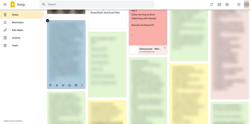
All of this might sound a bit abstract, so here’s a concrete example of an app that embodies the core principles of Material Design: Google Keep. The app uses vibrant, color-coded note backgrounds reminiscent of paper Post-it notes to help visually organize information. Each note appears as a card with rounded edges and uses icons that also appear in most other Google apps.
When I first tried Android Lollipop on my old Nexus 4, I was amazed by how visually stunning and cohesive it looked. Before Lollipop, iOS clearly led in interface aesthetics—Android 4.4 KitKat and earlier versions were functional but lacked consistency across apps and manufacturer skins.
Lollipop added new features with massive performance and battery improvements
Despite Material Design being one of those things that Android Lollipop was best remembered for, it was far from the only revolutionary improvement that came with it. A big one was replacing Dalvik with Android Runtime (ART), which was a significantly more advanced and efficient runtime environment. The runtime environment is responsible for running all apps and services on your phone, which is why switching to ART had a huge impact on how well apps run, how fast the phone feels, and how much battery it consumes.
It’s worth noting that ART was actually first released with Android 4.4 KitKat as a technical preview buried deep in the developer options. I used it on KitKat as well, and I still remember how snappier my phone felt after enabling it.
Another technical improvement was Project Volta, a set of battery optimizations and features designed to reduce power consumption. Features like Battery Saver mode, which activates when the battery reaches a set threshold, restrictions on background activity, smarter batching of tasks, and tools like Battery Historian for analyzing power usage.
![]()
Credit: Justin Duino / How-To Geek
Combined with ART’s improved efficiency, Android Lollipop improved battery life by 36% according to Ars Technica’s testing.
Another feature that resulted in a noticeable improvement in day-to-day use was Trusted Face, which could unlock your phone when it detected your face on the lock screen. It wasn’t super secure, since it could be easily fooled by a photo. Still, for people who weren’t too concerned about privacy (like me at the time), it offered a fast and almost instant way to unlock the device.
Lollipop’s legacy is still visible today
Credit: Joe Fedewa / How-To Geek
While Android Lollipop has been buried in a sea of Android updates that came since, its legacy is still woven into the core of modern Android and apps. Material Design is still used as a framework by developers, and it has continued to evolve. Its latest revision, Material 3 Expressive, forms the foundation of Android 16 and the brand-new UI overhaul that it introduced.
With Material 3 Expressive, it feels like Google built on what made the original Material Design special and added a bit of flair to almost everything. The subtle blur in the notifications drawer gives the impression of a semi-transparent material layered over the main display, just as the original design intended. Elements now respond with more dramatic, expressive animations, and dynamic colors and shapes create a more individualistic, personalized interface rather than the bland look we’re all used to.
The only downside is that many Android phones now spend a lot of time on custom skins to achieve a particular look and experience. In other words, they may not fully follow Google’s design guidelines, so, as always, the best way to experience Material Design as intended is on a Pixel phone.
![]()
Brand
SoC
Google Tensor G5
Looking to upgrade to a Pixel but not sure if you need all the bells and whistles of the more expensive models? You won’t be disappointed with the standard Pixel 10 model. Coming in striking colors, Gemini features, and seven years of updates, you can’t go wrong with this purchase.