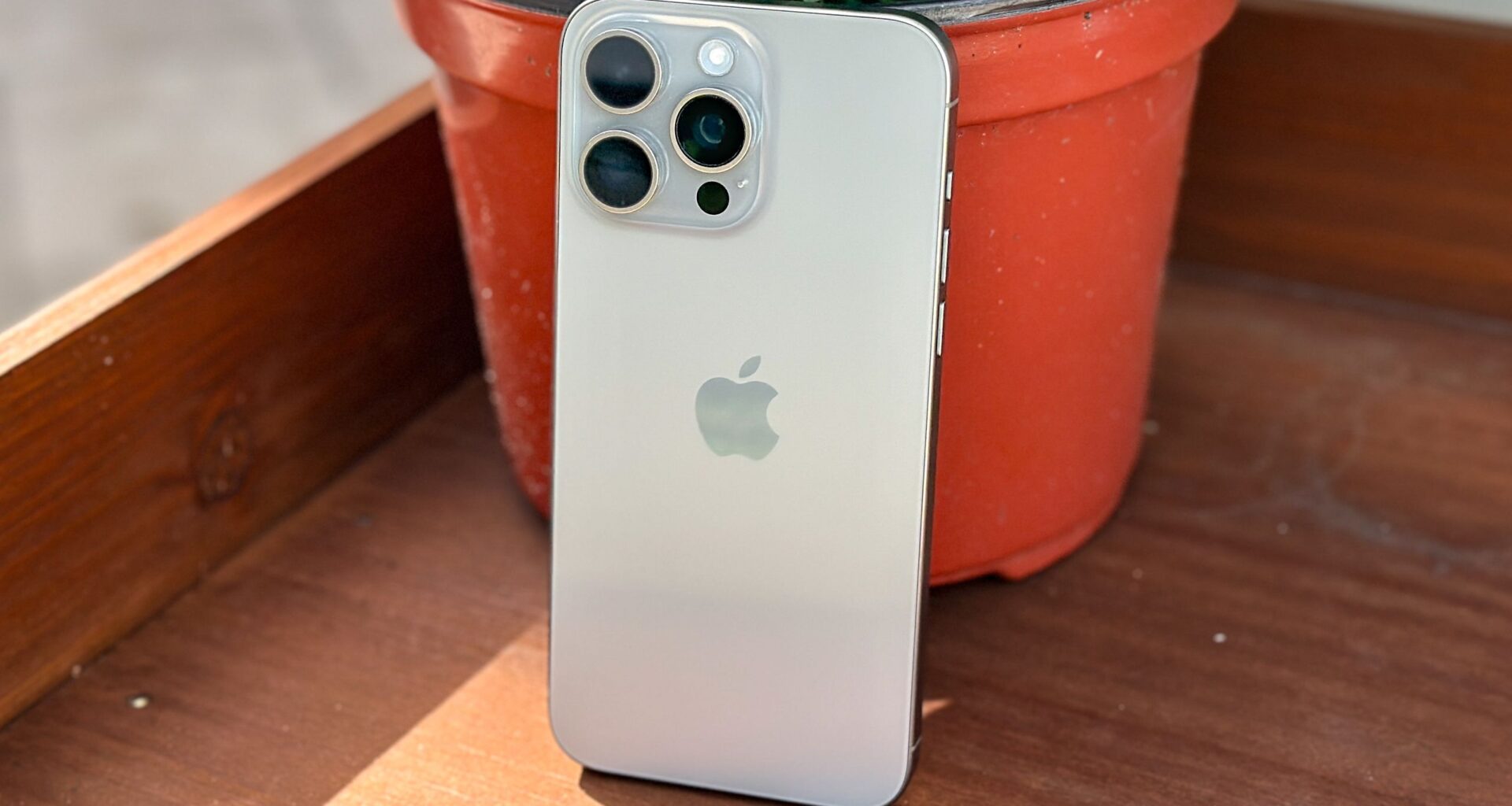
I will be honest — I have been putting off updating to iOS 26 on my current iPhone, instead having stuck with iOS 18.7 for the last few months. However, I recently decided to take the plunge and download Apple’s latest update onto my iPhone 15 Pro Max.
iOS 26 has a lot of strengths — there’s no getting past that — but I held back due to several concerns, as I’m not a fan of the look of Liquid Glass. However, I’ve had some time to get used to the interface on other iPhones as well as some of iOS 26’s other additions, like the improved camera layout. And that’s tempted me to try it on my everday iPhone.
You may like
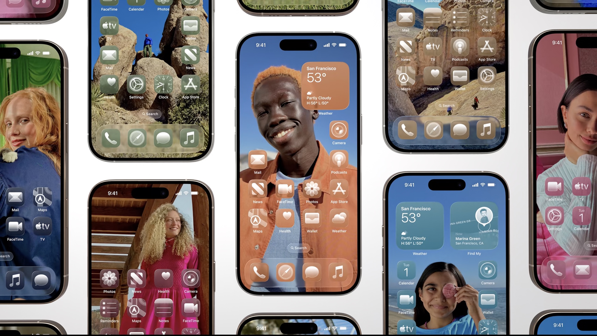
Liquid Glass is fine, but strange

(Image credit: Apple)
While I may have had some issues with the idea of Liquid Glass, thankfully, it doesn’t really make much of an impact in the majority of apps that I use. However, I’m still not a fan of the look of the home screen, especially when it comes to grouped apps.
The problem I have is that when you group apps, they create this weird glass effect that warps the home screen wallpaper. You can adjust this transparency, but that’s where my second issue comes in: iOS 26 is weirdly convoluted at times.
If I want to change the look of the group apps, I have to go into the Accessibility section of the Settings app, choosing Display & Text to find the option to turn on Reduce Transparency and increase the contrast.
However, if I want to change the look of Liquid Glass as a whole, then I have to go into the Display & Brightness section of Settings. That doesn’t change the tint of icons, though, because to do that, I have to make adjustments directly from the home screen.
It’s not the end of the world or anything, but it’s odd to have the options spread around like this. Why not just have a single settings option for all this stuff?
Updated iOS 26 apps are a mixed bag

(Image credit: Future)
I was a bit concerned that iOS 26 would alter how many of my favorite apps work, but for the most part, changes are largely stylistic. Apps like Discord, Twitch and my Kindle app all work as they did before. However, there have been some noticeable changes to built-in apps, especially with the Camera app and Apple Music.
Honestly, I don’t mind the changes to the layout of the iOS 26 Camera app, in fact, I actually prefer it. I’m not the biggest picture taker, to the degree that I tend to forget to use the wealth of options that I have available on my iPhone. However, the new design makes those options more prominent while streamlining the actual user experience.
You may like
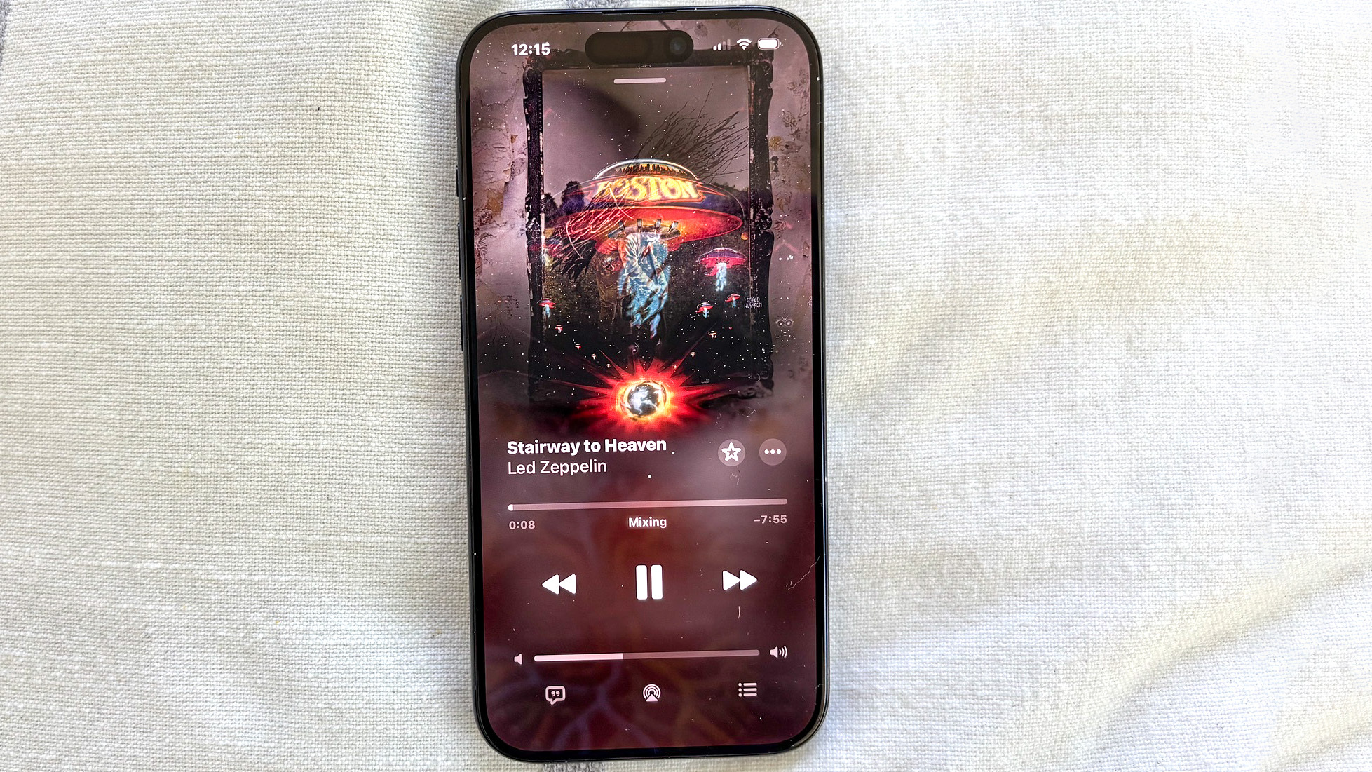
I am not such a big fan of the changes to Apple Music. For the most part, the biggest difference I noticed was the new navigation bar and the ability to swipe songs on the play bar. Now the former addition is fine, but it’s more of a stylistic choice than anything else.
The latter is more confusing, because you can only swipe to change songs while you are in the app. There’s no way that I can find to do it through the Dynamic Island when in any other app, nor can you do it from the lock screen.
What about Apple Intelligence?

(Image credit: Apple)
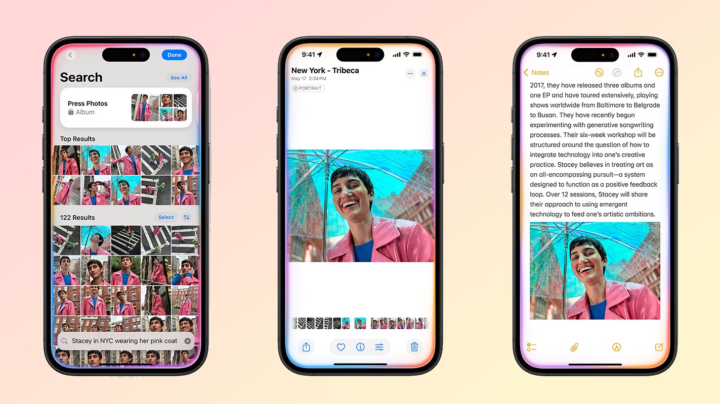
I don’t really use Apple Intelligence all that much, even though the iPhone 15 Pro Max is one of the few outside the iPhone 16 and 17 models to support Apple’s AI tools. And iOS 26 really doesn’t change that.
That’s because new Apple Intelligence features aren’t really part of this iOS update. For the most part, all you get are enhancements to existing capabilities like Visual Intelligence and Image Playground.
As a result, Apple Intelligence continues to trail Samsung’s and Google’s on-device AI features. Apple has even said we’re not going to see a critical AI update to Siri until next year.
That aside, how did I find upgrading to iOS 26, and is it worth it for older phones? Certainly, iOS 26 isn’t the worst thing in the world: most of the visual changes are relatively adaptable. However, it’s certainly more complicated than it really needs to be. At the end of the day, most apps work as they did before, but the ones that have changed feel more like a sidegrade than an upgrade.
Let us know if you’ve upgraded your (relatively) older iPhone and how you are finding the experience.

Follow Tom’s Guide on Google News and add us as a preferred source to get our up-to-date news, analysis, and reviews in your feeds.

