
The days are growing shorter and the light has officially taken on a consistent grey undertone, which of course means that winter is here. As a result, the kitchen has become a cosy point of refuge, one that deserves some special decorating for the season.
While festive decor is a given, kitchen paint ideas are less associated with seasonal changes. It’s easy to see why – it requires more commitment and costs more, but if these Farrow & Ball paint shades are anything to go by, you would gain plenty by taking the plunge.
‘I would never encourage decorating for a seasonal shift but out of necessity only,’ echoes Patrick O’Donnell, brand ambassador for Farrow & Ball. However, ‘when it comes to reviving a space, always think creatively. Painting units is often a good way to make a tired kitchen feel ‘new.’
You may like
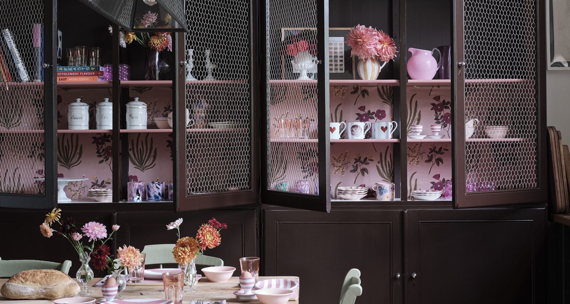
1. Cola
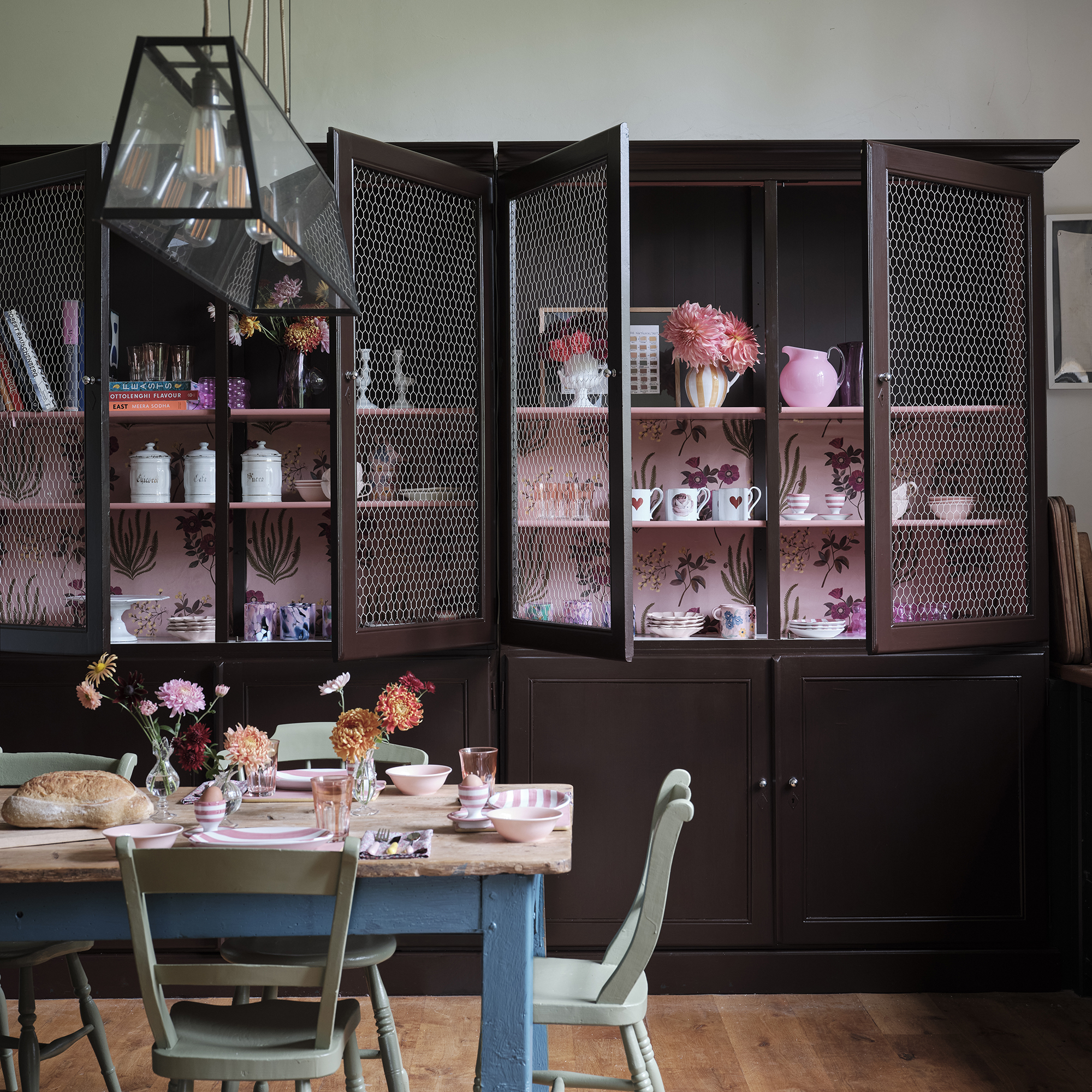
Farrow & Ball ‘Cola’ pictured on cabinetry.
(Image credit: Farrow & Ball)
It’s safe to say chocolate brown is the colour of the season. It’s made a serious case for sticking around in our wardrobes, and adding it to our homes is a great way to tap into the kitchen trend and invoke a sense of warmth. Farrow & Ball’s ‘Cola’ is the ultimate dark brown shade,
The kitchen is the heart of the home, so opting for shades with warm undertones will further those feelings of cosiness, encouraging everyone in the house to gather and socialise in this central spot. This is even more crucial in the winter months when a homely, inviting atmosphere is even more desired as an escape from the cold, dark evenings.
Colour is an underrated way of decorating for the seasons, and it can have a huge effect on mood, particularly if you struggle with SAD. Kitchen trends for 2026 are centered around creating warmth and a lived-in appeal through colour and texture, particularly earthy tones, and Farrow & Ball’s ‘Cola’ fits this brief.
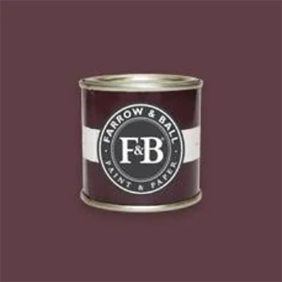
2. Preference Red
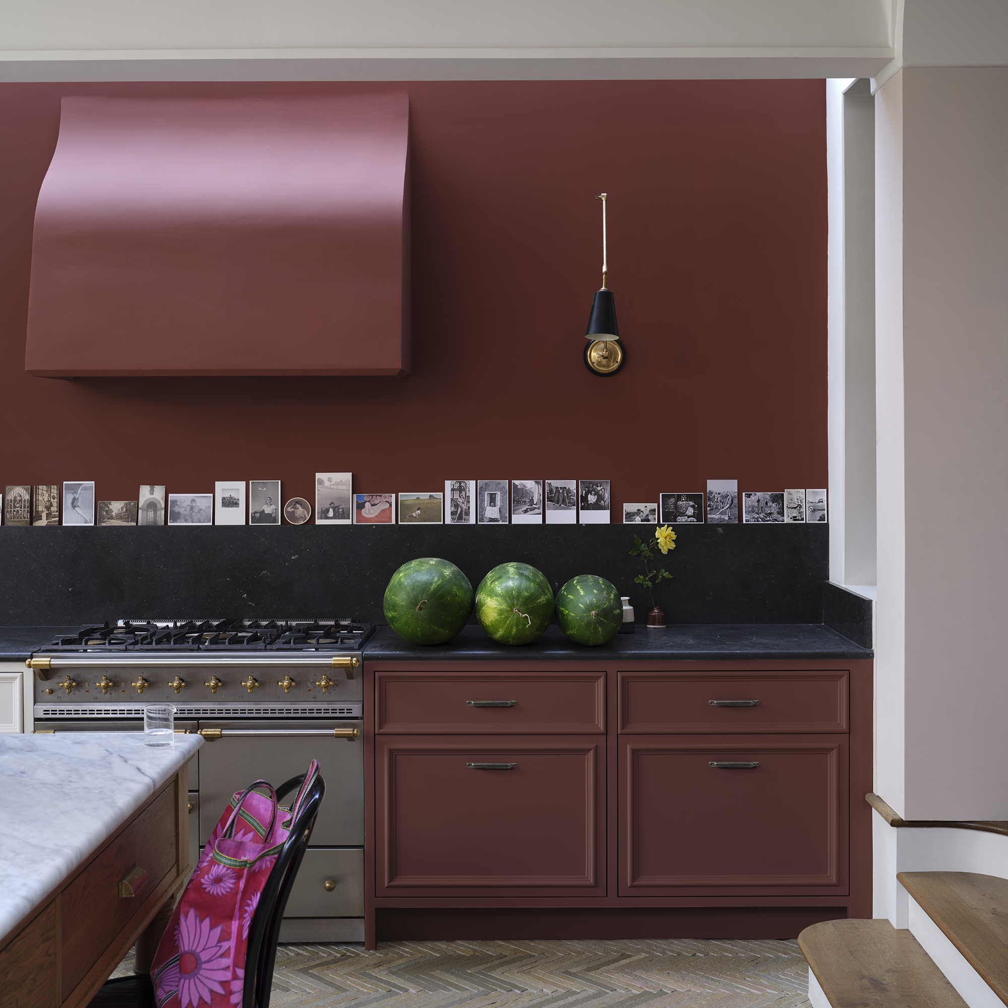
‘Preference Red’ decorates the kitchen cabinets, walls and cooker hood for a cocooning feel.
(Image credit: Farrow & Ball)
Understandably, chocolate brown might feel like committing too much to a trend. While Farrow & Ball has an abundance of paint shades that are perfect for winter, there is one other colour that particularly stands out.
‘Don’t be afraid to go dark on your cabinetry, especially when paired with a good mid-neutral on the walls. Deep wine reds, such as Preference Red, are another classic choice and will add an elegant contrast to soft, plaster pinks,’ explains Patrick O’Donnell, brand ambassador at Farrow & Ball.
Red might feel like a scary shade to decorate with, but if the unexpected red theory has taught us anything, it’s that it might be the missing piece to a stylish scheme. While red is inherently festive, incorporating red paint doesn’t feel like an obvious seasonal nod. Instead, it feels cocooning yet sophisticated and carefully curated.
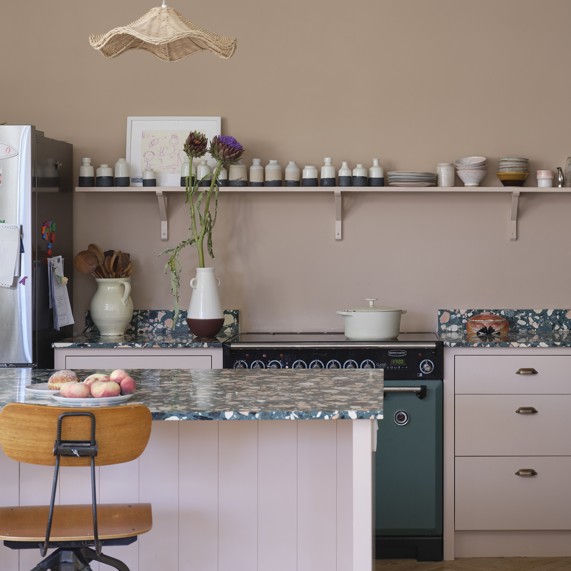
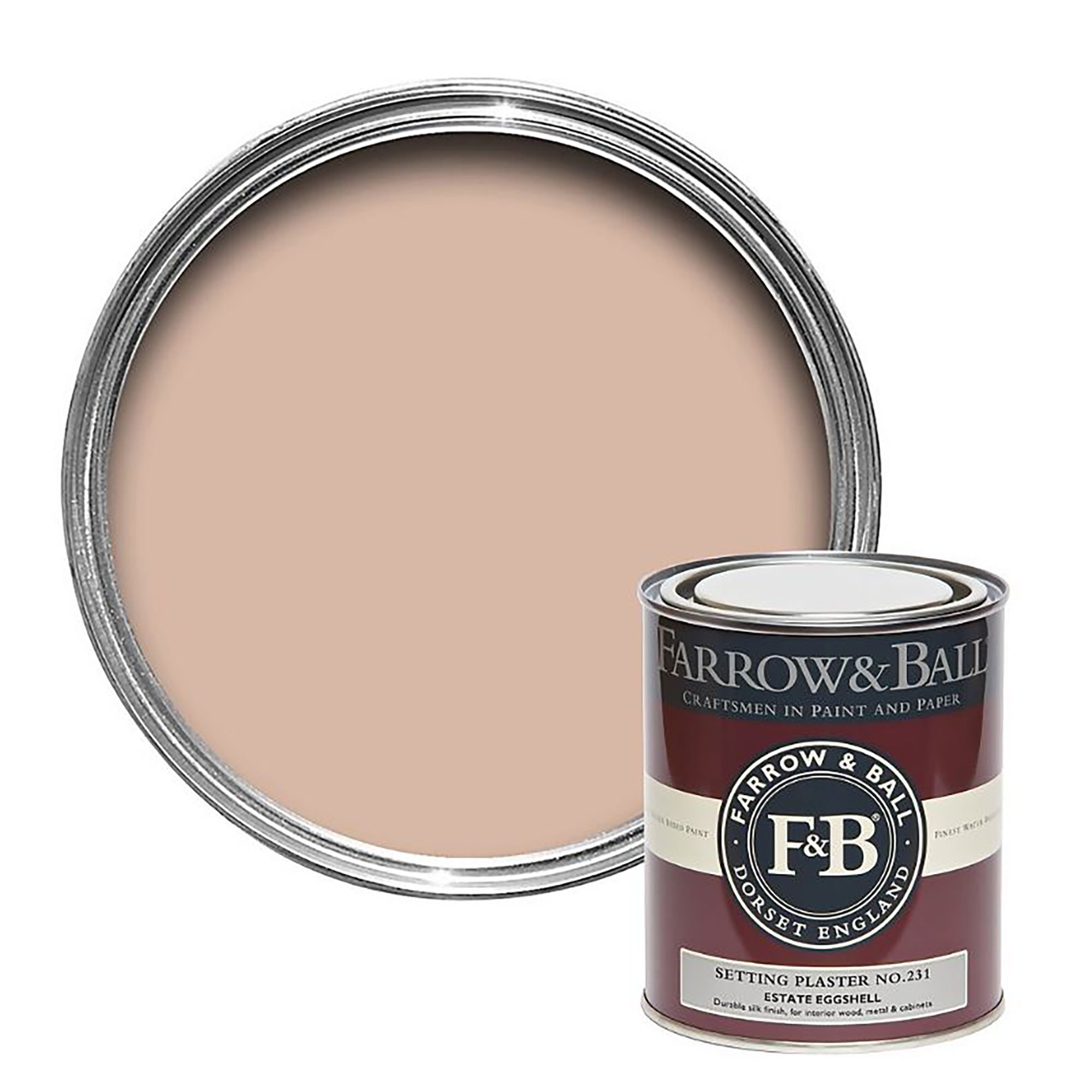
3. Setting Plaster
(Image credit: Farrow & Ball)
While the rich, dark shades make a kitchen feel cosy and enveloping in the winter months, sometimes a lighter colour is needed to lift the scheme. Pink once felt like an ‘out-there’ choice but is now considered much more of a neutral, as it works so well with an abundance of other colours.
‘Utilising more nuanced, earthy pinks such as Setting Plaster or Templeton Pink will surround the room with a warm glow and bring nostalgic comfort,’ Patrick adds.
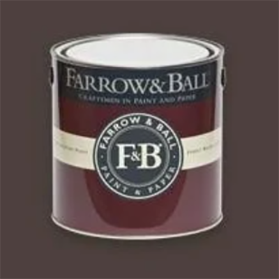
Cola comes from Farrow & Ball’s Archive collection, making it made to order. It has deep red undertones which differentiates it from other brown shades.
Farrow & Ball
Setting Plaster
Setting Plaster is a staple Farrow & Ball shade that will never go out of fashion.
Farrow & Ball
Preference Red
Preference Red is the deepest and richest red from Farrow & Ball. It looks particularly striking next to pale pink shades.
Even if painting your kitchen walls and cabinetry isn’t on the cards pre-Christmas, there are so many ways to incorporate these shades. Whether it’s through painting a door frame or even accessorising in rich chocolate brown and red hues, it’s guaranteed to add a seasonal touch.
TOPICS