
Taylor Swift’s “Life of a Showgirl” bathtub cover looks like a different person compared to the matching moment in the music video, and that has people jumping to conclusions about retouching or AI. Here’s a look at why.
Coming to you from Chelsea Nicole Photography, this insightful video uses the viral side by side to show how lighting choices alter the way a face reads on camera. Chelsea begins by breaking down the similarity in light direction between the video frame and the cover. The separation comes from how each environment handles the spill. The cover was shot in a white tub, surrounded by bright surfaces, milky water, and likely bounce cards, all of which push soft light back into Swift’s face. The video frame sits in a black room that absorbs the same light, which deepens shadow transitions and shapes the face more aggressively. Chelsea points to catch lights to confirm that the video actually uses a larger light source, but it still appears harder because nothing in the room returns the light to the subject.
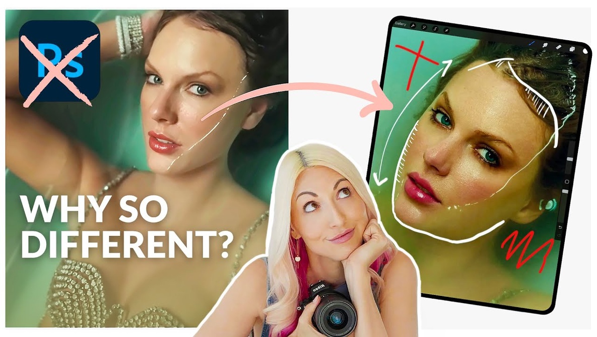
Chelsea also calls out a small shift in Swift’s head angle. The cover gives you more of each eyebrow and a rounder eye shape, which changes the perceived symmetry. The video frame shows a slight turn that narrows the face and sharpens the cheek structure. Chelsea mentions a bit of retouching in the cover image along the cheek line, where softening that transition creates a fuller look. These are minor adjustments, yet they stack to create two different impressions, with one reading softer and the other more defined.
From there, Chelsea highlights what she considers the real driver: lens focal length. The video was likely shot on a wider lens such as a 24mm or 35mm, which suits a moving narrative and gives room to show more of the scene. The album cover, on the other hand, was almost certainly captured with a longer lens such as an 85mm or 105mm, taken from higher up and much farther back. Chelsea explains that the distance required for longer lenses naturally compresses facial features so eyes appear a bit larger, cheeks look fuller, and the face shortens slightly. With a wider lens, you move closer to the subject to keep a similar framing, which removes that compression and can subtly elongate the face. Chelsea overlays outlines of Swift’s face from both angles to show how dramatic the difference becomes when you compare them directly.
Chelsea follows with examples from her own sessions, placing two photos of one client side by side with only the focal length changed. The wider image stretches the face and makes faraway elements shrink. The longer lens makes the nose look smaller, the hair feel fuller, and the background expand. She notes that she avoids going under a 50mm for a tight portrait and often uses something like a 200mm when a client wants to quiet down certain features through natural compression. She keeps much of the technical nuance and live demonstrations on screen, so you still get more detail by watching the full breakdown. Check out the video above for the full rundown from Chelsea.