As we approach the end of the year and (gulp!) the first quarter of the 21st century, the type world continues to bring us lashings of design-related goodness. This month’s releases span from deeply personal explorations to ambitious technical achievements; from grotesques that set out to challenge Helvetica’s ubiquity to experimental systems born from collaborative workshops.
A clear thread running through November’s typefaces is the dialogue between tradition and innovation. Several of the fonts on our list have historical precedents, in terms of British typographic heritage, mid-century modernism, or Art Nouveau flourishes. But importantly, none of them is settling for simple revival. Instead, they’re harnessing history as a foundation, resulting in type families that feel simultaneously grounded and fresh.
So whether you’re drawn to versatile text families with extensive language support, display faces with architectural presence or experimental systems that challenge conventional authorship, read on.
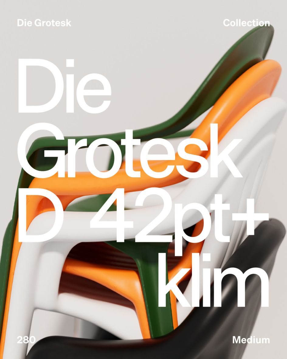
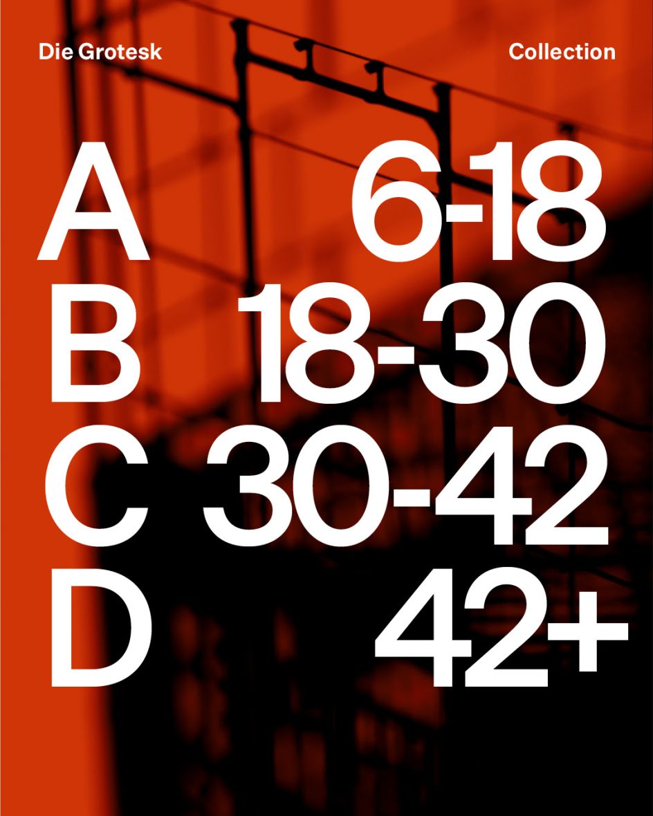
Die Grotesk aims directly at Helvetica’s overwhelming cultural presence, acknowledging both reverence and resentment towards a typeface so ubiquitous it feels inevitable. As Klim Foundry’s first retail variable font, it’s rooted in the study of original metal cuts and modernist rigour, and designed for perfect typographic texture across all sizes.
The variable axes enable seamless, precise control of weight and letter spacing, whilst static styles maintain their integrity at every size. This technical sophistication addresses contemporary practice’s demands for flexibility and consistency, offering designers granular control over typographic expression without sacrificing coherence. Rather than dismissing Helvetica’s power or embracing it uncritically, this alternative offers fresh air that breathes new life into the grotesque tradition.
2. Marblis by Julien Fincker
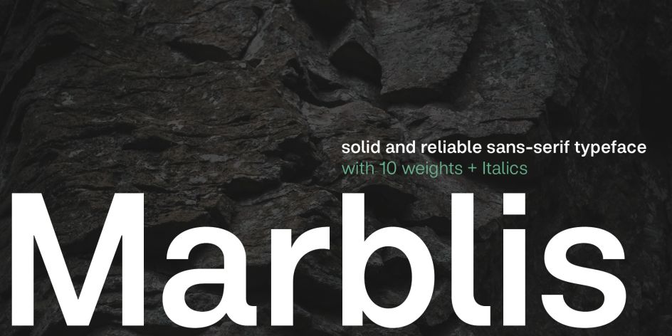
Julien Fincker’s Marblis also presents itself as a modern alternative to Helvetica’s omnipresence, offering a personal interpretation of the classic grotesque. With clear, neutral forms that convey stability and reliability, this isn’t just another neo-grotesque; it’s a thoughtfully developed system built for maximum functionality.
What distinguishes Marblis is its balance between neutrality and character. Whilst maintaining the solid, reliable presence expected from grotesques, it introduces a subtle personality that prevents the typeface from disappearing into background ubiquity. The result ensures content remains the focus whilst providing designers with a dependable, precise tool that performs consistently across contexts.
The family comprises 10 weights plus italics, totalling 20 styles, with over 1,410 glyphs per font supporting 200+ Latin-based languages. Marblis further demonstrates its versatility through comprehensive OpenType features and variable font capabilities, making it particularly suitable for corporate design, editorial work and signage systems. This font is available exclusively at Font Cuisine until 16 January; get 50% off with code Marblis50.
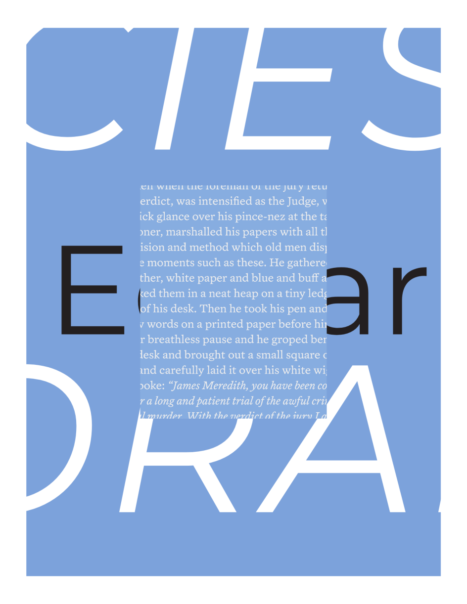
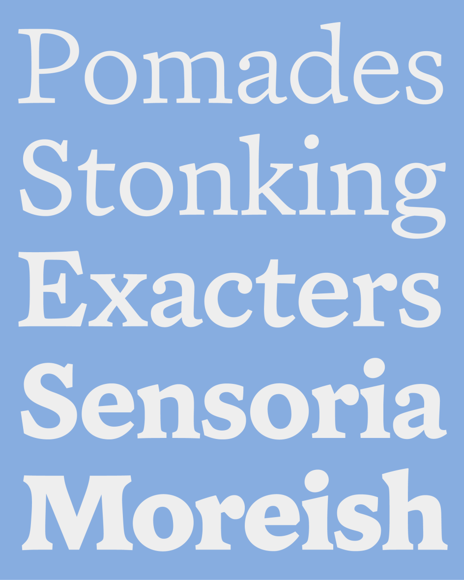
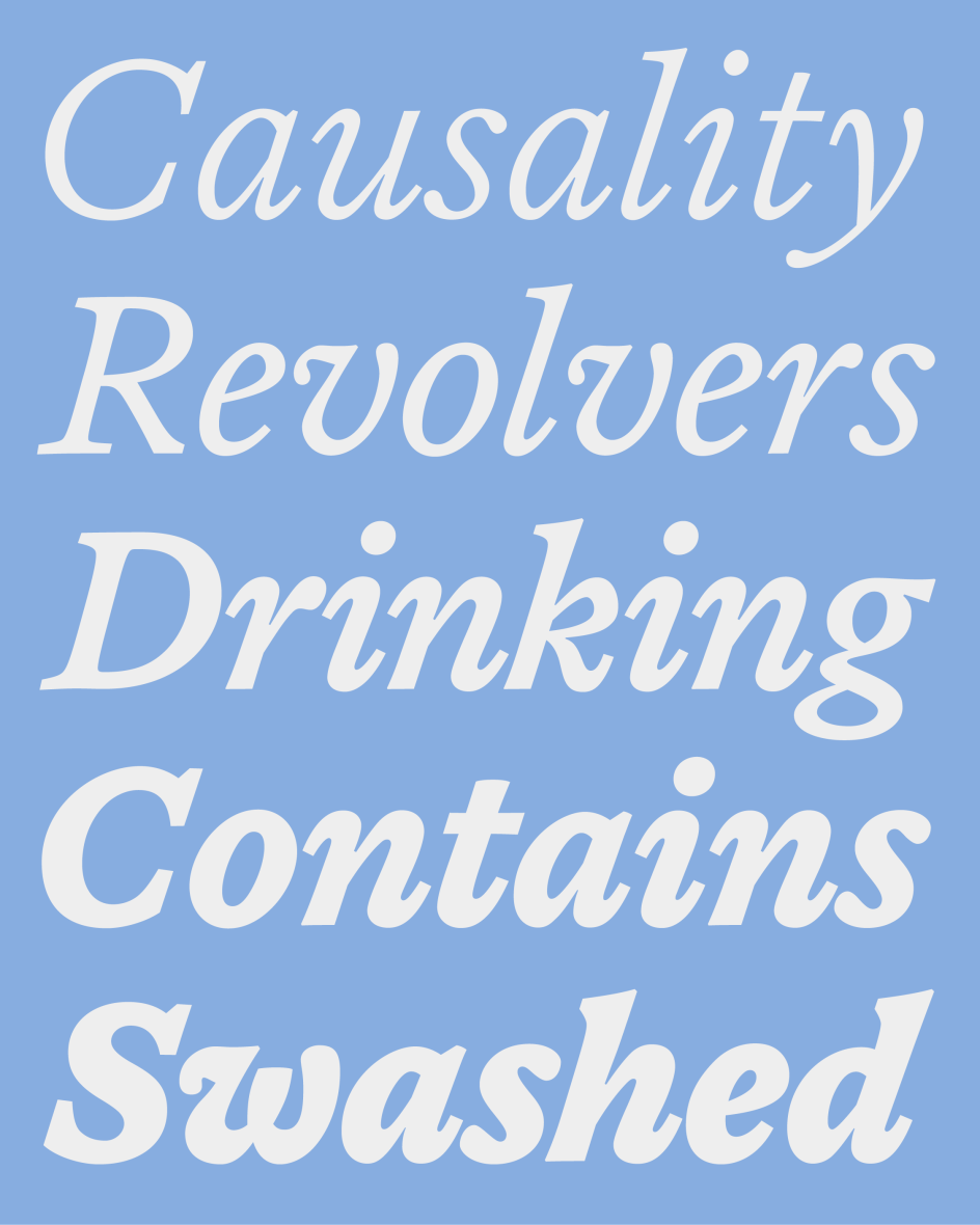
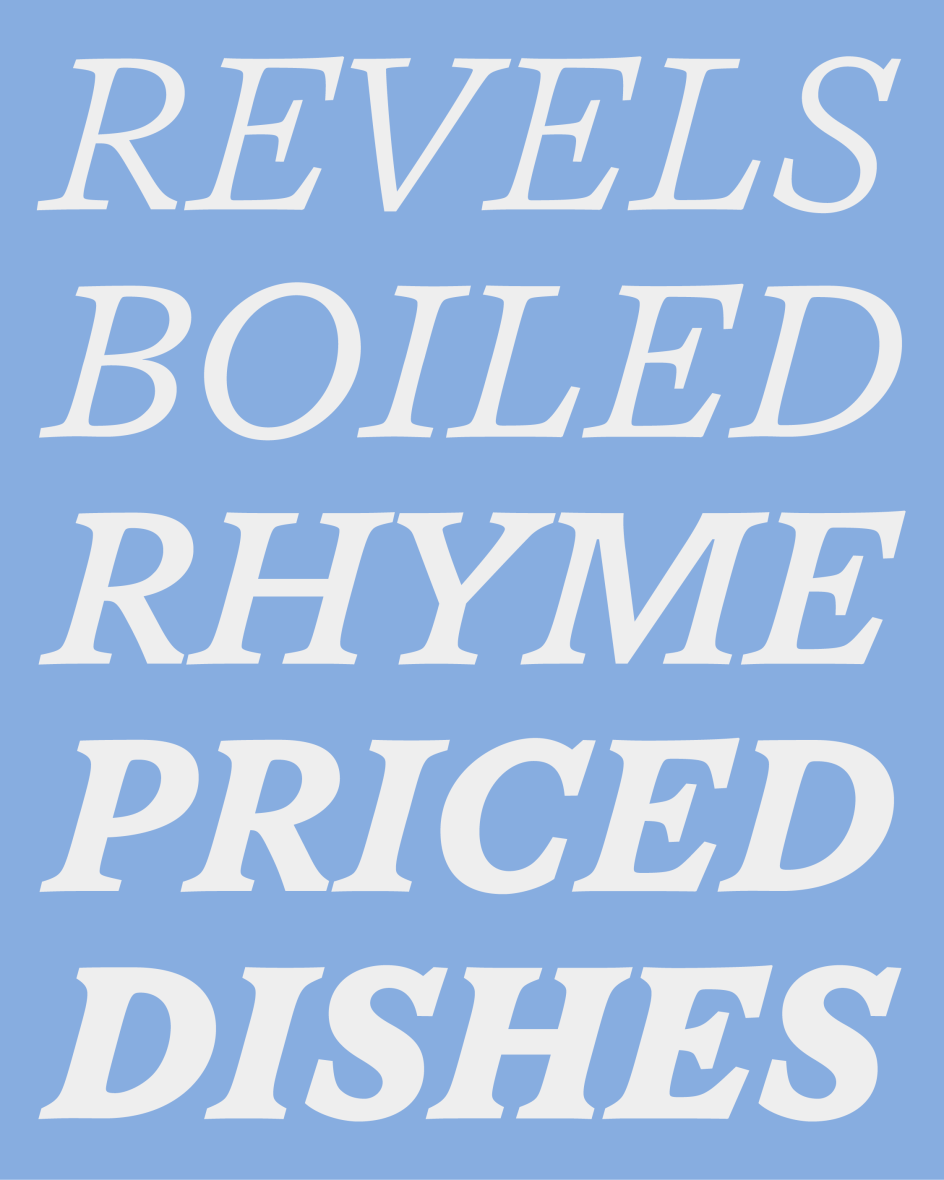
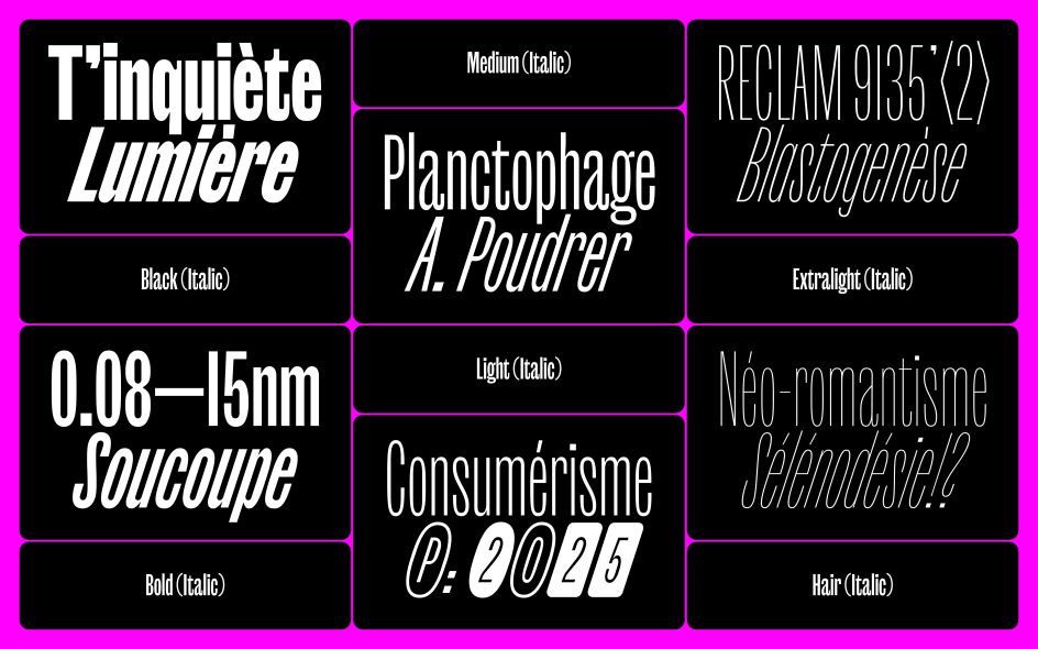
3. Edgar by Tobias Frere-Jones and Nina Stössinger
Frere-Jones Type’s Edgar marks the tenth anniversary of Mallory’s release, with a serif sibling that’s been gestating for a decade. Designed primarily by Tobias Frere-Jones with significant contributions from Nina Stössinger, particularly on italics, Edgar is an oldstyle text family exploring the intertwining of personal and public histories.
Named after Frere-Jones’ great-grandfather Edgar Wallace, a prolific crime writer, the typeface draws on British typographic tradition through the work of William Caslon and Alexander Phemister. This unlikely combination of sources separated by nearly 150 years creates a productive tension: letterforms that individually may not be perfectly balanced but knit together into words with compelling rhythm.
Edgar Wallace’s conversational, spirited writing style (which was famously dictated aloud rather than laboriously written) influenced his approach to texture and pacing. This new typeface aims to replicate that easy rhythm through shapes and space, creating patterns suitable for extended reading whilst maintaining a character that prevents disappearing into generic text. With development assistance from Hrvoje Živčić on character sets and language coverage, Edgar demonstrates how collaborative, iterative design can produce work that’s both historically informed and thoroughly contemporary.
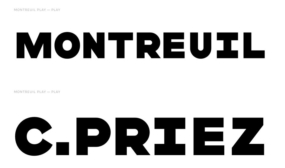
4. Montreuil by Julien Priez and James Edmondson
The product of a transatlantic collaboration between Julien Priez (aka Boogy Paper) and James Edmondson’s OH no Type Co., Montreuil is a comprehensive two-part family named after the French city where the former lives.
Montreuil Play emerged from Julien’s 15-year-old sketches exploring kit-based letterforms that could join together for interesting variations and abstract graphics. Rather than creating another conventional sans-serif, he decided to develop an extensive system of modular alternates. The aim is to encourage designers to experiment with shapes and construct custom compositions, empowering creativity rather than simply setting type.
Montreuil Text, meanwhile, was developed primarily by OH no’s team with Colin Ford and Jamie Otelsberg. It serves as the functional complement of Montreuil: a simplified, proportional family with multiple weights and italics suitable for extended reading. James’s contribution brought warmth to the system through careful attention to humanist details in letters like c, e, and s, balancing functionality with personality.
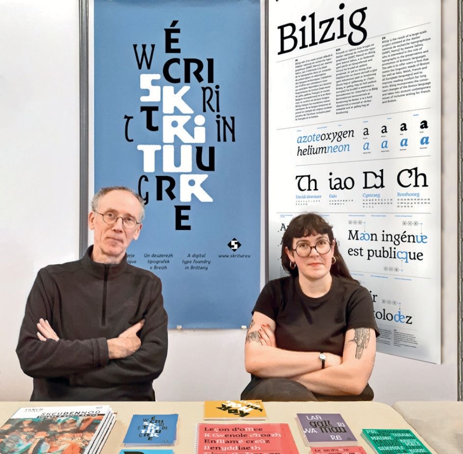
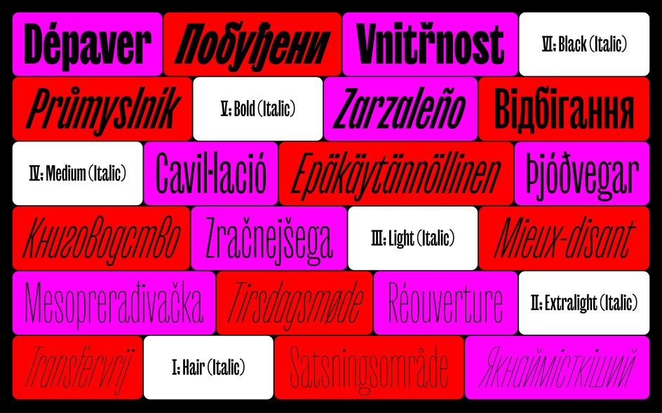
5. Bilzig by Jeanne Saliou
Created by French designer Jeanne Saliou following research at the Atelier national de recherche typographique (ANRT), Bilzig represents something of a landmark. Released on 18 November, it’s the first typeface designed specifically to support the typographic, linguistic and cultural needs of Breton, Gallo, Welsh, French and other European languages.
Beyond comprehensive language support, Bilzig integrates innovative features for Breton consonant mutations and inclusive writing, addressing contemporary linguistic challenges that most typefaces ignore. This technical sophistication serves a broader reflection on identity, territory and how letterforms carry cultural narratives.
Saliou’s journey from Brest through various French cities informed the project’s central question: “Can we establish a link between a letter and our place of birth?” Bilzig answers affirmatively, offering users a typeface meeting linguistic needs whilst promoting comfort during extended reading sessions. It’s available in four weights (normal, medium, bold, and black) for both roman and italic.
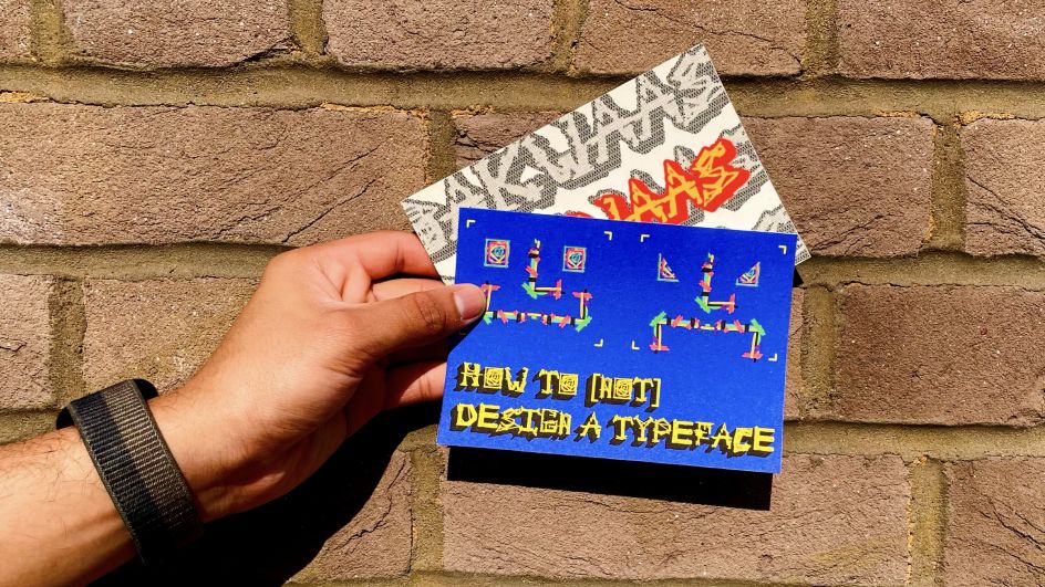
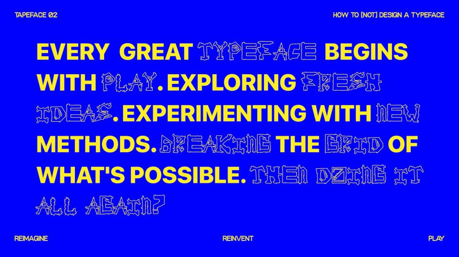
6. Tapeface by Varada Rege
Part of Varada Rege’s ongoing project How to [not] design a typeface, Tapeface was co-created by 27 individuals during a workshop. Each participant received one alphabet sheet and one colour of tape; every 30 seconds, sheets were passed to the next person, allowing everyone to contribute to every letter. The result is a typeface shaped by many hands: layered and chaotic, yet coherent.
Rather than a typical typeface with fixed final forms, Tapeface exists as a living, evolving type system; a visual language authored collectively rather than owned individually. The project asks fundamental questions about authorship, ownership, and what happens when type design becomes about shared making rather than individual perfection.
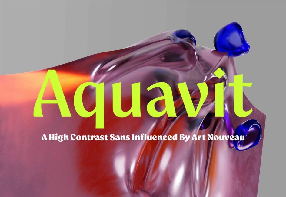
7. Aquavit by Felix Braden
Felix Braden’s Aquavit is a display typeface that combines the crisp precision of high-contrast sans-serifs with the warmth of vintage design. Inspired by the organic forms, flowing lines and expressive motifs of the Art Nouveau movement, it walks the line between cool sophistication and handcrafted natural charm.
The typeface proves functional and legible even in smaller font sizes. Its slightly top-heavy design with subtle calligraphic influences breathes an air of extravagance and grace, making it a go-to choice for designers seeking to infuse projects with subtle sophistication.
This would be a particularly good choice for exclusive lifestyle products, such as beauty, jewellery, fashion, music, food & beverage, and interior design, adding distinct authenticity and character to projects. More broadly, with its unique, non-conformist style, it’s a good choice for alternative brands seeking to stand out.
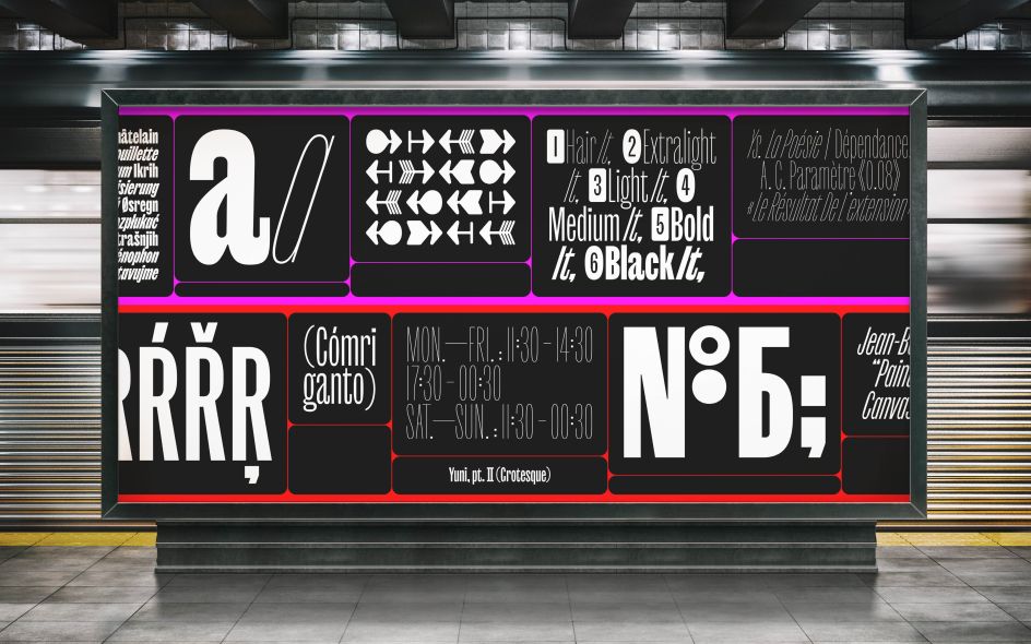
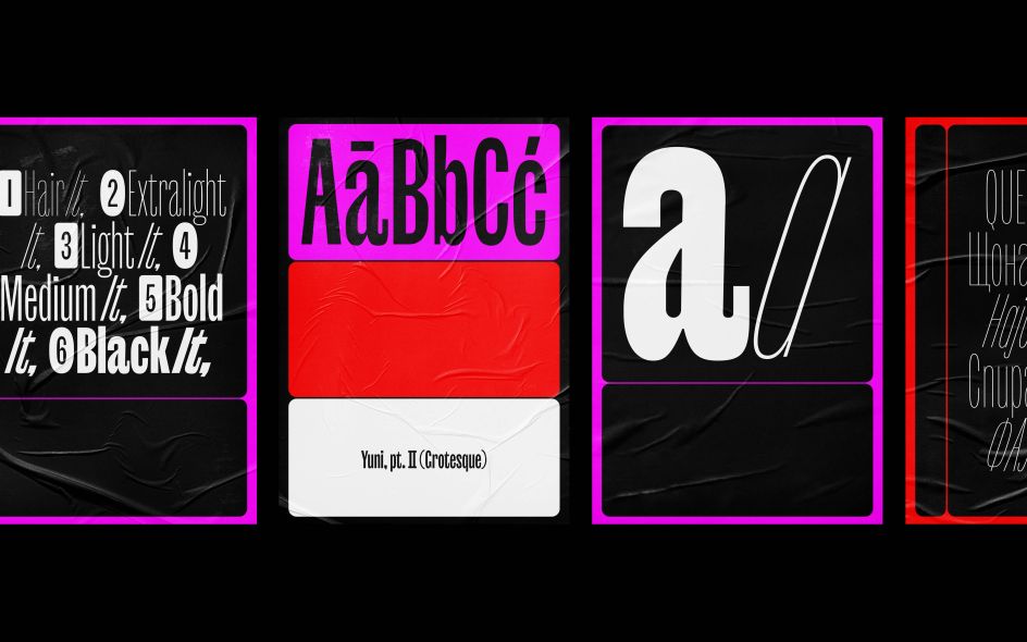
8. Yuni Grotesque by Nils Thomsen and TypeMates
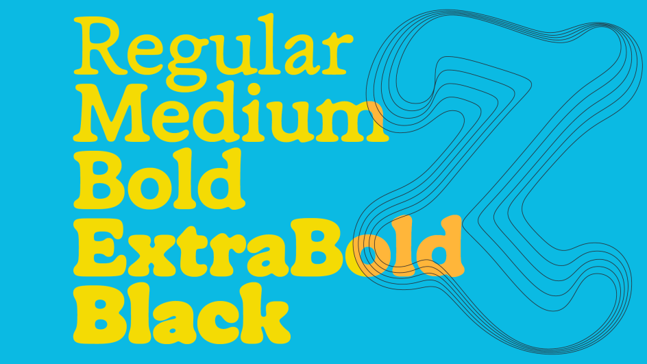
The second edition of the Yuni Collection, Yuni Grotesque by Nils Thomsen and TypeMates, positions itself as more than just a compressed sans or dismembered sibling of Yuni Slab. This is, as they say with characteristic humour, “the end of the Samsara of narrow sans serifs”. Its curves are playful and highly suggestive. As its weight transforms counters into almost-circular rounds, its outer curves take a flatter approach. This blend creates what TypeMates calls “a beautiful bouquet of high functioning foolishness”; a typeface that’s both practical and distinctive.
The six-weight range, from flimsy Hair through advantageous Medium to thick and sturdy Black, includes italic styles heavily sloped at an expressive 18° angle, conveying speed and confidence. With more than 900 glyphs per style (including native-approved Cyrillic and broad Latin character sets supporting 270+ languages), Yuni Grotesque offers steep accents, multiple figure sets (circled ones included), arrows, and OpenType features such as case-sensitive punctuation and contextual alternates.
This typeface is well-suited for anything grand and mighty: intricate branding, sophisticated layouts, oversized movie titles, or inflatable event signage visible from space.
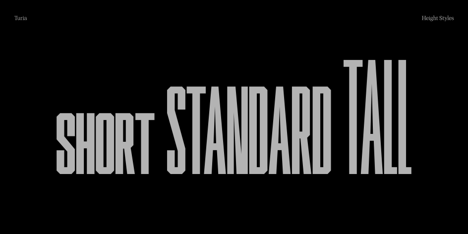
9. Turia by Alberto Molina
Alberto Molina’s Turia explores vertical proportion as a variable. In other words, each letter can expand or contract in height, allowing type to adapt visually and conceptually to different compositions. This bevelled, all-caps typeface embraces variation, play and subtle imperfection through variable technology.
Named after the river flowing through Valencia, the typeface is basically Molina’s homage to his home city. It comes in three predefined heights (Short, Standard, and Tall), plus a variable version allowing users to dynamically adjust individual letter heights. “I’ve always been drawn to condensed letterforms, those that feel like they’re adapting to space rather than occupying it,” Molina explains.
Furthermore, an interactive tool inspired by experimental workflows of Talia Cotton and Dinamo allows users to play with Turia’s variable properties and generate custom compositions. “What excites me most,” Molina adds, “is how it behaves when you combine different heights within a word—it gives the text a sort of kinetic rhythm.” By pushing vertical variation to its limits, Turia doesn’t just propose new visual texture: it invites designers to think of type as movement, rhythm and transformation.
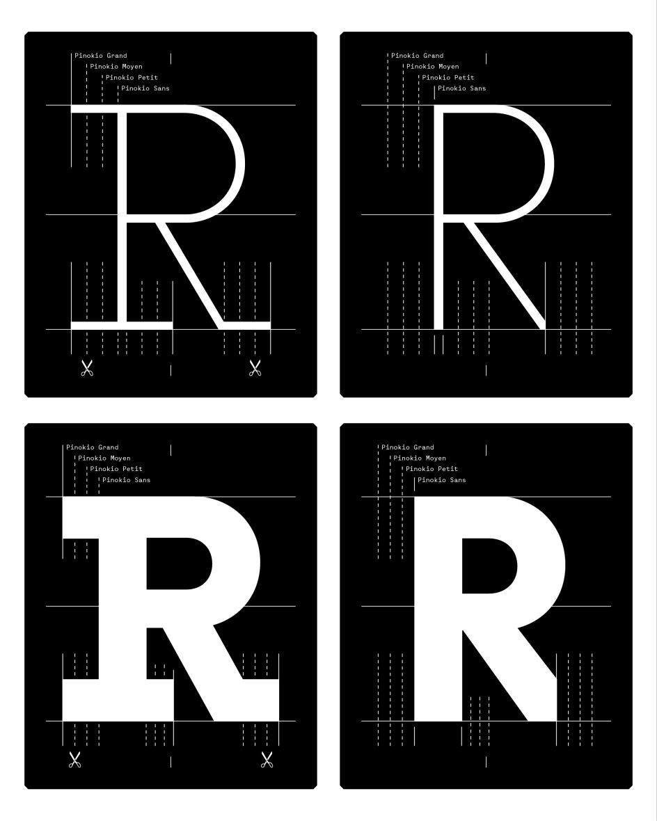
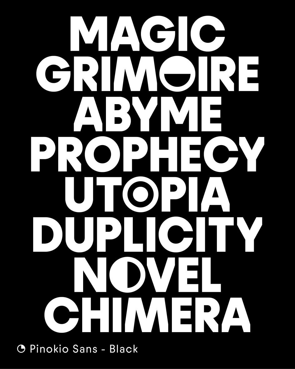
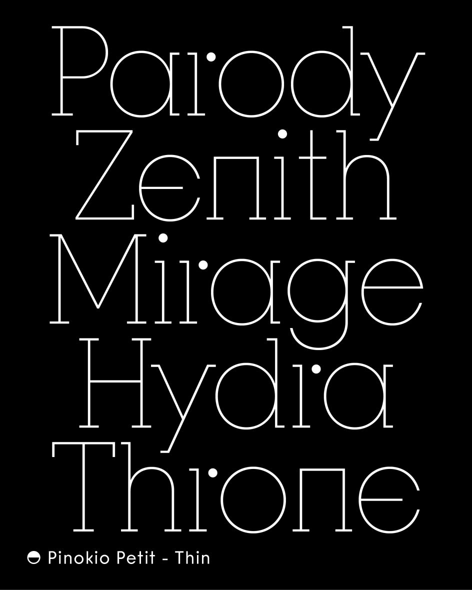
10. Pinokio by Tanguy Vanlaeys
Designed by Tanguy Vanlaeys for French foundry 205TF, Pinokio emerged from a story blending fantasy and fiction to develop a hybrid typeface; a chimaera combining the rigour of geometric sans-serifs with the strong structure of slab serifs.
Pinokio offers multiple variants whose coherence is reinforced by an intentionally rudimentary design. The vertically cut diagonals of the sans version allow for the emergence of serifs that grow progressively larger across four families: Sans, Petit, Moyen and Grand. This systematic approach creates a multifaceted typographic narrative.
In larger sizes, the typeface asserts itself, revealing multiple personalities through numerous stylistic variants. Bold design choices might initially suggest limitation to display contexts, yet in smaller sizes, Pinokio reveals unexpected potential for setting longer texts with a broad palette of typographic colour.
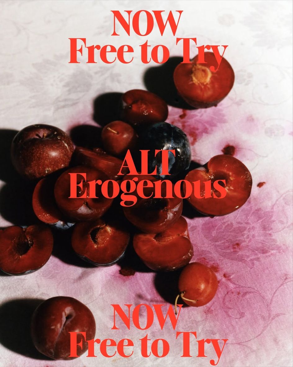
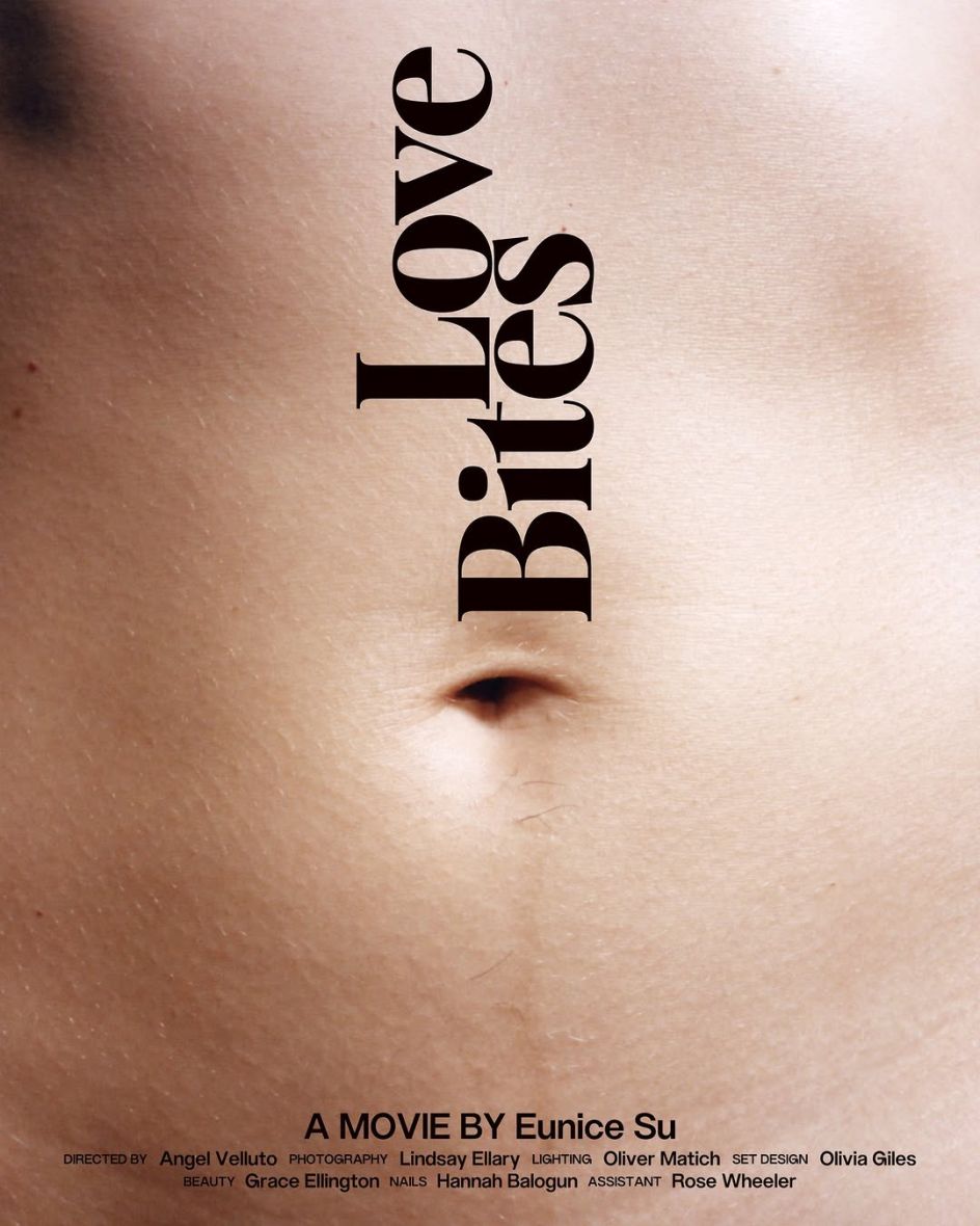
Designed by independent type designer Eunice Su and released through ALT.tf, ALT Erogenous is a bold display serif balancing sharp contrast with seductive curvature. Its high-impact letterforms feature pronounced stroke contrast, sensual serifs and a strong base structure; all of which provoke visual tension and intrigue.
The typeface revives lettering from the 1972 cover of Combat in the Erogenous Zone by Ingrid Bengis; a book exploring female identity, freedom and emotional duality. Eunice describes Erogenous as “a typographic response to these emotional and social complexities, a way to visualise internal tension and cultural questioning through form”.
With 484 glyphs supporting 219 Latin languages, including full Latin 1 & Extended-A coverage and 95% Latin Plus support, ALT Erogenous demonstrates how display typefaces can carry conceptual weight whilst maintaining technical sophistication. The design draws focus through deliberate provocation, making it particularly suited for projects requiring bold visual statements rooted in cultural commentary.
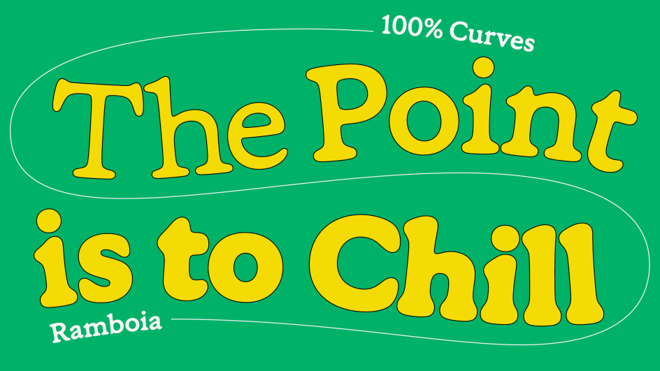
12. Ramboia by Rui Abreu and Catarina Vaz
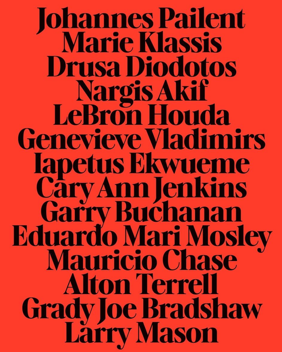
From Rui Abreu and Catarina Vaz at R-Typography Type Foundry, Ramboia offers a playful and joyful take on the French Old-Style tradition. Combining approachability with elegance, this five-weight family is crafted entirely from loose, flowing curves free of angles, creating a smooth and relaxed feel.
Recently honoured with a Certificate of Excellence from TDC 2025, Ramboia’s character emerges through its rejection of angular construction in favour of continuous curvature. This lends the typeface an organic, approachable quality whilst maintaining the sophistication expected from oldstyle traditions. This balance makes it particularly suited for projects requiring warmth and personality without sacrificing elegance or readability.